The Renault Sport logo embodies the thrilling spirit of motorsport, the unstoppable energy of racing cars, and the joy of victory on the track. It has become a symbol of technological excellence because the French company’s division focuses on high-performance and modern car design.
Renault Sport: Brand overview
When Renault combined its sports divisions, Alpine and Gordini, into one entity, the new company’s history officially began in 1976—the decision aimed to focus on developing high-performance road cars and motorsports together.
The original headquarters were in Dieppe, France, home to Alpine’s manufacturing plants. The new division’s main goal was participating in motorsport events such as Formula 1, rallying, and endurance racing.
Renault Sport became a major motorsports force in the late 1970s and early 1980s. The team won its first Formula 1 race at the French Grand Prix in 1977. This accomplishment marked a turning point for Renault, as it used a novel turbocharged engine.
The company unveiled the Renault 5 Turbo, its first road vehicle, in 1981. The automobile gained notoriety for its unconventional mid-engine configuration and turbocharged engine, designed for rally homologation.
The brand persisted in competing in various motorsport classes during the 1980s. With the Renault 5 Turbo, the team won the World Rally Championship in 1983. With the Alpine A442B, it won the GT class at the renowned 24 Hours of Le Mans in 1985.
Throughout the 1990s, the company concentrated on creating high-performance versions of Renault’s commercial cars. Famous models like the Megane Coupe 16V and Clio Williams gained popularity among auto fans.
Renault’s involvement in Formula 1 was restored in the 2000s. Fernando Alonso, the driver of the Renault F1 team, won the World Championship after winning the Constructors’ Championship in 2005 and 2006.
The brand continued creating “hot” versions of production cars during this time. The Clio RS and Megane RS were particularly popular and won praise for their exceptional handling and performance.
In the 2010s, the company expanded its endeavors by developing race vehicles for contracted teams—various racing series employed models such as the Formula Renault 3.5 and the Megane Trophy.
Renault made a factory team comeback to Formula 1 in 2016, using the brand’s knowledge and assets to help create and manufacture racing vehicles.
2021 was a pivotal year. The division’s planned rebranding to Alpine marked the resurgence of this illustrious moniker. This choice fits into the larger plan of the Renault Group to rearrange its brands.
The company’s conversion into Alpine was completed by 2022. With the transfer of all high-performance vehicles and sporting programs to the Alpine brand, the original entity ceased to exist as a distinct business.
Even though the brand ceased to exist as a separate entity, its influence can still be seen in Alpine’s high-performance vehicles and the company’s involvement in motorsports, particularly Formula 1.
Meaning and History
What is Renault Sport?
This division of the French automaker Renault specializes in high-performance cars and motorsport. It oversees the company’s motorsport operations and develops and produces sports road cars. These vehicles differ from regular models with superior handling, enhanced performance, and unique design. The division has a long history of success in various forms of motorsport, including touring car championships, Formula 1, and rally racing.
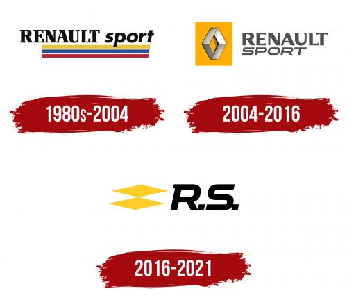
1980s – 2004
Renault Sport was once not a division of Groupe Renault but a separate company that used a logo featuring the French tricolor. The stylized flag was depicted as three long horizontal lines: blue, white, and red. Above them was another stripe—yellow, embodying the energy of lightning-fast sports cars. The perfectly straight parallels evoked the image of a racing track.
The slightly modified flag reflected the patriotism of the quintessentially French company, serving as its national and cultural identifier. Above the colorful pattern of lines was the name Renault Sport, rendered in two different fonts:
- The Renault Bold serif typeface was used for the first word, with strokes of contrasting thickness and rectangular serifs at the ends.
- The second part was set in a bold italic sans-serif font, roughly similar to Futura Std Bold Oblique.
The letter sizes also differed: designers intentionally capitalized “RENAULT” to highlight the company’s connection to the renowned car manufacturer. The word “sport” was written in lowercase glyphs, whose dynamic shape aptly conveyed the essence of auto racing.
Even the somber black color does not detract from this impression—on the contrary, it evokes a sense of confidence and an uncompromising drive for victory. Interestingly, the angle of the cut on all three stripes roughly matches the tilt of the letter “t,” making the tricolor appear as a natural extension of the text.
2004 – 2016
In 2002, Renault Sport became a division of the company, and its logo created two years later included the distinctive Groupe Renault symbol—a stylized diamond with two truncated corners. This simple geometric symbol connected all the brands the renowned car manufacturer owned.
The diamond shape originally represented a radiator grille, but over time, it came to be seen as a diamond—a symbol of wealth, strength, nobility, and exclusivity. The hexagonal form, reminiscent of a honeycomb cell, added dynamism to the emblem. The honeycomb association was reinforced by the bright orange color of the rectangular base, a fitting choice since bees symbolize wisdom, order, and diligence.
The diamond comprised four segments forming two “V” letters—upright and inverted. Designers highlighted these with dark outlines and a silver gradient, as “V” stands for victory. This implied Renault Sport’s triumph over competitors and its cars’ success on the racetrack.
The logo’s unusual texture reflected light. The smooth gradient transition from gray to white created the illusion of polished metal associated with modern automotive materials. Dark shadows made the diamond appear three-dimensional and slightly raised above the orange base, giving the emblem a futuristic look.
Designers retained the general style of the “RENAULT SPORT” text but made slight modifications. They split the company name into two lines for visual balance. The serifs on the letters in the first word became shorter and took on the form of triangles with cut-off ends. The second word was rendered entirely in uppercase and rewritten in thin italics with compressed glyphs, further associating the font style with the extreme speed of the cars.
2016 – 2021
In 2016, Renault Sport was reorganized and came under the management of two different divisions: Renault Sport Racing and Renault Sport Cars. This duality is reflected in its new logo, which features two flattened diamonds that do not merge but barely touch at their corners.
The diamonds are slightly shifted diagonally, mirroring the slant of the “R.S.” inscription and emphasizing the dynamics of high-speed cars. The emblem’s asymmetric shape creates a vibrating effect, similar to a roaring race car engine. The sharp corners convey an aggressive mood characteristic of sports competitions. At the same time, the muted yellow evokes feelings of optimism and friendliness, enhancing trust in the brand.
The elongated diamonds now resemble flames, bursting from the exhaust system or from under heated wheels rather than diamonds. The abbreviation “R.S.” represents the race car element, making the logo suitable for both divisions with nearly similar names. Its black color stands out perfectly against a light background. Although the wordmark consists of just a couple of letters, it reflects the activities of Renault Sport:
- The short serif at the top of the “R” resembles a car toggle switch.
- The “S” is reminiscent of a complex track that agile sports cars handle well.
Quadrangular dots follow the letters in the shape of diamonds set on their edges. These seemingly minor details play a significant role in the logo’s composition, as they visually connect the inscription with the yellow geometric symbol.
