


![]() Revenge (TV) Logo PNG
Revenge (TV) Logo PNG
The Revenge (TV) logo holds a secret related to the most mysterious literary work: Dumas’s novel The Count of Monte Cristo. It encapsulates the drama experienced by the series’ main characters and their emotional turmoil in their quest for justice.
Revenge began after ABC Entertainment president Paul Lee asked writers to create a large prime-time soap opera in the spirit of classic TV drama. Mike Kelley, who had created Swingtown for CBS and written for The O.C. and Providence, developed the idea with Joe Fazzio. They reread The Count of Monte Cristo and rebuilt its revenge structure around Emily Thorne, the Hamptons, and the wealthy Grayson family.
ABC ordered the pilot script in January 2011. In March, Emily VanCamp was cast in the lead role, followed by Madeleine Stowe as Victoria Grayson and Henry Czerny as Henry. James Tupper replaced Marc Blucas as the heroine’s father after scheduling conflicts with Necessary Roughness. On May 13, 2011, ABC ordered the series, placing it on Wednesdays at 10 p.m. against CSI: Crime Scene Investigation on CBS and Law & Order: Special Victims Unit on NBC.
The pilot aired on September 21, 2011, and drew 10.02 million viewers with a 3.3 Nielsen rating among adults 18 to 49. It became ABC’s strongest show in that slot since Lost in the 2006–2007 season and beat both CSI and Law & Order: SVU in key younger demographics. The first season brought broad press attention, and Madeleine Stowe received a 2012 Golden Globe nomination.
From season two, Revenge moved to Sundays at 9 p.m. In April 2013, Kelley left as showrunner, and Sunil Nayar took over, changing the tone in later seasons. Filming took place at Manhattan Beach Studios and ended on April 11, 2015. ABC announced the cancellation on April 29, and the final episode aired on May 10, 2015, with 4.8 million viewers. The series ended with 89 episodes across four seasons.
Meaning and History
![]()
The logo is based on the audacious title of the television series. It’s provocative, presenting a challenge to society, more precisely, to the offenders who have caused emotional trauma and irreparable loss to an individual. That’s precisely the case. According to the plot, the main heroine comes to the city to exact revenge for the humiliation she suffered 20 years ago. While executing her plan, the young woman uncovers the secrets and lies of the families who hurt her. As a result, she faces a significant threat. However, the entire city also ends up under the gun. The creators chose this emotion as the title because revenge is the series’ main driving force. It also became the basis for the conceptual emblem.
What is Revenge (TV)?
Revenge (TV) is a television series that aired in the US on ABC from 2011 to 2015. It was produced by Mike Kelley, with main roles performed by Madeleine Stowe, Emily VanCamp, and Gabriel Mann. The series was based on the novel “The Count of Monte Cristo” by French writer Alexandre Dumas. It consists of 4 seasons with 89 episodes.
2011 – 2015
![]()
The Revenge logo is mystical. The enigma can be seen in everything: the letters “dissolving” on a white background, the lowercase loop-shaped “g”, and the minimalist design. In other words, it has many special details that carry a deep symbolic load because the emblem is not just a screen saver for the TV series but its visualized concept.
The logo consists of an inscription with a font similar to Poor Richard RR Light. The letters are lowercase, Roman, and semi-bold, with a harmonious combination of lines of different thicknesses. The Antiqua adds expressiveness and underscores the idea of revenge, with its serifs resembling spikes. However, their blunt ends are still used to inflict painful blows.
Moreover, some glyphs are not brought to a logical conclusion; they seem underdrawn, as the lines do not close, which is visible at “e.” And “n” has fallen into two halves: its right side resembles an inverted hook. However, a special place in the logo is occupied by the stylized “g.” It is highlighted in red and shaped like a vertical infinity sign or an eight. The loop-shaped element also expresses the idea of revenge. Infinite revenge.
Font and Colors
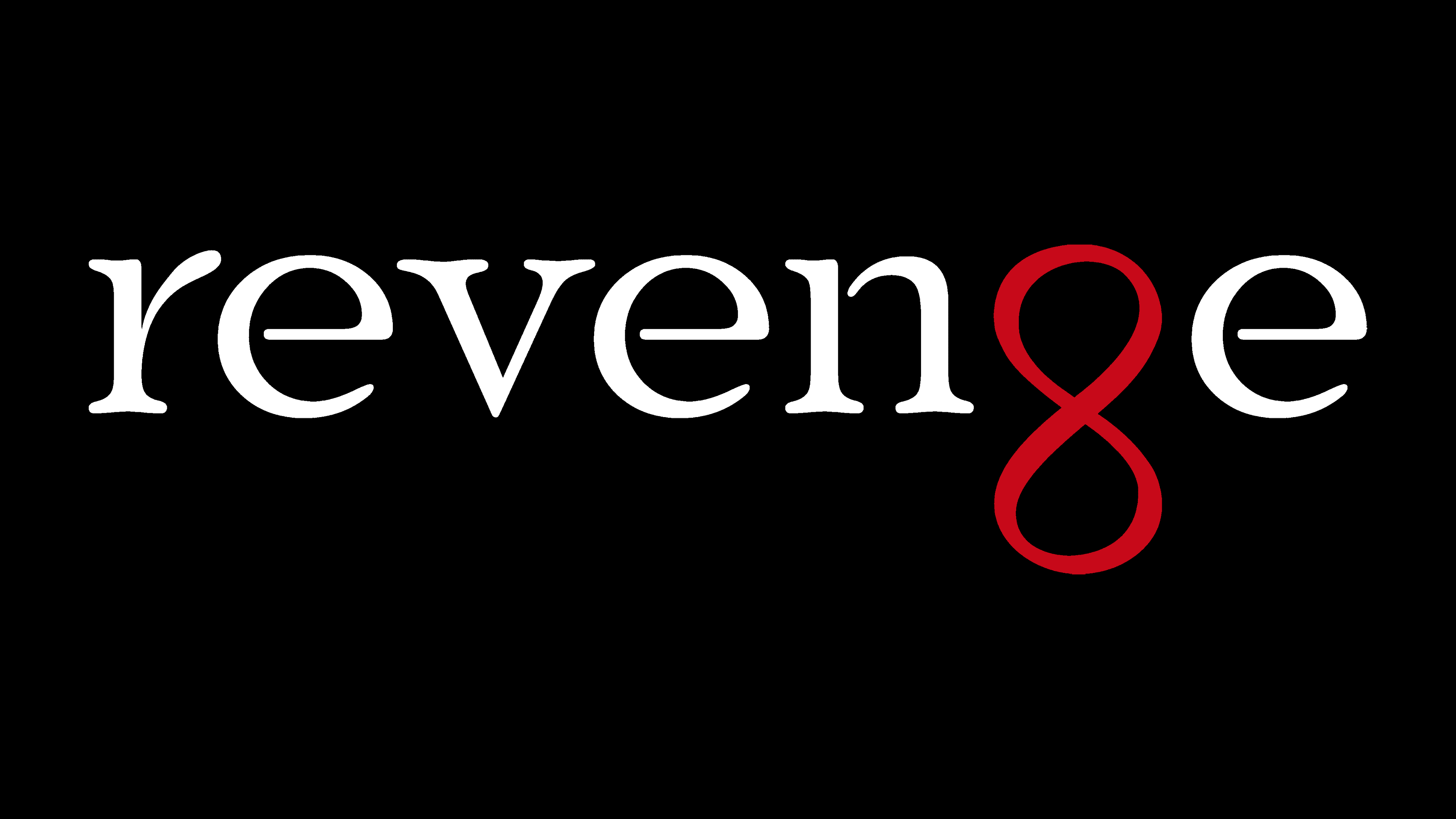
Designers chose a font for the Revenge logo in which the letters mysteriously dissolve in space. It resembles the Poor Richard RR Light typeface by Paul Hickson, published by Red Rooster. The similarity is evident in everything except the modified “g,” which conveys the television series’ intent.

The inscription’s palette corresponds to the project’s concept. It is fatal. After all, the classic red-and-black combination conveys peak passion. Such a combination shows the heat of energy and darkness-filled mystery.