According to the Saab logo, the brand’s cars are elite and royal, standing out on the road. The emblem demonstrates completeness, convenience, comfortable interior decoration, and high-quality car parts.
Saab: Brand overview
| Founded: | 1945 |
| Founder: | Saab AB |
| Headquarters: | Trollhättan, Sweden |
| Website: | saabparts.com |
Meaning and History
At first, the company was aerospace and only later got into the manufacture of cars. Its first model, which went into mass production, was the Saab 92. It appeared four years after the birth of the trademark – in 1949. The next iconic sample was presented in 1978. The passenger car was named Saab 900 and became the best-selling car, and the division was renamed Saab-Scania.
In 1989, another major step in the company’s activities took place, after which it was transformed into an independent structure and named Saab Automobile AB. Fifty percent of the shares went to the automobile giant General Motors. In 2000, the American concern sold its acquisition to a Dutch company. However, it failed to expand its consumer base and declared the brand insolvent. The bankruptcy petition was filed in 2011.
And the fact was that General Motors strongly opposed the fact that its technology could get to the auto industry in China, which was trying to buy the company. And he blocked the deal. In 2012, all the bankrupt property was bought by NEVS (National Electric Vehicle Sweden). She wanted to revive Saab Automobile but failed due to claims from the owner of the license for the manufacture of passenger cars under this name – it is still concentrated in the hands of the aerospace corporation of the same name.
As a result, NEVS lost the legal right to manufacture Saab cars and manufacture them under its brand. Each step of the long-suffering brand’s transition has been reflected in its identity, which is why it has a very rich history of emblems.
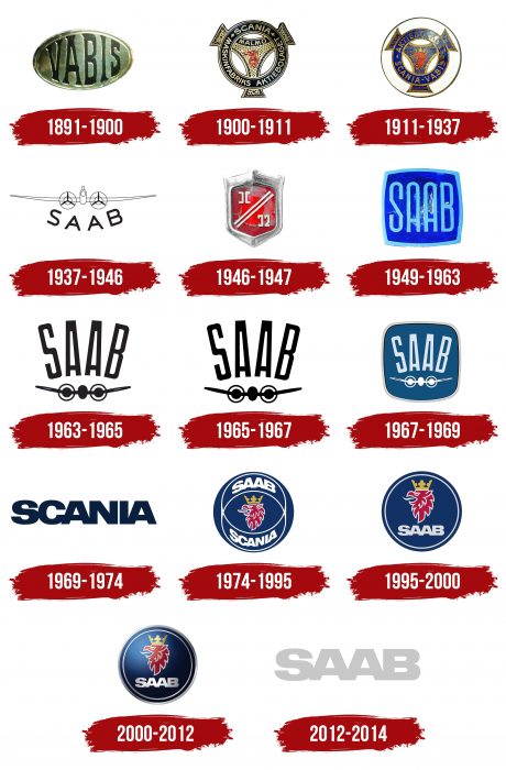
1891 – 1900
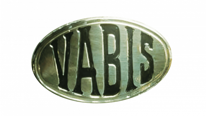
The debut identity mark dates back to the early days of Saab when it was called Vabis and was engaged in flight transport. It looked modest and consisted of single lettering in an oval with double edging. The font had subtle serifs. The letters were elongated.
1900 – 1911
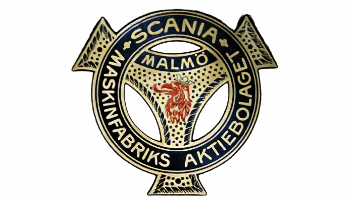
After the transformation into Scania-Vabis, the company undertook a logo redesign. It has become much more colorful and more complex in terms of the number of elements. Outwardly, the emblem was very similar to the steering wheel of a car. But a stylized propeller with a red griffin on a dotted background and the inscription “MALMO” was taken as a basis. The developers put a ring on it, consisting of a wide dark blue stripe and text in capital letters. Above was the word “SCANIA,” below was the almost circular phrase “MASKINFABRIKS AKTIEBOLAGET.” Three trapezoids protruded from three sides of the ring.
1911 – 1937
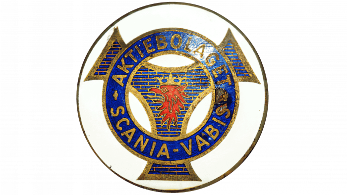
The designers refined the next version of the logo – they gave it an exquisite look. To do this, the authors sharpened the corners of the trapeziums, paved the background with bricks, made the blue color more distinct, redrawn the red griffin, and added a crown to it. In addition, they rearranged the inscriptions on the ring: at the top, they placed the word “AKTIEBOLAGET,” and at the bottom, the double name “SCANIA-VABIS.” Both parts of the text were separated by miniature crosses located on the right and left.
1937 – 1946
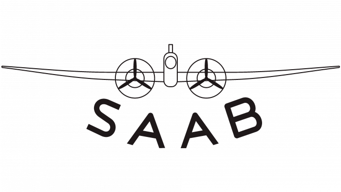
After developing the flight division, which became aerospace, the company received a radically different logo. It showed an airplane. It was placed in profile and consisted of a schematic cockpit, two large propellers on the engines, and fenders tapering to the sides. Below it was a large inscription “SAAB.” It was the first logo of a new era in developing a technical enterprise, so both the name and the font changed. The developers removed serifs from it, simplifying the identity as much as possible.
1946 – 1947
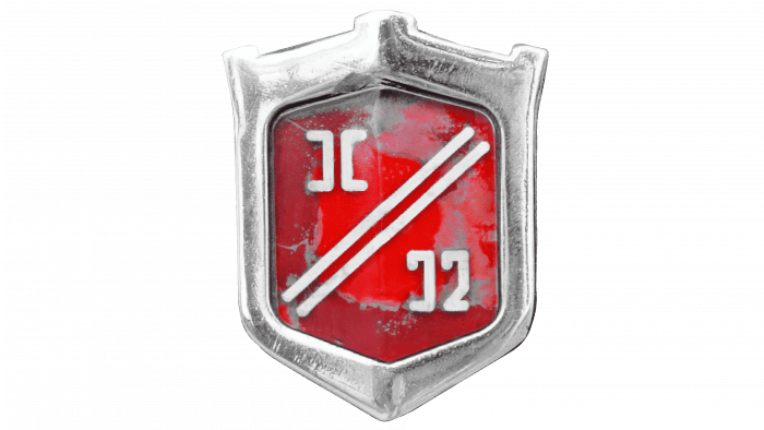
The emblem took the form of a vertical shield, scarlet and golden symbols, which were separated by two diagonal lines inside. Gold also appeared in the edging of the shield, with protrusions extended upwards along the edges.
1949 – 1963
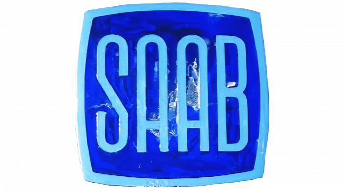
A redesign of the logo marked the release of the first car. The car was adorned with a simple square plate with the figured inscription “SAAB.” The background was blue; the title was blue.
1963 – 1965
The designers brought back the old emblem (1937-1946) by simply moving the name over the plane. They also strengthened the lines in the drawing and removed unnecessary detail.
1965 – 1967
The image has been made bold, and the letters have been shifted together.
1967 – 1969
The next stage of the company’s development brought new changes in the identity. To do this, the authors combined the previous logo with the 1949-1963 version. Retaining the existing design (aircraft and brand name), they added a raised square with rounded corners as a background.
1969 – 1974
After the transition to Scania, the brand changed its logo. It was changed to bold lettering consisting of the new name.
1974 – 1995
The designers have made the logo round. Inside, against a blue background, were two thin white rings that intersected. In the center was a red griffin with a golden crown. The upper and lower crescents bore the words “SAAB” and “SCANIA” in bold oblique sans serif type.
1995 – 2000
The developers have removed the double ring, leaving only one as a border around the edge of the blue circle. They raised the griffin with the crown up. In addition, the designers have removed one lettering, keeping the word “SAAB.”
2000 – 2012
As a result of the departure from General Motors, the brand has corrected the logo. The edging strip was changed (there were two of them), and the color palette (it received a gradient with highlights). The authors also changed the color of the rings from white to silver.
2012 – 2014
This logo was present on the first National Electric Vehicle Sweden cars – the new owner of the legendary brand. It consisted of a single inscription “SAAB” – gray, flat, and large.
Saab: Interesting Facts
Saab’s journey from an aerospace pioneer to a revered automotive manufacturer epitomizes innovation and adaptability.
- Automotive Beginnings: While Saab AB’s roots date back to 1937, its automotive adventure commenced in 1945. The aerospace giant ventured into passenger car production, applying its aircraft engineering prowess to create vehicles.
- The Ursaab Prototype: In 1946, Saab introduced the Ursaab, its inaugural car prototype. This prototype emphasized aerodynamic principles from aircraft design—an avant-garde concept for automobiles. This prototype laid the groundwork for the Saab 92, introduced in 1949.
- Debut and Design Evolution: The Saab 92 marked Saab’s entry into production vehicles, boasting a teardrop silhouette and a two-cylinder, two-stroke engine. Its design, aimed at reducing air resistance, heralded Saab’s commitment to aerodynamic, safe, and innovative vehicles.
- Safety Innovations: Saab emerged as a safety pioneer, introducing headlamp wipers and washers in the Saab 99 and standardizing seat belts. Its advanced crash-testing protocols underscored an unwavering commitment to occupant safety.
- Turbocharging Breakthrough: The 1977 Saab 99 Turbo brought turbocharged engines to the production car forefront, enhancing performance while keeping engine sizes in check—a concept now ubiquitous in the industry.
- Signature Features: Saab vehicles were distinguished by inventive, functional features like the center console ignition lock, designed to minimize injury risks during collisions, and the “night panel” feature, improving night driving safety.
- Rallying Triumphs: In rally sports, Saab’s legacy shines brightly, particularly with the Saab 96 in the 1960s. Erik Carlsson’s victories in this vehicle spotlighted Saab’s vehicular resilience and prowess.
- Enduring Legacy: Despite halting car production in 2011, Saab’s influence on automotive design and safety persists. Its dedication to user-centric features, safety, and technological foresight has left a lasting mark on the industry.
- Devoted Fanbase: Saab enjoys a devoted following worldwide, with enthusiasts valuing the brand’s distinct approach to vehicle design, innovation, and unique identity in the automotive domain.
- Continuation of Saab AB: Although Saab Automobile faced bankruptcy in 2011, Saab AB persists, excelling in aerospace and defense and perpetuating the legacy of ingenuity and engineering excellence established in 1937.
Saab’s foray into automotive manufacturing, fueled by its aerospace background, resulted in vehicles celebrated for their design, safety, and performance, illustrating a remarkable blend of aviation and automotive engineering.
Font and Colors
The visual identity of the iconic company has been characterized by simplicity and modesty at almost all times. It was dominated by restrained tones and a minimum of elements, the most difficult of which was the aircraft. But when Saab and Scania merged, the logo became pretentious: it featured a heraldic griffin with a crown.
One of the permanent logo typefaces is GIll Sans, designed by Eric Gill. But its author was based on London Underground, a font proposed by Edward Johnston in 1916. Another lettering style is a corporate typeface from the British Broadcasting Corporation. The next option is United Colors by Benetton, Tommy Hilfiger, AT&T. The most modern version of the font is Helvetica Neue Black Extended.
The corporate palette consists of black, blue, silver, blue, red, gold, and white.
Saab color codes
| Neon Silver | Hex color: | #c9c9c9 |
|---|---|---|
| RGB: | 201 201 201 | |
| CMYK: | 0 0 0 21 | |
| Pantone: | PMS 420 C |
