 Sandvik Logo PNG
Metalworking and rock drilling require tools that can withstand constant stress and maintain precision during prolonged use. Cutting tools, drilling equipment, and components are used in manufacturing and mining, where process stability depends on their quality. The Sandvik logo represents an industrial group that develops and manufactures tools, equipment, and materials for the metalworking and mining industries.
Sandvik was founded in 1862 by Göran Fredrik Göransson in Sandviken. It was a metallurgical plant, the first in Europe to master the Bessemer steel production process. The company began producing steel wire and tubes. By 1914, it had started manufacturing stainless steel for the chemical industry.
In the 1920s, Sandvik developed carbide tools. In 1942, it introduced the Coromant brand, which became a key part of its business. After World War II, the company expanded into foreign markets. It opened plants in Europe, the United States, and Asia.
In 1972, Sandvik listed its shares on the Stockholm Stock Exchange. In the 1980s, the company entered the mining equipment market. In 1990, it acquired the Finnish company Tamrock, a manufacturer of drilling rigs.
In the 2000s, the company formed three divisions. These were cutting tools, mining equipment, and materials. In 2006, Sandvik acquired the German company Walter AG for 750 million euros. The deal strengthened the company’s presence in mechanical engineering.
After the downturn of the 2010s, the company carried out restructuring. In 2019, it spun off its Materials Technology division into a separate company called Alleima. The main focus was shifted to tools and mining solutions.
In 2021, the company invested in digital technologies for tool wear monitoring. In 2022, it invested in developing metal powders for 3D printing. In 2023, Sandvik acquired the American company Xact Downhole Telemetry. In 2024, it began implementing autonomous drilling systems.
The company manages two main divisions. These are Manufacturing and Machining Solutions and Mining and Rock Solutions. It operates in more than 40 countries and remains one of the world’s leading manufacturers of industrial equipment and tools.
Meaning and History
What is Sandvik?
A Swedish engineering group producing metal-cutting tools, mining equipment, and products made from special alloys. The main business areas include tooling systems for metalworking, equipment for the mining and construction industries, and stainless steel materials. The company combines materials science with digital automation solutions. It supplies products to the mining, mechanical engineering, oil and gas, chemical, food, and aviation industries. Among its key products are Sandvik Coromant cutting tools and drilling rigs.
before 2023
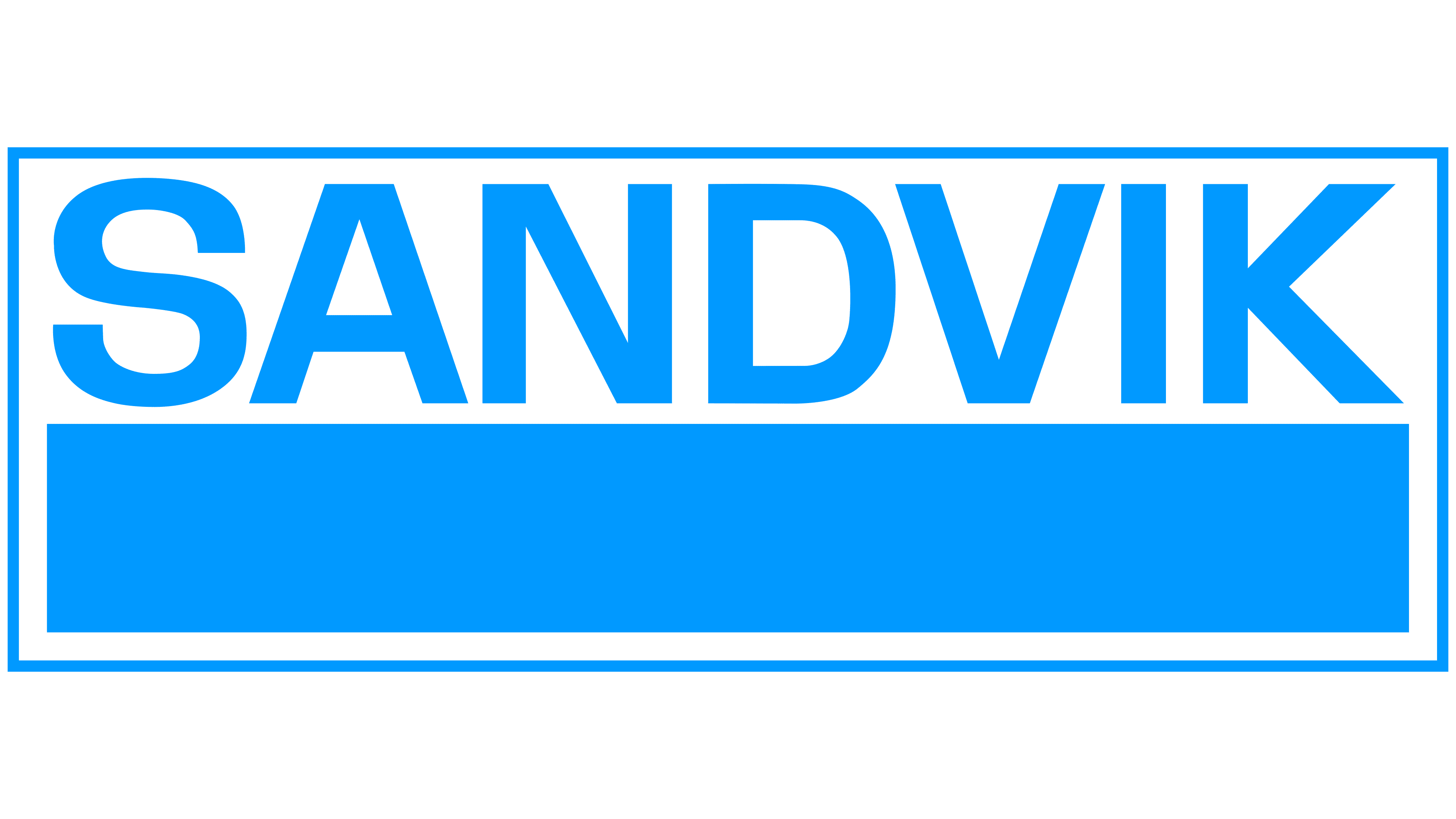
Before 2023, Sandvik used a formal logo featuring a blue frame, the company name, and a lower color block. Its appearance reflected the brand’s industrial foundation through order, structure, and the prominence of the name.
The company was established in Sweden in 1862 by Göran Fredrik Göransson under the name Högbo Stål & Jernwerks AB. In 1868, the business became Sandvikens Jernverks AB. The Sandvik name comes from Sandviken, an industrial community near the factory. The shortened form later became the brand’s working name.
The old logo was enclosed within a thin blue frame with an even outline. It contained two sections. The upper section featured SANDVIK in uppercase blue letters. The typeface was bold, upright, and sans-serif, resembling Univers Bold or DIN.
The lower section consisted of a solid blue rectangle. It matched the width of the upper section and appeared as a continuous block of color. The frame and lower block formed a rigid structure, while the company name remained in the foreground.
2023 – today
On September 21, 2023, Sandvik introduced a new logo and updated identity. The project is associated with the agency Lynxeye. The brand moved away from the former frame and lower blue block toward a more flexible system combining a black SANDVIK wordmark with a circular symbol.
The new identity is based on the positioning statement “We make the shift, advancing the world through engineering.” Sandvik connects it with digitalization, automation, and engineering developments for manufacturing, mining, and infrastructure. The brand identifies proactive partnerships, forward-thinking solutions, and sustainable progress as its foundations.
The 1962 logo inspired the wordmark. SANDVIK appears in bold, condensed, uppercase black letters. The sans-serif typeface resembles modified versions of Helvetica or Neo Sans. The compact letterforms make the name the primary anchor of the entire system.
A black circle containing curved white stripes appears on the left. The three diagonal lines resemble ribbons or twisted strips of metal. Sandvik explains the symbol through the phrase “make the shift and advance the world through engineering.” The circular form represents circularity, the planet, and global scale. At the same time, the rising diagonal refers to the company’s role in helping customers advance through engineering technology.