


![]() Sanoflore Logo PNG
Sanoflore Logo PNG
The Sanoflore logo shows the transformation and improvement of customers’ skin after using the brand’s cosmetics. The emblem says the company’s products are the gold standard in cosmetology. The company mark on the packaging is a guarantee of performance.
Sanoflore began in 1972 in the “Vercors” mountains, where Rodolphe Balz created a botanical garden with about 350 medicinal plants. The concept combined cultivation and processing at a single location, without synthetic additives.
In 1977, he launched an experimental farm with local producers using pesticide-free methods. By 1986, a distillery and laboratory were opened, marking the start of the cosmetics line. That same year, all products received Ecocert certification.
In 1994, the laboratory introduced gas chromatography-mass spectrometry for essential oil control, bringing analytical standards closer to those of pharmaceutical practice. In 1995, operations moved to a 15-hectare site near Gigors-et-Lozeron, uniting production, research, and cultivation.
Distribution focused on pharmacies and specialized stores. In 2002, Balz co-founded Cosmébio, establishing a certification system for organic cosmetics. Brands such as Weleda and Lavera operated within parallel frameworks.
By 2006, Sanoflore had 147 employees and approximately 15 million euros in revenue, with about 20 percent of revenue from exports. That year, L’Oréal acquired the brand and integrated it into its Active Cosmetics portfolio alongside La Roche-Posay and SkinCeuticals.
In 2010, production was transferred to Fareva, marking a shift to an outsourced model. In 2013, Aqua Magnifica, based on a complex of nine essential oils, became a flagship product.
By 2021, revenue declined to 2.9 million euros. In 2023, L’Oréal sold Sanoflore to Ekkio Capital and Sergio Calandri, who are associated with the HerbalGem and Biofloral brands, thereby restoring independent control.
Meaning and History
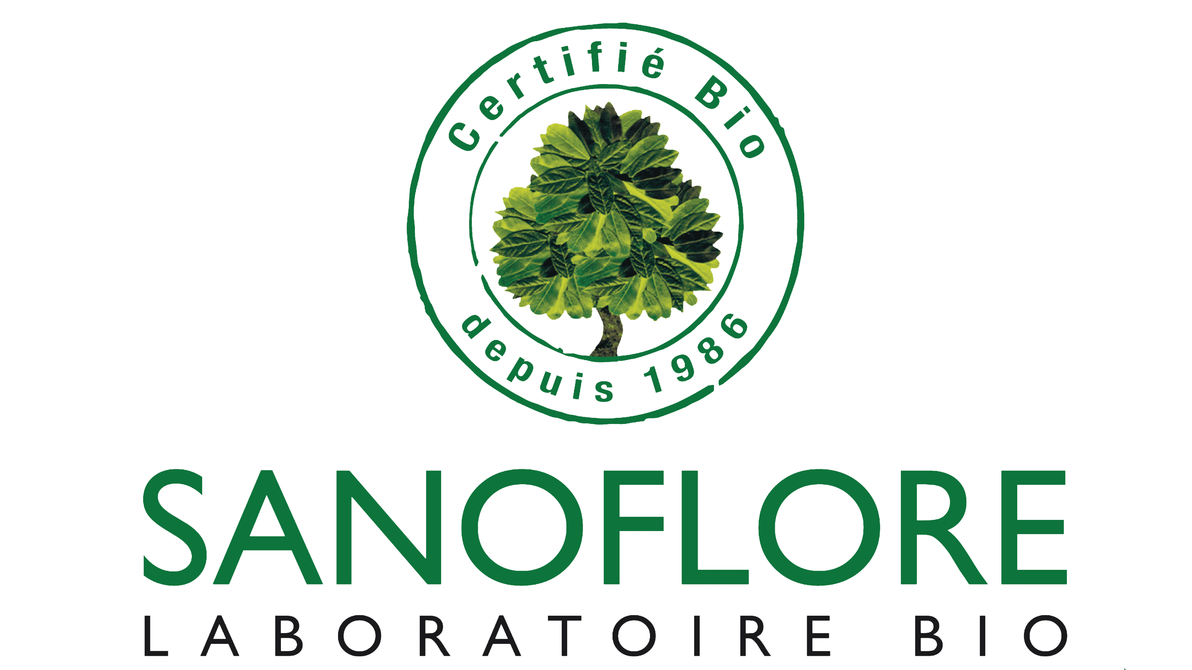
The Sanoflore brand has two emblems. The early one is made in golden colors and emphasizes the elitism of luxury cosmetics. Topical features a soft green palette and focuses on the naturalness of its ingredients.
One logo features a tree in the letter “O” surrounded by two phrases: “Certified organic” and “Since 1986”. Below is the brand name and the words “Organic Laboratory.” On the second, the tree is arranged in a double ring, and on a wide stripe, it is written in French “Certifie BIO” and “Depuis 1986”. Below you can see the phrase “Sanoflore Laboratoire BIO.” In both cases, the tree logo consists of four elements: three large branches forming a crown and a trunk.
What is Sanoflore?
This is a brand owned by the L’Oréal Group. It specializes in certified-organic skincare products that harness the power of botanicals grown in the French Alps. The company is known for its ability to extract potent active ingredients from organic flowers and plants, developing formulas that blend sensory pleasure with natural effectiveness. Drawing on carefully selected plant ingredients from its herb gardens in the Vercors region of France, the brand has created a product line that includes facial and body care, as well as aromatherapy.
Font and Colors
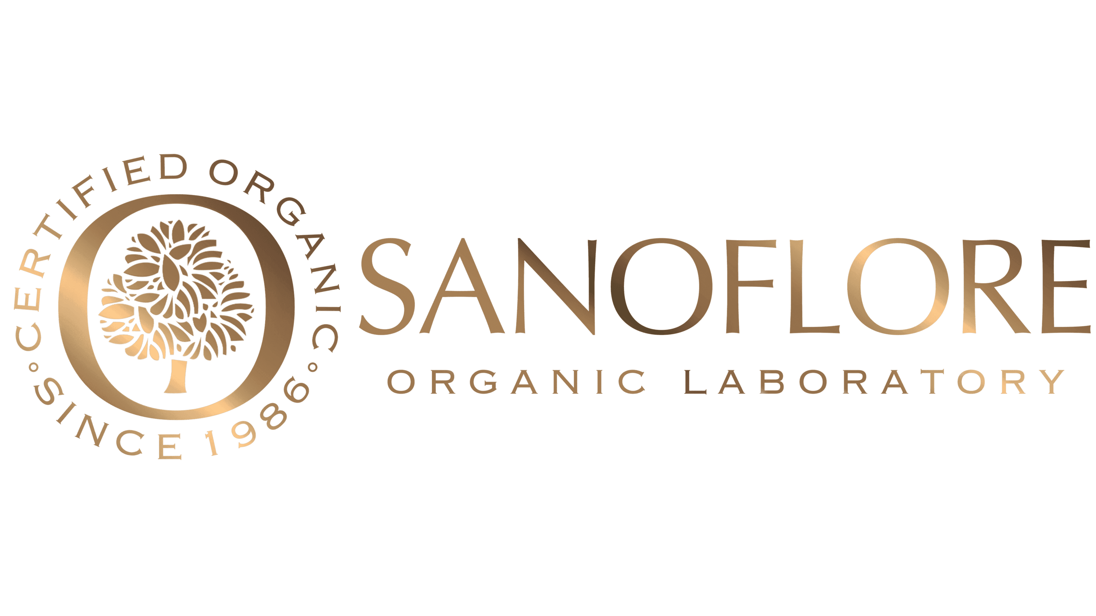
The inscriptions in the emblem are set in the sans-serif typeface Chopped. The letters are mostly lowercase. Basic colors are gold, green, and silver. The first is cosmetics for the elite; the second is the naturalness of the components.