


 Sendas Logo PNG
The cash-and-carry format involves purchasing goods in large quantities at wholesale prices, a model used by both families and small business owners. Volume and cost drive purchases, with price and product availability as key factors. The Sendas logo is associated with a Brazilian retail chain that offers food and household goods in a cash-and-carry format.
Sendas Distribuidora S.A. was founded in 1974. Rodolfo Junji Nagai opened the first Assaí Atacadista store in São Paulo. The cash-and-carry format targeted small businesses and restaurants. It enabled direct purchases from manufacturers at low prices. Until 2007, the network operated only in São Paulo state and built a reputation as a reliable partner.
In 2007, Companhia Brasileira de Distribuição, part of the Casino Group, acquired a stake in Assaí. By the end of 2008, the network included 28 stores in São Paulo, Rio de Janeiro, and Ceará. In 2011, Companhia Brasileira de Distribuição completed a full acquisition. By then, the chain had grown to 59 locations across seven states and the Federal District.
From 2011 to 2016, the company expanded its operations and strengthened its logistics and management systems. In 2016, Assaí was spun off as a separate unit focused solely on the cash-and-carry format. In 2017, the company launched the Passaí credit card in partnership with Banco Itaú. This card let customers buy goods at wholesale prices.
In 2019, Sendas initiated a public offer to acquire Almacenes Éxito S.A. This expanded the company’s geographic presence. In December 2020, the decision was made to separate Assaí. In February 2021, Sendas Distribuidora S.A. began trading independently. The company’s shares are listed on B3 and the New York Stock Exchange under the ticker ASAI.
From 2021 to 2023, Sendas acquired 70 Extra Hiper stores owned by GPA. These locations were converted into Assaí Atacadista. In November 2022, Casino sold 140.8 million shares at 19 reais per share. In March 2023, another 254 million shares were sold at 16 reais per share. Casino’s stake decreased to 11.7 percent. In July 2023, Casino fully exited Sendas’s capital.
By the end of 2023, the company operated 288 stores across 24 Brazilian states and the Federal District. In 2024, it strengthened its operational base. Interbrand recognized it as one of the country’s 25 most valuable brands for the sixth consecutive year.
Meaning and History
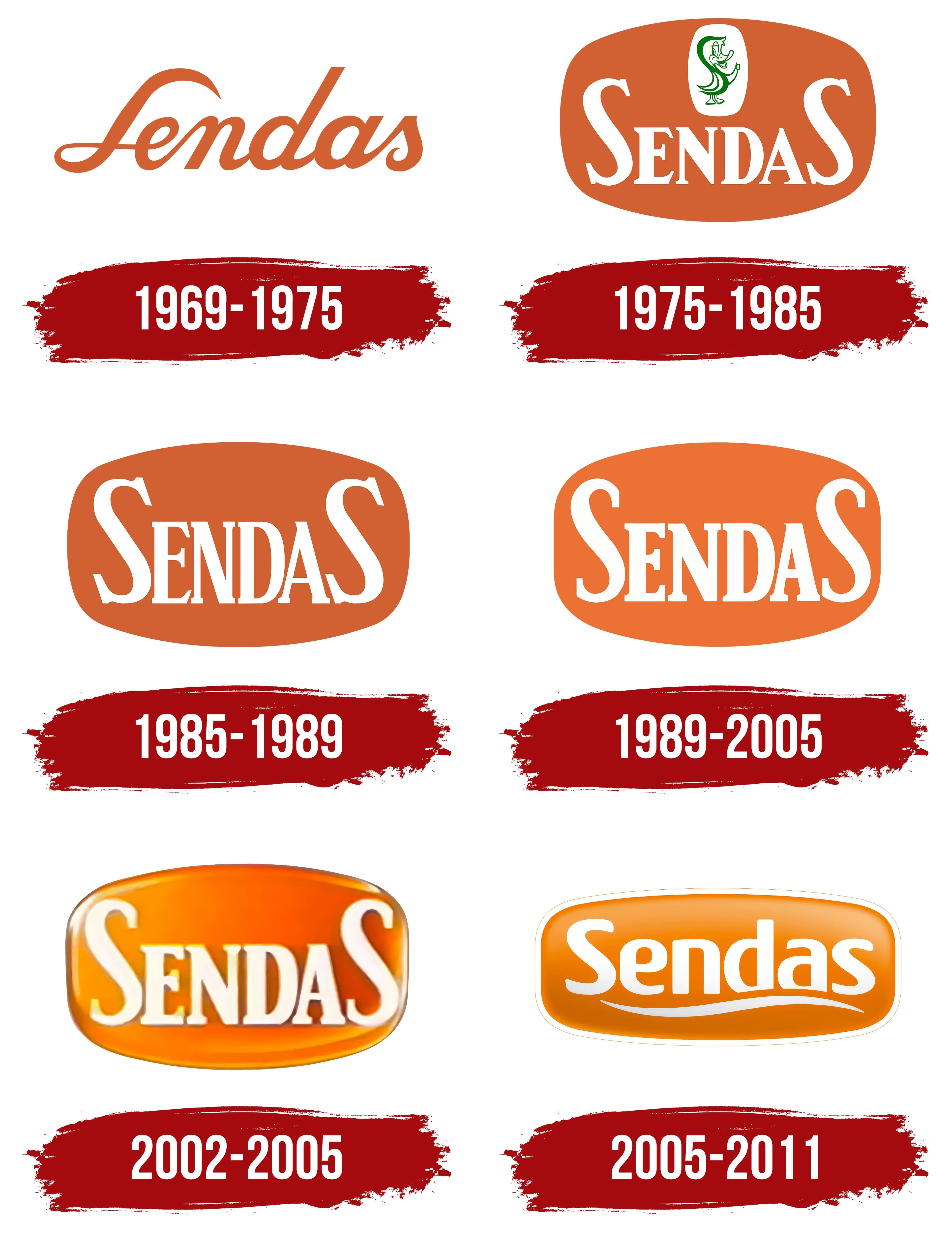
What is Sendas?
A Brazilian retail chain based in Rio de Janeiro has developed the cash-and-carry format under the Assaí Atacadista brand. Its main audience includes small business owners and buyers who purchase goods in bulk at reduced prices. The company operates through more than 250 stores mainly in the southeastern and northeastern regions. Customers select products from shelves and pay at checkout; the company offers no delivery or credit sales, and prices are 15–20% lower than at supermarkets. The assortment includes food, household, and non-food products.
1969 – 1975
The Brazilian chain Sendas took its name from a family that began trading in Rio de Janeiro state. In 1924, Portuguese entrepreneur Manuel António Sendas opened Armazém Transmontano in São João de Meriti. His son Arthur founded Casas Sendas in 1960. “Casas,” meaning “houses,” formed part of the original business name. The family surname later became the supermarket chain’s name, appearing as a handwritten signature in its early logo.
The Sendas wordmark consisted of connected, right-slanting calligraphic letters. Its orange color had a terracotta-ochre tone resembling clay or fired brick. The initial capital “S” formed a large loop on the left, with its upper curve rising above the lowercase letters. The “d” provided a second tall stroke. Between the “S” and “d,” and then through the end of the word, the letters joined along the baseline to form a continuous line. Thick strokes alternated with fine connections, the terminals tapered, and the final “s” ended in a small curl. The logo consisted entirely of the surname, with calligraphic lettering replacing a frame, background panel, or separate emblem.
As the family business grew, its stores changed format. In 1969, Arthur Sendas opened the chain’s first self-service supermarket in Jacarepaguá. By then, Sendas was already an established retail name. The legal name Sendas Distribuidora came after the retail brand.
1975 – 1985
The next version replaced the handwritten Sendas wordmark with white lettering on an orange panel. The elongated panel combined the outline of a horizontal oval with that of a heavily rounded rectangle. “SENDAS” appeared in serif capitals. Large “S” letters at either end rose above the compact “ENDA” group, enclosing it with long curves. Separate letters replaced the connected calligraphy, and the name became part of a colored emblem.
Above the name, a green character appeared on a small white vertical inset with rounded edges. Its curved body followed the shape of an “S,” combining the first letter of the Sendas surname with an anthropomorphic duck. A bill, eyes, arms, and feet turned the letter into a mascot. The white field separated the thin green drawing from the orange background. The character appeared both with the name and on its own.
The duck became part of Sendas’ workplace culture. Young employees who helped bag groceries were called “marrequinhos,” meaning “ducklings.” A former employee recalled the nickname in an oral history recorded by Museu da Pessoa.
1985 – 1989

The character and white inset were removed, leaving the Sendas name inside the orange panel. The lettering was enlarged to nearly fill the panel’s height. The upper curves of the two outer “S” letters rose into the newly available space, bringing them closer to the emblem’s edge.
The enlarged “S” letters framed the narrow “ENDA” group. The middle letters featured thick main strokes, fine connecting lines, and serifs that finished the vertical strokes. The logo now consisted of two parts: the orange field and the Sendas surname.
1989 – 2005

The next flat version retained the emblem’s structure while changing the lettering and background color. The terracotta-ochre field was lightened by one or two shades, bringing it closer to bright orange. The lettering gained thicker strokes, and the middle “ENDA” group became more compact. The first and last “S” continued to rise above the four letters between them. The remaining design stayed unchanged.
The chain’s name also began appearing on product packaging. In February 1995, canned peaches imported from Greece became the first products sold under the Sendas brand. Honey and condensed milk followed. A surname that had previously identified stores now appeared on products across several categories.
Sendas products were also sold in Bon Marché hypermarkets. They retained the Sendas name, which shoppers had known for years. Packaging layouts were developed with input from the chain and manufacturers. The shared logo united the range under one brand and linked it to the retail chain.
2002 – 2005

In the next version, the background and lettering were reworked to give the existing emblem depth. The white serif name retained its arrangement, along with the two enlarged outer “S” letters. The orange panel became convex, with a rounded rim. Gradients, highlights, and shadows created the raised effect.
Warm orange combined with golden yellow, amber, and pale honey tones. The background became lighter toward the center and darkened to brown along the edges and corners. Soft highlights within the panel and along its upper edge suggested reflected light on a glossy surface. The rounded rim separated the panel from its surroundings.
Light and shadow defined the letters’ facets, with an inner glow and subtle shadows that made the name look raised. A soft white glow traced the edges. The rest of the earlier arrangement remained unchanged.
2005 – 2011
Sendas retained its separate retail name after Grupo Pão de Açúcar began integrating it in 2003. In 2005, the chain was repositioned for middle-income shoppers using a model previously developed for CompreBem. The company worked to rebuild the brand’s image and refurbish its stores. From February through June, 60 locations in Rio de Janeiro were updated.
By 2005, Sendas was using its final logo. The all-caps “SENDAS” became “Sendas,” with a capital initial followed by lowercase letters. The serifs and oversized final “S” disappeared. The upright lettering combined rounded forms with heavy strokes. The tall “d” retained a vertical accent. The white name sat on an elongated orange rectangle with rounded corners and a thin white outline.
A white wavy band appeared beneath the name. It widened toward the middle from pointed ends, dipping on the left and rising near the right edge. The name and lower band replaced the earlier arrangement, which featured tall “S” letters at either end. The logo appeared in both flat and dimensional versions. In the dimensional treatment, a light yellow-orange top transitioned through an orange middle to an almost amber lower section. Highlights and subtle shading along the edges and corners complemented the gradients.
In 2010, Grupo Pão de Açúcar announced that Sendas and CompreBem would be converted to Extra Supermercado. Group head Enéas Pestana explained that the consolidation would focus efforts under the Extra name and broaden the offering for shoppers. Store formats changed along with the name. The program was completed in 2011. Extra’s identity replaced Senda’s orange emblems, ending the chain’s history as a separate retail brand.