The SF Studios logo shows that the company makes both classic films and films in unusual genres. However, she remains loyal to her views and beliefs. The emblem reads the harmony and completeness of the resulting film masterpieces.
SF Studios: Brand overview
| Founded: | 27 December 1919 |
| Founder: | Bonnier Group |
| Headquarters: | Stockholm, Sweden |
| Website: | sfstudios.se |
Meaning and History
SF Studios is involved in the creation and promotion of films. She directed the Oscar-winning film A Man Called Ove (2015) and has worked with many Scandinavian directors, whose work has received universal acclaim. She also owns most of the screen adaptations of the works of the children’s writer Astrid Anna Emilia Lindgren. The studio currently works with foreign companies, including Sony Pictures, Metro-Goldwyn-Mayer, and Warner Bros. They have co-produced films.
The famous SF intro tune appeared in 1943. It was used for the weekly news coverage, which was shown in theaters before the premiere. The music was written by the then-popular Swedish composer Jules Sylvain. It only took him a few minutes. And after the arrangements, the sound became familiar to the modern audience.
The history of logo creation is also very old. It is believed to have been developed by the head of marketing, Nils Hårde. Before joining SF Studios, he graduated from the Academy of Fine Arts, was a periodical artist, and drew posters that have become internationally recognized classics. Nils Hårde’s signature appears next to the 1924 film Gösta Berlings Saga poster. According to another, less believable legend, an unknown woman is the logo’s author.
The design of a graphic symbol has changed very often – so much so that not all of its versions have survived to our times, and not all are taken into account. For example, now many have forgotten that in the 1960s, the monogram “SF” was moved from the familiar circle to a square base. But then the developers decided to return to the original round shape. Ultimately, it was she who became the main one.
1921 – 1964
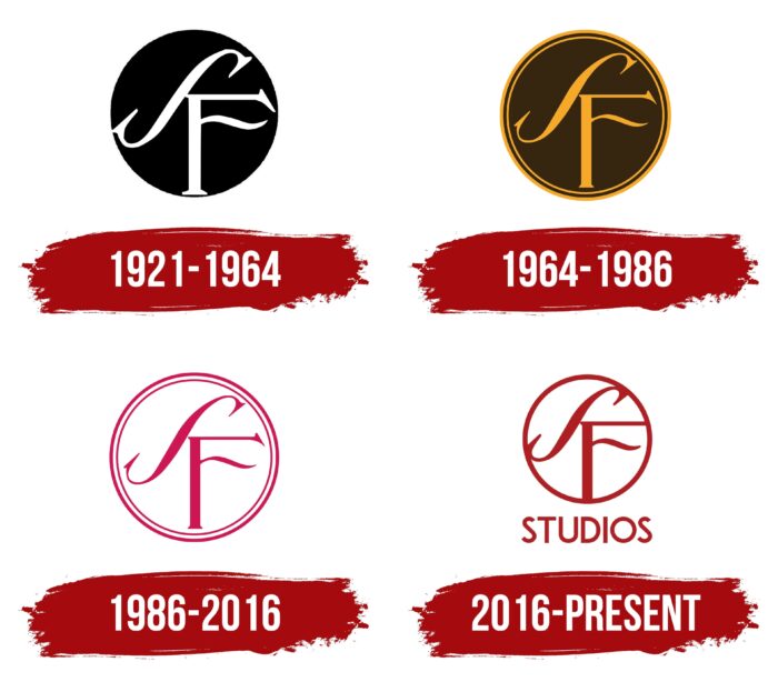
In 1919, AB Svensk Filmindustri was founded. To stand out in the emerging film industry, it needed a recognizable logo. The author of the idea is Nils Hårde, the creator of the popular posters of the time. He used the first letters from the name of the film studio and combined them on a black background. The initial design was very simple. He appeared in a promotional poster for the 1921 film Johan.
Archival evidence suggests that the elegant circle monogram was not developed until the late 1930s. It remained in black and white, just like the original. The “F” occupied the lower right corner of the circle, and the diagonally inverted “S” was adjacent to it from above. Both letters had long, rounded serifs.
1964 – 1986
After minor changes, the base took on a coffee color, and the monogram became dark beige. Moreover, the logo now has the same dark beige frame, consisting of two rings of different widths. The designers reduced the letters a little to not touch the borders and made the lines a little thinner.
1986 – 2016
As a result of further experiments, the color scheme was transformed again. The round base was completely white. The fact is that she created a neutral background for the rest of the elements, which were painted in a dark crimson color. It is a traditional monogram and double bezel.
2016 – today
In 2016, the company was renamed SF Studios. In honor of this event, she received a redesigned logo. Modern designers have solved the problem of free space by stretching letters across the entire width of the circle. Now “S” and “F” go to the borders, merging with them into one whole. So the outer border looks almost like a full-fledged part of the monogram. Since the letters have been reshaped, the serifs have become subtle. Only a tiny protruding stripe in the upper left corner of “F” is visible, separating it from “S.”
The frame does not consist of two rings but one in the new version. The background color remained white. As for the main elements, a dark red shade was chosen for them. The inscription “STUDIOS” appeared at the bottom; that is, the letter “SF” can be interpreted not only as a decorative pattern but also as a full-fledged part of the company name.
Font and Colors
From time immemorial, the graphic symbol of a film studio consisted of a monogram inside a circle. Moreover, it was previously used mainly in news reviews (SF Journal) and the media. He could not be seen so often in the films, except in the end credits. Designs have changed over the century, with variations with different color schemes.
The font of the inscription “STUDIOS” is a typical geometric sans serif of a round shape. All letters are bold and capitalized. The color of the elements is dark red, almost burgundy, and the base is completely white.
SF Studios color codes
| Fire Brick | Hex color: | #ae1f23 |
|---|---|---|
| RGB: | 174 31 35 | |
| CMYK: | 0 82 80 32 | |
| Pantone: | PMS 1795 C |


