


 SGS Logo PNG
Quality control, product testing, and verification of compliance with standards are key to industry and international trade. These processes enable monitoring of product characteristics and compliance with requirements at various stages of production. The SGS logo is associated with a company that conducts product inspection, testing, and certification worldwide.
SGS was founded in 1878 in Rouen, France. The company was named Société Générale de Surveillance. From the beginning, it inspected grain cargoes. The main goal was to ensure fairness in trade operations between exporters and importers.
At the beginning of the twentieth century, the company expanded its field of activity. It began inspecting textiles, metals, and industrial raw materials. In 1915, the first laboratory was opened in London. Four years later, the headquarters were moved to Geneva.
After World War II, SGS continued to grow. The expansion of global trade led to increased orders. In the 1950s, the company entered the oil and gas sector. In the 1960s and 1970s, SGS expanded into markets in Africa, Asia, and Latin America, where it conducted import and export controls.
In 1981, it became a public company. The shares were listed on the Geneva Stock Exchange. In the following decades, the organization grew through the acquisition of inspection and certification firms in Europe, the United States, and Asia.
In the 1990s, the company became one of the first to obtain ISO 9000 certification for its quality management system. In the 2000s, the organization strengthened its position in environmental monitoring and industrial safety. It acquired Environnement SA, Malthus Group, and other specialized firms.
In 2021, SGS completed the acquisition of Golder Associates, an Australian company. This expanded its expertise in engineering and environmental services. Today, the company operates in 140 countries. It has 2,600 offices and laboratories. The total number of employees is approximately 99,000.
SGS serves the world’s largest industries, including agriculture, energy, construction, chemical manufacturing, healthcare, and digital commerce. The company remains the leading independent operator in inspection and certification.
Meaning and History
What is SGS?
A Swiss company that provides independent inspection, testing, and certification services for various industries. Starting with the inspection of grain shipments during maritime transport, it has grown into a global network with more than 2,600 offices and laboratories. Its specialists assess product quality and safety, conduct analyses, and inspect cargo. The structure includes nine industry departments and eight regional zones covering agribusiness, transportation, oil and gas, minerals, and industrial manufacturing.
before 2003
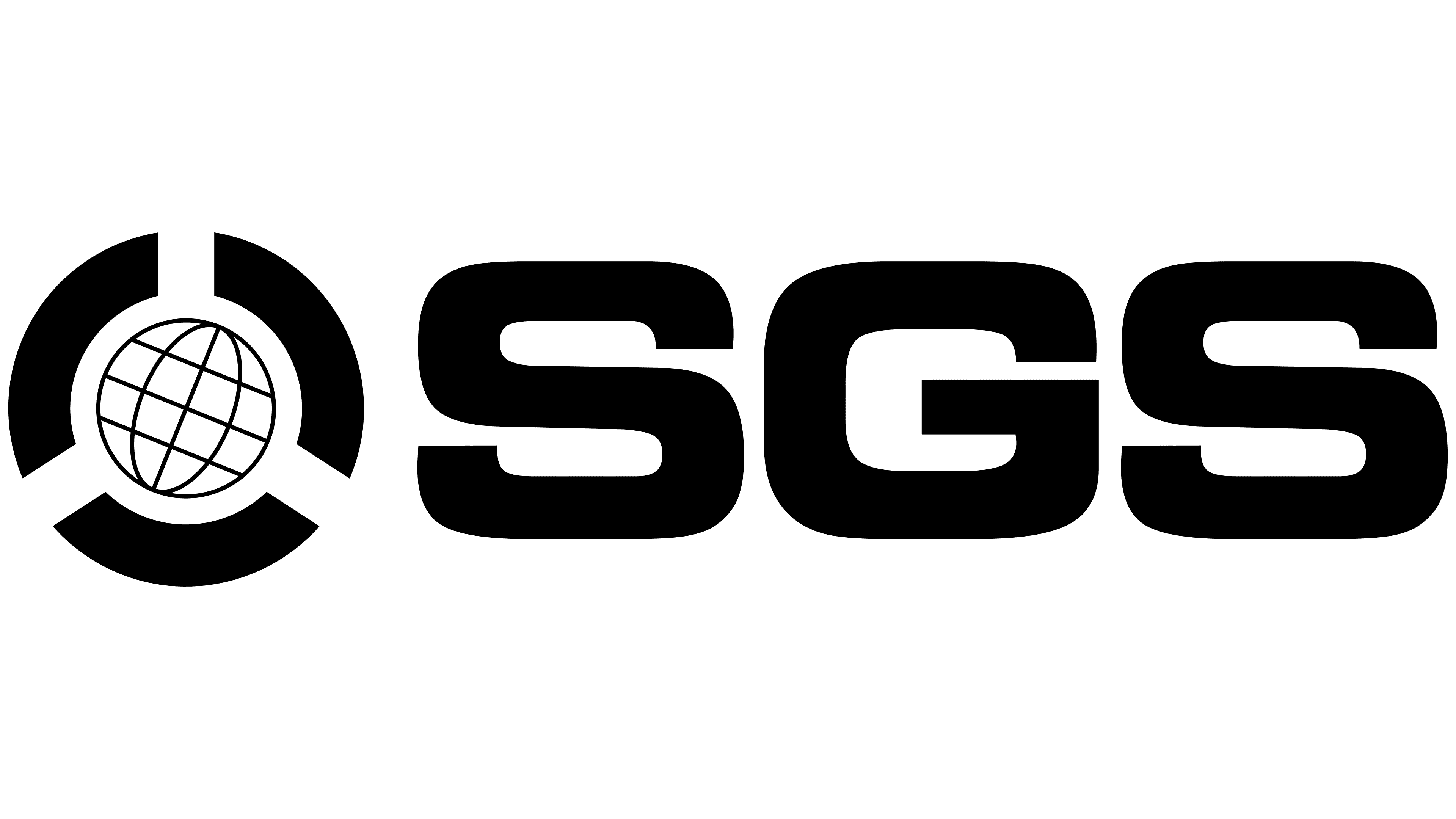
Before 2003, SGS used a formal black logo featuring a globe and a large abbreviation. The visual identity reflected international inspection, cargo verification, and operations across different countries.
The history of SGS began in Rouen in 1878. Henri Goldstuck started a grain shipment inspection business. In 1919, after the company moved its headquarters to Geneva, it adopted the name Société Générale de Surveillance. The abbreviation SGS came from this name.
The French name translates as “General Society of Supervision” or “General Society for Surveillance.” It described the company’s work in independent verification, observation, and control. The old logo represented this idea through a globe enclosed within a circular form.
A circle containing a stylized globe appeared on the left. Thin intersecting arcs formed meridians and parallels, dividing the globe into small segments. The outer ring consisted of three large sections resembling thick wedges directed toward the center. Their beveled edges left openings between them.
The SGS wordmark appeared on the right. All three letters were uppercase and sans-serif, with heavy strokes of equal thickness. The typeface resembled Microgramma Bold Extended or Eurostile Extended Heavy. The black color, dense typography, and globe presented the image of an international company involved in inspection, supervision, and verification.
2003 – today
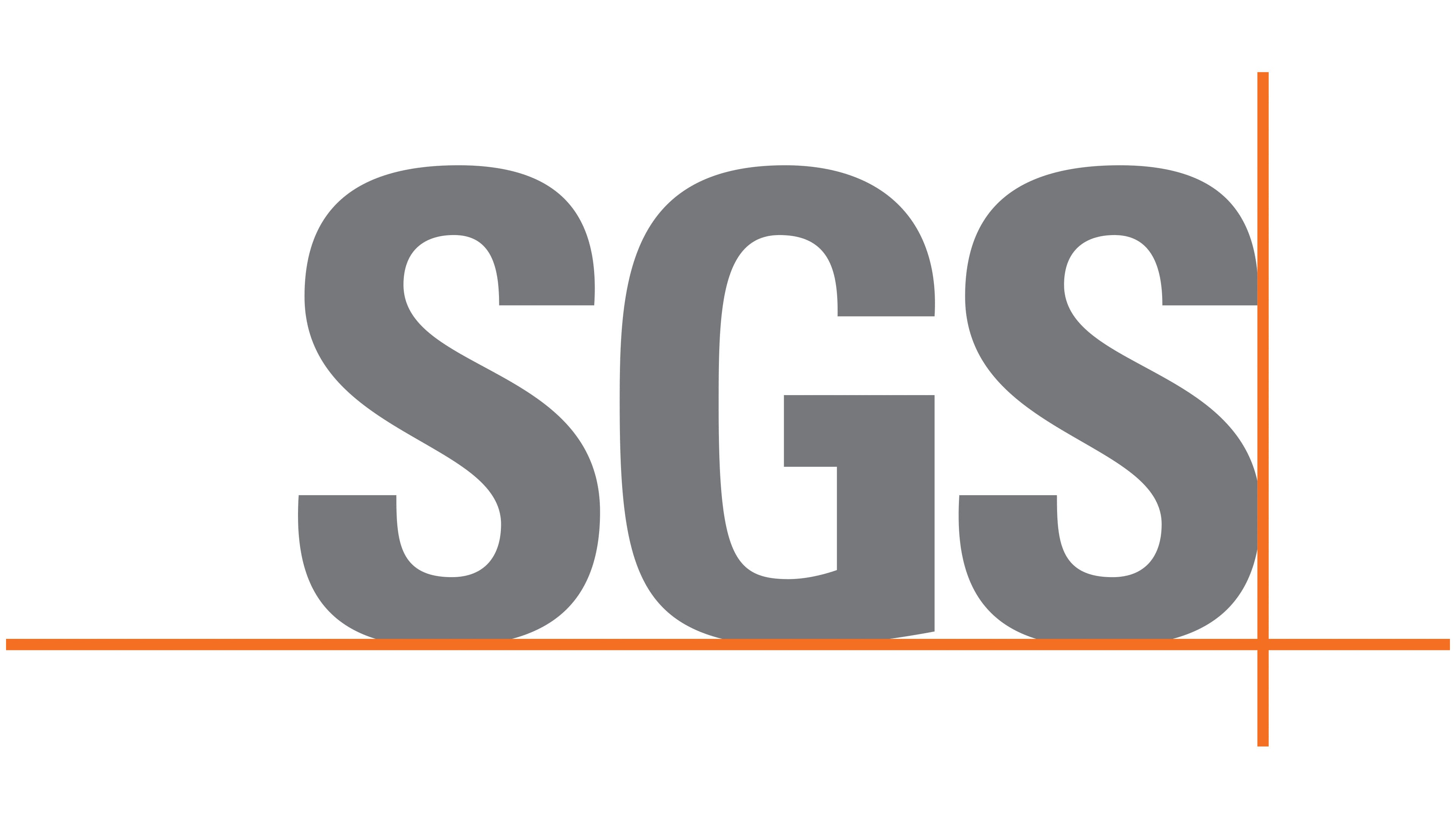
Following the update, the SGS logo shifted toward a short abbreviation and a more restrained corporate presentation. The complex globe emblem was replaced by an SGS wordmark featuring a technical accent beneath the letters.
The three uppercase letters use a heavy sans-serif typeface resembling Helvetica Rounded Bold. The letters have thick strokes, soft terminals, and a gray color. The abbreviation became the primary representation of the name, giving the logo a more compact and professional appearance.
A thin orange line runs beneath the letters with a small gap separating it from the lower edge of the wordmark. A vertical line of the same thickness and color connects to it on the right. Together, the lines form a corner.
The orange lines extend beyond the word and resemble coordinate axes or part of a technical drawing. The arrangement connects the logo with inspection, measurement, control, and precise assessment. The gray letters preserve the formal business image of an international company.