 Network Rail Logo PNG
The Network Rail logo effectively fulfills its purpose: it conveys the company’s seriousness and reliability while remaining easy to understand. Despite its apparent simplicity, the emblem exudes a sense of grandeur, as it is associated with almost the entire United Kingdom’s railway network.
Network Rail’s history began with the earlier structure of Britain’s rail system. In 1947, the government nationalized the railways and formed British Railways, later British Rail. In 1994, during John Major’s privatization program, rail services and infrastructure management were separated.
Railtrack was created in 1994 to manage the national rail network, and its shares traded on the London Stock Exchange. The company faced criticism over underinvestment and safety problems. The Hatfield rail crash in 2000 exposed serious track failures, leading to inspections, delays, repair costs, and a collapse in public confidence. In October 2001, Railtrack entered administration after financial problems and the refusal of further government support.
Network Rail was founded in 2002 as a company limited by guarantee to replace Railtrack. It began operations on October 3, 2002, taking control of more than 20,000 miles of track, 40,000 bridges and viaducts, tunnels, signals, and level crossings. Its early work focused on restoring reliability through investment in tracks, signaling, and stations. In 2003, its first business plan set out 26 billion pounds of investment over five years.
In 2004, Network Rail brought maintenance under direct control. It later modernized the West Coast Main Line, opened a “National Operations Centre” in London in 2008, supported transport for the 2012 Olympics, and entered the public sector balance sheet in 2014. From 2015 to 2022, it worked on the Great Western electrification, London Bridge station, the Digital Railway program, regional decentralization, renewable energy plans, East Coast Main Line upgrades, accessibility projects, and safety technology.
Meaning and History
What is Network Rail?
It is a British public company that owns, operates, and maintains rail infrastructure in the UK. This includes tracks, signals, bridges, tunnels, crossings, and key stations. The company is responsible for ensuring the safe and efficient operation of the rail network, managing timetables, and coordinating infrastructure maintenance and modernization projects. It works closely with the train operators who run passenger and freight services on the network.
1947 – 1994
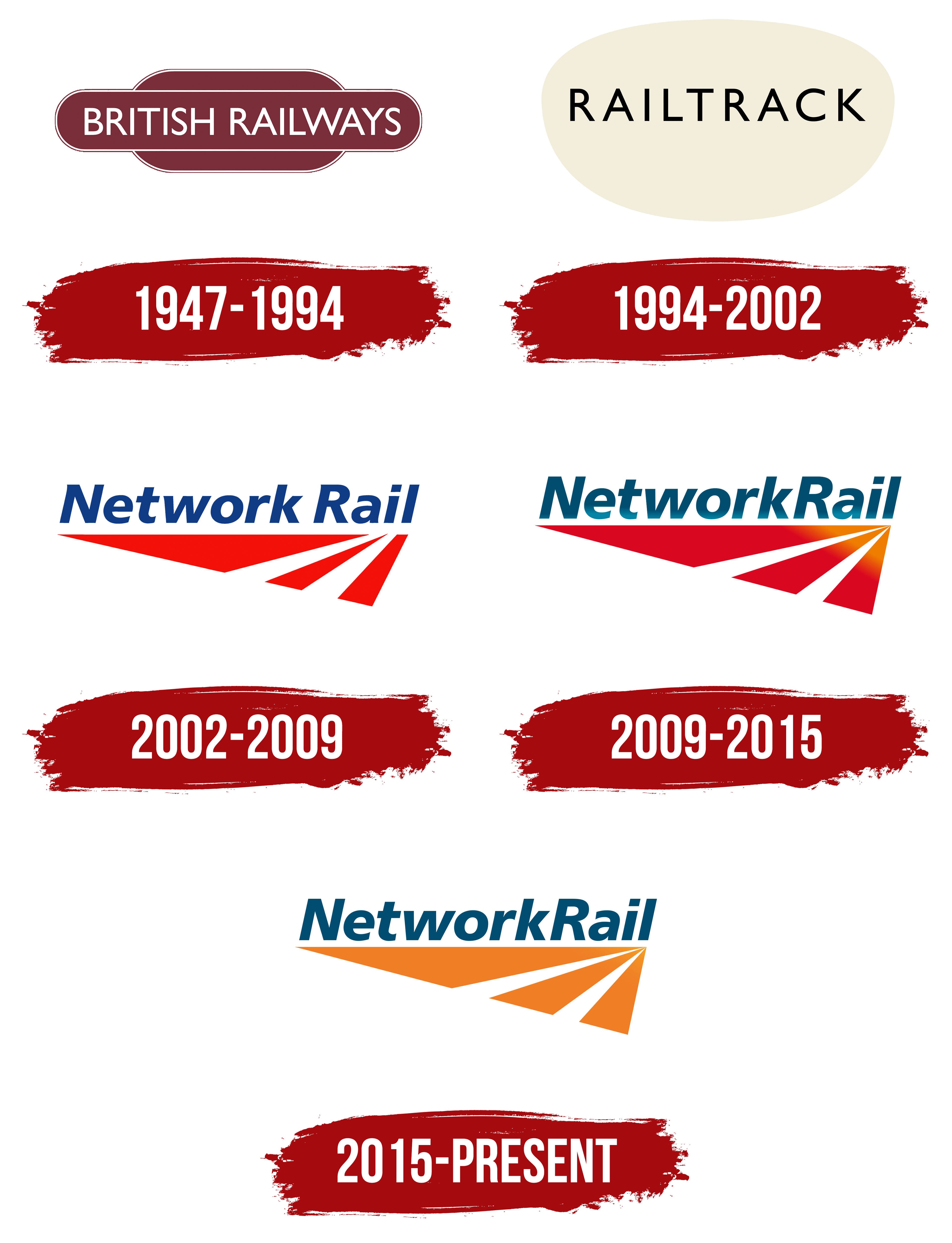
The predecessor of Network Rail was British Railways, whose trains transported millions of passengers across the country daily. The shape of its logo was meticulously designed. The oval silhouette, slightly elongated horizontally, is framed by a double line, evoking a sense of completeness. This geometric figure hints at movement and continuous progress, reflecting the essence of the railway itself, long tracks stretching from one end of the country to the other.
The central oval sits between two broad bands with rounded outer corners. The smooth lines emphasize the stability and reliability of the transportation system, while the emblem’s overall massiveness conveys the era when trains were symbols of industrial power. The logo’s three “layers” are colored in deep red wine, evoking associations with British culture, resilience, and confidence.
Set against the rich maroon background, the company’s white name stands out prominently in the center of the oval. The text uses a clean, minimalist font with no decorative elements, highlighting the company’s commitment to practicality and simplicity. The letters are composed of uniform lines of equal thickness, giving the logo a formal appearance. Yet, the smooth curves soften the text’s shape, preserving a sense of classic charm.
1994 – 2002
In 1994, the government decided to privatize British Railways, creating Railtrack, a group of companies. Its logo resembles a 3D beige bubble, an oval shape with a convex top. This massive figure reflects the scale of the organization, which owns almost all of the United Kingdom’s railway infrastructure, including bridges, tunnels, tracks, and signaling systems.
At the center of this vast space is the name “Railtrack,” symbolizing that the company is at the forefront of a large system. The lettering uses the same font as the British Railways emblem. Its clean design conveys the brand’s core values: reliability, precision, and modernity.
The minimalist font style creates a sense of formality and professionalism, while the lack of serifs makes the text easy to read. The clean lines symbolize order and structure, aligning with the character of a company that oversees the railway network of an entire country. The letters are wide enough to appear stable but not so large as to seem bulky. This balance gives the text a unified, balanced, and symmetrical look.
The logo embodies the spirit of British design, prioritizing simplicity and functionality. This is evident even in the minimalist color combination of black and beige. It is more distinctive than the typical black-and-white palette, as the beige adds a sense of natural softness, calmness, and elegance to the image.
2002 – 2009
By the early 2000s, it became clear that Railtrack was struggling to fulfill its responsibilities. A series of railway disasters raised doubts about the company’s ability to maintain the tracks, and its major projects failed due to a lack of funding. As a result, the organization was brought under government control and rebranded as Network Rail. Along with a new name, the company received a new logo that reflects its connection to the transportation infrastructure.
The company completely changed its identity to avoid associating with Railtrack, leaving no trace of the old symbols. The new emblem features an abstract composition of three shapes: two triangles and a narrow trapezoid. These shapes appear as diverging lines that widen toward the left edge. Their dynamic form emphasizes the company’s commitment to modernizing the network, expanding routes, and continuing to grow.
The abstract elements’ bold geometry and bright color draw attention, creating a sense of rapid forward motion. The choice of red is deliberate, symbolizing energy, strength, initiative, and determination- the qualities Network Rail needed to rescue the railway infrastructure from collapse.
The logo also indicates the transportation system: the white negative space between the polygons resembles railway tracks. The lines’ expanding shape creates a perspective effect, making them appear to stretch into infinity and hinting at Network Rail’s limitless possibilities and foresight. The tracks extend far beyond the horizon, reflecting a journey without beginning or end.
Above the improvised tracks, the “Network Rail” text proudly sits. Thanks to the bold letters and rich color, it looks confident. The modern font complements the emblem’s minimalist style, while the deep blue color is associated with reliability, stability, and confidence. The contrast is heightened with the red polygons, allowing the text to stand out prominently.
2009 – 2015
The organization updated its visual identity to appear more progressive, introducing a gradient into its emblem. This addition brought a sense of novelty that Network Rail’s previous appearance lacked. The smooth gradient transition is present in every logo element, including the text and the abstract geometric design.
The brand name is dominated by dark blue, symbolizing confidence and security. This is subtly interrupted by a faint pale line running along the lower part of the letters. The muted blue shade evokes calmness, even though the gradient makes the text appear dynamic. This contradictory combination reflects the balance between stability and energy that underpins the company’s operations.
The appearance of the geometric abstraction has noticeably changed: all three shapes are now triangular, converging from a single point in the top-right corner. This creates a perspective effect, giving the illusion of three lines stretching into the distance. The orange gradient makes them resemble sunbeams, which evokes positive emotions. The red color is also retained, though it has become darker, symbolizing energy, strength, and determination, important qualities for a company responsible for the UK’s railway network.
The gradient effectively mimics a shiny texture, giving the image a three-dimensional and deep appearance. The golden hue at the ends of the triangles creates the impression that a bright light source is nearby. The white negative space forms the tracks, which seem aimed toward that light. The combination of bright shades and angular shapes highlights Network Rail’s dynamic and forward-thinking nature.
2015 – today
In 2015, the logo was simplified, primarily reflected in its color palette. Designers removed the gradient to emphasize the brand’s seriousness, as a simple two-dimensional form best conveys formality and restraint. The new version uses only two colors:
- Blue (#014D71) for the text
- Orange (#F07E26) for the graphic
The designers chose relatively pale and muted shades, which makes the logo less visually dynamic than the previous version, which was red-dominant. However, the abstract composition no longer distracts from the text: the company name has become the logo’s star, while the three triangles serve as a base.
The same font as before is used for the text: bold, italic, sans-serif. Its minimalist look aligns with the logo’s modern style. The phrase “Network Rail” consists of slightly elongated letters with smooth lines. Their clean, straightforward form evokes confidence. The noticeable slant adds a dynamic element to the text, as if it’s moving forward, hinting at trains speeding down the tracks and the company’s continuous pursuit of growth.
The formality of the wordmark contrasts with the unconventional geometric abstraction. The designers kept the same shape since the composition of three triangles perfectly creates a sense of perspective, evoking the image of tracks disappearing into the horizon. The graphic symbolizes the vast railway network that spans the entire country. The new orange color gives the emblem the appearance of sunbeams, a symbol of hope, opportunities, optimism, and eternity.