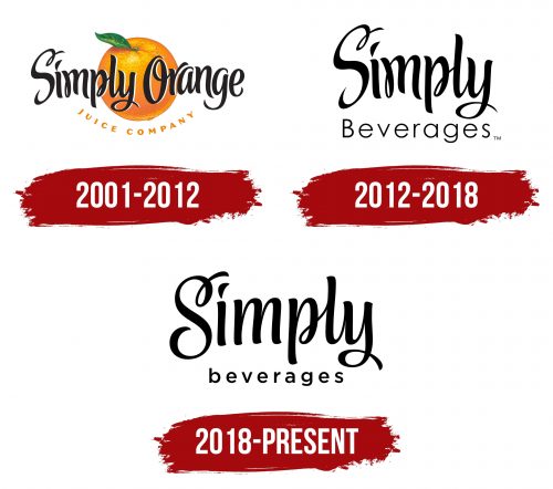
The Simply logo features a classic color scheme in its elegant form. It combines dynamism and stability, making it attractive yet understated. The logo possesses an elusive charm and unique style, consistently associated with high-quality products.
Simply: Brand overview
The brand’s history officially began when the Coca-Cola Company decided to enter the premium fruit juice business in 2001. Particularly in the juice market, the company observed a growing consumer desire for less processed and more natural products. Simply was established in response to this trend, providing juices and other drinks free of artificial flavors, colors, and preservatives.
Simply Orange was the first product in the line, and thanks to its straightforward ingredients and fresh flavor, it became very popular quickly.
Following the popularity of Simply Orange, the company added Simply Lemonade to its roster in 2003. This product, which gave customers a natural lemonade without artificial ingredients, also gained popularity fast.
In 2004, Simply Limeade was introduced, continuing the tradition of introducing more citrus drinks. This latest addition met the increasing demand from customers for more unusual flavors.
In 2006, it debuted Simply Apple, its first non-citrus product. This move increased the brand’s consumer base by drawing in fans of apple juice who were looking for a healthier substitute.
2007 was a significant year for the brand’s global growth. The company started selling outside the US, breaking into the Canadian and a few European markets.
Launching Simply Lemonade with Raspberry in 2009, the brand continued its innovations by fusing the traditional lemonade flavor with subtle raspberry notes. This was an attempt to address the expanding mixed fruit flavor trend.
2011 Simply Cranberry Cocktail was introduced, broadening the selection to accommodate more conventional American tastes. This product gained popularity as an ingredient in cocktails and a stand-alone beverage.
In response to the increasing trend of smoothie consumption, the company launched its first line of smoothies in 2013. A variety of tastes mixing fruits and vegetables were available from Simply Smoothie.
2015 was a year of advancements in packaging. The brand unveiled a new, ergonomically designed bottle to increase customer convenience.
In 2017, the brand introduced Simply Light Lemonade to appeal to consumers watching their weight, further expanding its market share in the lemonade category.
In 2018, Simply Almond launched almond milk made from plants. This product category saw a notable expansion, indicating the rising demand for dairy substitutes.
With the launch of the Simply Smoothie Recharge range in 2019, the brand maintained its innovative streak by adding vitamins and minerals to boost immunity and vitality.
In 2020, the company launched Simply Oat, an oat milk, to broaden its selection of plant-based beverages. This action was taken in reaction to the rising demand for oat milk among consumers looking for dairy substitutes. Three varieties were available: vanilla, unsweetened, and original.
In 2021, the alcoholic variant of the well-known Simply Lemonade was introduced: Simply Spiked Lemonade. This product, created in collaboration with Molson Coors Beverage Company, was an alcoholic version of the traditional Simply Lemonade. This expansion gave the brand access to a new market and represented the expanding trend of ready-to-drink alcoholic beverages.
The company stepped up its sustainability efforts in the same year. By 2025, the brand intends to use only recycled plastic for its bottles. This action fits into The Coca-Cola Company’s larger plan to reduce the consumption of fresh plastic.
The continued expansion of the functional beverage line characterized 2022. The brand responded to the increased customer interest in products that boost immunity and overall health by introducing a line of juices and smoothies enhanced with probiotics and vitamins.
In 2023, the company introduced a new line of goods in entirely recyclable paper packaging for certain beverages, continuing the brand’s innovative packaging efforts. This program aimed to attract eco-aware customers and lessen the brand’s environmental impact.
This year, the brand extended its reach internationally by breaking into new markets in Latin America and Asia. The company made minor product adjustments to suit regional tastes, launching drinks with regional fruits and flavors.
In response to consumer demand for more functional and healthful products, the brand effectively broadens its product offering by tackling new beverage categories in addition to classic juices.
Meaning and History
The excellent taste characteristics of the products provide pleasure, and their unique composition is extremely beneficial for health. One might think there’s nothing more to desire. However, the creators of the modern identity, like the brand itself, didn’t stop there. With each new series of beverages, the symbolism transformed, images changed, and the identity evolved dramatically. Observing these transformations is quite fascinating.
What is Simply?
It is a brand owned by The Coca-Cola Company that specializes in all-natural juices and beverages. Known for using simple, non-GMO ingredients with no added preservatives, colorings, or artificial flavors, the company offers a variety of products including orange juice, lemonade, and fruit punches. The brand emphasizes freshness and flavor, and its products are often labeled “not from concentrate” to emphasize their natural quality. The drinks are available in supermarkets, grocery stores and online retailers, making them a popular choice among consumers looking for clean and refreshing beverages.
2001 – 2012
The brand’s first logo is rightfully considered the most striking. It was created as a presentation piece designed to attract attention and be memorable. Its expressiveness was intended to be noticeable to customers on juice packaging, so a fairly large orange is placed at the center.
The orange is not hand-drawn; it lacks cartoonishness or excessive brightness. Since the goal was to offer natural juices and beverages, the realism of the citrus element was extremely important. The color of the orange is well-chosen, bright, and close to natural. The texture of the orange conveys the product’s natural quality. A single green leaf evokes freshness as if the orange was just picked from the tree. The leaf is the only element that stands out in its tone.
On a white background, black letters spell out two words: “Simply” and “Orange.” The words have simple flourishes and are written in black. The distance between the words is about two spaces. Below the brand name, the words “Juice Company” are printed in similar uppercase letters, significantly smaller than the brand name. The key inscription is centered, making it visually prominent. The phrase “Juice Company,” along with the image of the orange, forms a harmonious tandem, emphasized by the beautiful arc of the text.
2012 – 2018
Over time, the bright and juicy orange was completely removed from the company’s identity for several reasons. First, the products became well-known to customers. With more flavors emerging, there was a need to broaden the perception of the logo without focusing on one fruit. Second, logos’ graphic nature and conservatism gradually became key aspects. Thus, the new logo featured only two inscriptions, each symbolically significant.
The central place was occupied by the word “Simply,” written in beautiful and elegant letters. The first letter was capitalized, while the rest were smaller but in the same style. The font was consistent for all letters. The black letters created a sense of timeless balance on a white background. Infinity was an important focus in the identity. The second word, “Beverages,” was placed below. Its font was simple and easily readable.
The large spacing between the letters of all words enhanced readability and helped present the typography in its aesthetic beauty and originality.
2018 – today
In 2018, Simply’s product range expanded significantly. The flavors became more interesting and exotic, attracting more customers. The target audience grew, so some changes in the identity were logical, though not drastic.
The word “Simply” is still written in black letters on a white background. The font is elegant and concise. Each letter compares to the charm of a black swan gracefully gliding down a river. Stability and consistency are reflected in the unchanged writing of the word “Simply.”
The second element of the logo, the word “Beverages,” looked new and unusual. It enhanced the effect, with letters of the same size neatly emphasizing the central inscription.
It is worth noting that the company continues to produce its iconic orange juice from 2018 to the present. Therefore, consumers can see the identity in two versions: with the inscription “Beverages” in black letters or with the inscription “Orange.”

