


![]() Six Flags Logo PNG
Six Flags Logo PNG
The bright emblem corresponds to equally vibrant emotions and memories. Therefore, the Six Flags logo is associated with adrenaline, fun, and joy that people experience while visiting amusement parks. It also reflects the atmosphere of the attractions, emphasizing their uniqueness and variety.
Meaning and History
![]()
The Six Flags Entertainment Corporation has undergone several name changes, but each invariably mentioned the six flags in the company’s logo. Originally, they referred to the following countries:
- Confederate States of America;
- United States;
- Republic of Texas;
- Mexico;
- France;
- Spain.
All of them ruled Texas at different times. When Angus Gilchrist Wynne Jr. decided to establish an amusement park there, he wanted it to be thematic, with each zone reflecting the region’s history and cultural heritage. He dedicated six sections to those countries associated with Texas and used their flags as part of the attractions’ branding. In 2017, any reference to the Confederate States of America had to be removed for political reasons.
The flags on the corporation’s emblem are not linked to any particular country, not even the USA. They look like small triangular pennants, similar to those on a golf course. This neutrality stems from the company’s now operating many amusement parks under the Six Flags brand across North America, meaning their symbolism is no longer tied to Texas’s history.
What is Six Flags?
Six Flags is the former name for the Six Flags Entertainment Corporation, which oversees a chain of amusement complexes featuring various rides and water play areas. These are located in Canada, Mexico, and the USA. The company was founded in 1961 when the American businessman Angus Gilchrist Wynne Jr. opened a theme park in Arlington, Texas.
1961 – 1992
![]()
This is a classic logo with the inscription “SIX FLAGS” written in a decorative font resembling “Circus” by Dan Roseman. The letters have expansions on the top and bottom, with wavy edges. One part of the word is colored orange, and the other is red. The two colors smoothly transition from one to the other, embodying vibrant emotions. Logos with this design can still be seen on older attractions.
1992 – 1998
![]()
Artists depicted seven white triangular flags attached to slender poles of varying lengths. They are positioned within the negative space inside a large blue polygon with a split base and wavy sides. The company’s name is now written in black letters using a unique font characterized by the following:
- diagonal cuts on the ends of the strokes;
- oval internal letter gaps;
- a triangle replacing the usual round dot above the “i.”
1998 – 1999
![]()
In this version, used for one season, each flag is painted in its color: green, orange, pink, purple, yellow, and turquoise. They still vary in height but are now grouped in a colorful “bouquet” and placed inside an irregularly shaped black vertical stripe. At the bottom, there’s a similarly irregular circle. Together, the two geometric figures form a stylized exclamation mark, a symbol of expression. The brand name has been shifted to the left, retaining the font.
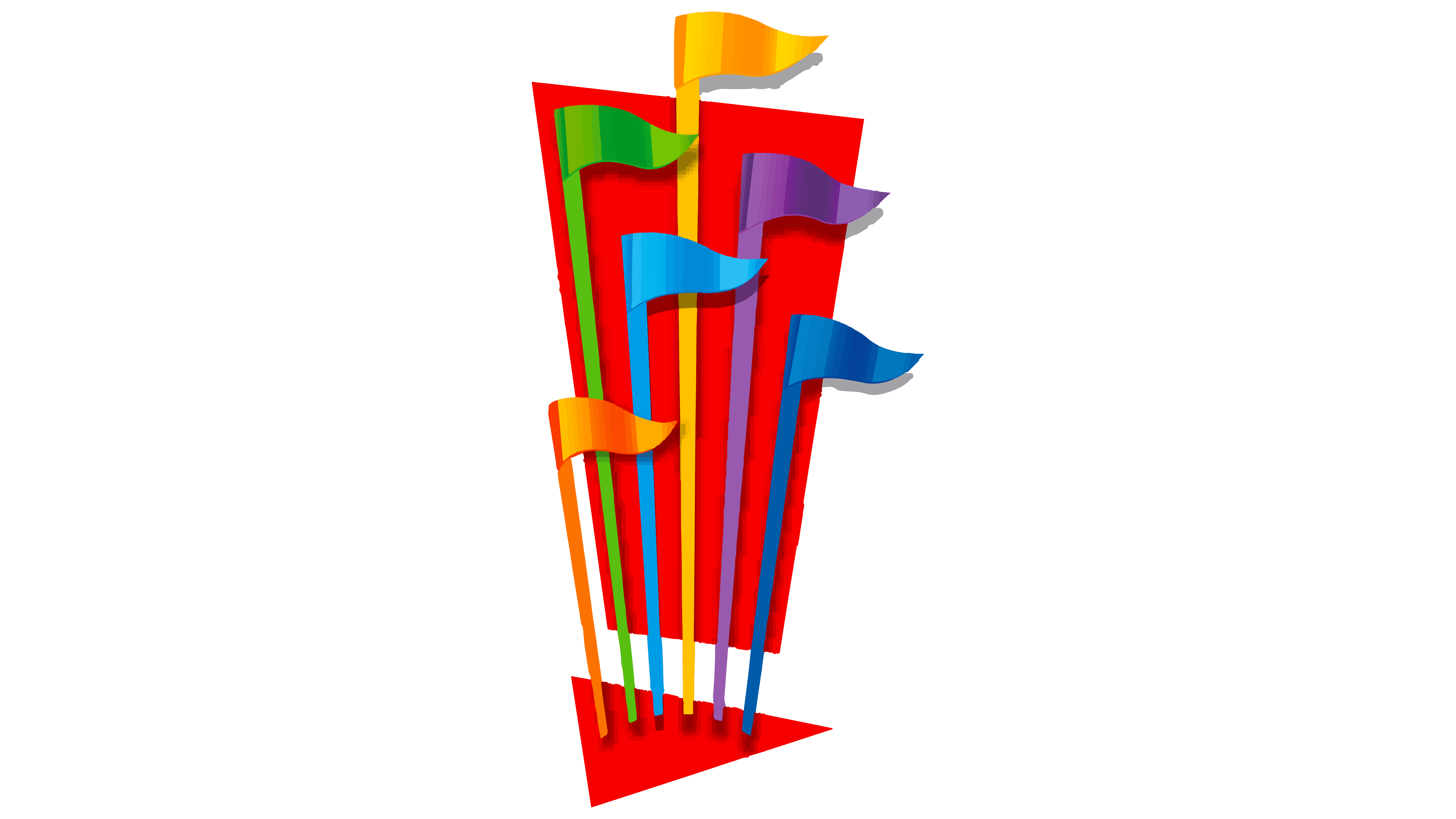
1999 – 2015
![]()
To make the logo more optimistic, designers retained black only for the “SixFlags” wording. There is now no space between the two words. The letters no longer seem to jump but now have a slight tilt to the right. Colorful flags (orange, green, blue, yellow, purple, and pink) are pinned to a red triangle, complemented by an overlying trapezoid and part of the exclamation mark. This emblem became popular during the Premier Parks era.
2004 – 2015
![]()
Alongside the vertical version was a horizontal one, in which a red exclamation mark with multicolored flags separated the two words in the brand name. This logo format was introduced in 2004 when the amusement park in Ohio was renamed Six Flags Worlds of Adventure.
2015 – 2019
![]()
The flags are now more compact since they’ve been moved closer to the center of the exclamation mark. The gradient and the triangles’ curved shapes give the impression that they are fluttering in the wind. Dark blue is used instead of pink.
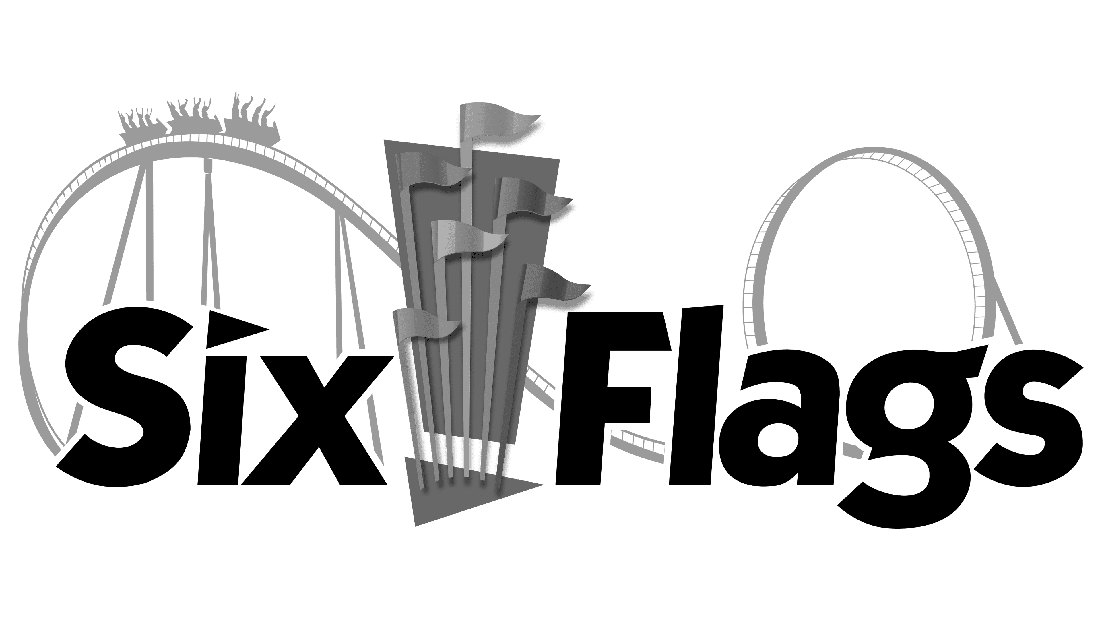
2019 – 2024
![]()
Behind the writing and flags, an image of a popular roller coaster with a winding track system has been added, showing carts rolling. The blue structure clearly shows the tracks, depicted as thin lines. The passengers have raised their hands, expressing the thrill of the exhilarating ride.
2024 – today
![]()
The new logo of Six Flags Entertainment Corporation marks a new era for the brand following its merger with Cedar Fair. It reflects significant changes in style and color palette influenced by the merger.
The core element remains the “Six Flags” name, now rendered in a revised font. This new typeface is more reminiscent of the one used in Cedar Fair’s logo, symbolizing the union of the two companies and their shared future. The lettering has become more formal and business-like while retaining its recognizability.
The text’s blue color has also been adjusted to a shade closer to Cedar Fair’s. This choice can be seen as a tribute to both companies’ legacy and a step toward creating a unified, strong brand.
The stylized flag above the “i” in “Six” has been retained as a symbol of continuity and historical heritage. However, the flag is now rendered bright red, adding dynamism and energy to the emblem. The red flag represents passion, energy, and vitality, aligning with the spirit of the entertainment industry.
All additional elements from previous logos, such as towers, roller coasters, and swirls, have been removed, making the new logo simpler and streamlined. This minimalism emphasizes the brand’s modernity and relevance, focusing on the future.
Font and Colors
The italicized Six Flags font is likely a modified ITC Kabel Bold. Designers rotated the letters and slightly altered their shapes to create a playful mood. The triangle over the “i” imitates a small flag.
The logo uses bright colors, evoking positive emotions. Yellow, orange, purple, green, red, and various shades of blue draw attention to the amusement parks. The black lettering stands out perfectly against the background.