


 Soul Eater Logo PNG
The Soul Eater logo symbolizes the constant battle between light and dark in a world where heroes collect the souls of evil people to reach a balance. It captures the series’ key concept while creating a fantasy vibe. The emblem emphasizes the story’s mystical nature and is shrouded in mystery.
Soul Eater began in 2003, when manga artist Atsushi Ohkubo created a short work for Square Enix’s Monthly Shōnen Gangan, a magazine known for Fullmetal Alchemist. Reader interest led to serialization in August 2004. The story centered on Death Weapon Meister Academy, where human weapons and meister partners trained to hunt witches and corrupted souls.
The main cast included Maka Albarn and Soul Evans, Black Star and Tsubaki, Death the Kid, and the Thompson sisters. Ohkubo combined gothic cities, grotesque figures, dark comedy, and fast battles, giving the manga a style distinct from many shōnen titles of the period. Sales grew in Japan and abroad, and the franchise expanded beyond print.
Bones, the studio behind Fullmetal Alchemist and Eureka Seven, produced an anime adaptation in 2008 for TV Tokyo. International licenses brought the series to dozens of countries while Naruto from Studio Pierrot was gaining a large Western audience. Games, figures, posters, clothing, and accessories followed. Soul Eater: Monotone Princess for PlayStation 2 became one of its main game adaptations.
The manga ended in August 2013 after 113 chapters collected in 25 volumes. Ohkubo launched Soul Eater NOT! in 2011, focusing on other students at the academy, and Bones adapted the spin-off for television in 2014. Anniversary editions later appeared, while fans continued discussing a new anime version closer to the manga’s ending. The first anime departed from the original final arc.
Meaning and History
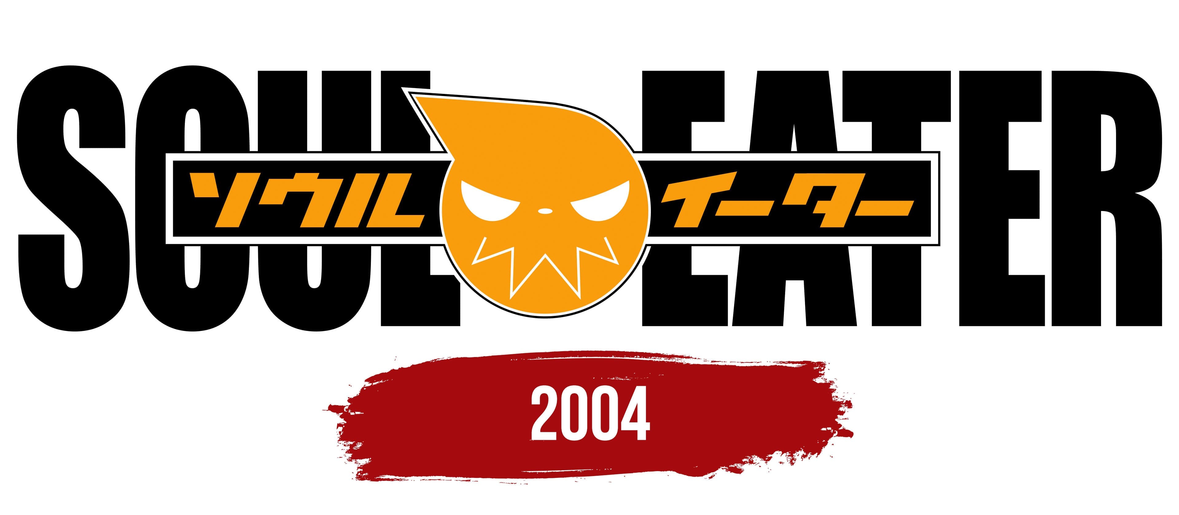
While creating Soul Eater, Atsushi Ohkubo drew inspiration from the works of Tim Burton and J.K. Rowling. This explains the story’s gothic yet whimsical nature. The logo, which debuted with the manga, has a layered design featuring text in both English and Japanese. It also contains the franchise’s most famous symbol, a round, orange creature with expressive eyes and a zigzag mouth. This represents the soul of one of the main characters, a demon-weapon named Soul Evans, mirroring his appearance and personality traits.
- The character acts aloof and arrogant to appear cool, and the face on the emblem captures those emotions.
- Since Evans has triangular teeth, the smile appears as a zigzag line.
- In his human form, the demon weapon’s hair is swept to the side, so his soul isn’t perfectly round but has a triangular protrusion at the top.
The famous Soul Eater sign often appears in the manga itself. You can spot it, for example, on the back of Evans’ first jacket and other pieces of clothing.
What is Soul Eater?
Soul Eater is a Japanese manga created by Atsushi Ohkubo, which later became the basis for an anime series of the same name. It was published in 2004, with the last chapter appearing in 2013. The events take place in a fictional world where weapon-humans hunt evil souls. The main characters are students at the Death Weapon Meister Academy.
2004

The logo contains several elements that collectively convey the key aspects of Soul Eater. In the background, the manga’s English title is written in vertically stretched, sans-serif letters. Its black color makes it clear and legible, despite a small rectangle partially obscuring it. The geometric shape is centered and black, with a thin white border. Inside, orange characters spell out “ソウルイーター,” the brand’s name in Japanese.
Words are separated by an orange creature shaped like a circle with a triangular protrusion. This is the soul of Soul Evans, showcasing his core qualities. It resembles an emoji with a zigzag mouth, big eyes, and a small nose. The face exudes an evil superiority, reminiscent of a Halloween pumpkin. This makes sense since Atsushi Ohkubo was inspired by The Nightmare Before Christmas and other works by Tim Burton.
Each element of the logo speaks to the manga’s uniqueness. The work’s title highlights the characters’ main mission: collecting the souls of wrongdoers. The symbols add authenticity and cultural context. The quirky cartoon creature is a recognizable symbol in a universe where the constant battle between good and evil unfolds.
Font and Colors

The creators of the Soul Eater wordmark used a custom or modified font that closely resembles URW Impact W01-BoldCondensed. It’s a bold, no-frills typeface with vertically elongated letters, created in 1965 by typographer Geoffrey Lee. Since 1998, it has been part of the Microsoft Windows web package.

The English text and central rectangle are black, an excellent backdrop for the orange symbols and drawing. The color combo is super contrasting.