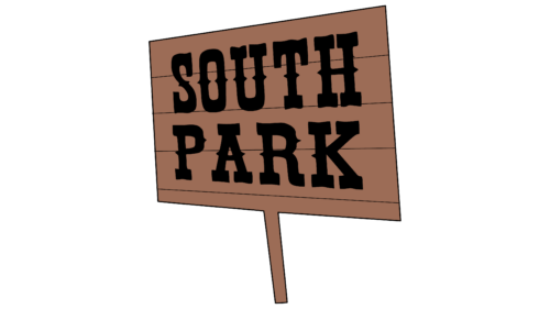
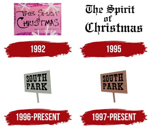
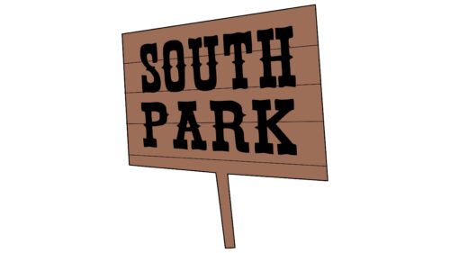
The South Park logo is simple and clear. The emblem is like a sign, inviting the viewer to turn off the road into a small provincial town where the events of the series unfold. The sign resembles a real one, symbolizing the intertwining of fiction and truth.
South Park: Brand overview
| Founded: | August 13, 1997 – present |
| Founder: | Trey Parker, Matt Stone |
| Headquarters: | United States |
| Website: | southparkstudios.com |
South Park is an adult animated series about the adventures of four fourth-graders living in a small U.S. town. It addresses prudish taboos and the shortcomings of American culture. It airs on Comedy Central in the evening. From 2020, exclusive rights to broadcast on the Internet belong to HBO Max, and from 2025 this right will be transferred to Paramount +. South Park Studios produce the animation. The series is planned to be renewed until 2027.
Meaning and History
Originally, they did not plan to make a series out of the cartoon. Therefore, the logos are slightly disjointed. The first two cartoons are separate parts, shot with a big gap. They were combined into one group with a common name, which is used in visual signs. The short films laid the foundation for the South Park series, which is mentioned in the two subsequent logos. The emblems of the cartoons and the series are completely different in concept. The first ones are elements of parody; the second ones are related to a road sign indicator and focus on the place of events.
What is South Park?
An adult animated series with unpleasant images, satire, and mean black humor, which includes 26 seasons, each of 13 episodes lasting 20 minutes. The main characters of the picture are children, which further enhances the idea of mocking the views and values of Americans.
1992
In 1992, two student friends made a short horror cartoon about four children and a reanimated snowman monster, which was defeated by Jesus. The original film was called Jesus vs. Frosty.
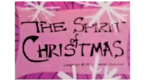
However, two parts were planned, and together they were called The Spirit of Christmas, which is written on the cartoon’s logo. The inscription is placed on a pink sheet, which lies on top of a raspberry background. The edges of the background are traced as if cut like fringe. Across the entire logo are white paper snowflakes.
The students filmed the cartoon using an old camera, colored paper, cardboard, and glue. Therefore, everything in the emblem is connected with paper. The snowflakes indicate that the events take place in winter. The pink and raspberry colors hint at bloody events and a miracle since two boys are killed by the hands of a snowman, and they are saved by the reanimated Jesus from the manger.
1995
The film was liked by one of the executives of Fox Broadcasting Company, who ordered the guys to make a second part of the cartoon as a joke to congratulate his friends. This led to the creation of the animation Jesus vs. Santa.
The logo for this part was somewhat simplified, leaving only the title: The Spirit of Christmas. The budget for the series was only 750 dollars, so they didn’t order a logo from anyone; they came up with it themselves. The title was written in an old English font used by engravers and later newspaper publishers.
The inscription hints at truths known from ancient times about the meaning of Christ’s birth and the peaceful coexistence of people with each other. The newspaper font tells us that the battle between Santa and Christ in the supermarket did not escape the attention of journalists and will make it into the newspapers.
1996 – today
The logo belongs to the pilot series about four boys living in the town of South Park. The invented provincial corner was placed in the Colorado mountains, as the students who created the cartoon studied at the University of Colorado.
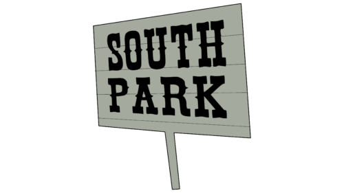
The emblem features a gray sign with the name of the town. The logo resembles a roadside sign indicating the settlement. The wooden base made of boards speaks of the small scale of the town.
The combination of South Park is written in two levels in black font. The name was taken from real ones. However, in reality, this is not a town but a high-mountain valley. The prototype of the animated town was a settlement in this valley called Fairplay. It has a population of 724 people.
The technique of the logo parodying original signposts hints that every episode of the series contains a parody of existing films, cartoons, songs, and games. This feature has become the main distinguishing feature of the project.
The pilot episode saw the light of day after the launch of the series. It was added as a gift to the DVD of the second season. The logo was very slightly different from the future one. The difference unintentionally demonstrated that the pilot episode has several inconsistencies with the future regular series. The episode is indeed similar to the first episode of 1997 and served as the basis for its creation. Nevertheless, the 1996 version had a few unique features that true fans could spot.
1997 – today
1997 was the year of the launch of the first season of the animated film. Its logo was different from the pilot version, only in color. Brown was more suitable for the idea of a wooden sign. Besides, light gray is more naive, light, and truthful, which does not correspond to the black humor of the series. And dark brown well reflected the sharper plot and sad events of the film.
Font and Colors
The main colors of the logo are black and brown. The dark palette quite corresponds to the not-very-pleasant plots.
- Black – black humor and satire.
- Brown – the dark side of life, sarcasm.
The font contains the following:
- Cowboy elements from Urban Cowboy-Regular.
- Hinting at the old Fairplay museum called South Park, which is dedicated to the times of the gold rush.
- Cowboys.
- Gold diggers who lived in the city.
This technique links the animation with the real settlement.
South Park color codes
| Pecan Brown | Hex color: | #9c6c56 |
|---|---|---|
| RGB: | 156 108 86 | |
| CMYK: | 0 4 20 7 | |
| Pantone: | PMS 7525 C |
| Black | Hex color: | #000000 |
|---|---|---|
| RGB: | 0 0 0 | |
| CMYK: | 0 0 0 100 | |
| Pantone: | PMS Process Black C |
