


 Spain National Football Team Logo PNG
The Spanish National Football Team logo blends historical heritage and modern realities. It highlights the Spanish team’s professionalism and impressive achievements, comparable to the military victories of the Spanish kingdom.
Spain’s national football team, La Roja, began its official path in the early 20th century. The federation was formed in 1909, and the team’s first official match came at the 1920 Olympic Games in Antwerp, where Spain beat Denmark 1-0. The side soon became a strong European name, although the Spanish Civil War and World War II slowed its early progress.
Spain reached the quarter-finals at the 1934 World Cup and finished fourth in 1950, its best result for many years. The 1950s were linked with Alfredo Di Stéfano, but his era did not bring a major national title. Spain missed the 1954 and 1958 World Cups, then failed to pass the group stage in 1962 and 1966. Earlier figures such as Ricardo Zamora remained part of the country’s football memory.
The first major trophy arrived in 1964, when Spain won the European Championship by beating the Soviet Union 2-1 in Madrid. The following decades were uneven. Spain hosted the 1982 World Cup, reached the quarter-finals in 1994 and 2002, and had leading players such as Fernando Hierro, Raúl, and Luis Enrique, but often fell before the final rounds.
The strongest era was from 2008 to 2012, featuring Iker Casillas, Sergio Ramos, Carles Puyol, Xavi, Andrés Iniesta, and David Villa. Spain won Euro 2008, the 2010 FIFA World Cup, and Euro 2012 through a possession-based style built on short passing. Later results were weaker, with exits in 2014, 2016, 2018, a Euro 2020 semi-final in 2021, and a penalty shootout loss to Morocco in 2022.
Meaning and History
What is the Spain National Football Team?
The Spain National Football Team, or La Roja, represents Spain in international football competitions. Managed by the Royal Spanish Football Federation (RFEF), the team is renowned for its technical excellence and possession-based style of play, often referred to as “tiki-taka.” Spain has achieved significant success in major tournaments, including multiple FIFA World Cup and UEFA European Championship titles. The team has produced many world-class players who have left a lasting impact on the sport. Spain’s footballing tradition and passionate fan base make La Roja a formidable force in international football.
1920 – 1921
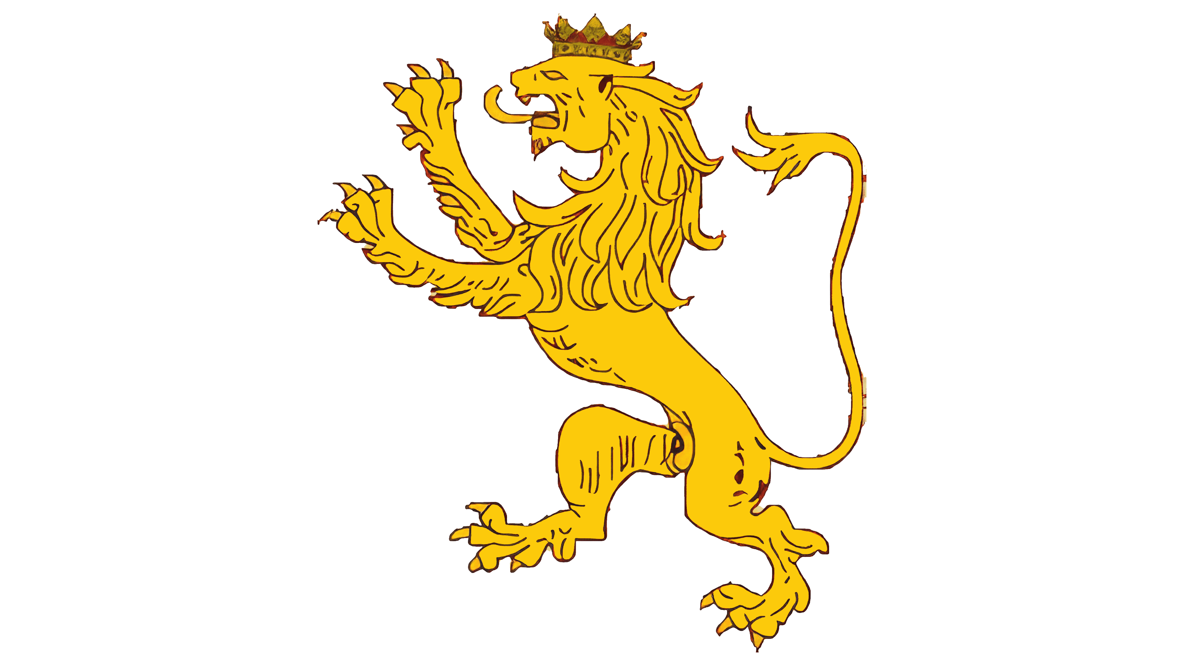
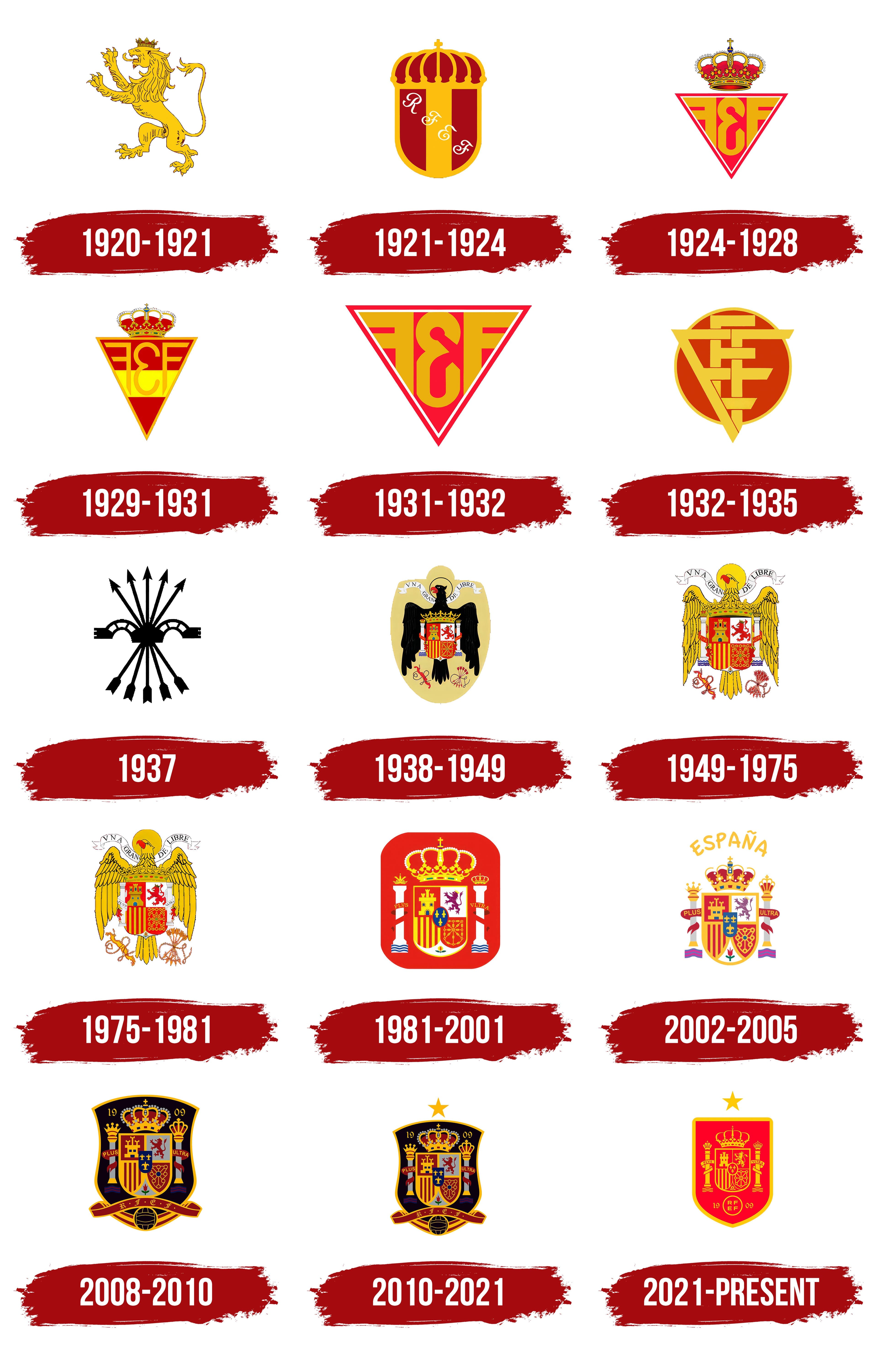
As their first symbol, the team chose the image of a lion from the flag of the Kingdom of León, which played a key role in the birth of Spain. The lion parallels the team’s formation and the country’s founding. By selecting a heraldic image, the team committed to honoring their roots and being as brave and strong as the lions of Spain. Like the team, the emblem was created for the 1920 Summer Olympics, where the athletes won a silver medal.
1921 – 1924
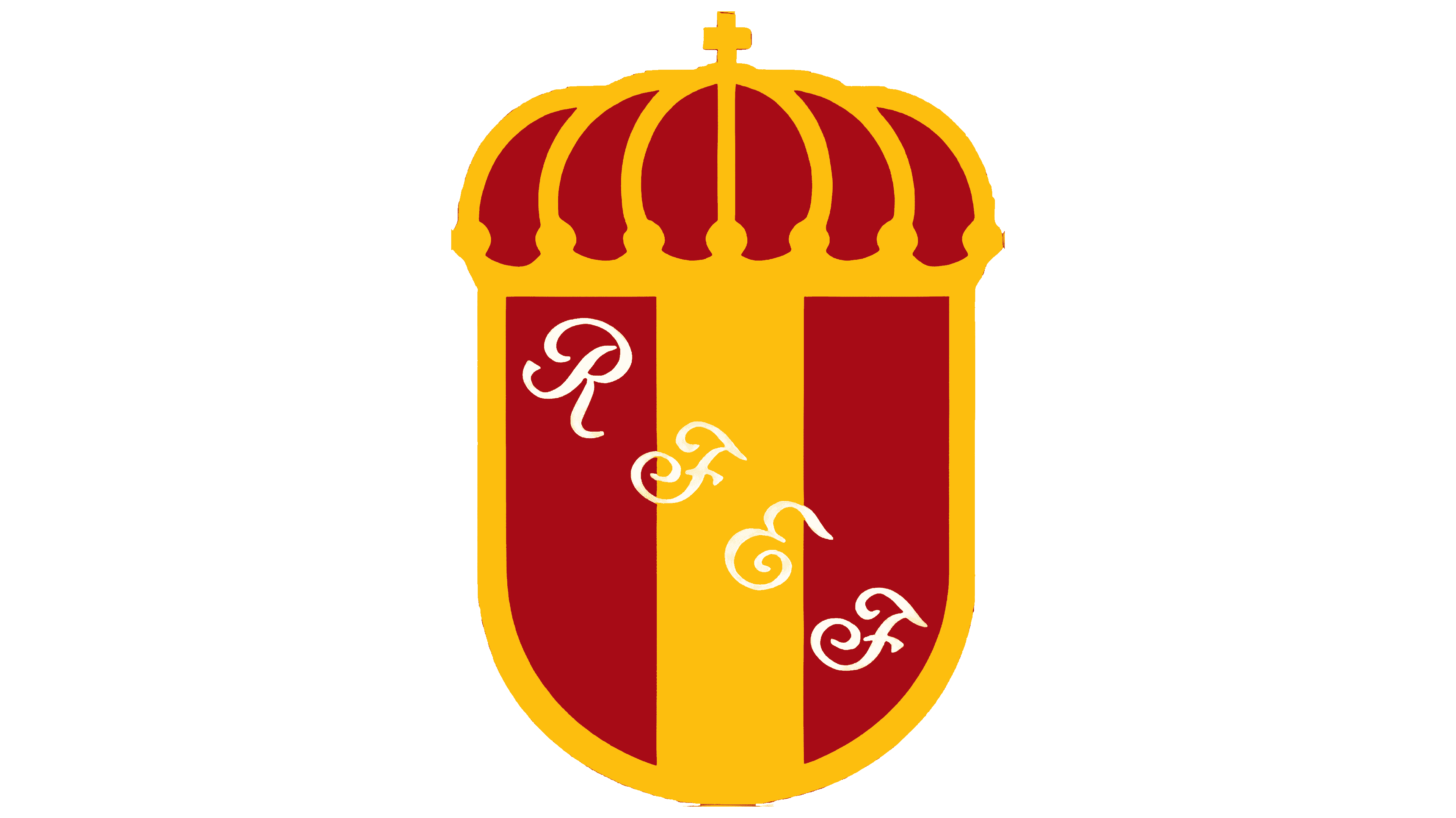
After their successful debut, the team approached the selection of a symbol more carefully. The new logo featured a shield in the colors of the national flag, crowned with the Spanish crown. This blend of nobility and grandeur was adorned with the white abbreviation of the Royal Spanish Football Federation, placed diagonally. The logo reflected the athletes’ pride and patriotism, showing that the team was worthy of representing the country on the international stage.
1924 – 1928
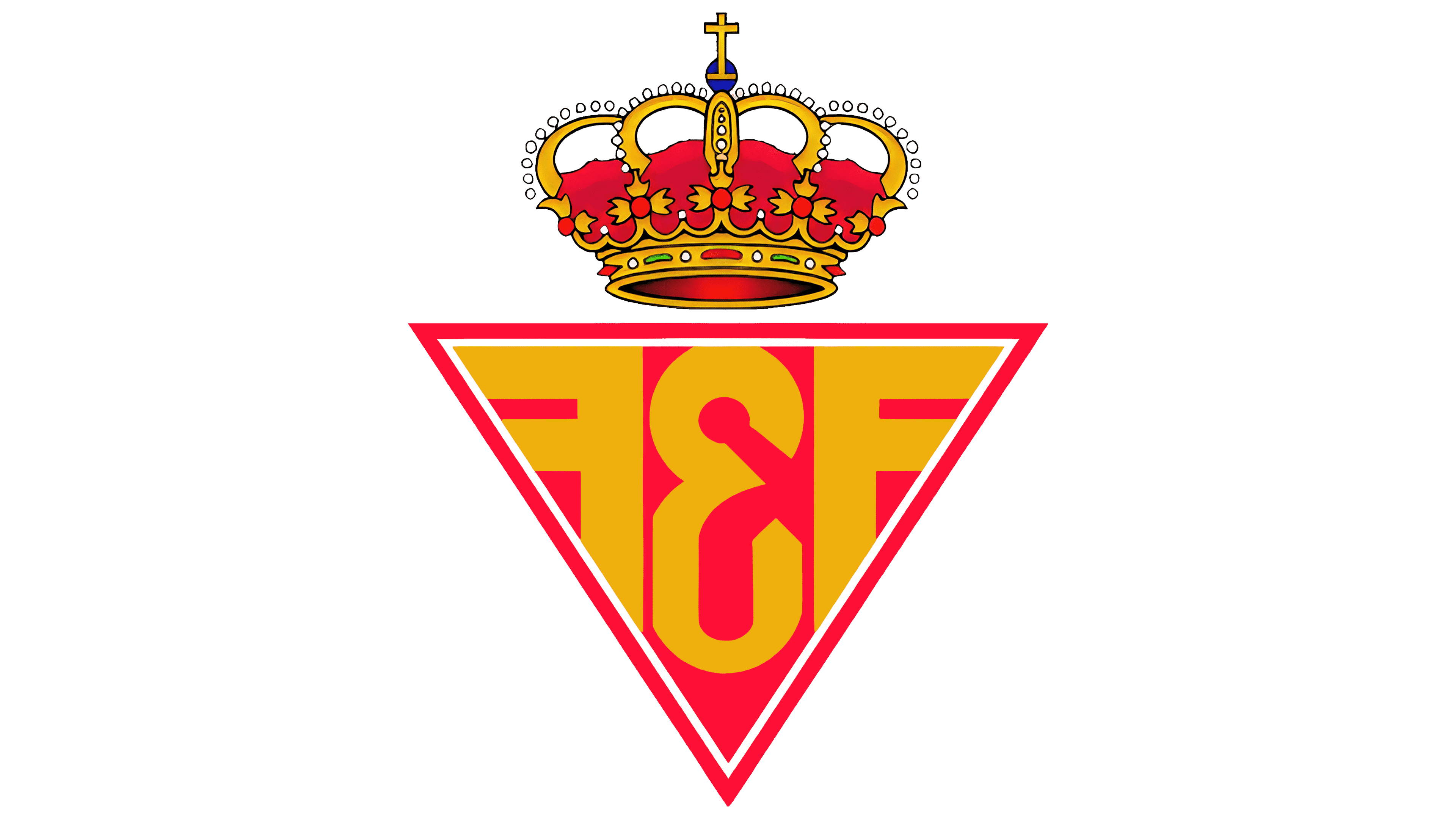
The new emblem’s triangular shape impresses with its balance and stability. Resting on a fine point, the symbol resembles a bird taking flight, echoing the eagle on the kingdom’s ancient coats of arms. Inside the figure is the abbreviation FEF: Federación Española de Fútbol. The letters F are turned in opposite directions, making them look like wings. Above the triangle is a crown, symbolizing the Royal Federation’s patronage.
1929 – 1931
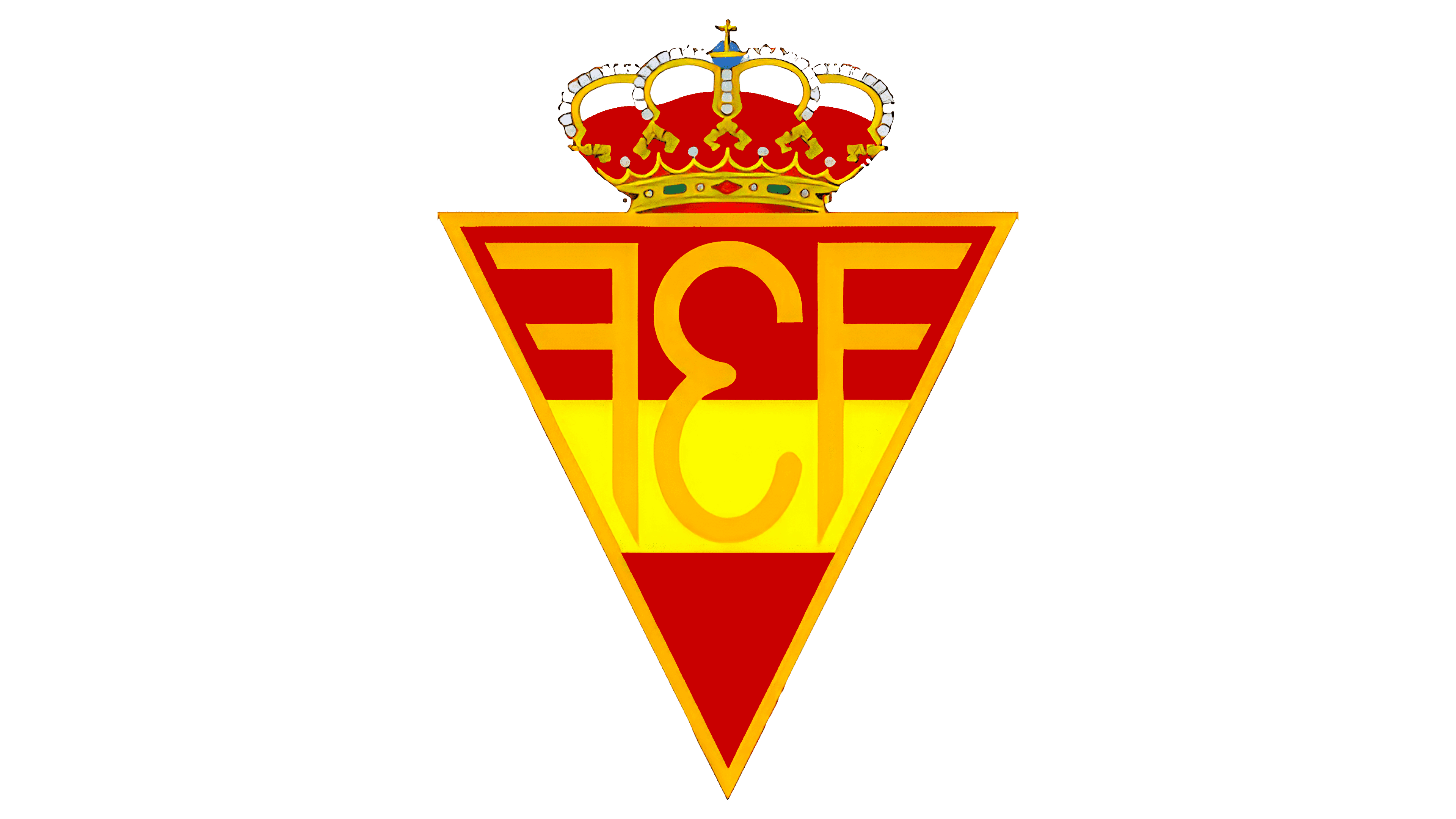
The emblem underwent slight changes in detail. The crown was lowered onto the upper edge of the triangle, forming a unified symbol. This design transformed the monarchs’ patronage into respect for the players who have achieved a high level of royal skill on the field.
A thin orange line around the figure created color balance, maintaining only the national shades in the logo. Two red and one yellow stripes echoed the Spanish flag and referenced the Kingdom of Aragon. Purple and gold, symbols of luxury and wealth, highlighted the team’s achievements, awards, and trophies.
1931 – 1932
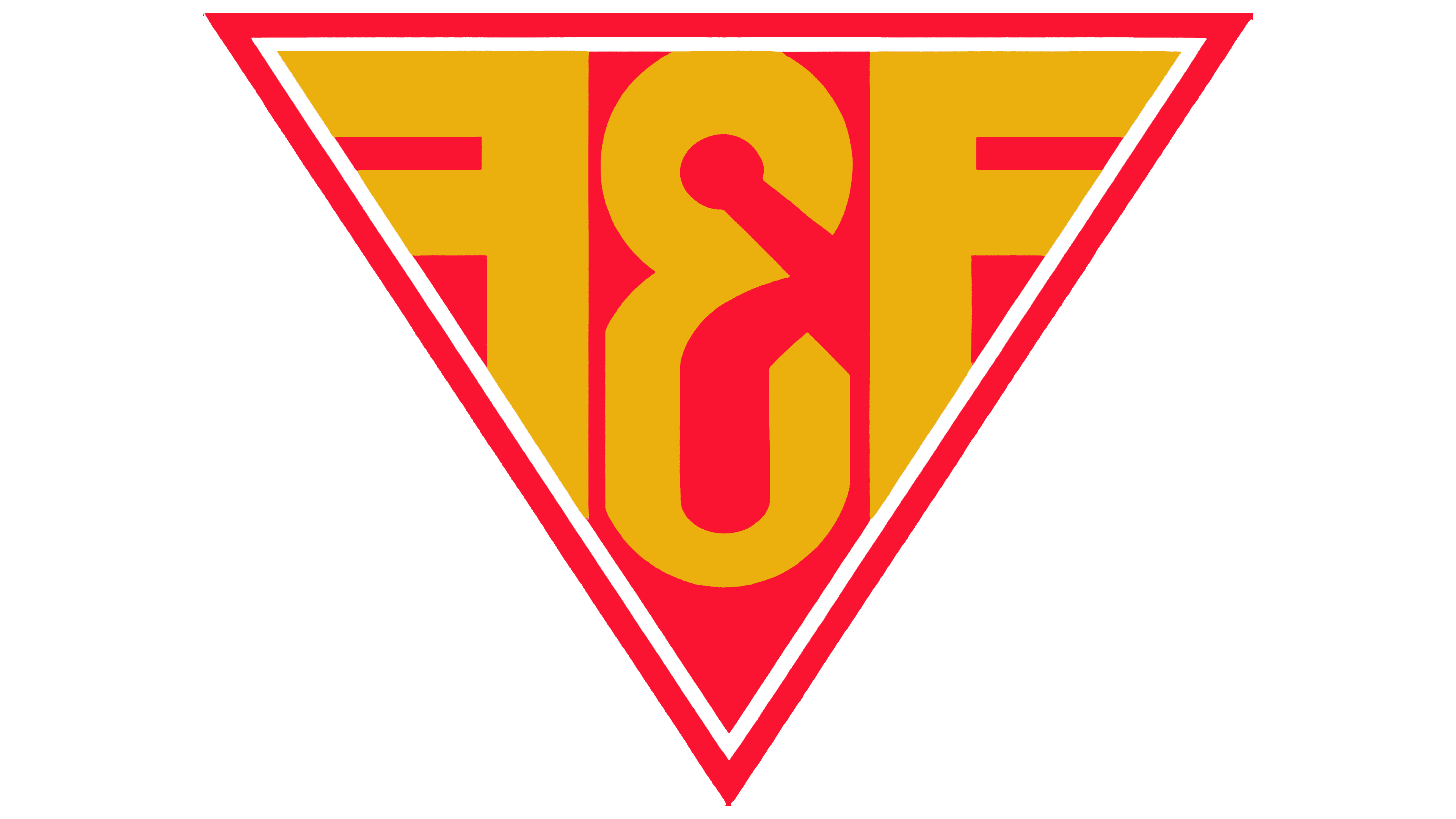
In anticipation of their first World Cup, the team moved away from royal ambitions, giving the logo a more sporty and modern look. The triangle, as a symbol of logic and balance, reflects the Spanish team’s stability and strength on the international football stage. Resting on a sharp angle conveys the athletes’ skill, precision in striking, and successful goal scoring.
1932 – 1935
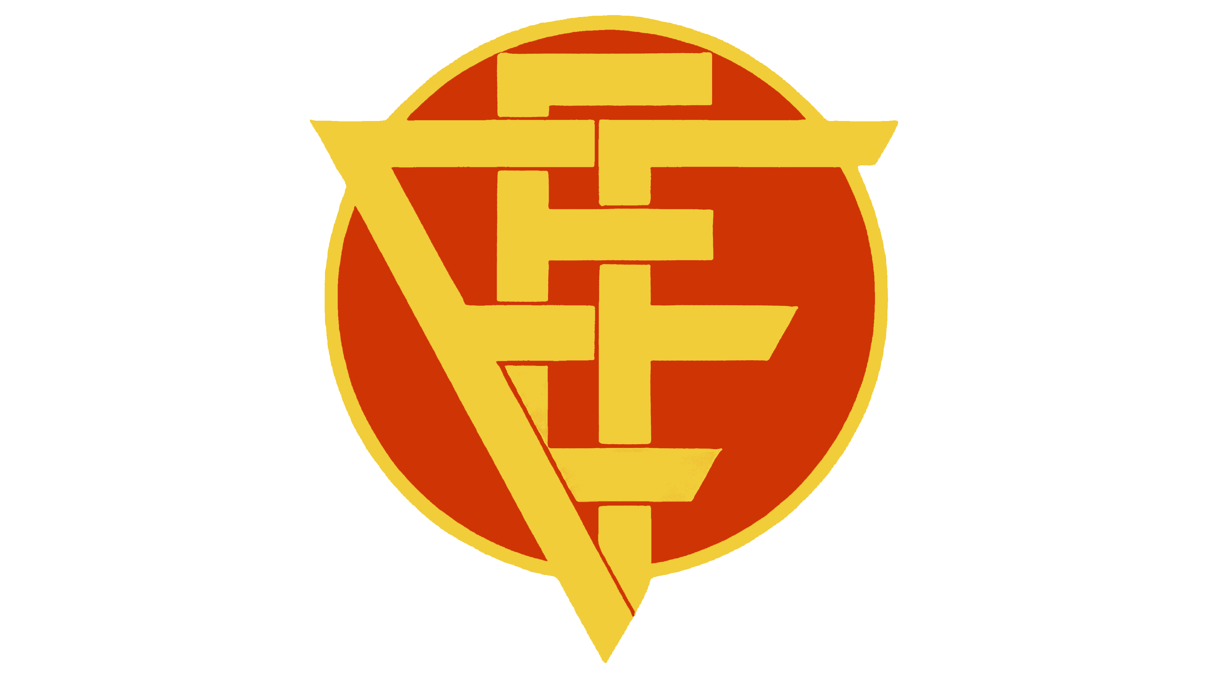
The team’s logo has been transformed into a sphere, giving the emblem a sense of movement and evoking the image of a ball. As a symbol of the rising sun, the circle predicts the team’s success.
The first letters of the federation’s name are intertwined into a single monogram, forming a clear triangular structure. The golden lines highlight the players’ skills.
The focus on precise geometric shapes embodies the beauty of football with its well-thought-out combinations and passes.
1937
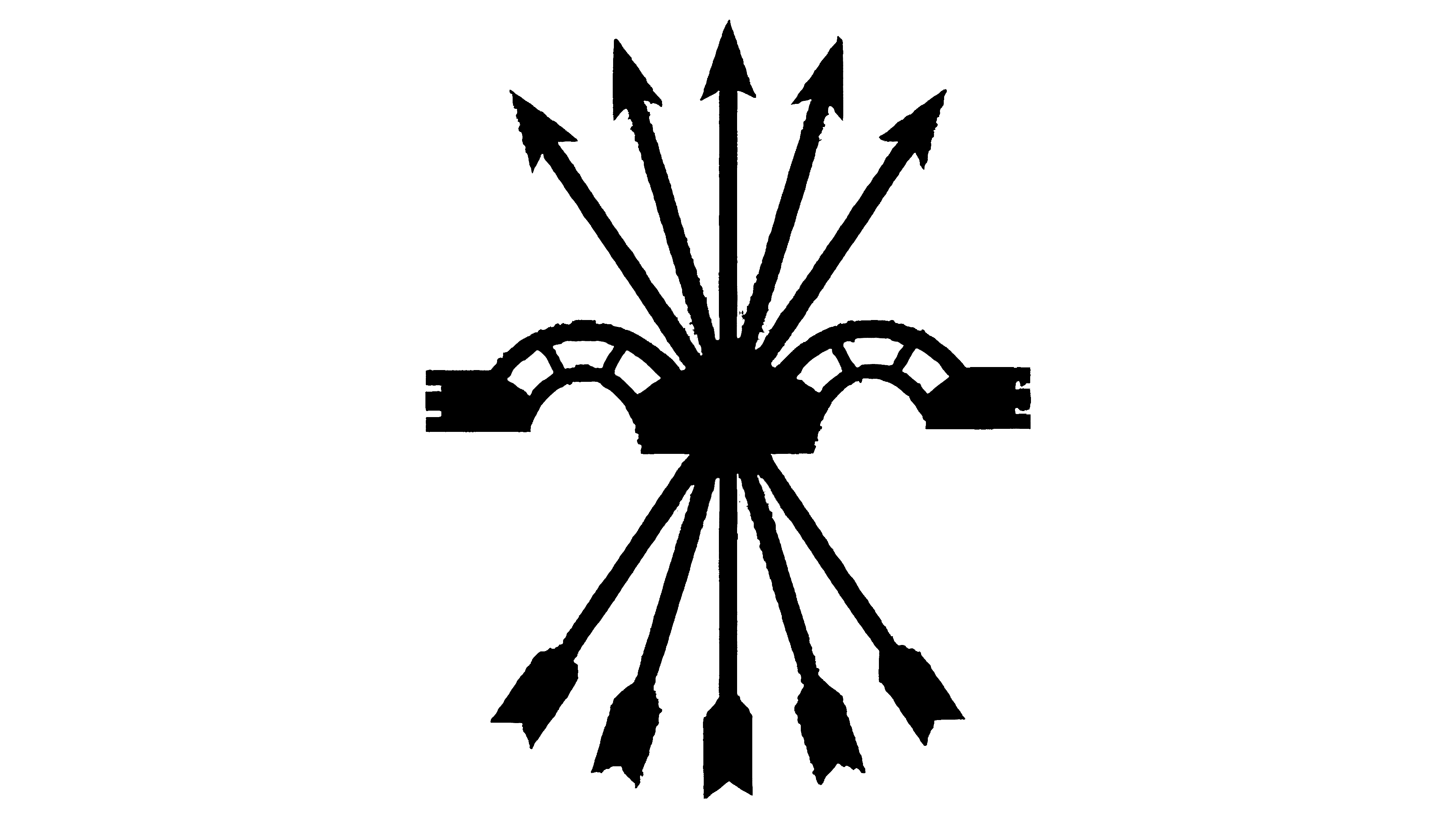
The black color reflects the military events that engulfed Spain in 1936. In 1937, the most tragic event of the Spanish Civil War occurred: the bombing of Guernica. As an act of mourning and condolence, the team changed its logo, basing it on the city’s coat of arms.
The emblem features a hermit’s house and an old oak tree, symbols of the rights and freedoms of Biscay. In the team’s logo, the assembly house is depicted in black, pierced by numerous arrows rather than the green tree. The emblem shows the many wounds inflicted on the city.
Five arrows bundled together represent the logo of Catholic Queen Isabella, signifying that the monarchist forces were responsible for the bombing.
1938 – 1949
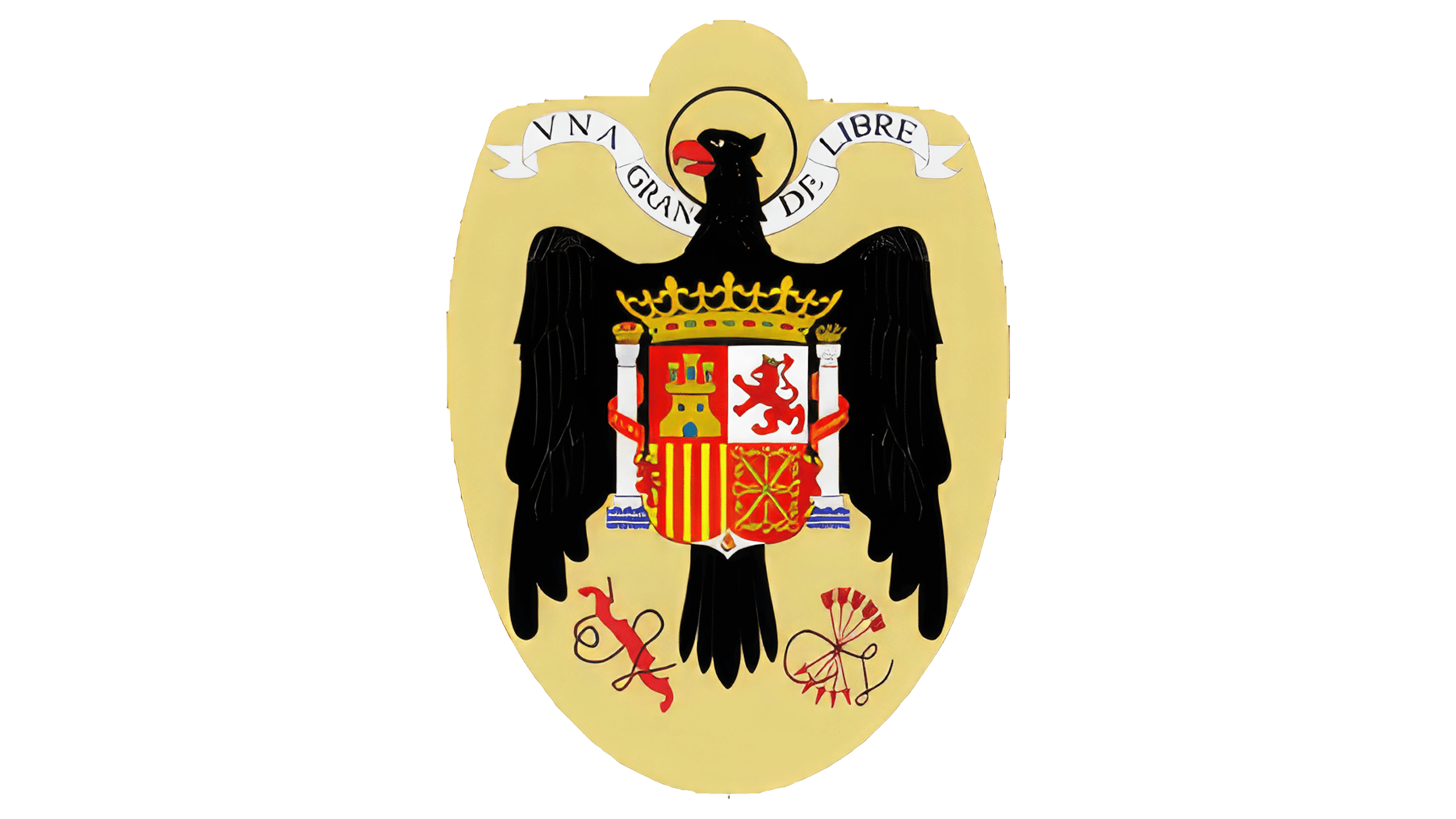
The team’s logo featured the country’s new coat of arms from the Francoist dictatorship period, which was closely aligned with Nazism. The image depicted the eagle of Saint John the Evangelist with a halo, holding a shield divided into four parts with the coats of arms of Navarre, León, Castile, and Aragon. This design emphasized the unification of the country’s lands under a single faith and a single party. The crown above the shield proclaimed the monarchy, while two pillars with imperial and royal crowns symbolized the rulers’ strength and power.
A heraldic ribbon behind the eagle’s head described Spain as “Una, Grande, Libre,” highlighting the country’s unity and greatness. The yoke and arrows below the eagle represented the new order established due to the civil struggle. These symbols were the emblems of the Catholic Monarchs.
1949 – 1975
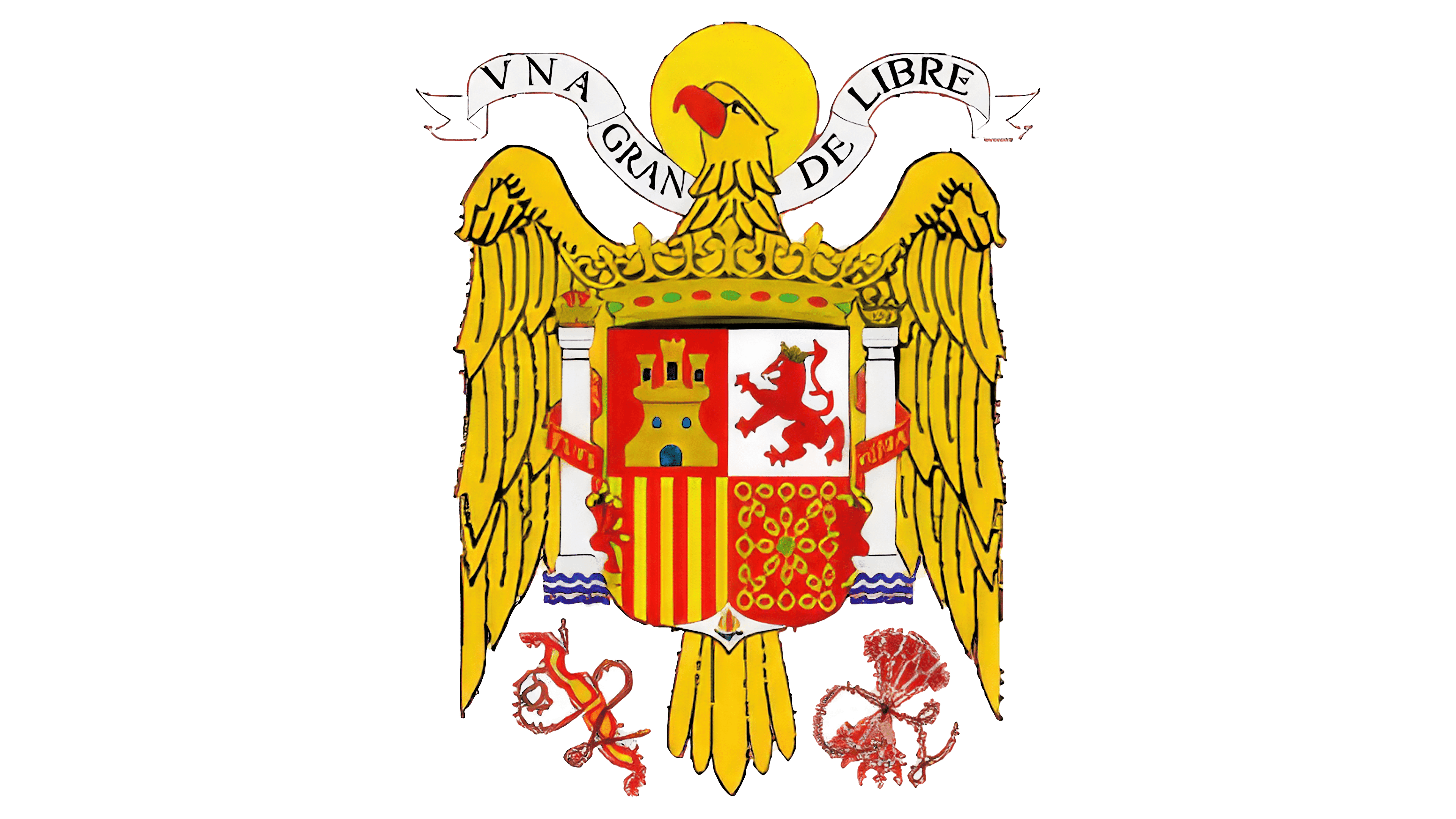
Spain was declared a kingdom, and its monarchy was restored. To show pride and solidarity with events in their homeland, the team altered the logo, incorporating gold and crimson colors instead of the previously dark, black tones. These shades emphasized the monarchy’s flourishing, prosperity, and wealth. The new design celebrated national identity and royal heritage, highlighting the team’s connection to their country’s renewed sense of grandeur and historical significance.
1975 – 1981
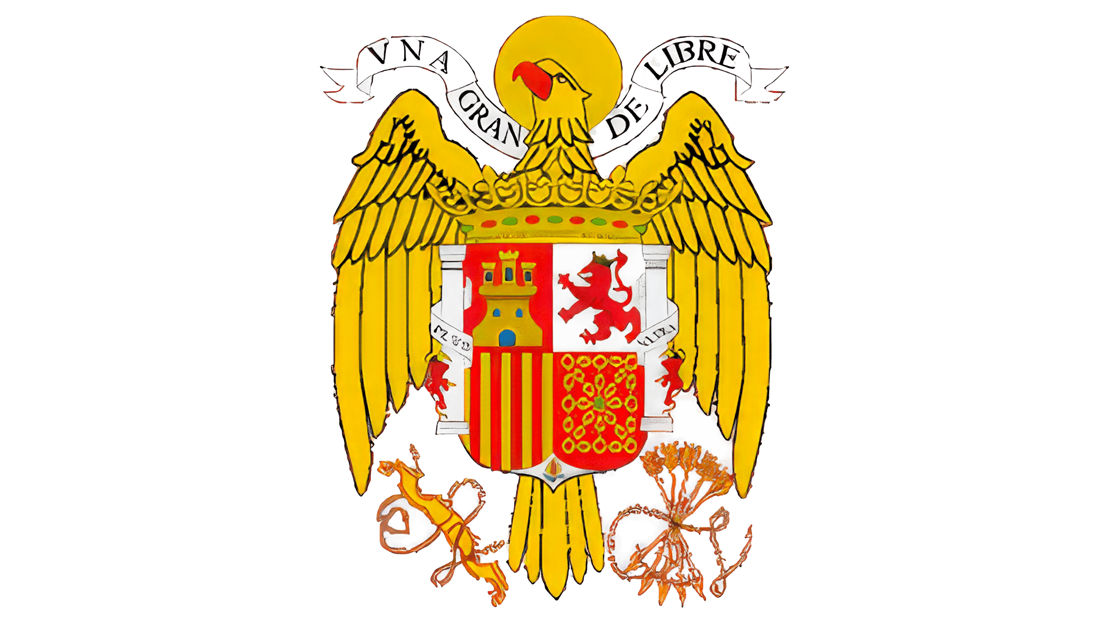
After the end of the dictatorship, the logo was revised and updated with minor details to enhance its overall appearance. The eagle’s feathers were refined to achieve a more perfect shape, while the bow and arrows gained sharper lines and a more pleasing color. The waves under the columns, previously called the Pillars of Hercules, were removed. The ribbons on the columns were changed to white, symbolizing a new beginning. These adjustments brought a sense of renewal and improvement, reflecting the country’s transition and hopeful outlook.
1981 – 2001
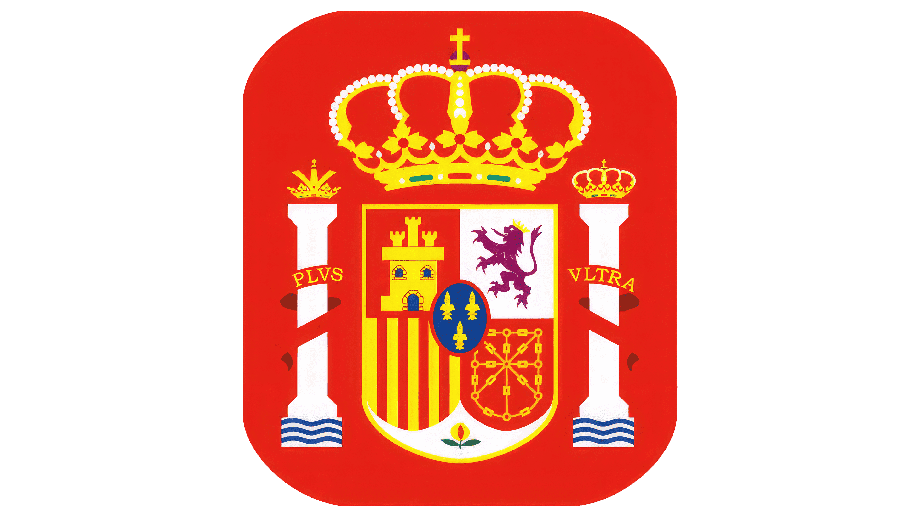
In anticipation of the 1982 World Cup, which Spain hosted, the team’s logo underwent rebranding. The new design featured a red square with rounded corners. The background symbolizes the energy and activity involved in organizing the tournament.
At the center of the emblem was Spain’s new coat of arms, featuring a shield bearing the provincial coats of arms. On either side, the columns remained, representing the pillars of the monarchy and the geographical gates of Gibraltar (the southern tip of Spain forms one shore of the Strait of Gibraltar between Europe and Africa). This strategically advantageous location gives the country superiority in controlling maritime routes.
The emblem reflected the nation’s historical characteristics, showcasing Spain’s rich cultural heritage and grandeur to visiting teams.
2002 – 2005
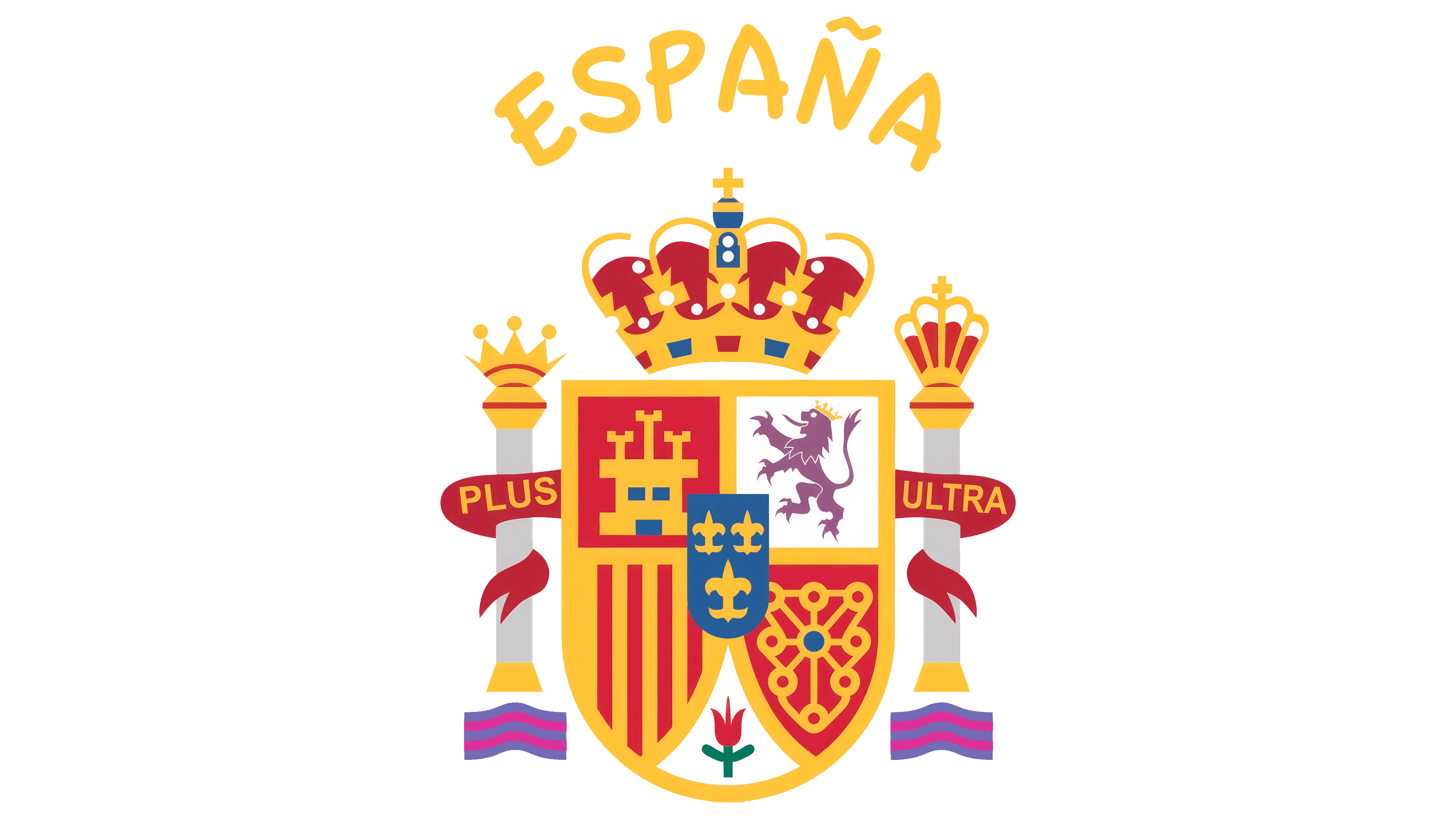
In 2002, the emblem became simpler and more schematic. The removal of the background improved the visibility of fine details. The detailed crowns atop the columns narrated the country’s history.
According to legend, the mythical giant erected the Pillars of Hercules at both ends of the strait. In ancient times, they symbolized the boundaries of the known world and represented the discovery of new horizons. The ribbon on the columns reads, “Further beyond.”
For Spain, the columns also symbolized the past and the future. The imperial crown represented the former power and grandeur of the Spanish Empire, one of the most powerful in the world during the 16th to 18th centuries. Its power reached its peak under Charles V, Holy Roman Emperor.
The royal crown represents the modern Spanish monarchy. It symbolizes national unity, continuity of power in the country, and respect for history and traditions.
Navarre’s coats of arms, chains, and Aragon, with stripes, were sharpened to accommodate the pomegranate flower, the emblem of Granada.
The emblem demonstrated Spain’s unity, highlighted achievements and victories, and created a majestic image of the team for their opponents to see.
2008 – 2010
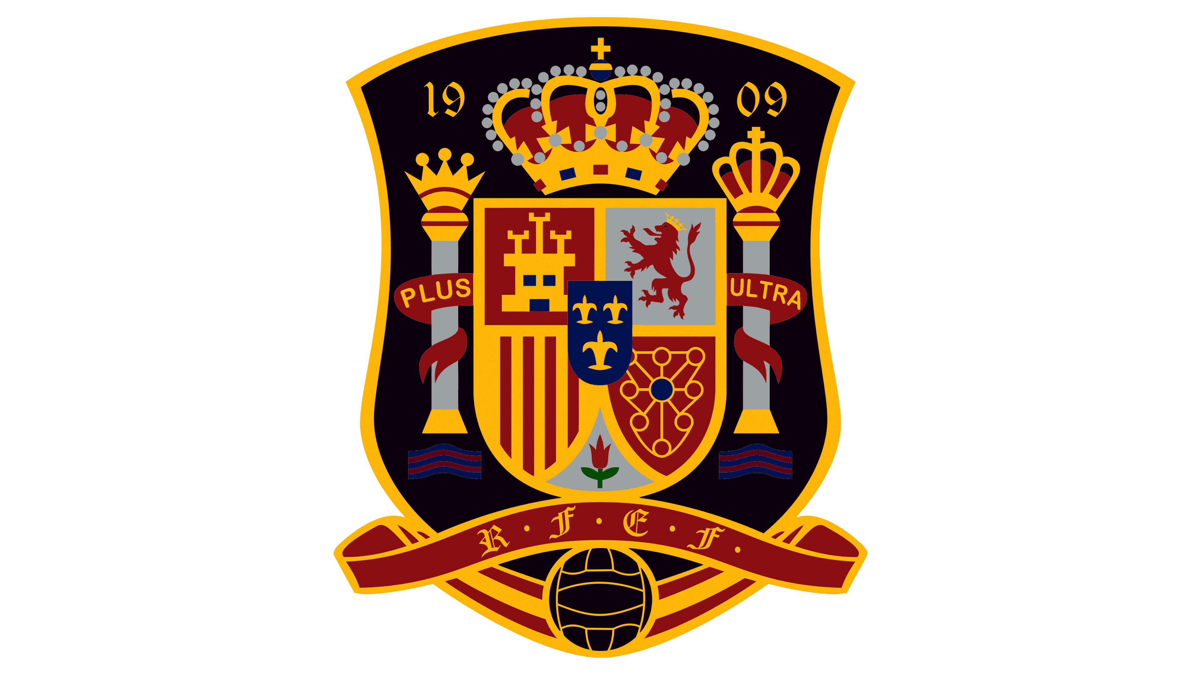
2008 was the first year the team logo featured symbols associated with soccer. A striking black shield represented the team’s power and strength. A soccer ball was placed at the shield’s base, serving as the design’s main element. An elegantly folded heraldic ribbon wrapped around the ball, displaying the abbreviation of the National Football Federation in gold letters.
Inside the shield, the national emblem of Spain highlighted the players’ deep connection to their homeland, with their matches dedicated to the country’s glory. At the top, the founding date of the Royal Spanish Football Federation was displayed.
2010 – 2021
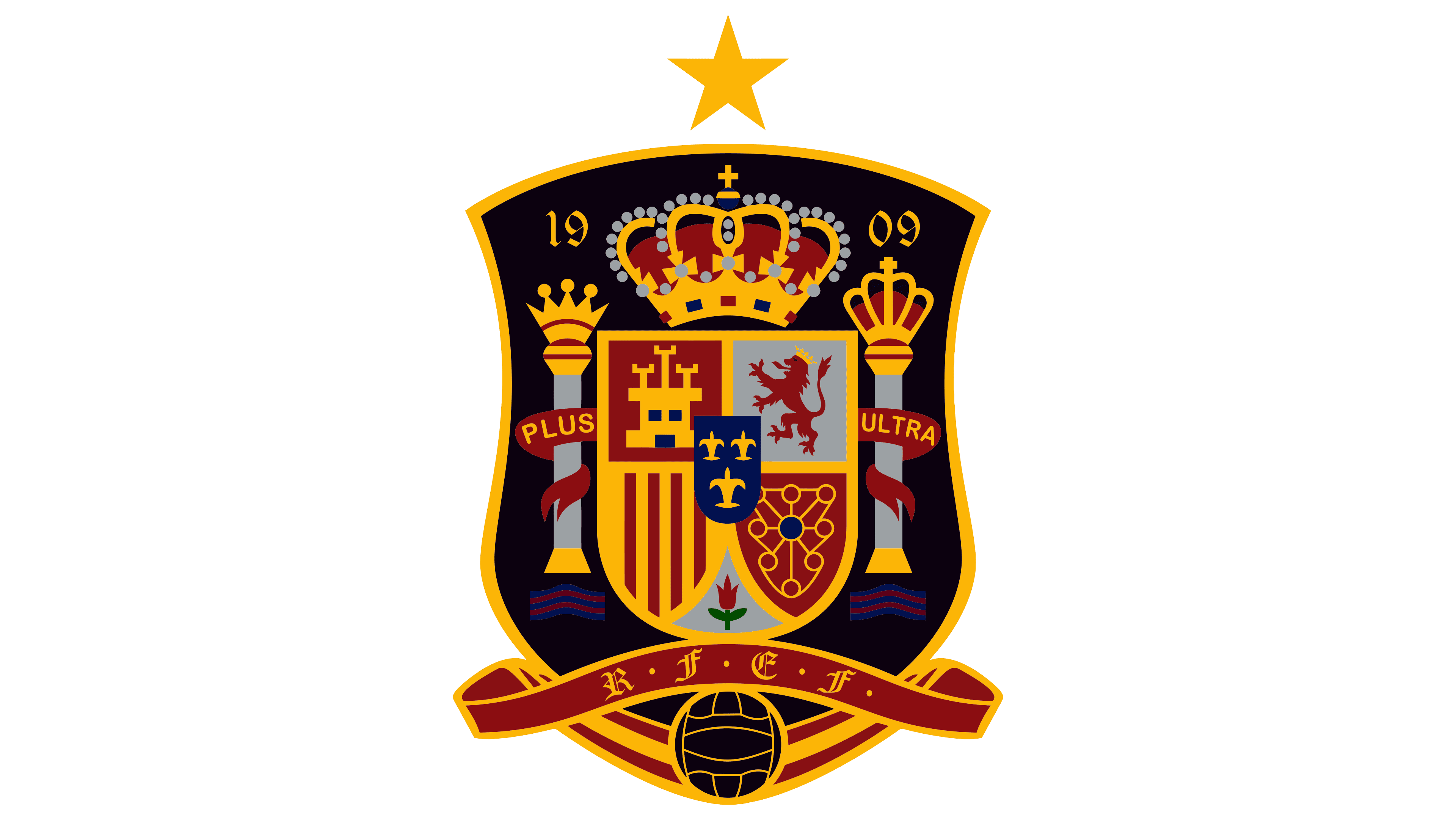
Bright and clear colors distinguish the logo. Gold contrasts beautifully with black, replacing orange, while the switch from gray to white adds expressiveness to the emblem. The main elements of the logo remained the same. The most significant addition is the star shining above the image. This celestial symbol represents a heavenly blessing and commemorates the glorious victory at the 2010 World Cup. These changes enhanced the logo’s visual impact, creating a striking and memorable representation of the team’s achievements and aspirations.
2021 – today
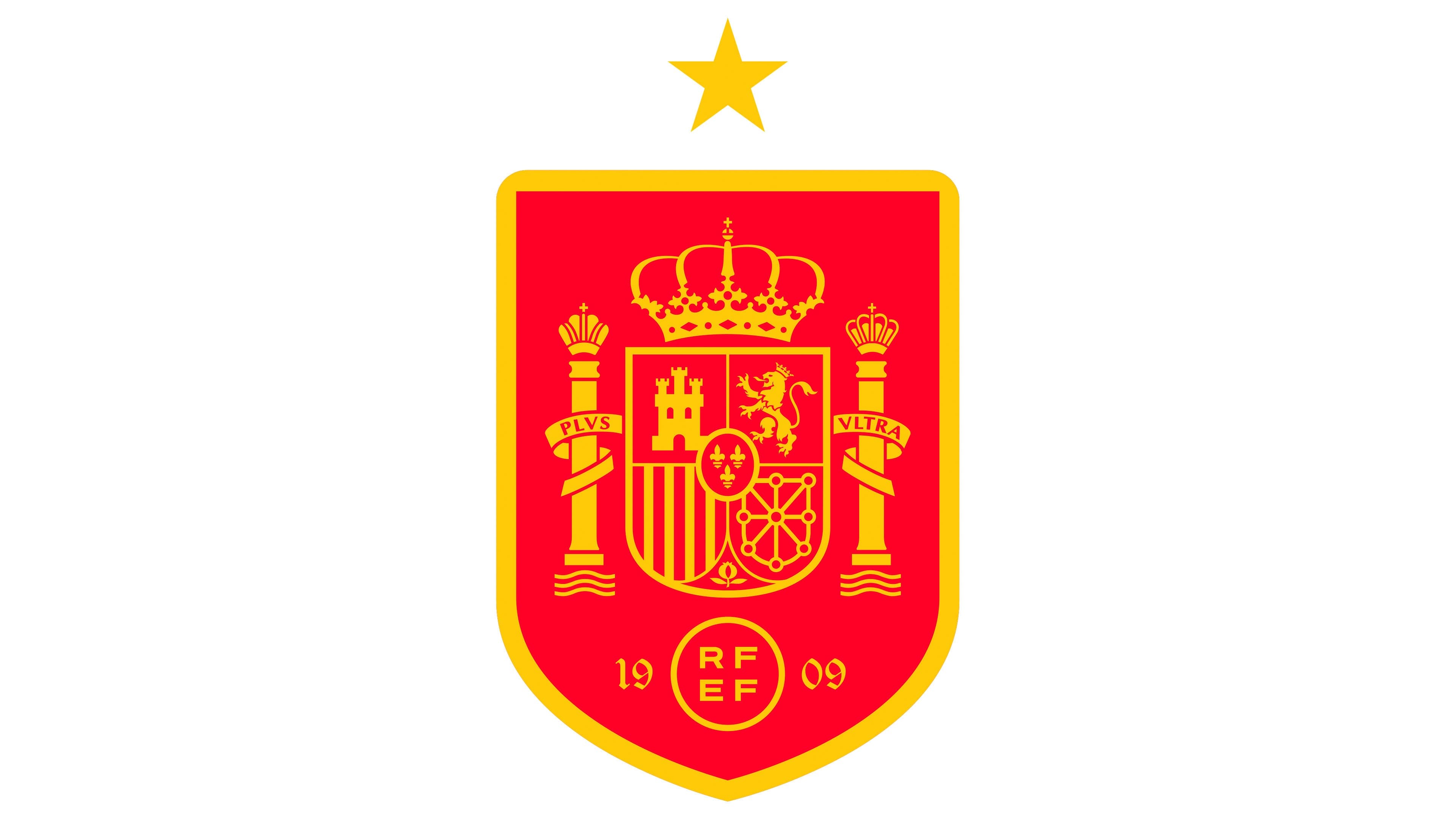
The modern design stands out with its orange-red color scheme, which details every aspect of the emblem. The shield’s contours have become more streamlined with simple, straight lines.
Below the emblem, the federation’s abbreviation appears in a circle, with two letters at the top and two at the bottom. This element echoes the light oval in the center of the national emblem, where the lilies of the French House of Bourbon, which ruled Spain, are located.
The arrangement of the four letters harmoniously mirrors the four main shields on the national emblem: a gold outline and a star complete the overall image. The national team is known for its consistent skill and successful performances in Spain’s honor.