 Stora Enso Logo PNG
Wood-based materials are produced through logging, processing, and manufacturing for the packaging, construction, and paper industries. Wood serves as a raw material for various industrial products. The Stora Enso logo represents a company that processes wood and manufactures packaging materials, paper, and construction materials.
Stora Enso was formed in 1998 through the merger of the Swedish company Stora and the Finnish company Enso. Both organizations have histories dating back to the Middle Ages. Stora originated from the Stora Kopparberg mine, first mentioned in 1288. Enso-Gutzeit was founded in 1872 in Kotka. By the 19th century, both companies had shifted from mining to forest-product production and become leaders in Scandinavia’s pulp and paper sector.
After the 1998 merger, the company became Europe’s largest producer of paper and cardboard. Its revenue was about € 10 billion. In the early 2000s, the company expanded and invested in China. In 2004, it built a plant in Guangdong. In 2007, Stora Enso acquired a 75 percent stake in Huatai Group.
The global crisis of 2008 and 2009 forced the company to close some facilities and reconsider its development strategy. Since 2009, Stora Enso has focused on packaging and biomaterials. The company began developing wood processing technologies.
In 2015, construction began in Finland on a bioproduct plant for producing microfibrillated cellulose. In 2018, it opened a demonstration plant to produce lignin. In 2019, the company invested € 1 billion to modernize the Oulu facility.
Since 2020, Stora Enso has accelerated its transition to sustainable packaging solutions and molded fibers. In 2021, the company acquired the German firm Polar Bear, strengthening its position in the European market. In 2023, the company opened a plant in Poland to produce barrier board for food packaging. In 2024, the company completed its exit from the printing paper segment.
The company operates eighty-five production facilities in more than thirty countries. Stora Enso remains one of the world’s largest producers of packaging and pulp materials.
Meaning and History
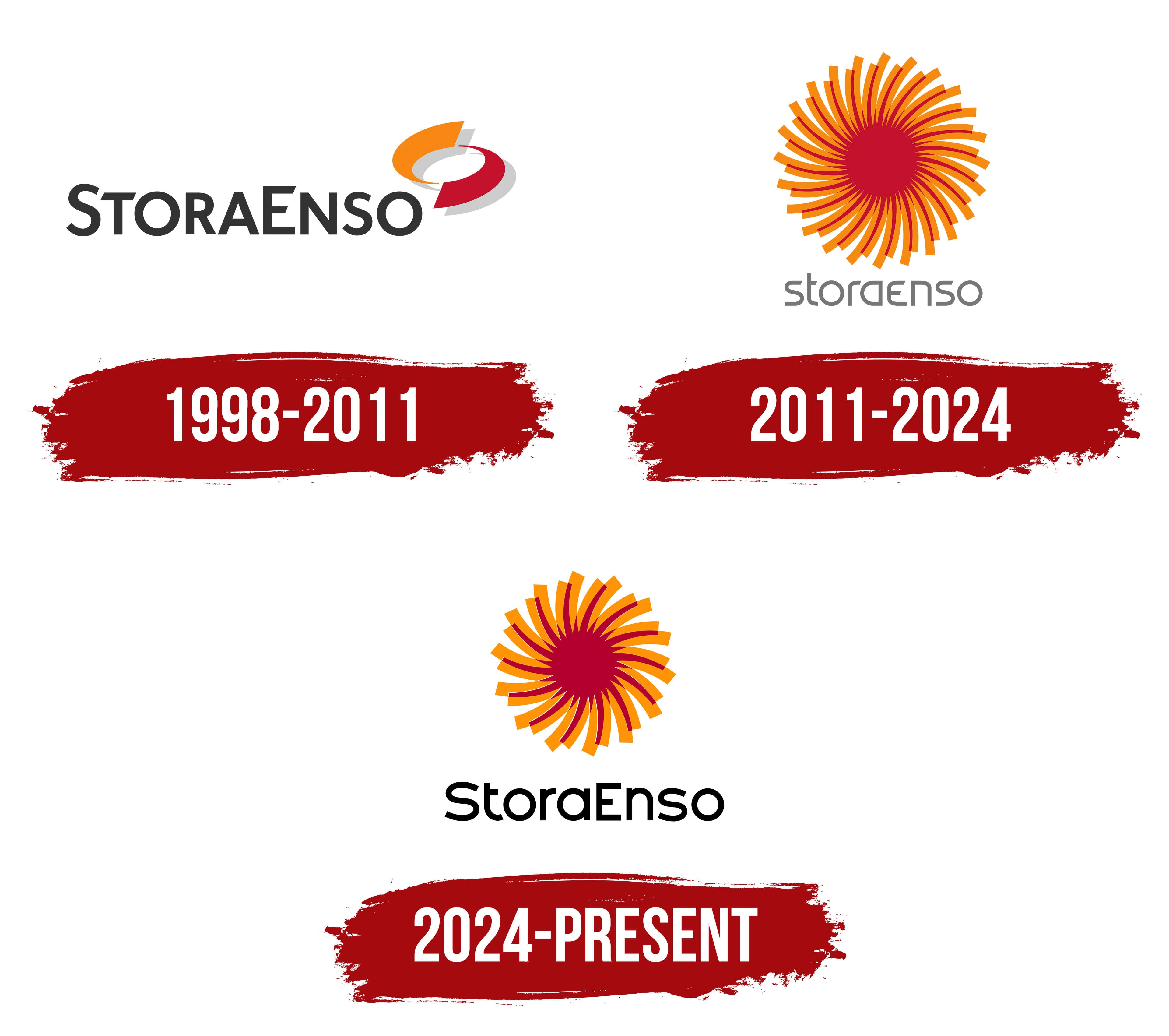
What is Stora Enso?
It is a Finnish-Swedish corporation headquartered in Helsinki, established after the merger of a Swedish mining company and a Finnish pulp and paper group. It ranks among the largest producers of forest and paper products. The main areas of activity include biomaterials, packaging, paper, and wooden construction.
1998 – 2011
The 1998 merger of Sweden’s Stora and Finland’s Enso called for a shared name and logo that preserved both companies’ recognition. Stora Enso’s first identity was presented at the end of that year, with an international rollout beginning in 1999. Helsinki agency Hasan & Partners developed the project with Diefenbach Elkins, which handled the international rollout. Art Director Ossi Piipponen created the logo and emblem. Management associated the new identity with bringing production and innovation together.
The two parts of the name carried different industrial histories. The Swedish business traces its roots to the Falun copper mines, mentioned in a document dated 1288. Stora survived from Stora Kopparberg, meaning “Great Copper Mountain.” The Finnish business began in 1872, when Hans Gutzeit opened a steam-powered sawmill in Kotka. In the late 19th century, the company established a wood pulp mill on the Vuoksi River. It received the name Enso from the Finnish “ensi,” meaning “first,” because it was the first mill of its kind on that river. The name later passed to the settlement that grew around it and became part of Enso-Gutzeit. After the merger, the group kept both historical names and produced packaging materials, pulp, wood products, and biomaterials.
The logo joined the names as StoraEnso. The dark, nearly black lettering used upright sans-serif forms. The initial “S” and “E” rose above the other letters, which were set in small capitals. An emblem made of two broad, curved ribbons appeared above the right end of the name. The upper ribbon was bright orange, and the lower one burgundy red. Their opposing curves and tapered ends left a white oval opening between them. Light gray shapes offset downward created shadows beneath the colored ribbons. The company associated red, orange, and gray with nature and environmental care.
2011 – 2024
Stora Enso’s Rethink program, launched in 2010, led to a 2011 logo update. The program’s name reflected its purpose of reconsidering established practices. The company reassessed its traditional role as a paper producer, developed renewable materials, and looked for a way to express the connection between natural resources and their reuse in its identity. Brian Kaszonyi, creative director at Helsinki agency N2, was commissioned to develop the design.
A circular symbol modeled on an open eucalyptus flower replaced the earlier emblem. The plant is directly connected to Stora Enso’s production, as eucalyptus wood played an increasingly important role in pulp manufacturing. Numerous curved bands with orange edges radiated from a dense burgundy-red center. Alternating red and orange sections and the slanted lines created a swirling pattern. Beyond the flower, the shape also suggested a circular saw blade, paper rolls, and the pages of a book being turned. The circle represented natural cycles and material recycling.
The name moved beneath the emblem. Gray “storaenso” lettering used lowercase sans-serif letters with thin strokes, rounded contours, and a single-story “a.” In one version, white “rethink.” lettering appeared in the red center, linking the emblem to the transformation program. The emblem’s colors were specified as Pantone 187 C red and Pantone 144 C orange, with Pantone 424 C gray for the lettering.
2024 – today
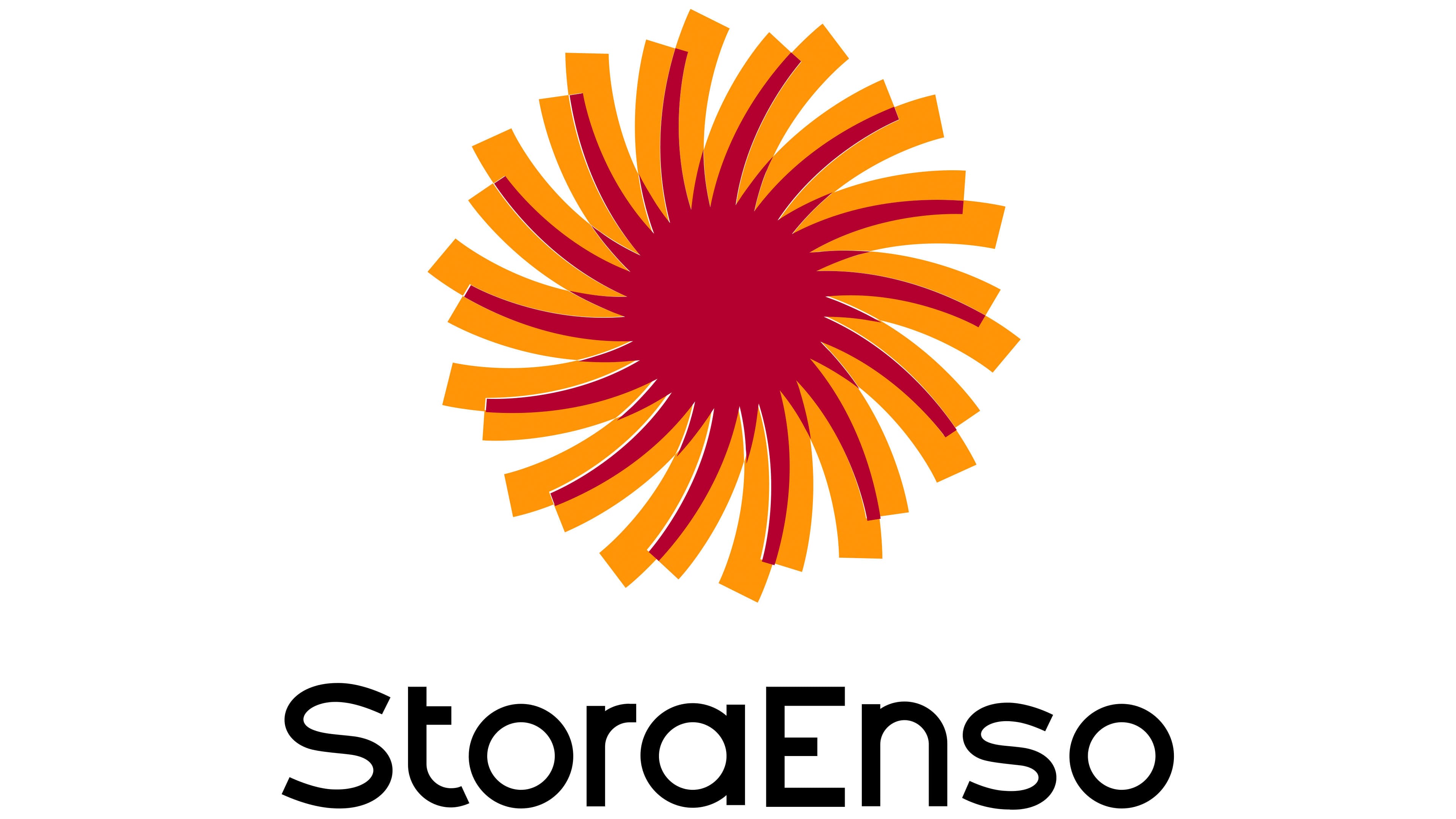
In the subsequent Stora Enso logo, the name grew larger relative to the flower. Black StoraEnso lettering replaced the gray lowercase “storaenso” beneath the emblem. Capital “S” and “E” letters once again distinguished the two names within a single wordmark. The sans-serif letters retained their rounded contours but were spaced more closely, and the full line occupied more horizontal space. Despite the tighter spacing, the strokes remained relatively light.
The red-and-orange flower above the name retained its circular shape and swirling pattern. Curved petals radiated from a dense burgundy center, alternating dark red and bright orange. There were fewer bands, and they became larger. The white “rethink” wording was removed from the center, leaving a solid red field. The new size relationship gave the name greater prominence while preserving the emblem’s established motif.