 United States Steel Logo (US Steel Logo) PNG
Steel production underpins construction, transportation, and infrastructure, where metal is used in building frames, bridges, and rails. Smelting and processing steel require strict control of parameters and consistent production processes. The United States Steel logo is associated with a company that manufactures steel and supplies materials to the construction and industrial sectors.
United States Steel Corporation was founded on February 25, 1901, through the merger of Andrew Carnegie’s steel company, John Pierpont Morgan’s Federal Steel Company, and several other enterprises. It became the largest industrial deal of its time. The market capitalization exceeded $1.4 billion, and the company’s share of US steel production reached two-thirds.
Charles Schwab was the company’s first president. Elbert Henry Gary later succeeded him and led the corporation until 1927. By the mid-20th century, US Steel had become an industrial giant. In 1958, the company employed about 260,000 people and produced over 40 million tons of steel annually.
In 1982, the corporation acquired Marathon Oil for $ 6.2 billion. In 1986, it purchased Texas Oil & Gas. In 1991, the company carried out a major stock restructuring. In 2000, the corporation acquired a steel plant in Košice, Slovakia, and renamed it US Steel Košice.
In 2002, USX was split into Marathon Oil and the revived United States Steel Corporation. In 2003, the company acquired the assets of bankrupt National Steel, thereby strengthening its position in the industry. In 2015, the company closed the Fairfield Flat-Rolled plant. In 2017, the company sold its stakes in Brazilian enterprises.
In August 2023, the company began searching for an investor. In December, it announced an agreement with Japan’s Nippon Steel. The deal was valued at $ 14.9 billion.
President Joe Biden blocked the agreement, citing national interests. After a court decision, Nippon Steel officially took control of US Steel. The US government retained a “golden share.”
Japan committed to investing 11 billion dollars in production modernization by 2028. By the end of 2024, steel shipment volumes had decreased by 8.4 percent. At the same time, the plant in Slovakia planned to increase capacity in 2025.
Meaning and History
What is United States Steel?
An American steel corporation from Pittsburgh, created through the merger of the assets of Andrew Carnegie, J. P. Morgan, and several steel companies. It became the world’s first corporation with a $1 billion market capitalization and controlled two-thirds of the US steel market. Production facilities include plants in Indiana and Arkansas, as well as in Košice, Slovakia, and pipe manufacturing for the oil and gas industry. The company owns a coking plant in Clairton and the Mon Valley Works complex. Japan’s Nippon Steel has acquired a controlling stake.
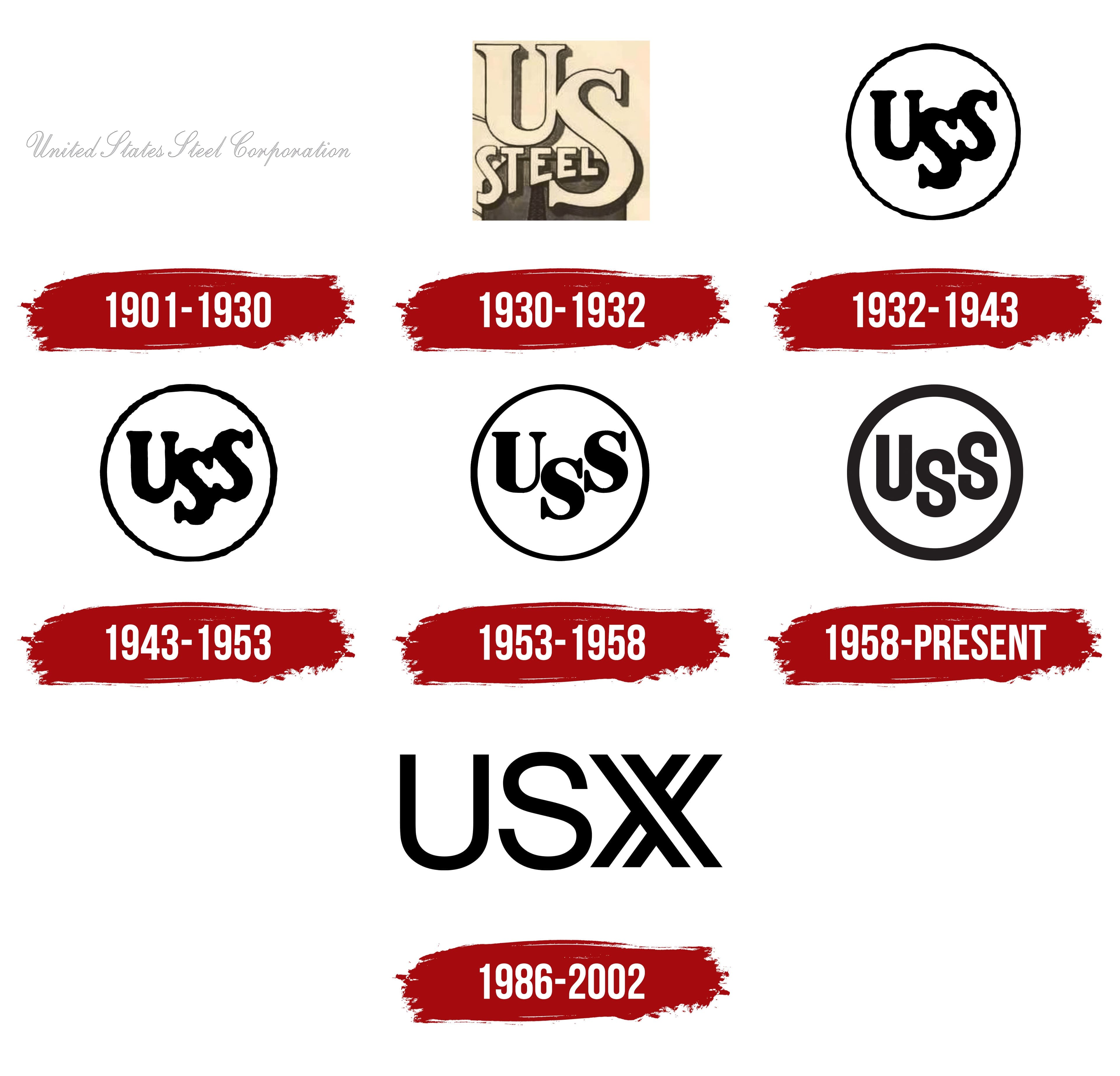
1901 – 1930
Financier John Pierpont Morgan consolidated steel companies to form the United States Steel Corporation. Established on February 25, 1901, the corporation brought together Carnegie Steel, Federal Steel, and other industry businesses. Its name identified both its country and its principal material, steel.
The full name became the basis of a wordmark. It appeared on a single line in calligraphic lettering resembling a handwritten signature. A gray outline surrounded the light gray letters. The initial capitals “U,” “S,” “S,” and “C” were large, with long flourishes. At the same time, the lowercase letters flowed into one another. All the letters slanted to the right. Thin connecting lines alternated with heavier main strokes. The lettering resembled Edwardian Script or Snell Roundhand. The name filled a long horizontal strip, with the full-name calligraphy serving as a frame or separate emblem.
In the shortened form, “U. S. Steel,” initials replaced the geographic portion of the name, while “Steel” remained. The “USS” monogram combined the first letters of United States Steel. Alongside its official name, the business was also known as “The Corporation.”
1930 – 1932
In the 1930 version, US Steel’s long name gave way to a compact, letter-based emblem inside a square frame. Large “U” and “S” initials represented the company’s shortened name, while a small “STEEL” inscription connected them to steel production. The three parts of the name were placed close together so the emblem could be reproduced in small print formats.
A beige “U” occupied the upper left. Its heavy vertical stroke rose along the frame’s left side. A larger “S” sat lower on the right, its curves filling that side of the frame. The letters had thick serifs and contrasting main and connecting strokes. A black shadow offset from their light outlines gave them depth.
“STEEL” ran beneath the “U” across the lower portion of the monogram, overlapping the “S.” It used small, closely spaced serif capitals. The inscription narrowed from left to right, following the large letter on the right. Heavy strokes and tight spacing connected the small word visually to the initials above.
1932 – 1943
By 1934, United States Steel’s emblem had gained a circular frame and a “USS” monogram. A thin black ring replaced the square frame, and a second “S” replaced “STEEL.” The full name remained outside the inner field. Three interlocking large initials represented United States Steel.
The black “U” occupied the left side, the first “S” sat lower, and the second “S” stood on the right, level with the “U.” Their heavy strokes touched and partially overlapped, creating a dense silhouette. Small white gaps between the curves of the two “S” letters separated their outlines. A thin ring surrounded the monogram, contrasting with the lettering’s weight. The circular arrangement continued in the 1943 version.
1943 – 1953
The next adjustment changed the height of the “USS” initials. They became slightly smaller while retaining their existing arrangement and position inside the circular frame. The rest of the design remained unchanged.
1953 – 1958
In 1953, the “USS” monogram was reworked to reduce the overlap between the letters. The contours of the “U” and right-hand “S” were aligned, and the serifs became thin. The middle “S” remained lower than its neighbors. Spacing between the letters stayed minimal, although their internal openings widened. The contrast between the main and connecting strokes increased.
The revised lettering brought greater order to the letters’ placement and connections. The three initials retained their staggered arrangement within a thin circular frame. The changes affected the letterforms and their meeting points, preserving the emblem’s existing structure.
1958 – today
In 1958, U. S. Steel updated its emblem and the overall identity of the corporation and its divisions. As aluminum and plastics gained wider use, the company wanted to present steel as a material for modern products. It commissioned New York design firm Lippincott & Margulies to develop the program. Russell Sandgren led the project, and Emil O. Biemann of the agency’s team is credited with designing the logo. John Wakely and his predecessor, G. Reed Schreiner, who oversaw corporate communications design, initiated the update. The new emblem was introduced on March 31, 1958.
Work began with research into public perceptions of steel and the identity materials used by the company’s businesses. A Politz Research survey found that people primarily associated steel with heavy structures and machinery. They were less familiar with its use in small household objects. Designers spent three months visiting factories and offices, comparing names, letterheads, and printed materials. Inconsistent identities made it difficult to recognize the divisions as parts of the same corporation. The research confirmed that the existing “USS” monogram was well known, so it was retained. The work focused on refining the letters and establishing consistent rules for using the emblem.
The serifs were removed from the “U” and both “S” letters, and the strokes became nearly uniform in weight. The new lettering resembled typefaces such as Futura or Gotham Rounded. The spaces between the initials increased, while the middle “S” remained lower than its neighbors. A heavy ring replaced the thin circle. In the black-and-white version, the ring and letters stood out against an open interior field. A reversed version with a light ring and lettering was provided for dark surfaces.
The circular emblem was accompanied by a division’s name and the line “Division of United States Steel” or “Subsidiary of United States Steel.” The businesses retained their individual names, while the descriptor identified their affiliation with U. S. Steel. The Graphic Standard Manual defined the symbol and lettering placement, their relative sizes, and the use of typefaces and colors.
As part of the program, Lippincott & Margulies created Steelmark, a separate emblem identifying steel as a material. A circle contained the word “Steel” and three four-pointed shapes with concave sides, known as hypocycloids. The circular frame linked the design to the “USS” monogram, while the colored shapes replaced the three initials. Yellow, orange, and blue accompanied the message that steel lightens work, brightens leisure, and widens the human world. Steelmark’s purpose allowed it to be used beyond U. S. Steel products.
In the 1960s, the program was transferred to the American Iron and Steel Institute, or AISI. Production-related meanings were added to the colors in the 1970s. Yellow represented coal, orange iron ore, and blue steel scrap.
In 1962, Republic Steel suggested that the Pittsburgh Steelers football team put Steelmark on its helmets. Changing “Steel” to “Steelers” required AISI’s permission. The team initially applied the emblem to the right side to test how it looked on a gold helmet. The one-sided placement remained. For the team’s first postseason game, the helmets were repainted black.
1986 – 2002 (corporate)
Marathon Oil’s 1982 acquisition and Texas Oil & Gas’s 1986 acquisition expanded the corporation beyond steelmaking. Its existing name referred to steel, but the company now encompassed both steel and energy businesses. On July 8, 1986, it became USX Corporation. Siegel & Gale developed the name and identity. The initial list contained 287 options. Maxus, Amerco, USSA, and USX reached the final round, with USX becoming the new name.
Dutch designer Roger van den Bergh participated in the project. He had from Thursday afternoon until Monday morning to prepare design options. The new logo consisted of large black capitals spelling “USX.” The circular frame was removed, and the initials were aligned on a common baseline instead of staggered. The “U” and “S” occupied the left side of the wordmark and had rounded sans-serif forms.
The final “X” was constructed differently from a conventional letter. It consisted of intersecting diagonal bands with doubled lines. White gaps ran along the diagonals, separating the black sections within the shape. The angular “X” contrasted with the rounded “U” and “S,” while their shared height and color united the three letters.
USX was the parent corporation, while the steel business continued operating as US Steel. The separation of the businesses was completed on December 31, 2001. The steel company became United States Steel Corporation, and the remaining energy company became Marathon Oil Corporation. From 2002 onward, U. S. Steel operated as a separate corporation with the circular “USS” monogram.
The historic name was also retained when the combination with Nippon Steel was completed on June 18, 2025. Under the terms of the transaction, the company kept the U. S. Steel name and its United States Steel headquarters in Pittsburgh.