


 SW Logo PNG
The Sesame Workshop logo symbolizes the path to the immeasurable treasures of knowledge that viewers discover through the company’s programs. The emblem reflects the brand’s main goal: supporting children’s development and learning by providing unique content that helps kids grow, learn new things, and build valuable skills. The logo conveys that Sesame Workshop entertains and paves the way for learning and development, inspiring children to discover new worlds full of opportunities and knowledge.
Sesame Workshop began in 1968 as Children’s Television Workshop, founded by psychologist Lloyd Morrisett and television producer Joan Ganz Cooney. Morrisett had noticed how closely his young daughter watched television and questioned whether the medium could support early learning. Cooney’s production background helped turn that idea into a nonprofit project for preschool children, with a strong focus on families from low-income communities.
In 1969, the organization launched Sesame Street, its main and best-known project. The series combined Jim Henson’s puppetry, music, humor, and structured educational material. It quickly became a major part of preschool television. In the 1970s, the group expanded the brand through Sesame Street Magazine, character-based toys, and learning products for children and parents.
The 1980s brought wider educational work. In 1983, Children’s Television Workshop launched 3-2-1 Contact, a science series for older children. During the 1990s, Sesame Street grew internationally through localized versions with regional characters, languages, and lessons adapted to different countries. In 2000, the organization changed its name to Sesame Workshop to reflect its work across television, digital media, and educational tools.
In the 2000s, the group developed apps, websites, and online games. In 2015, it partnered with HBO to fund new Sesame Street episodes and projects. Sesame Studios followed in 2016, creating digital content for YouTube and other platforms. Sesame Street in Communities launched in 2018; the show marked its 50th anniversary in 2019, and 2020 content addressed stress and uncertainty for families. In 2021, HBO Max released The Not-Too-Late Show with Elmo. By 2023, the organization remained active in early education, media, and international outreach.
Meaning and History
What is SW?
This nonprofit organization, known for creating “Sesame Street,” pioneered children’s education and entertainment. It revolutionized preschool learning by using television to engage children and teach them important skills. The organization covers a range of topics, from basic literacy and math to social issues such as diversity and inclusion. Through vibrant characters like the Muppets and curriculum-based educational stories, the organization continues to impact education. Beyond the TV show, it produces books and digital media and adapts its programs for diverse cultural audiences, influencing children’s development worldwide.
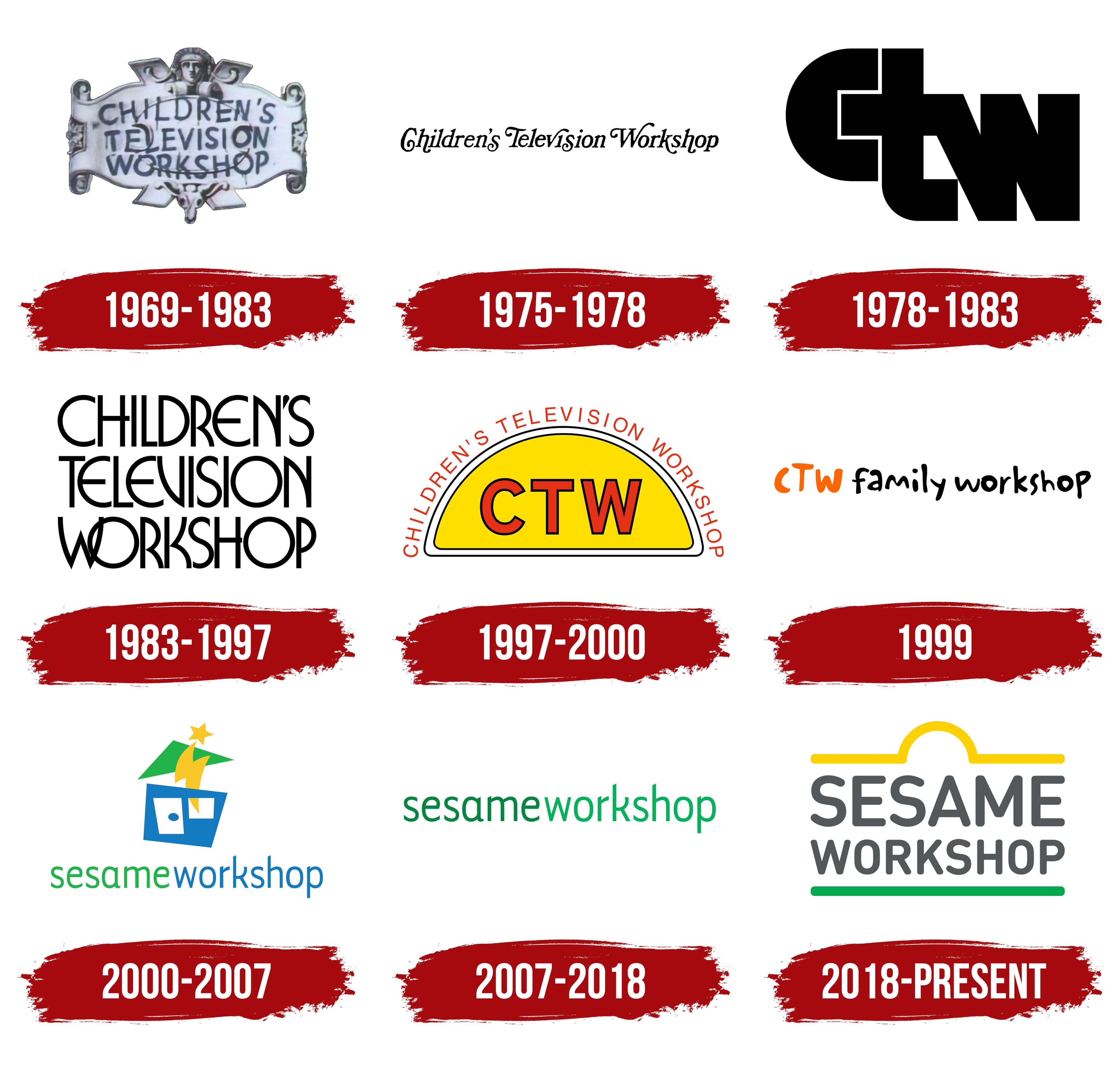
1969 – 1983
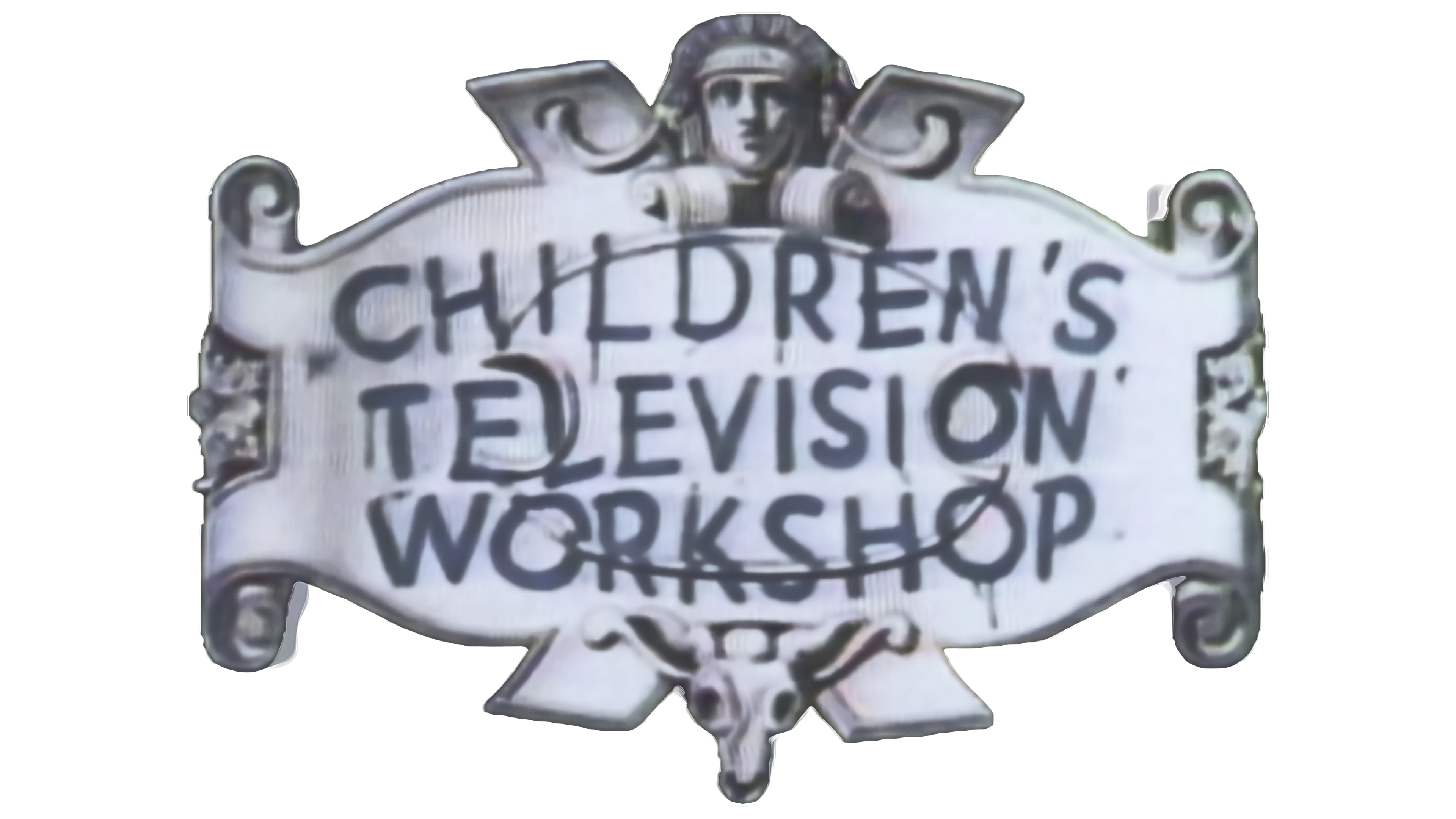
The organization’s original name, Children’s Television Workshop, appeared on a scroll styled like ancient maps from adventure films. This design emphasized the organization’s important mission of preparing children for school through television. With its captivating visual style, the emblem aimed to make the learning process both beneficial and exciting. At the top and bottom of the scroll were heads symbolizing a ship’s figurehead, ready to embark on discoveries and unexplored shores. The handwritten lettering reinforced the association with education and school activities and underscored the organization’s primary goal of learning through television.
1975 – 1978

After successfully launching two popular children’s shows, the company expanded its repertoire by including programs for an adult audience. This move led to a logo redesign. The name was written in an elaborate black font reminiscent of Disney’s style. The logo had a magical, fairy-tale-like appearance that reflected the variety of content produced. This design successfully combined elements suitable for children’s educational programs and more mature, intellectual shows while maintaining a connection to the brand’s educational mission.
1978 – 1983

The emblem created in the late 70s has an impressive and serious appearance. Three massive black letters, CTW, are tightly intertwined, like puzzle pieces, forming a cohesive composition. This design approach symbolizes the structured, reliable educational programs the company offers to preschools. The logo emphasizes an organic blend of learning forms, including cartoons, lessons, and books. The concept reflects the brand’s essence: a comprehensive approach to education through entertaining programs, embodied by the puzzle idea, where each element complements the other to create a unified system.
1983 – 1997

The company focused on creating children’s content, including science-oriented series. The emblem from this period features thin, flexible letters arranged in three levels, giving the logo a neat rectangular shape with straight edges. The font blends rounded and straight lines, creating a light, playful feel while still conveying professionalism. This approach emphasizes the company’s mission to create educational and entertaining programs that present knowledge in an accessible, engaging way, making it easy for children to absorb.
1997 – 2000
In the new logo, the rising sun symbolizes hope for a bright future, reflecting the optimism accompanying the company’s reorganization and the influx of private investment. The yellow half-circle conveys warmth and emerging energy. Against this bright background, the company’s acronym stands out in red letters with a black outline, giving the emblem clarity and expressiveness. The full brand name is in thin red font along the edge of the circle, rather than in the sun rays. Overall, the logo conveys a joyful mood and lightness, evoking associations with childhood and fun, while its geometric shapes add order and harmony.
1999

The company launched a new channel, Noggin, to broadcast its programs while updating its website. The channel’s logo resembles cartoon credits, emphasizing its connection to on-screen viewing. The letters in the name are designed in an unconventional style: they vary in thickness, height, and angle, giving the logo a playful, childlike ease. The red acronym flows seamlessly into the new website name, “Family Workshop,” specifically created for families with young children. The site’s content targets preschoolers and their parents, offering educational and developmental programs in an easy, engaging way.
2000 – 2007
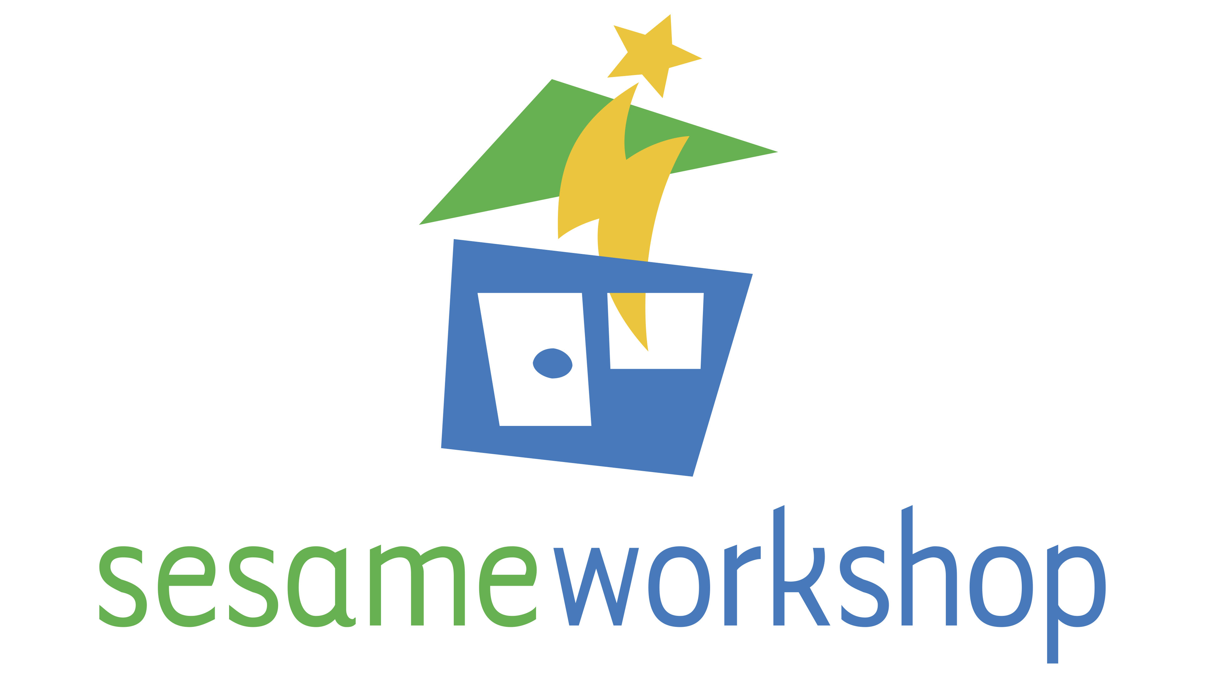
The company updated its logo after a leadership change and rebranding, featuring a bright, symbolic design. The image resembled a child’s building block: a blue house with a green roof that appeared to soar upward like a star floating in the sky. This element reflected the brand’s main goal of supporting children in their aspirations, giving them a great start in life, and helping them succeed, turning them into “stars.”
The new name, Sesame Workshop, was now written as one word and styled with thin, elegant letters. The name refers to the famous phrase from the tale of Ali Baba and the Forty Thieves: “Open, Sesame,” which unlocked a path to vast treasures. In the brand context, this phrase symbolizes the “treasures of knowledge,” highlighting its educational mission. The logo also referenced their iconic show, Sesame Street, which played a key role in the company’s educational programs.
The colors visually separate the words. The green color of “Sesame” was associated with a seed, symbolizing life potential, growth, and wisdom. The blue word “Workshop” emphasizes the creation and learning process, drawing attention to the ongoing work of unlocking children’s potential.
2007 – 2018
The brand’s emblem was simplified to a concise lowercase name, set in two shades of green. This choice emphasizes the company’s educational mission. The calligraphic style hints at elegance and attentiveness in the approach to learning. The green tones in the logo reflect work with the younger generation, highlighting growth and development, as well as the brand’s contribution to the planet’s future.
One of the company’s most significant steps was creating The Joan Ganz Cooney Center, a research center dedicated to studying and improving digital learning for children. This expanded the brand’s influence in education, reinforcing its leadership and innovative approach to teaching. The emblem symbolizes educational goals, the pursuit of progress, and creating a better world for future generations.
2018 – today
The company name “Sesame Workshop” sits between two lines, each with symbolic meaning. The lower green stripe symbolizes the earth, plants, and all things that grow and develop. This green line represents the soil in which the “seeds” of knowledge, planted through the company’s educational projects, take root.
The upper line, yellow, is slightly curved in the center and resembles the rising sun. It symbolizes the light and warmth that help these “seeds” grow. The curve represents a sprout breaking through the ground, reaching for the light of knowledge and growth. This visually represents how the company, through its programs, helps children grow and learn.
The logo’s font is modern and simple, with soft, rounded edges that make it accessible and friendly for viewers of all ages. The logo uses no overly complex shapes; everything is clear, understandable, and easy to read. This aligns with the company’s goal of being approachable and accessible for children and parents.
The logo design echoes the classic emblem of their flagship project, “Sesame Street.” It has the same minimalism and clarity of lines. Like the show, this logo embodies a brand representing a whole concept: an educational platform where knowledge, like seeds, grows with careful nurturing.
When the company created this logo, its development was directly connected to the “Sesame Workshop” mission, helping children learn through play and fun. Green and yellow represent nature and life and reflect the company’s work in harmony.