 Swedbank Logo PNG
Everyday financial transactions include card payments, account management, mortgage applications, and business services. In Sweden and the Baltic countries, many of these tasks are handled by a single bank, which supports individuals at various stages of life. The Swedbank logo represents a financial group that provides banking services to individuals and entrepreneurs, including payment transactions, loans, and asset management.
Swedbank traces its history to 1820. That year, the first savings bank opened in Gothenburg. The idea of encouraging savings spread throughout the country. By the beginning of the twentieth century, hundreds of local savings institutions operated in Sweden. In 1900, the banks formed the Association of Savings Banks. In 1926, they began publishing the magazine Lyckoslanten, which promoted a culture of saving.
At the same time, the cooperative banking system was developing. It received a legal framework in 1915. By the mid-1930s, the number of agricultural credit cooperatives had reached about eight hundred.
The 1990 financial crisis became a turning point for the banking sector. In 1992, eleven major regional banks merged to form Sparbanken Sverige. The cooperative institutions formed Föreningsbanken AB. Both organizations carried out restructuring and listed their shares on the stock exchange.
In 1997, Sparbanken Sverige and Föreningsbanken AB merged. The result was FöreningsSparbanken. The bank had a nationwide network and served about five million customers. In 1998, it acquired the Estonian Hansabank and began expanding into the Baltic region.
In 2006, the bank adopted its modern name, Swedbank AB. The visual elements were unified with the symbols of the savings banks and Hansabank. In 2008, during the global financial crisis, the bank incurred losses from loans in the Baltic countries and received government support.
In 2013, Swedbank completed the rebranding of its Baltic divisions. In the same year, the bank exited Russia and Ukraine. In 2014, it opened a new headquarters in Sundbyberg.
In 2019, a scandal broke out over money laundering through Baltic branches. The investigation revealed suspicious transactions totaling tens of billions of dollars. In 2020, the Swedish regulator fined the bank four billion kronor for compliance violations.
In 2024, the appeals court found former CEO Birgitte Bonnesen guilty of misleading investors during the trust crisis. Today, Swedbank remains the largest bank in Sweden and one of the leading financial institutions in the Baltic countries. The bank serves millions of clients and continues to cooperate with independent savings banks.
Meaning and History
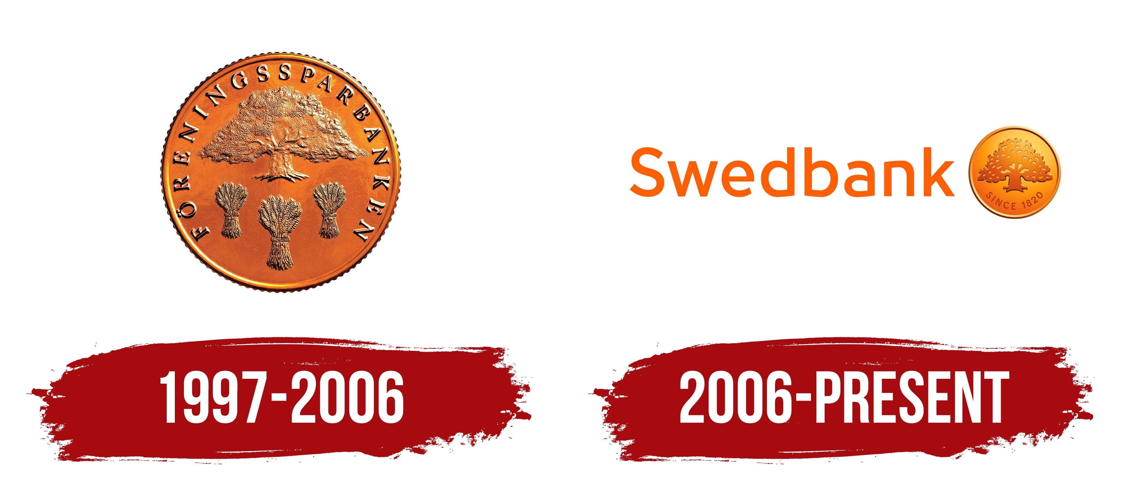
What is Swedbank?
A major Swedish bank that originated from the city’s first savings bank. It holds about one-fifth of the country’s banking market and is a leader in Estonia, Latvia, and Lithuania. It serves millions of private clients and hundreds of thousands of companies through a network of branches in Sweden and the Baltic states. Ownership is divided among savings organizations, cooperatives, and pension funds. The bank offers services in accounts, loans, insurance, investments, and leasing. Assets exceed 2.5 trillion kronor, and most profit comes from interest and commission income.
1997 – 2006
Swedbank arrived at its current name through the long history of Swedish savings banks. Its earliest roots date to 1820, when Sweden’s first savings bank opened in Gothenburg. The Swedbank brand appeared in 2006 following the FöreningsSparbanken period and the acquisition of Hansabank. The name combines “Swed,” meaning Sweden, with “bank.” It was introduced for the new Nordic-Baltic banking group.
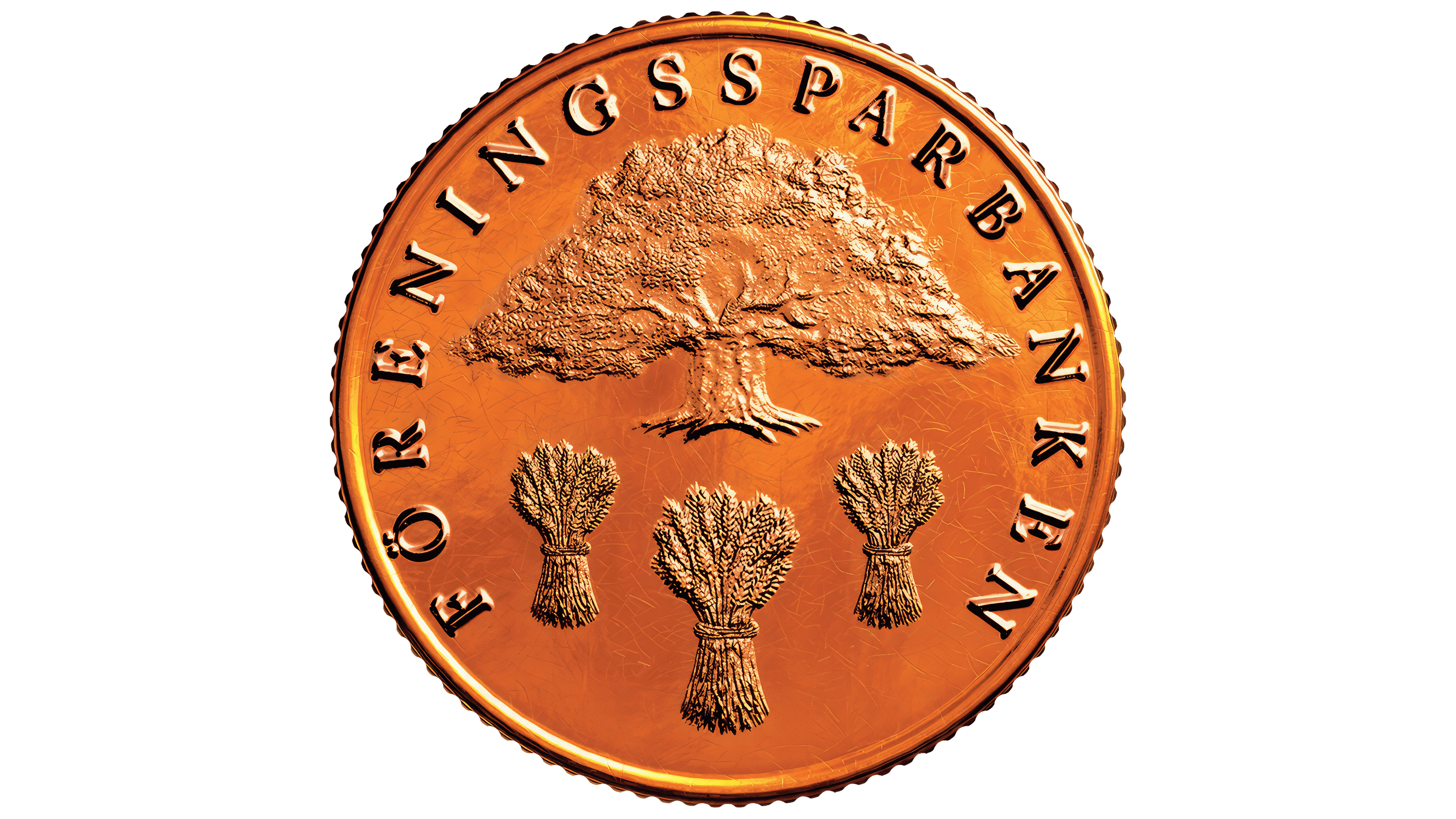
Before becoming Swedbank, the bank went through the merger of Sparbanken Sverige and Föreningsbanken. Plans for the merger were announced in February 1997, and the FöreningsSparbanken logo was presented to the public in September 1997. Lars Hall created it by combining the Savings Banks oak with the three sheaves of Föreningsbanken. According to Hall, the copper coin represented tradition and a new beginning. In contrast, the copper color preserved the image of a “bank for the people.”
The oak had long been part of Swedish banking culture. Artist Acke Kumlien drew it in 1928. In 1932, the image was registered as a shared trademark for Swedish savings banks. A motto about security based on savings appeared beneath the oak. In 1940, illustrator Arvid Olsson created an advertising film in which a large oak grew from a small acorn. In 1942, the image was redesigned as a green-and-white emblem that later became a classic symbol of Sweden’s savings banks.
A four-color version of the oak appeared in 1981. It was used alongside the classic version for approximately 10 years. In 1991, Sparbanken introduced the oak in a blue, yellow, and red color scheme, while some independent savings banks retained the earlier version.
The 1997 FöreningsSparbanken logo resembled a round bronze and copper coin with embossed details. A spreading oak stood in the center with a broad crown, small leaves, a textured trunk, and roots at the base. Beneath the tree were three identical sheaves of wheat tied in the middle.
The uppercase inscription FÖRENINGSSPARBANKEN ran around the outer circle. The serif typeface resembled classic fonts such as Times New Roman. The letters had a three-dimensional appearance, as if cast in metal, and followed the coin’s circular shape. The copper color with a slight golden tone connected the bank’s history, the savings tradition, and Föreningsbanken’s agricultural motif before the transition to the Swedbank name in 2006.
2006 – today
The Swedbank name had been used for the bank’s international operations since 1983, although the group operated under another primary name at the time. During the planned merger between FöreningsSparbanken and SEB in 2001, the name “SEB Swedbank” was considered. The full transition to Swedbank took place on September 8, 2006, when the bank changed its name and adopted an updated visual identity.
The bank retained the copper coin during the renaming process. Audience research showed that people had a strong emotional connection to the image. The composition was revised. The Föreningsbanken sheaves disappeared, while Josef Hugo Jönsson’s oak remained. Swedbank preserved its connection to Swedish savings banks while reducing its association with the former FöreningsSparbanken brand.
Orange became the main color of the new identity. According to Swedbank, it combines the former symbols of FöreningsSparbanken and Hansabank. For the Nordic-Baltic group, the color connected its Swedish heritage with its international role following the acquisition of Hansabank.
The current logo consists of the Swedbank wordmark and a round coin containing an oak on the right. The name appears in orange letters. The first “S” is uppercase, while the remaining letters are lowercase. The sans-serif typeface resembles Myriad or Helvetica Rounded. The wordmark has a softer appearance than the old FöreningsSparbanken coin design. It is better suited to the banking brand introduced in 2006.
The circular symbol is designed as a stylized golden-orange coin. Inside it is an oak with a broad crown and a short, thick trunk. Its branches and leaves form a dense pattern with cutout areas. The tree is close in color to the background, while shadows and highlights create depth. The inscription SINCE 1820 follows the curve along the bottom of the circle.
Swedbank’s brand guidelines describe the logo as the primary carrier of the company’s visual style. Two versions are used: the main version with an orange wordmark and a reversed version with a white wordmark. For joint communications involving Swedbank and independent Savings Banks, the coin may be used without the Swedbank name.