Swisscom: Brand overview
Swisscom, derived from Switzerland’s long-standing public telecommunications services, emerged in 1998 from the privatization and subsequent demerger of the former Swiss company PTT (Post, Telegraph, and Telephone). PTT has controlled the country’s telegraph and telephone services since the late 1800s.
The Swiss telegraph network, established as a state-owned enterprise in 1851, paved the way for the creation of a state-owned telephone network in 1877. However, it was not until 1997 that the government decided to privatize PTT, splitting it into two separate entities, Swisscom for telecommunications and Swiss Post for postal services.
The following year, Swisscom was officially established as a state-owned company and debuted on the stock market, with the Swiss government retaining a controlling stake (51%). In the early 2000s, Swisscom broadened its horizons by launching various telecommunications services, including mobile, broadband, and television within Switzerland.
In 2006, Swisscom acquired Italian broadband service provider Fastweb, an important step in the company’s overseas development. Three years later, the company embarked on a major initiative to expand its fiber-optic networks throughout Switzerland.
Today, Swisscom holds a leading position in the Swiss telecommunications market with a share of more than 60% in the key sectors of mobile, broadband, and TV. The company is also a pioneer in new technologies such as 5G, cloud computing, and the Internet of Things (IoT). Fastweb continues to be one of the leading broadband providers in Italy.
Swisscom has transformed itself from a component of a state monopoly to the largest telecommunications operator in Switzerland and has also made a name for itself abroad. Despite the public listing and the expansion of its business scope, the company is still mainly owned by the Swiss government.
Meaning and History
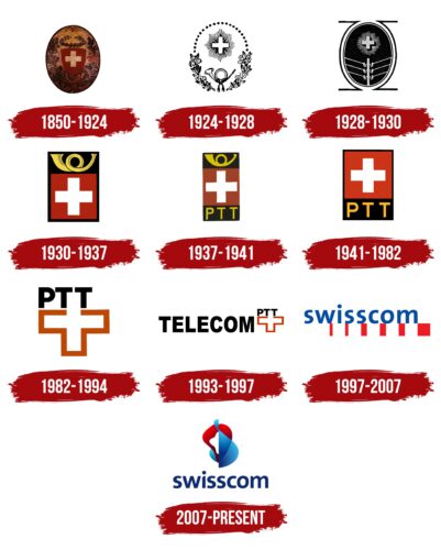
1850 – 1924
1924 – 1928
1928 – 1930
1930 – 1937
1937 – 1941
1941 – 1982
1982 – 1994
1993 – 1997
1997 – 2007
2007 – today
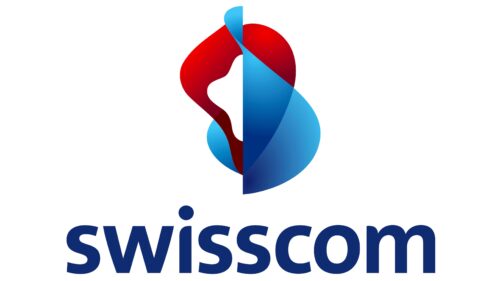
The Swisscom logo is based on the name, which consists of two main parts: “Swiss” (indicating the country where the company is located) and “communications” (the type of services offered). The text is colored in blue and placed under an abstract graphic design in red and blue tones. The unusual image includes two indeterminate figures with clear contours. The text uses a lowercase font with soft glyphs. Most of the letters, including the “i,” have curves, except for the “w,” which stands out in a more formal style.
The combination of red and blue in the abstract graphics is reminiscent of a little dance of colors. It’s as if the shapes are talking to each other, similar to the way Swisscom helps people communicate. The blue text seems light and casual, like a calm lake in Switzerland. The letter “w” stands apart in its formal style, like a serious businessman in a room full of artists. It’s different, but it’s great.
Swisscom color codes
| Dark Sapphire | Hex color: | #0f2b71 |
|---|---|---|
| RGB: | 15 43 113 | |
| CMYK: | 87 62 0 56 | |
| Pantone: | PMS 280 C |
| Lapis Lazuli | Hex color: | #0060ae |
|---|---|---|
| RGB: | 0 96 174 | |
| CMYK: | 100 45 0 32 | |
| Pantone: | PMS 300 C |
| Red | Hex color: | #ff0000 |
|---|---|---|
| RGB: | 255 0 0 | |
| CMYK: | 0 100 100 0 | |
| Pantone: | PMS 1655 C |


