![]() TeamViewer Logo PNG
TeamViewer Logo PNG
The TeamViewer logo conveys the idea of quick, easy connections between users, regardless of distance. It emphasizes the reliability of a platform that became a standard tool for remote work and support.
TeamViewer appeared in 2005 in the German town of Göppingen as a simple solution for remote computer control. The first version used VNC technology, adapted for household tasks. The company quickly gained recognition for its policy of offering free use to private individuals and paid licenses to businesses.
In 2014, TeamViewer was acquired by the British private equity firm Permira for approximately € 870 million. Under its management, the company transitioned to a subscription model and was listed on the Frankfurt Stock Exchange in September 2019, with a total valuation of € 5.25 billion.
Since 2020, TeamViewer has actively acquired companies and developed augmented and mixed reality technologies, including Ubimax and Upskill. TeamViewer software products are compatible with major platforms, including Windows, macOS, and Linux.
Today, TeamViewer is headquartered in Göppingen and has offices in numerous countries worldwide, employing approximately 1,400 people. Among the company’s clients are hundreds of thousands of commercial organizations globally.
Meaning and History
![]()
What is TeamViewer?
It is a popular software application that enables remote control of computers over the internet. Tech support specialists and remote employees use the program to access devices from anywhere in the world. TeamViewer is easy to use: users install it and exchange an ID with their partners. It supports cross-platform operations, including mobile devices.
2005 – 2006
![]()
The company’s first visual representation to the world was concise and effective. In 2005, the developers of the remote-access app introduced a simple symbol. Two black arrows in a circle symbolized the essence of the software: a connection across distance.
A white circle within a blue square represented the stability of the connection. The name appeared on the left side, set in white text against a calm gray background. The simple, neat Helvetica Bold font supported the company’s technical style.
Blue reflected digital technologies, while gray symbolized professionalism and reliability. This visual style served as the foundation for all subsequent TeamViewer logos.
2006 – 2008
![]()
Instead of frequent experiments, the company preferred a gradual evolution. The logo retained its recognizability, undergoing only minor updates. The blue square with arrows moved to the left, a typical placement for this type of graphic element.
The “TeamViewer” name kept the Helvetica Bold font, emphasizing the technical style. The gray background received a gradient effect, adding depth and dimension.
The main addition was the slogan “Give Your Desktop Wings,” written in lowercase, to emphasize the ease of remote management. The slogan featured a reflection effect, subtly conveying transparency in connection.
This version of the logo illustrated TeamViewer’s desire to expand the possibilities of remote work.
2007 – 2016
![]()
The company’s main idea in 2007 was a change of perspective. The previous flat logo gained depth and a new viewing angle. The blue square reflected light and had a glossy finish, emphasizing technological advancement.
The traditional arrows remained unchanged, symbolizing two-way data transfer and reflecting the primary benefit of access from anywhere in the world.
The name was highlighted in blue. The font was updated to a clear, thin, modern Helvetica Neue, which fits the digital context.
The shift to a brighter blue symbolized the software’s ease of connecting users. The company chose it to evoke the simplicity of remote interactions.
2016 – 2023
![]()
Blue became the logo’s sole and final choice. In 2016, the company moved away from glossy and 3D effects, adopting a simple flat style. The square with rounded corners emphasized user-friendliness and accessibility.
The name was written using two different fonts. The first part, “Team,” was in bold Helvetica Bold, while the second part, “Viewer,” appeared lighter and thinner in Helvetica Light. This contrast in fonts reflects the service’s primary function: combining solid reliability with simple ease.
The double-sided arrow within the circle inside the square continued to symbolize two-way communication. The arrow remained a symbol of exchange and remote access, the application’s core function.
The minimalist design kept the brand relevant and professional, and the bright blue color emphasized user trust and service reliability.
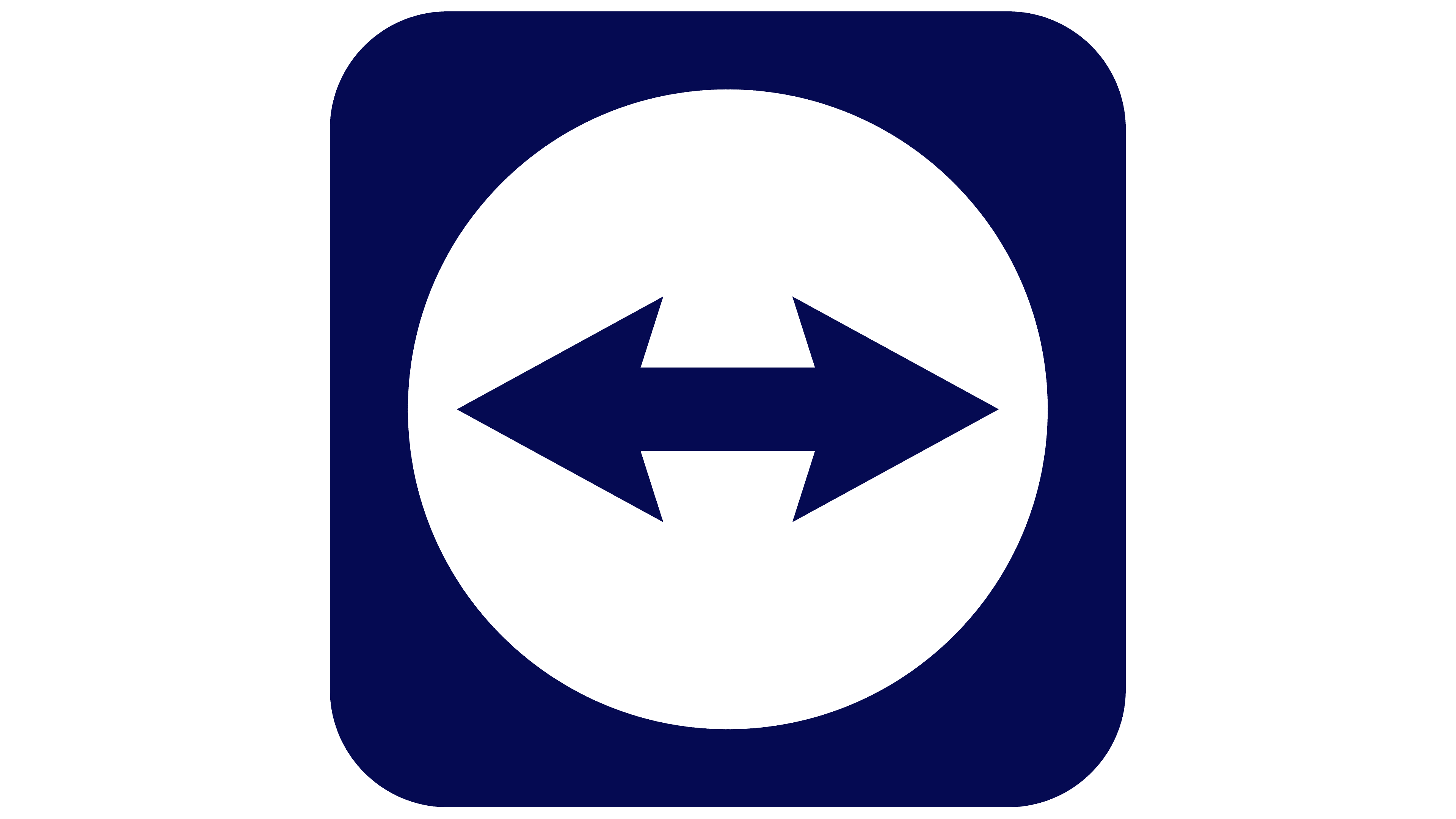
2023 – today
![]()
In the new TeamViewer logo, designers at Interbrand focused on simplicity and the precision of forms that reflect the brand’s digital nature. Instead of bright tones and gloss, the company shifted to a dark blue shade reminiscent of Navy Blue. The updated color emphasizes the product’s technical specificity and reinforces a sense of professionalism.
The bidirectional arrow symbol was left unchanged. It was placed at the center of a circle inscribed within a square with soft, rounded corners. The arrows pointing in opposite directions convey the idea of mutual data exchange and remote interaction between users. The square and arrows are rendered in dark blue, while the circle remains white.
The brand name TeamViewer was set as a single word, with emphasis on the capital letters T and V. The Euclid Circular B typeface was used for the lettering, characterized by concise sans-serif forms and soft, rounded lines. The typeface conveys a modern, technological style, reflecting a company focused on remote interaction and digital communication.
The changes strengthened TeamViewer’s image as a reliable, professional service while preserving the recognizable elements of the previous design.