 Telkom Indonesia Logo PNG
Telecommunications include mobile communications, the internet, and digital services that facilitate data exchange and everyday communication. These services run on an extensive network that covers major cities and remote regions. The Telkom Indonesia logo represents a company that provides telecommunications services and develops communications infrastructure across Indonesia.
Telkom Indonesia traces its history to October 23, 1856. That day, Dutch colonial authorities launched the first telegraph line between Batavia and Buitenzorg. By the early twentieth century, postal, telegraph, and telephone services had been combined into the state agency PTT. This became the foundation of the country’s national telecommunications system.
After independence was declared in 1945, the Indonesian government took control of the network. In 1965, postal and telecommunications functions were divided between PN Pos Giro and PN Telekomunikasi. In 1974, PN Telekomünikasyon was transformed into Perumtel. In 1980, the international division was split into a new organization, Indosat.
In 1991, Perumtel became a joint-stock company, PT Telekomunikasi Indonesia, known as Telkom. In 1995, the company conducted a large share offering in Jakarta, New York, and London. It was the first time an Indonesian corporation achieved an international listing. The state retained a controlling stake.
In 2001, the subsidiary Telkomsel was created. It became Indonesia’s largest mobile network operator. In 2002, Telkom acquired internet provider Telkomnet, strengthening its position in the digital services market.
Since 2008, the company has modernized its infrastructure on a large scale and implemented digital technologies. In 2013, the company became the first in the country to launch 4G LTE. In 2015, it introduced a strategy for transitioning to a digital operator model. The main areas of development became cloud solutions, media content, and financial technology.
In 2018, the company acquired Intelsat Corporation’s Indonesian division. In 2020, Telkom launched the Indonesia Fiber to the Home program to expand its high-speed internet access network.
The company serves more than 170 million customers. It is listed on the Indonesia Stock Exchange and the New York Stock Exchange and remains the country’s largest telecommunications operator. The government owns fifty-two percent of its shares.
Meaning and History
What is Telkom Indonesia?
The largest telecommunications corporation in Indonesia, headquartered in Bandung, controls the fixed-line market and holds a monopoly on local and international telephone services. Its structure includes Telkomsel, which has about 160 million subscribers. Main areas include IndiHome (internet, television, telephony), mobile services, corporate solutions, cloud and data centers, and wholesale infrastructure with international cable lines. The company is developing 5G in 13 cities, collaborating with Disney+ Hotstar, and promoting IoT through Telkom Smart. Its main competitors are Indosat Ooredoo and XL Axiata.
1965 – 1974
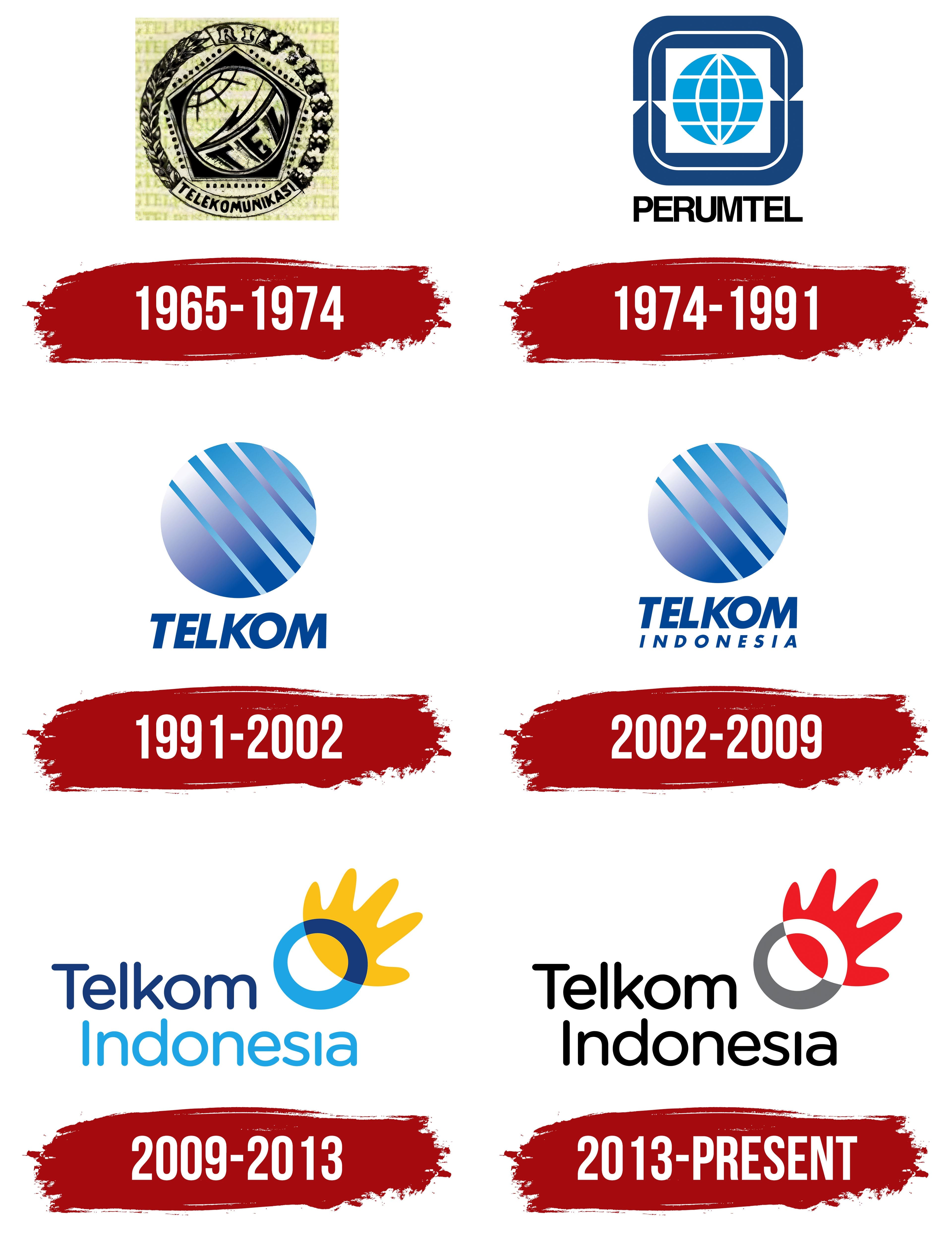
The name PN Telekomunikasi was introduced on July 6, 1965, when postal and telecommunications services were divided between two state organizations. Both had previously been managed by PN Postel, established in 1961. The telecommunications organization received a name that reflected its work and an emblem that incorporated symbols of public service. PN Telekomunikasi marked the beginning of Telkom Indonesia, a partly state-owned company providing telecommunications and digital services.
The company’s roots trace back to a telegraph line connecting Batavia and Buitenzorg, now Jakarta and Bogor. Dutch colonial authorities opened the line on October 23, 1856. In the early 20th century, postal, telegraph, and telephone operations were brought together under a single government service. That organization later became the basis for enterprises in independent Indonesia.
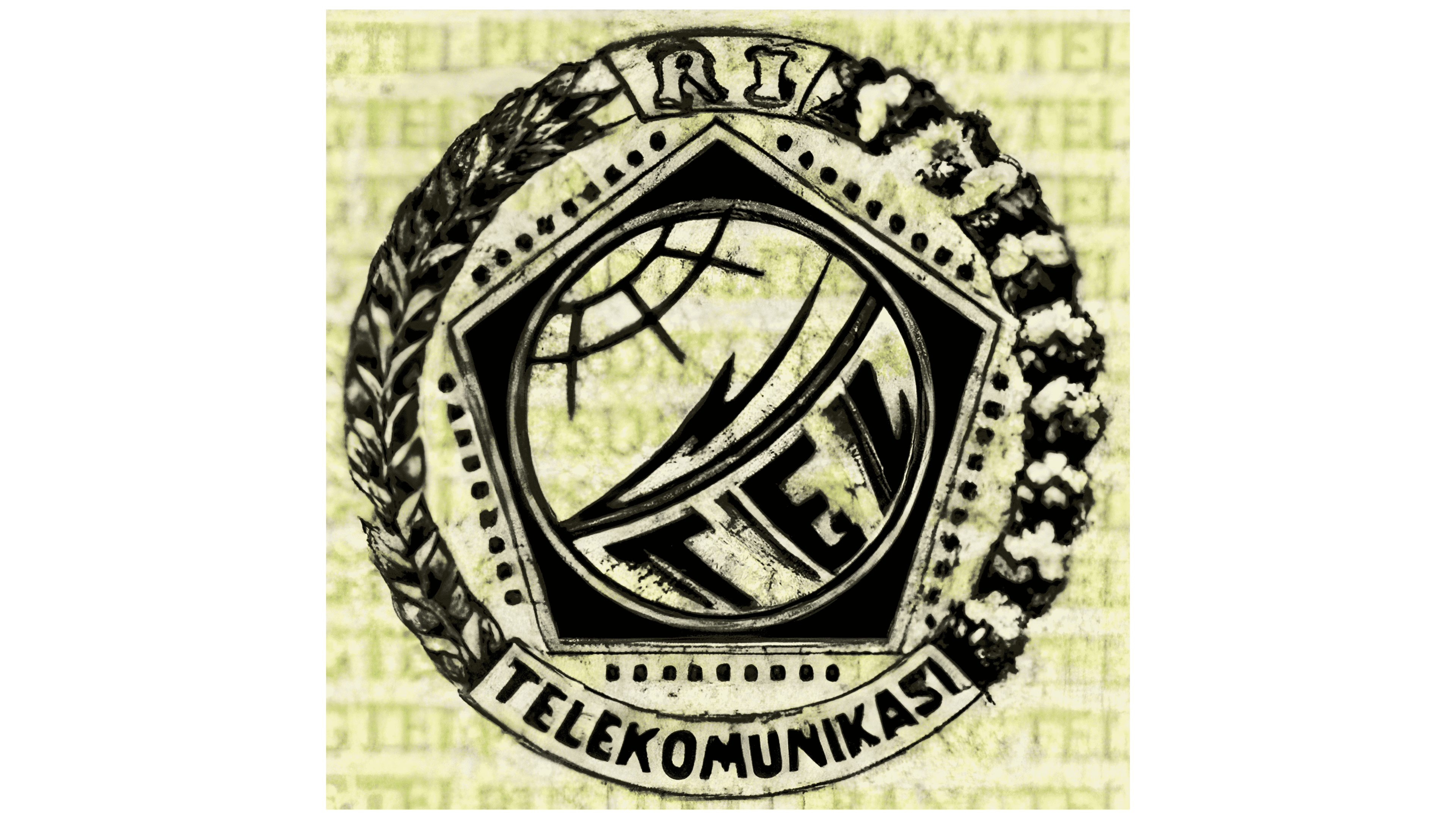
PN Telekomunikasi’s early logo featured a pentagonal shield with a black interior and a thin, light-colored border. Inside, a circle was divided by a diagonal lightning bolt running from the upper left to the lower right. A globe grid appeared above the bolt, with the letters “TEL” below it. The large, heavy letters had geometric shapes and a pronounced rightward slant. Light lines and lettering stood out against the dark background. The components were closely arranged, filling the circle.
A botanical wreath surrounded the shield. Its left half featured intertwined, elongated leaves resembling laurel, while the right half showed flowers in small clusters. A ribbon across the top bore the abbreviation “RI,” short for Republik Indonesia. A lower ribbon curved around the shield and carried “TELEKOMUNIKASI” in black sans-serif capitals. The republic reference and the industry name linked the emblem to the national telecommunications system. The shield, wreath, and ribbons made it look like an official agency seal.
1974 – 1991
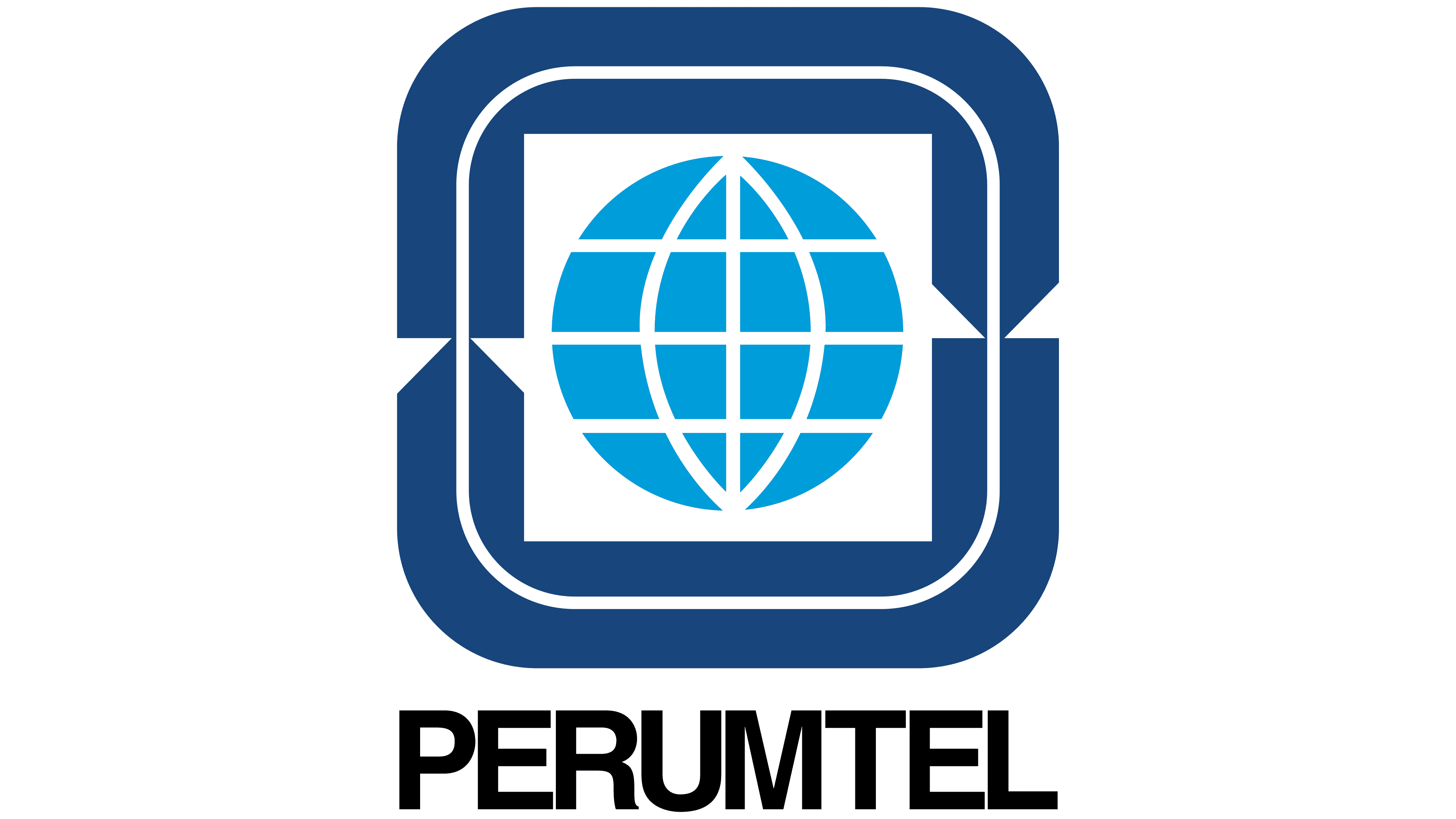
Adopting the name Perumtel in 1974 brought an updated emblem. The organization’s full name became Perusahaan Umum Telekomunikasi, meaning “state telecommunications enterprise.” The abbreviation Perumtel was formed from that name and placed beneath a globe. The globe maintained a connection to the previous logo, while geometric shapes replaced its former surroundings.
The design consisted of three main shapes. A light blue globe with a white grid of meridians and parallels sat in the center of a white square with pointed side projections. A dark blue rectangular frame with rounded corners surrounded the square. The frame consisted of two opposing sections, separated by gaps on the left and right. Sharp notches appeared midway along the sides. A thin white square outline followed the frame’s inner edge, with corners echoing the rounded outer border. Light blue distinguished the globe from the white field, while dark blue defined the emblem’s outer edges.
The word “PERUMTEL” appeared below in black. It was set in closely spaced, bold sans-serif capitals. The upright letters had even strokes and shapes resembling Helvetica Bold and Univers Bold. Their weight complemented the thick blue frame. Unlike the slanted “TEL” lettering in the previous version, “PERUMTEL” used an upright style.
1991 – 2002
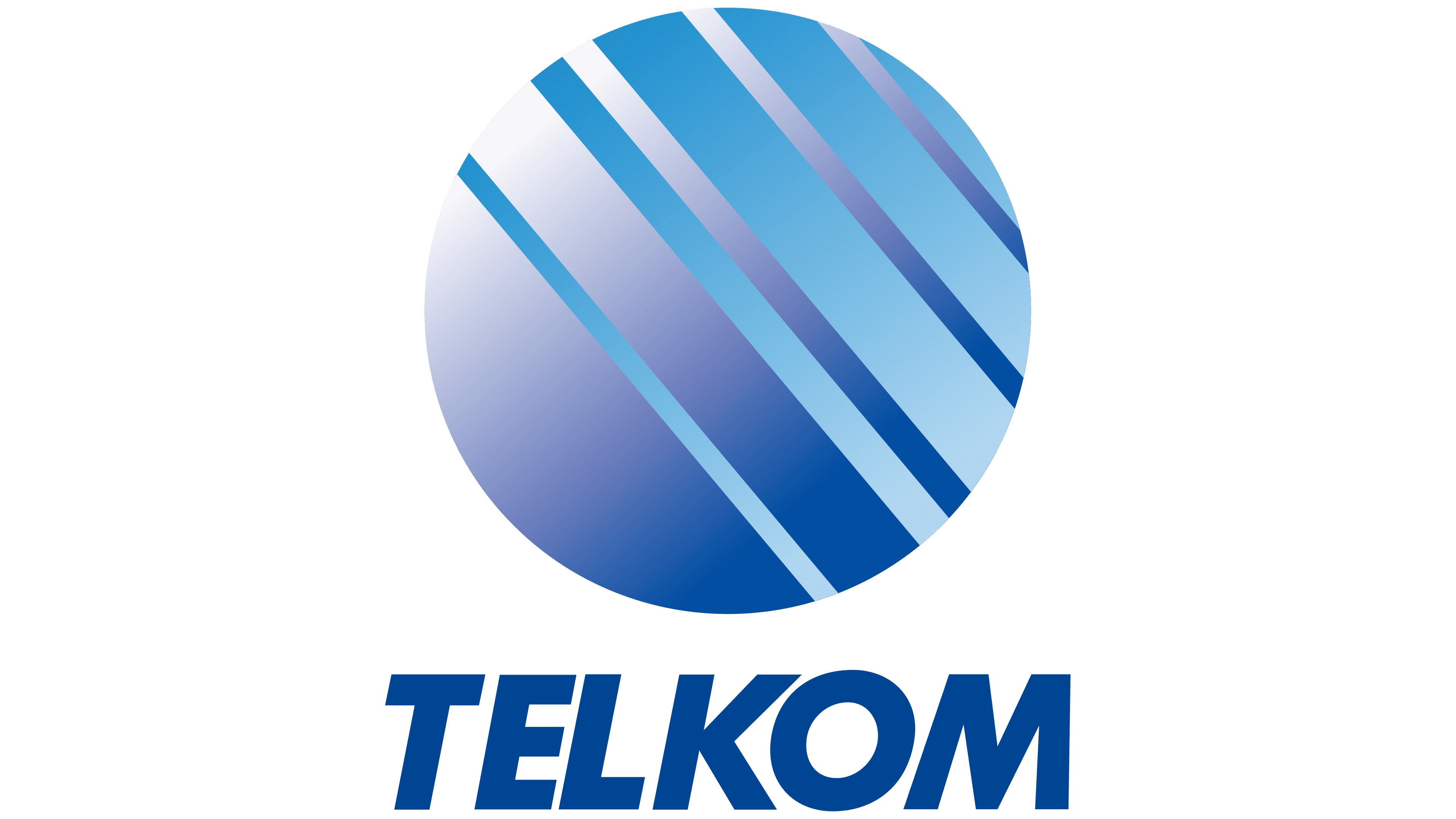
The name Telkom replaced Perumtel on May 1, 1991, when the enterprise became the state-owned company PT Telekomunikasi Indonesia. Telkom was derived from the Indonesian word Telekomunikasi, meaning “telecommunications.” The second part of the full name, Indonesia, identified its country of origin. The updated logo retained the circular globe outline from the earlier emblem, replacing its grid with abstract diagonal stripes.
“TELKOM” was centered beneath the sphere in Futura Bold Italic. The dark blue sans-serif capitals were bold and slanted to the right. The name formed the lower portion of the logo, with the blue sphere above it.
A gradient from light blue at the top to deep dark blue at the bottom gave the sphere a sense of volume. Six parallel light-blue stripes, slanted leftward, crossed the circle. Alternating stripe widths created bands of varying thickness. The circular shape resembled a stylized globe, while the diagonal lines suggested a stream of light or a signal. In this version, gradients and stripes crossing the surface formed the planet’s image.
2002 – 2009
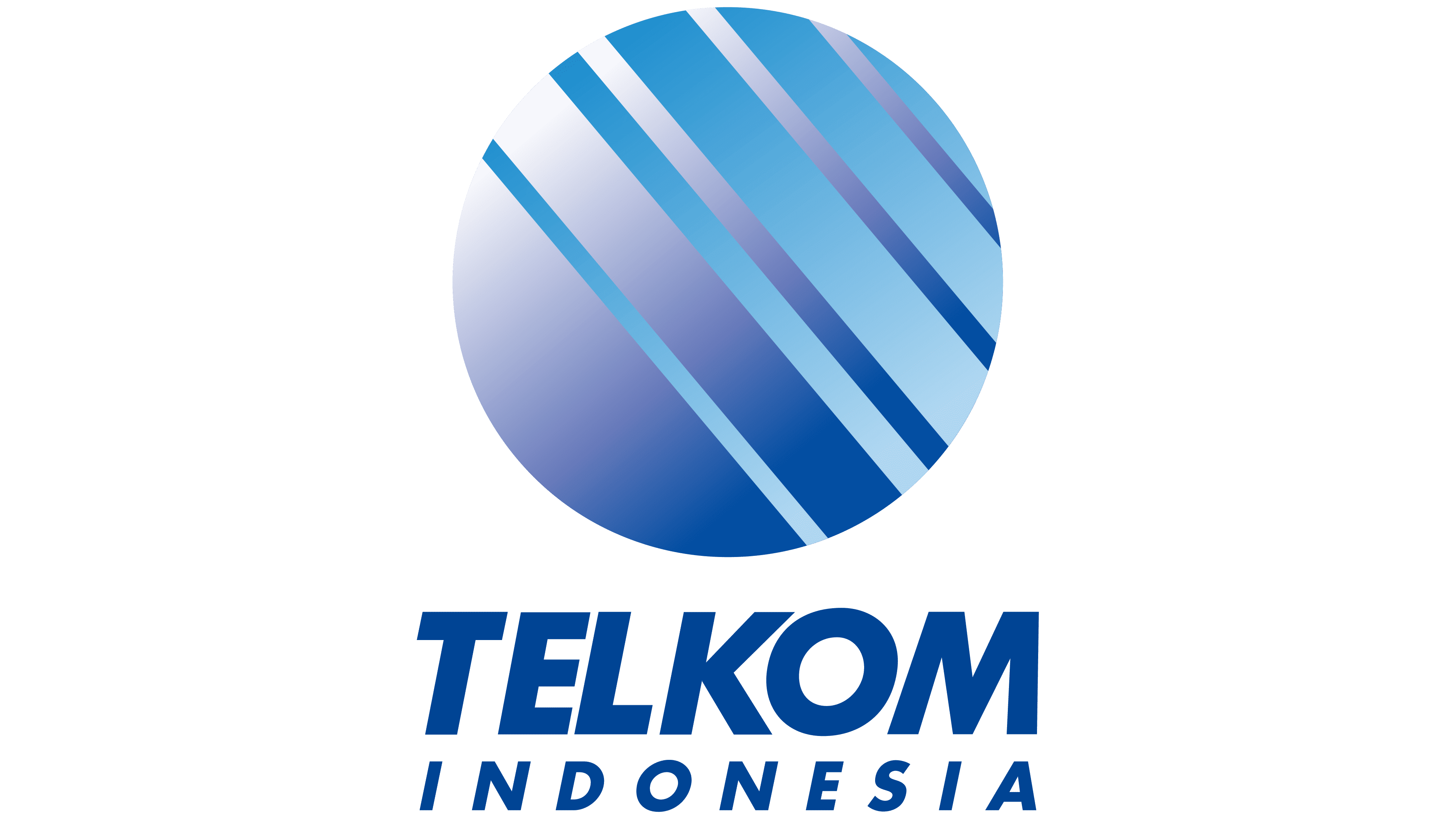
Telkom Indonesia added its full name to the logo on September 13, 2002. The update accompanied the formation of TelkomGroup and the introduction of the tagline “Committed 2 U,” a stylized way of saying “Committed to You.” The main change was adding the country’s name.
“INDONESIA” appeared beneath “TELKOM” in dark blue. It used smaller, thin capital letters with a rightward slant. Increased letter spacing extended the lower line to nearly the width of the upper one. Differences in size and weight distinguished the two parts of the name. At the same time, their placement brought them together as a single block of text.
“TELKOM” remained in Futura Bold Italic. Above it, the existing sphere retained its diagonal stripes, blue tones, and gradients, creating a sense of volume. The second line added the full name, Telkom Indonesia, while the sphere remained unchanged.
2009 – 2013
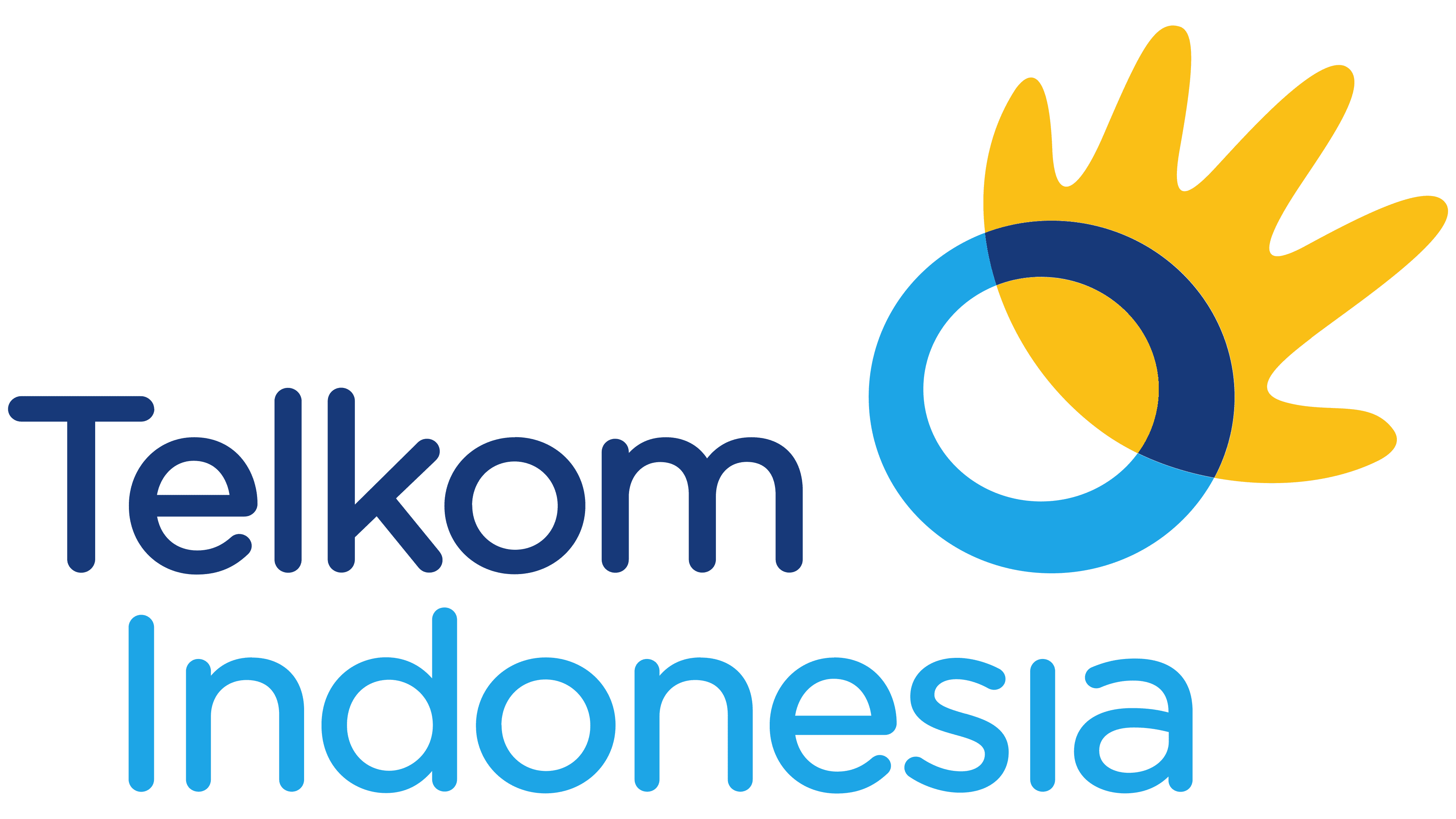
As Telkom Indonesia expanded its services, it revisited its brand identity. The company brought telecommunications, information services, media, and edutainment together under the acronym TIME. Telkom was becoming an integrated provider of connectivity and digital content, and the update was intended to reflect its broader range of activities.
The Brand Union’s Jakarta office developed the rebrand. The result was unveiled on October 16, 2009, and officially launched at Djakarta Theatre on October 23. The launch celebration also included the Indigo Awards ceremony and was broadcast live on Trans TV. The changes covered the emblem, lettering, and tagline.
An open yellow hand and an irregular rounded ring replaced the striped sphere. All five fingers had rounded tips. The ring overlapped part of the hand, making the palm appear to extend beyond it. The upper arc was dark blue, while the lower arc was light blue. A darker area where the shapes overlapped created a transparency effect. The hand and circle related to the tagline “The World in Your Hand” and the promise of access to the world through Telkom’s services.
The name moved to the left side of the logo, with the symbol on the right. Both lines used Gotham Rounded, a sans-serif typeface with rounded stroke endings. “Telkom” appeared in dark blue. The light blue word “Indonesia” sat below it, offset to the right. Only the initial “T” and “I” remained uppercase; the other letters became lowercase. The soft letterforms gave the new identity a friendly appearance.
2013 – today
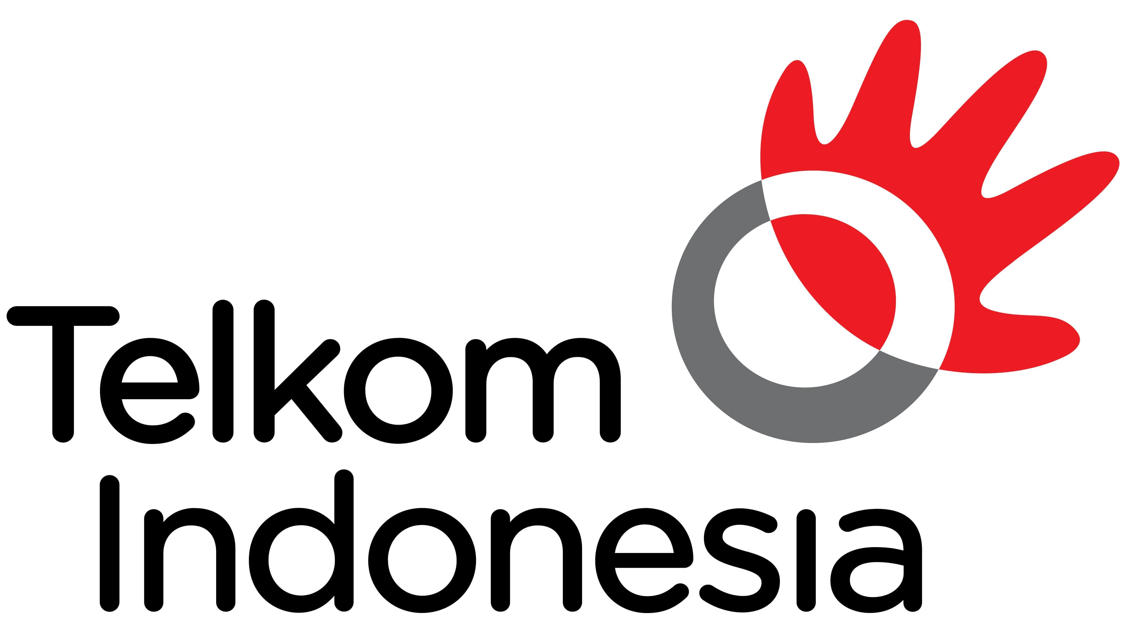
Telkom Indonesia’s ties to the state and the national flag informed its 2013 update. Red and white became part of the official logo for PT Telekomunikasi Indonesia (Persero) Tbk, developed in collaboration with Brand Union. The color change accompanied transformations in the business, infrastructure, work practices, and employee training.
PT Telekomunikasi Indonesia (Persero) Tbk unveiled the new version in June, with an official presentation on August 16, 2013, as part of the Mahakarya Telkom Indonesia untuk Indonesia program. RCTI broadcast the event live. The presentation was timed to coincide with the 68th anniversary of Indonesian independence, celebrated on August 17.
The ring outline and stylized right hand remained, but their colors changed. The palm became red instead of yellow. The company associated red with courage, love, energy, and perseverance. The blue ring became gray to represent technology. The overlap between the shapes became white, a color associated with purity, peace, light, and unity. The lettering turned black to symbolize strong will. The circle continued to represent the world, while the hand reaching toward it conveyed the idea behind “The World in Your Hand.” The tagline remained alongside the emblem.
The name used Gotham Rounded, with its rounded stroke endings. In the vertical version, the name occupied two lines; in the horizontal version, it appeared on one. The version used depended on the application size. At smaller sizes, the tagline was omitted, while the smallest formats used only the hand and ring.