


![]() The BOYS Logo PNG
The BOYS Logo PNG
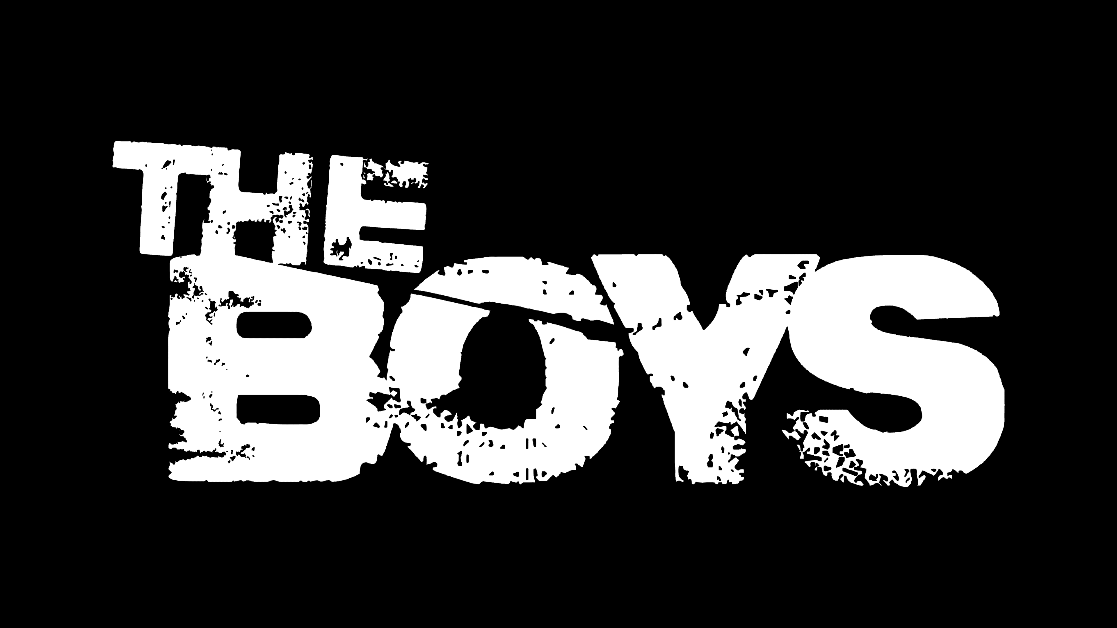
The BOYS logo is filled with sorrow and darkness. The emblem represents characters who have discovered the other side of life without embellishments or fairy tales. The size of the sign emphasizes the importance of the mission chosen by the young heroes, as they have not lost the ability to distinguish good from evil.
“The Boys,” a comic book series created by Garth Ennis and Darick Robertson between 2006 and 2012, subverts traditional superhero narratives. This series introduces readers to “The Boys,” a CIA-backed group tasked with keeping unchecked superheroes in line, blending dark humor with critical commentary on power and responsibility.
By the end of 2017, Amazon took a bold step by green-lighting a TV series adaptation spearheaded by Eric Kripke, known for his work on “Supernatural.” Kripke’s vision was to mirror the original comics’ blend of brutal violence and dark comedy, exploring the complex dynamics of power misused by superheroes.
When “The Boys” debuted on Amazon Prime Video in July 2019, it immediately resonated with audiences, earning acclaim for its unflinching portrayal of action, societal critique, and humor. Despite, or perhaps because of, its unapologetic dive into themes of graphic violence and the darker aspects of heroism, the series sparked discussions and controversies.
Amazon’s confidence in the show’s appeal was evident when it announced renewals for a second and third season before the first had even concluded. The “The Boys” universe continued to grow, with a spinoff series, “Gen V,” focusing on young adults at a superhero college, signaling the franchise’s expansion.
By June 2022, “The Boys” had launched its third season, maintaining the edgy and provocative storytelling that had drawn fans to its first episode. With over thirty comic issues and multiple seasons of television, “The Boys” has etched its mark as a distinctive, critical voice within the superhero genre, challenging conventions and setting a new standard for storytelling.
Meaning and History
![]()
The journey from the idea to the film’s broadcast was long. Starting in 2008, the film crew disagreed with the movie companies. Only in 2016 did Cinemax take on the project. However, in 2017, Amazon Studios bought the rights to the series, and production began only in 2018. The well-known logo was likely developed after filming started. Viewers saw the emblem and the film in 2019.
What is The BOYS?
It is a comedic series about a team of daredevils fighting superheroes who abuse their powers: nominated for 6 Emmys. Executive producer Eric Kripke. Three seasons of 8 episodes each have been shot, with each episode lasting about an hour. The fourth season is planned for 2024. In addition to the series, several spin-offs have been released, including Seven on 7, Diabolical, and Gen V.
2019 – today
![]()
The identity consists of the series title on two levels. “The” is done in smaller letters and tilted downwards. “BOYS” is written in large capital letters with light abrasions.
The film’s title speaks to the heroes’ youth. Since the team includes a girl, the term does not refer to gender but indicates a style of behavior. The boys are street kids, rough and secretive, each with their own secret and sadness.
The grim emblem and abrasions indicate that the participants have endured considerable suffering. Mother’s Milk looks 20 years older because his mother was transformed with a mutagen during pregnancy, and now, to live, he constantly needs milk. Kimiko was separated from her family and forced to kill. The girl was taken prisoner and subjected to terrible experiments, rendering her mute. Frenchie’s past involves contract killings and arms dealing. His father had bipolar disorder and tried to strangle the boy. The heroes know life’s underside and are as battered as the logo itself.
The tilt of the first word in the emblem emphasizes that:
- The BOYS have no superpowers, or they developed incorrectly, “awkwardly.”
- Each of their childhoods was predetermined to have a sad ending, and they gravitate towards it, just as the word “The” tilts downwards.
- The guys are dependent. To use their powers and stay alive, they constantly need to take the mutagen V.
The only thing keeping the participants afloat is their mission and mutual support.
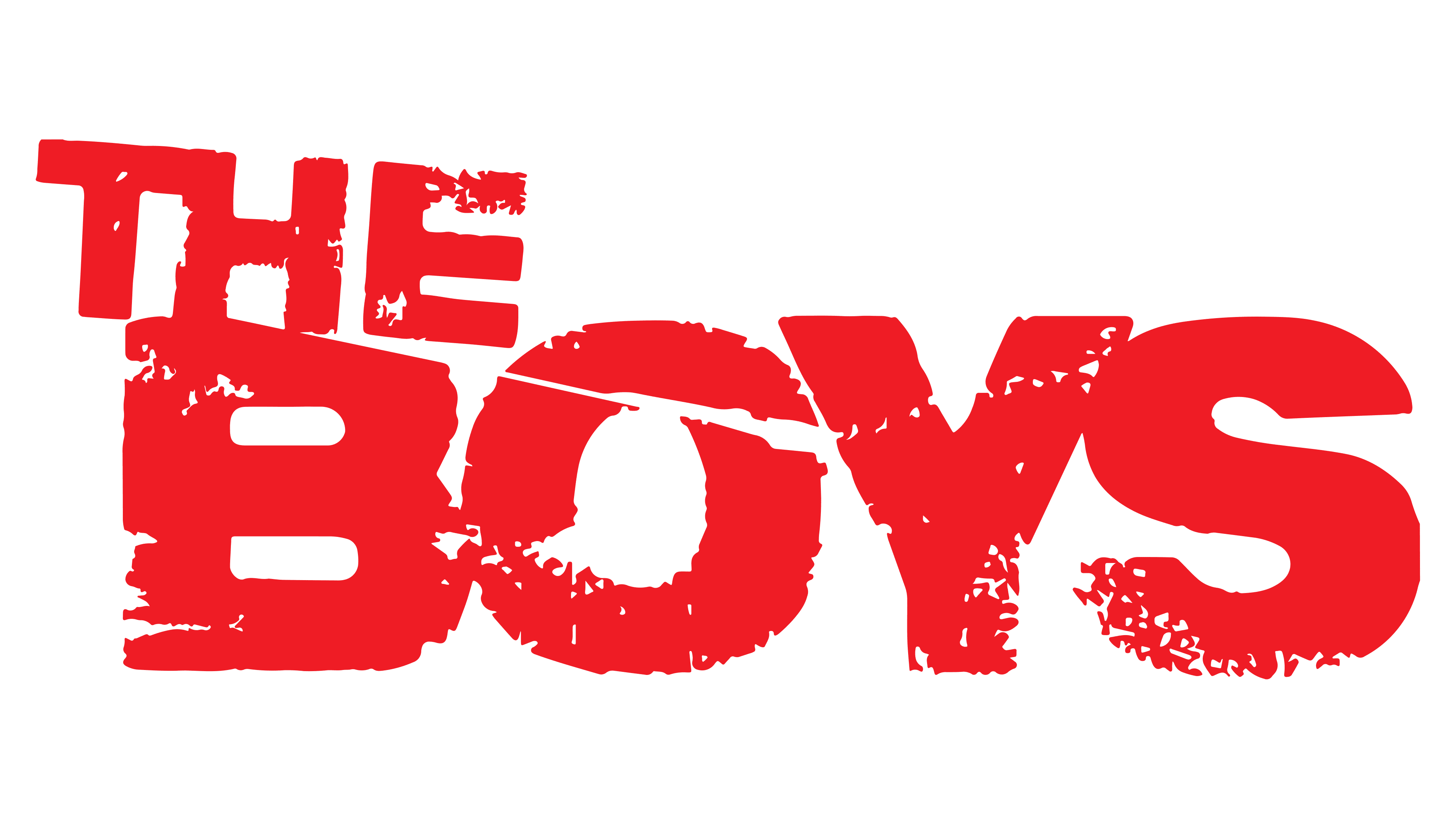
Font and Colors
The color of the logo was chosen in tune with the film’s genre, which falls into drama and black humor. The shade indicates the need to hide. The BOYS oppose a team of corrupt and greedy superheroes who play a beautiful role for the whole world. To discover their secrets and expose them, one must remain unnoticed.
The black in The BOYS logo suggests that The Seven reveal their true faces only in secret, under the cover of darkness, when they are not playing the roles assigned to them by Vought International.
The font of the name is made unique by traces of injury and abrasion. Lines resembling scars from the past indicate the ‘experienced’ boys. The upper case signifies the importance of the team’s mission. Without their participation, the world would be unaware of the danger posed by superheroes. It’s no wonder the CIA sponsors their work.