


![]() Toy Story Logo PNG
Toy Story Logo PNG
From the emblem, kindness and games breathe. The Toy Story logo conveys a cheerful mood and the emotional, dangerous adventures of its kind toy characters. Friendship, development, and joy are hidden within the symbols, all set against the backdrop of instructive stories.
Toy Story began as part of Pixar’s early experiments with computer animation. After leaving The Walt Disney Company in the 1980s, animator John Lasseter joined Lucasfilm’s graphics division. He later helped build Pixar after Steve Jobs purchased the studio in 1986. Pixar’s short film “Tin Toy Story” eventually inspired the character of Buzz Lightyear, named after astronaut Buzz Aldrin.
In 1991, Disney signed a $26 million agreement with Pixar for three animated features. Early versions of Toy Story nearly collapsed in 1993 after Disney executives demanded a harsher version of Woody. The rewritten material failed during an internal screening remembered as Pixar’s “Black Friday.” Even Tom Hanks criticized the character during recording sessions. Pixar paused production and rebuilt the script around a friendlier Woody.
The film premiered in November 1995, with Tom Hanks and Tim Allen voicing Woody and Buzz, respectively. Rendering the movie required about 800,000 machine hours, while Pixar could finish only a few minutes of animation per week. Toy Story earned $358 million worldwide on a budget of nearly $30 million and became the first full-length CGI animated feature. Pixar’s IPO followed immediately after release, valuing the studio at around $1.5 billion.
Toy Story 2 arrived in 1999, after being developed as a direct-to-video project. Toy Story 3 became one of the biggest animated hits of 2010, while Toy Story 4 passed $1 billion worldwide in 2019. Disney acquired Pixar in 2006 for $7.4 billion.
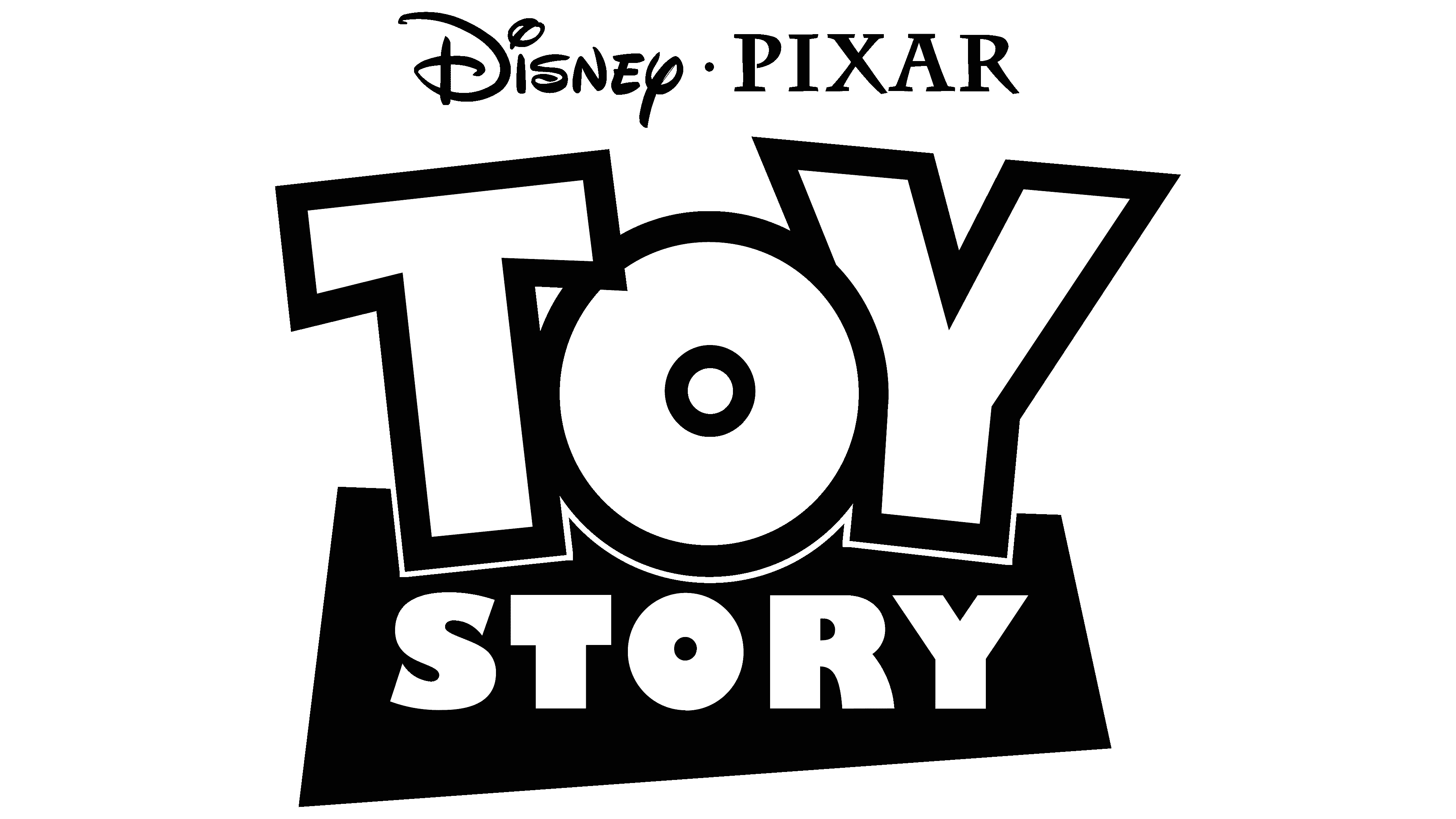
Meaning and History
![]()
Toy Story was directed by John Lasseter, who made his debut in this role. In animation, he perfectly reflected a script written by a team that included Joel Cohen, Andrew Stanton, Joss Whedon, and Alec Sokolow. They used a story by Joe Ranft, Pete Docter, Andrew Stanton, and John Lasseter as the basis. The heroes were voiced by a constellation of brilliant actors and actresses: Annie Potts, Wallace Shawn, Tom Hanks, Don Rickles, Tim Allen, and many others.
The storyline unfolds in the real world, but with anthropomorphic toy characters of an ordinary child living in an ordinary family. When people are around, toys are just toys, but when no one sees them, they come to life and begin to think, speak, and act. The main focus is on a cowboy sheriff named Woody and astronaut Buzz Lightyear. They confront each other and fight for the affection of the owner, the boy Andy Davis. One day, they find themselves in a dangerous situation together and get lost.
Both viewers and critics highly appreciated the cartoon. He has been praised for his technical innovation, the sophistication of subject matter, wit, 3D animation, vocals, and music. It has won numerous film awards and is recognized as aesthetically, culturally, and historically significant.
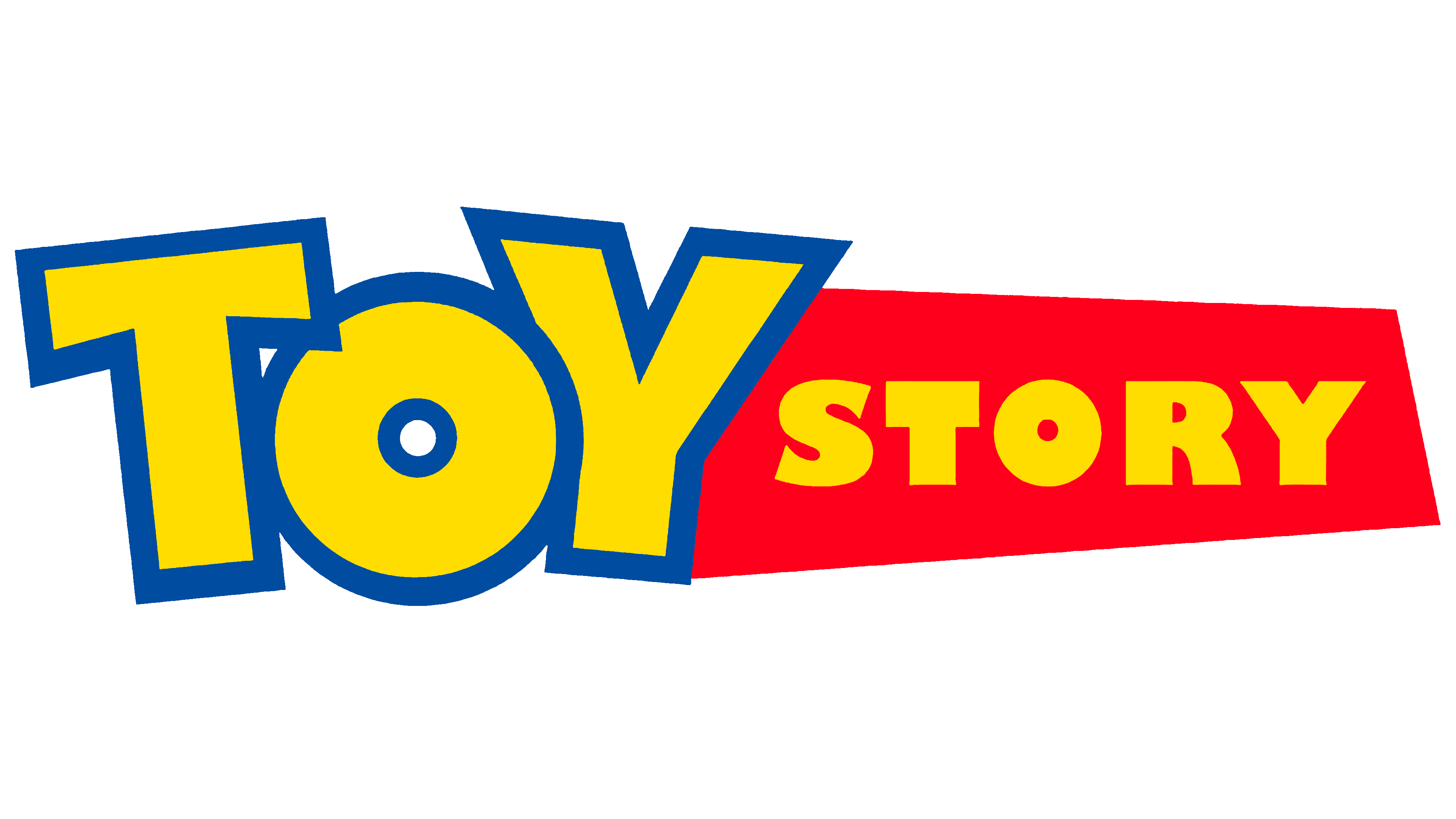
1995
![]()
The animated motion picture’s debut emblem consists of a two-line title. The top word (“Toy”) has no background. It is executed in uppercase characters that “swing” in different directions: “T” tilts left, “Y” tilts right. A thick blue stripe surrounds each letter, and they are colored bright yellow. The bottom row is occupied by the inscription “Story.” It is located on a geometric shape that resembles a rectangle. Solid yellow marks are visible against a red background. The upper word partially covers it.
1999
![]()
The second part of the cartoon received a more modern logo. It has a 3D effect. This is facilitated by the shadows and the blue frames enclosing the letters in the first row. As a result, the edging stands out visually from the rest. In this version, a third line also appeared, with the series number designation. The number is framed in the same style as the first word.
2010
![]()
The third version of the full-length animated film featured an emblem that was almost identical to the previous logo. The difference between them is insignificant, in just a few details. So, the developers made the light frame blue to increase the volume, removed the warm yellow and replaced it with lemon, changed the number “2” to “3,” and placed the names of the Pixar studio and Disney company at the top. And so that the words do not merge, they put a miniature dot between them.
2019
![]()
The number of shadows on the logo of the fourth Toy Story series has been reduced. They have become thinner and more invisible. The darkened stripe on the left side of “Y,” cast by the letter “O,” is visible. The number “4” received the same style as the “3”, geometrically precise, even, smooth. But, of course, the four still have several right angles. The designers have slightly increased the background color of the word “Story” by adding a deep red tint.
Font and Colors
Since the first release, the iconic cartoon’s logo has maintained a well-recognizable design. The adjustments affected only very small details: strengthening the palette by several tones, drawing and removing shadows, and changing the numbering of the series.
There are two types of typefaces used in the emblem. The word “Story” is written in Gill Sans Ultra Bold, first introduced in the 1920s by Arthur Eric Rowton Gill. And “Toy” is made in an individual style, similar to Agent Orange and Agent Red (developed by Pizzadude), as well as SF Slapstick Comic from ShyFonts.
The logo’s palette is juicy and catchy. The scheme includes yellow (warm sunny and lemon), red, and blue in two shades.