


 TP-Link Logo PNG
The TP-Link logo symbolizes a company offering affordable networking solutions, reflecting its key values and mission. The lines that make up the emblem evoke a sense of continuous connection, highlighting the brand’s primary goal of providing stable and reliable connectivity. This visual element conveys a commitment to innovation and the advancement of digital technologies.
TP-Link was founded in Shenzhen in 1996 by brothers Zhao Jianjun and Zhao Jiaxing. Its name referred to twisted-pair cabling, while the first products were computer network cards. From 1997 to 1998, the company added network switches and built its own manufacturing and development base.
Wireless equipment entered the range in 2000 with routers and adapters for growing Wi-Fi demand. International expansion began in 2001 and 2002 through overseas offices and quality certifications. A factory covering more than 100,000 square meters opened in 2005, supporting higher output and a broader catalog. Products for homes and small offices followed in 2007 and 2008 as the SOHO line developed.
By 2009, TP-Link had become the world’s largest supplier of wireless networking equipment and had established research centers. Mobile routers with 3G support arrived in 2011, along with a logistics center for global distribution. The company entered home automation in 2013 and 2014 through Kasa Smart, then updated its corporate identity in 2015 and introduced Neffos smartphones.
Deco mesh systems appeared in 2016 and 2017, followed by affordable 802.11ax devices in 2018. From 2019 to 2020, TP-Link expanded home networking, smart-home products, and business systems. Models using the 6 GHz band arrived in 2021 and 2022. By 2023, the company operated across more than 170 countries with networking, smart-home, mobile, and enterprise product lines supported by its own factories and research centers.
Meaning and History
What is TP-Link?
This multinational networking equipment provider offers a wide range of products from mesh systems and high-performance routers to smart home devices and networking accessories, reshaping the concept of digital connectivity. The company combines advanced networking technologies with reliable security features and high performance, making them accessible to home users and businesses. The products integrate seamlessly into modern connected homes and offices, delivering professional networking capabilities at affordable prices, ensuring reliable internet connectivity and smart device management.
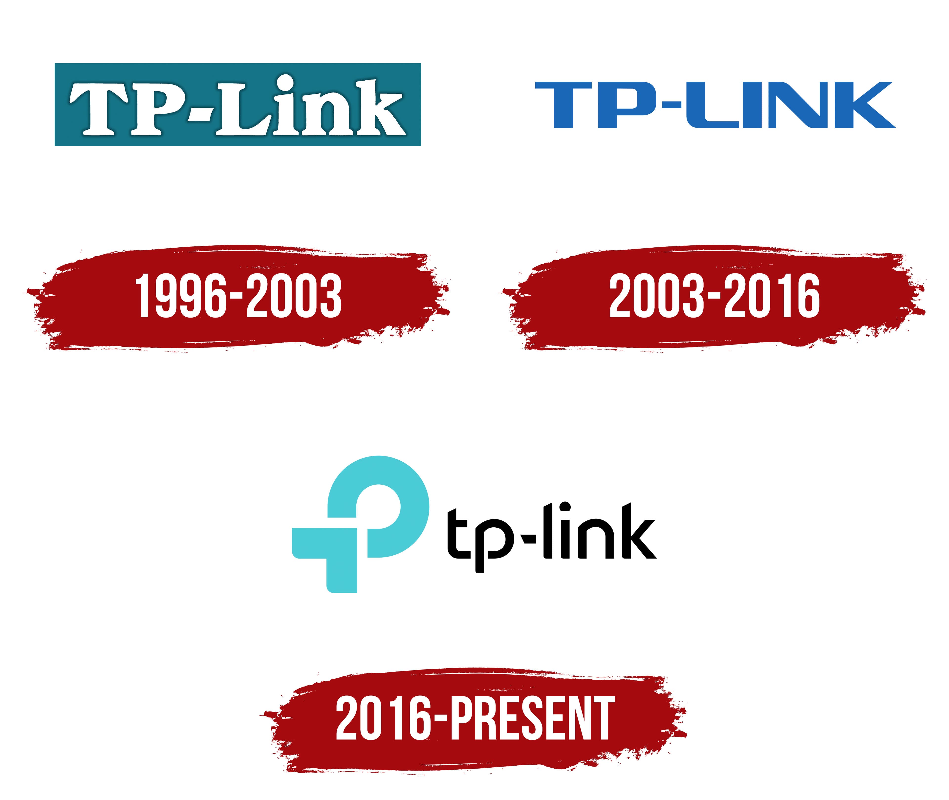
1996 – 2003

The company’s first logo featured a white inscription on a blue-green background. The background’s enclosed shape symbolized a space, whether a house, apartment, or office, where TP-Link technologies are installed. This shape also evoked the image of computers, for which the brand produces devices like routers, cameras, modems, and network adapters.
The shadow surrounding the letters added depth and visually lifted the symbols above the surface, emphasizing the company’s innovative approach to development. Initially, the brand’s name contained a hidden reference to a connection through a twisted pair, hinting at the company’s primary goal of providing reliable network connectivity.
2003 – 2016

The blue inscription became a kind of second logo for the company, symbolizing its drive for innovation and progressive solutions. The brand actively pushes the boundaries of traditional perception, introducing a completely new way of data transmission. Notably, the emblem lacks a background, highlighting its versatility and adaptability across various formats and environments.
The brand’s use of routers that enable Wi-Fi data transmission has positioned it among global leaders. The light blue color of the letters carries deep symbolism, associating it with air and sky. This shade conveys a sense of lightness and freedom while remaining tied to the idea of simplicity in the use of technology.
At the same time, this color hints at the company’s high-tech nature, digital developments, and innovative solutions. The logo has become a symbol of its readiness for expansion into international markets. This design evolution is directly connected to the desire to reach a new level of overseas sales and enhance the brand’s recognition worldwide.
The emblem’s smooth curve of the letter “L” stands out. It resembles an antenna, symbolizing connection and data transmission. This element emphasizes the company’s core specialization and its role in the technology world.
2016 – today
In the modern era, where wireless technologies are increasingly dominant, TP-Link’s abbreviation is interpreted as Trust and Performance, reflecting the company’s core principles of trust and efficiency. The TP-Link logo features stylized letters “P” and “t,” harmoniously combined to form a shape reminiscent of an infinity symbol or a closed loop. This element visualizes the concept of network connectivity achieved through the company’s products. The company’s technological solutions allow users to interact with the world around them through simple devices.
Next to the symbol is the brand name, written in neat black letters with partially cropped glyphs. These slanted and truncated details are intentional; they symbolize the aim of reducing device sizes and minimizing the number of wires. This ensures high-quality connectivity using a minimal number of compact devices produced by the company.
The turquoise shade used in the logo embodies freshness, innovation, and technological progress. This color conveys sustainability, progress, and continuous development, underscoring the company’s leading position in network communications.