


![]() Trokiando Logo PNG
Trokiando Logo PNG
Although the Trokiando logo initially had no hidden meaning, it has come to symbolize love for cars and beautiful objects over time. The emblem of this brand is known primarily within niche circles, among pickup owners in the Trokiando subculture. The manufacturer’s clothing is targeted at this audience.
Meaning and History
![]()
The company named itself after a trendy movement and actively supported it by organizing various events. As a result, its logo can be seen at car exhibitions, drawing thousands of fans of this unique style. Because enthusiasts of the subculture often attach the Trokiando emblem to the rear windshield of their vehicles, people unfamiliar with the brand mistake it for a car enthusiasts’ club. The manufacturer of clothing and accessories remains unfazed by the confusion and continues to use its versatile word mark, making it hard to discern that Trokiando is primarily a t-shirt and sweatshirt brand.
What is Trokiando?
Trokiando is a streetwear brand based in Texas. It was founded by cousins Edgar Cavazos and Juan Hernandez, along with their friend Jorge Guevara. The brand emerged in 2013 amidst a fashionable car culture phenomenon called trokiando. Supporters of this subculture modify pickups and other trucks to participate in exhibitions and drifting.
Initially, Edgar Cavazos, Juan Hernandez, and Jorge Guevara had no preconceived ideas about what their brand should look like. Several unrealized ideas remained sketches, prompting Edgar to take matters into his own hands. Passionate about graphic design, he created the logo for the first batch of shirts. Their friends disseminated the merchandise among car enthusiasts, making the Trokiando emblem widely recognized among supporters of the eponymous subculture.
This is a black-and-white wordmark that contains only the company’s name. The inscription is written in a semi-cursive calligraphic font and is positioned diagonally. The wavy top of the “T,” the curving dot over the “i,” and the elongated loop at the bottom of the “k” create a sense of elegance. The logo appears as a symbol of an elite society where outsiders are not welcome. Indeed, that is partially true, as Trokiando clothing and accessories are primarily intended for fans of modified pickups and other freight vehicles.
Font and Colors
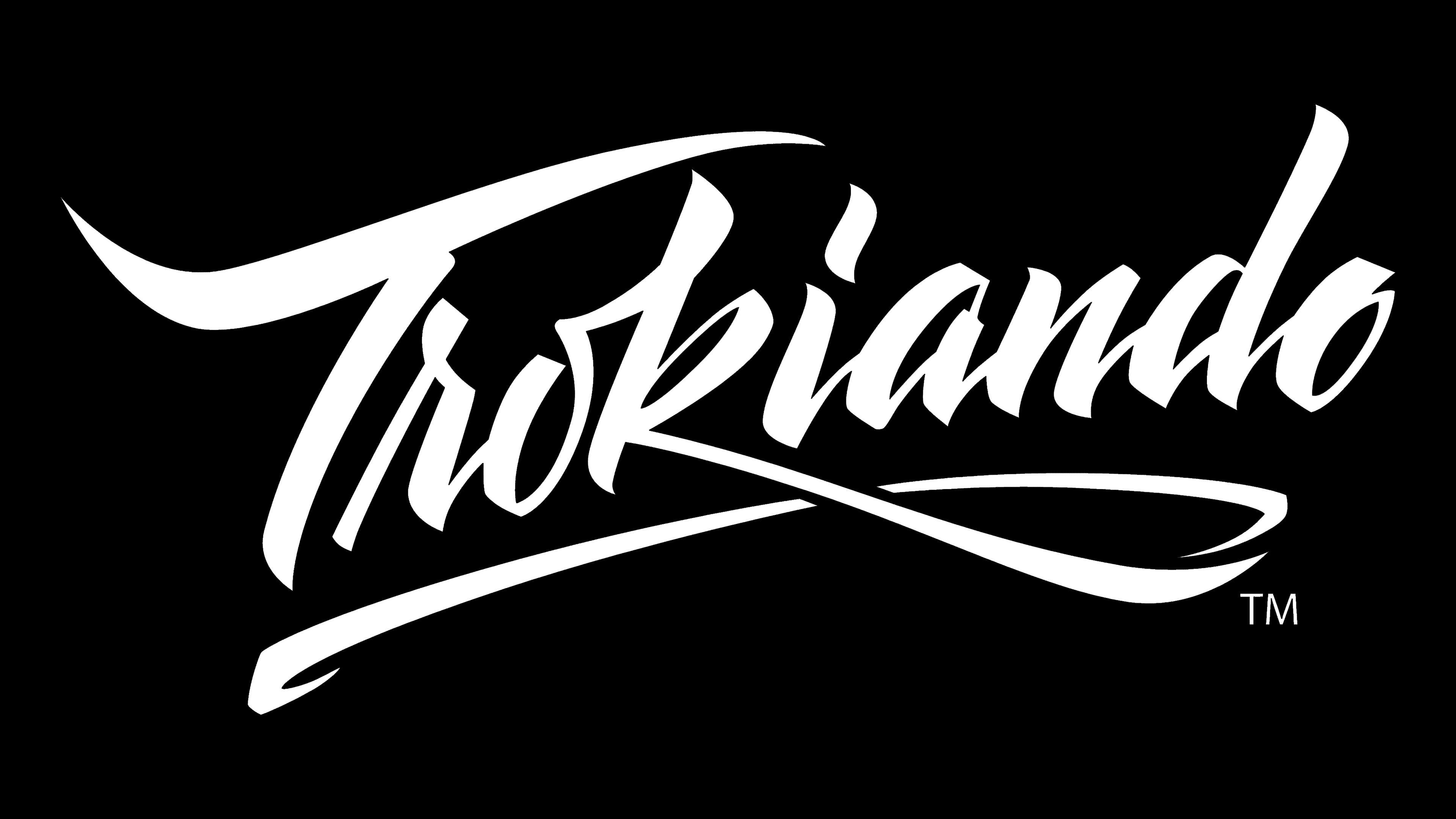
Edgar Cavazos created the wordmark himself without relying on any existing fonts. What he achieved is a calligraphic inscription with contrasting stroke thickness, pointed ends, and decorative elements that give the letters a refined individuality.
The black-and-white color scheme also looks elegant in this case. Its minimalism makes the emblem expressive and concise, which suits the streetwear manufacturer well.