


![]() Univision Logo PNG
Univision Logo PNG
The Univision logo is as vibrant and striking as all the network’s broadcasts. The emblem embodies the spirit of the passionate, emotional Latin American viewers who choose the company’s broadcasts. The symbol reflects the variety of content and the unification of disparate community groups.
Univision’s history began in 1955, when Raúl A. Cortez launched KCOR-TV in San Antonio, Texas. It was the first US television station broadcasting only in Spanish. The project lost money, and in 1961, Cortez sold it to his son-in-law, Emilio Nicolás Sr., and partners. Control later passed to Mexican media figure Emilio Azcárraga Vidaurreta, head of Telesistema Mexicano, the predecessor of Televisa.
On September 29, 1962, KMEX-TV began broadcasting in Los Angeles. Together with KWEX-TV, it formed the core of Spanish International Network, or SIN, the first US television network built around a non-English language. Programming came mainly from Mexico, including telenovelas, news, and talk shows. In 1976, SIN became the first US network to distribute its signal by satellite through Western Union’s Westar II.
In 1986, the FCC refused to renew SIN station licenses, citing foreign-control rules. In 1987, SICC sold ten stations for about $300 million to Hallmark Cards and First Chicago Venture Capital. The network then took the Univision name. After a difficult period, Hallmark sold the company in 1992 for $550 million to a group led by Jerrold Perenchio, who restored programming supply and invested in station upgrades.
By the mid-1990s, Noticiero Univision was beating local CBS, NBC, and Fox news programs in major Hispanic markets such as Los Angeles and Miami. In 1996, Univision listed on the New York Stock Exchange under UVN. Telemundo remained its main rival. In 2007, a Saban-led group bought the company for $13.7 billion, and in 2020, ForgeLight and Searchlight Capital took control. In 2022, the merger created TelevisaUnivision, which includes TV, radio, cable, and ViX assets.
Meaning and History
![]()
The precursor to Univision, station KCOR-TV, was launched in 1955. However, the active development of Spanish-language television in the U.S. began after the station was purchased by Emilio Azcárraga, owner of the Spanish Televisa, who opened additional stations and established the international Spanish-language network SIN and the SICC corporation. The network subsequently underwent a name change, expansion, bankruptcy, and a resurgence, but the Azcárraga family never let go of it.
As the company grew and investor groups changed, its visual identity evolved.
What is Univision?
One of the two largest television networks in America, targeting the country’s Spanish-speaking audience. It broadcasts American-produced shows and series purchased from Latin America. The audience is over 50 million people.
1962 – 1970
![]()
Initially, Azcárraga named his network simply the Spanish International Network, as reflected in its logo. The name clarified who the channels were broadcasting to and in which language. Using the name as an emblem was a smart move for the new network and for winning over U.S. Latinos.
1970 – 1987
![]()
Eight years later, the network was well-known, so its name was shortened to the acronym SIN. For the logo, they used a bold font that conveyed the corporation’s scale; in addition to the two main ones, it had opened about a dozen television companies across America, all of which had high ratings by that time.
The letters S and N are cut into parts by paired stripes, showing the formation of a single corporation from whole parts. The solid central I seemed to connect the extreme symbols, with a message about spreading to the South and North encrypted.
1986 – 1987
![]()
![]()
In 1987, one of the main owners of the American part of SIN, Azcárraga’s son-in-law Nicolas, sold his share to Hallmark Cards, which partnered with Televisa. The new owners renamed the group of studios Univision. Changes were likely planned even before the official announcement, as in 1986, Televisa filed to trademark the name Univision in America.
The new company name combines the words “Uni” and “vision,” which together translate to “unified vision.” The name conveys the company’s goals: to unite Spanish-speaking residents, represent their views, and forge a unified position within this group of U.S. citizens.
The image on the logo complements the idea. Earth is at the center of the composition, painted in black. In one part, a broadcasting point is depicted from which waves emanate, and light appears at the point where they propagate. The planet is enclosed within a frame of several such waves, illustrating the network’s goal of covering the entire Earth with its broadcasts and promoting unity among the Spanish-speaking population. Moreover, the broadcast waves emanated from Latin America, indicating the language and the audience the network was catering to.
1987
![]()
While the transition and renaming process was underway, the Univision logo was updated to incorporate both the original and new names, along with an element from the Televisa logo, effectively establishing the American network’s ownership over the years.
The three elements demonstrated the main aspects of the birth of Spanish-language broadcasting in America:
- The acquisition of the first channel by Televisa’s owner
- The creation of SIN by him
- The subsequent renaming to Univision
The emblem was meant to help users associate and remember old and new names.
1987 – 1989
![]()
The next transitional logo removed the past name, leaving only the Univision inscription and the image of the Earth submerged in broadcasting waves. The composition and elements of the emblem made the visual sign even more closely aligned with Televisa’s identity, while maintaining a hint of the network’s origin.
1989
![]()
The logo lasted for six months, from July to December. The image appeared to be forged out of gold, with waves reflecting off the sides of the elements. The elegant letters formed a voluminous figure with angled sides, with the letter ‘I’ prominently placed in the center.
The composition showed that the individual’s identity is at the heart of the company’s activities. In choosing programs, it focuses on its users’ preferences and strives to facilitate the self-determination and self-expression of Spanish-speaking residents of America.
The placement broke the name into three parts: “Univ,” “i,” “sion,” and the encrypted words “University of Zion.” Zion is a mountain in Israel associated with a believing community and salvation. Most Latin Americans are devout Catholics.
1990 – 2012
![]()
Univision came under Hallmark’s ownership. As a result, Televisa terminated its contract with the network and took back its programs. The disappearance of familiar and beloved shows led to a loss of viewers and, in 1990, to bankruptcy. Having crashed, Hallmark sold the network to a group of investors, giving it a new life. Once again, a company from the Televisa group was among the new owners.
The logo of the turn of the 21st century was designed by New York graphic designers at Chermayeff & Geismar. The experts suggested a different approach to visual identity, placing a multicolored figure at the center of the composition and incorporating elements of green, blue, red, and purple. The blocks formed the capital letter U – the first in the name Univision.
The TV’s image is based on the RGB color model, specifically red, green, and blue. Therefore, the composition clearly shows the company’s affiliation with broadcasting.
The figure is based on the Windows visual sign principle and hints at the network’s “window to the world” for its viewers.
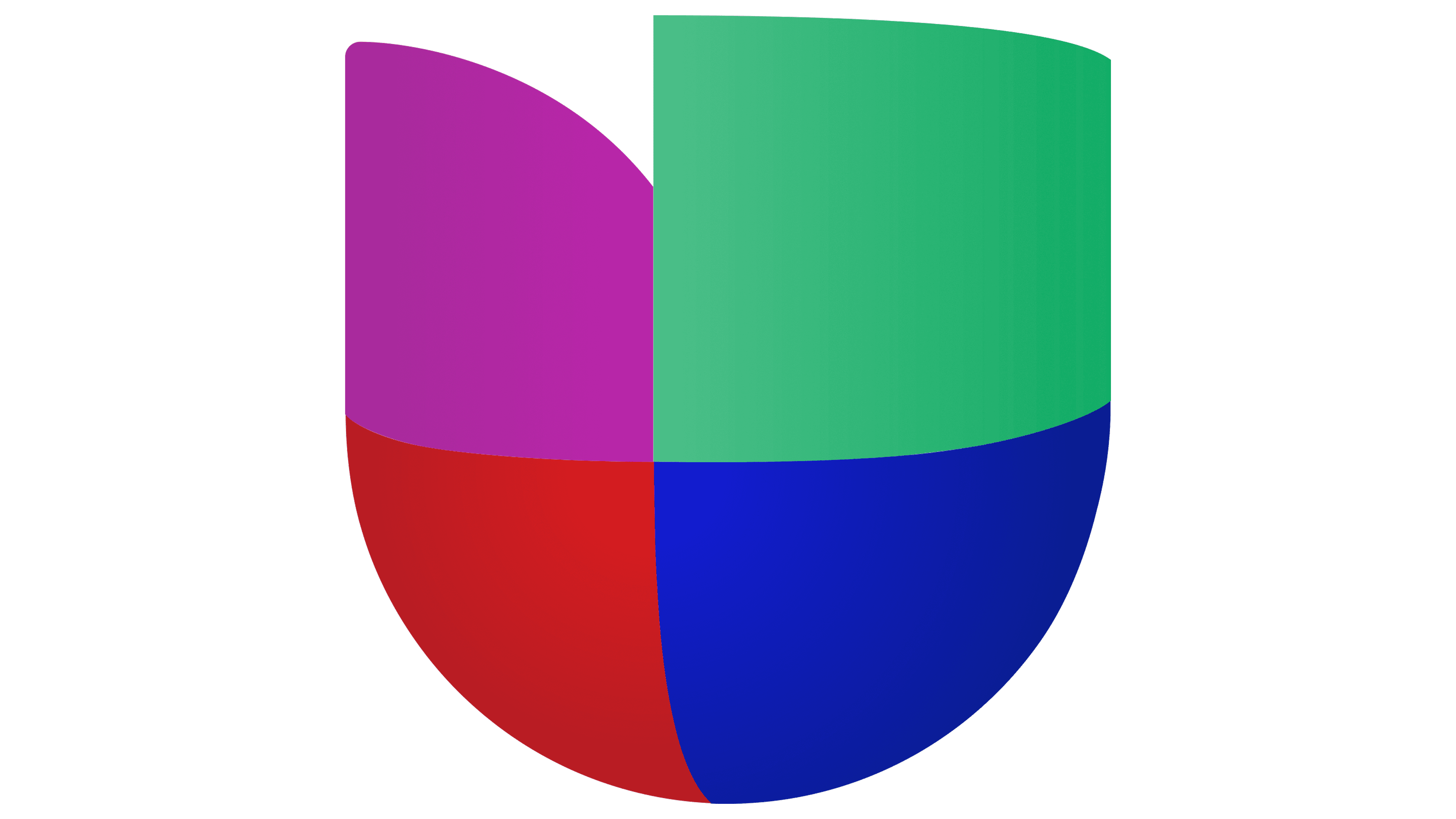
2012 – 2019
![]()
In 2011, Televisa once again bought a stake in the network, which it had left in 2005 due to a conflict with the main owner. Thanks to the collaboration, Univision became multi-platform and grew significantly. This required a review of the visual identity.
The new logo was designed by the British design agency Wolff Olins. The artists created the network’s most vibrant and impressive logo, making the elements voluminous with a glossy, streamlined mirror surface.
The figure evoked a technogenic 3-D wonder of the future. It demonstrated the network’s foresight, technological development, and provision of the most modern services to its users. It also hinted at management’s desire for modernization and a transition toward innovation and unique developments in broadcasting.
All figure elements merged into one, becoming the prototype of a heart. The symbol represents Univision’s love for its viewers. It also indicates the customers’ reciprocal loyalty to this network. The studio became a hub for the most beloved shows.
The absence of seams between the elements shows the unity of Spanish-speaking people on different continents.
2019 – today
![]()
The flamboyant Sibling Rivalry Studio worked on the latest interpretation of the emblem. They simplified the bright, futuristic style while maintaining the image’s overall appearance, composition, and volume. However, the elements lost their shine and reflectiveness, making the emblem more trivial. The size of the green part also decreased, adding compactness.
Font and Colors
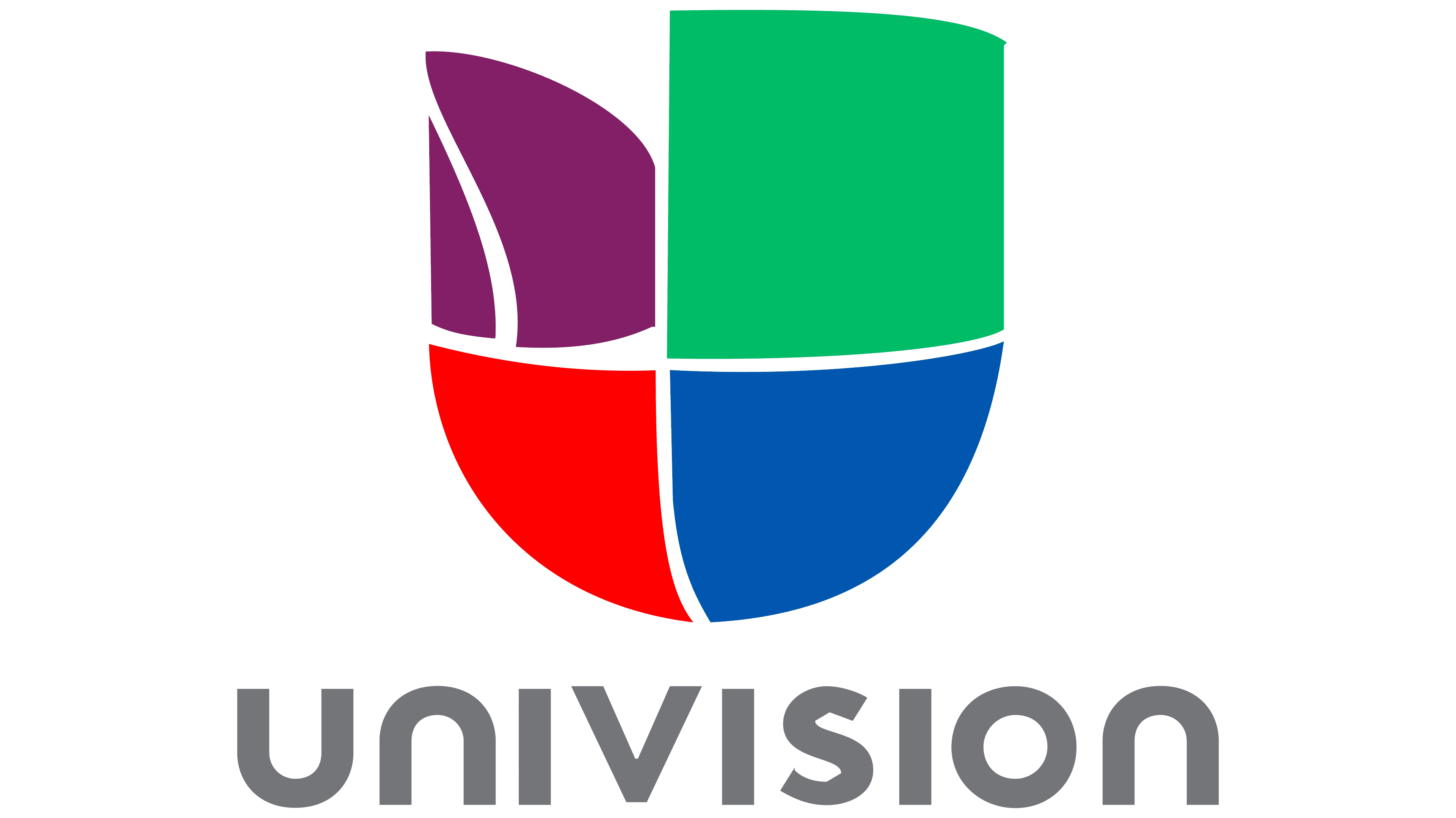
The Univision logo’s color palette is bright and saturated. It includes the primary colors of the RGB model, which eventually form all existing shades on the screen. Each color reflects the direction of the studio’s content.
- Red: top-rated shows, a passionate Latin American audience.
- Green: content that helps all Spanish-speaking groups grow and unite.
- Blue: development and intellectual growth, thanks to the network’s educational shows.
- Purple: unleashing potential, exploring the unknown, self-improvement, art, music.
The inscription’s font is smooth and streamlined, Posterama 1984 Bold. It demonstrates the studio’s ability to smooth over disagreements between immigrants and native Latin Americans in the US by taking into account the interests of all groups.