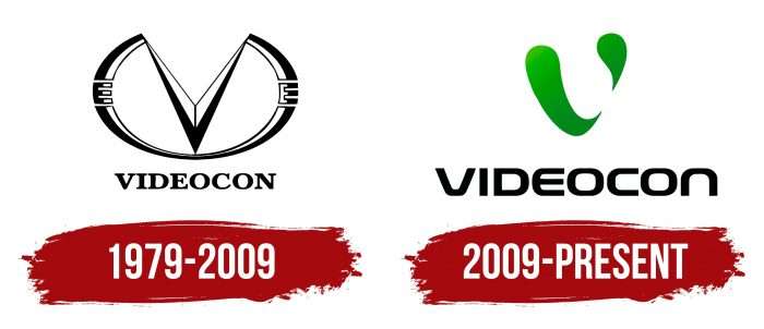
The Videocon logo shows the coverage of different business areas. In the emblem, the company demonstrates the ability to multitask, ensuring all areas’ growth and development. This is supported by a strong financial base of the oil subsoil.
Videocon: Brand overview
| Founded: | 1979 |
| Founder: | Venugopal Dhoot |
| Headquarters: | Mumbai, Maharashtra, India |
| Website: | videoconindustriesltd.com |
Meaning and History
The Videocon conglomerate, founded in 1979, donated color televisions to India and then took over frost-free refrigerators and smartphones. It constantly reacted to changing market dynamics, and the rebranding carried out in 2009 became a symbol of this development. The transformation affected only the logo: after the update, a simple abstract icon became even simpler and more abstract, which was supposed to attract the attention of young people.
What is Videocon?
Videocon is an Indian company that was involved in various types of businesses. It produced mobile devices, appliances, and electronics and was also involved in telecommunications and the oil and gas industry. It was considered the first seller of color televisions in India. The conglomerate was founded in 1979 and had factories in different countries worldwide. In 2018, it faced financial problems, and in 2021, it was acquired by Vedanta Resources.
1979 – 2009
The first Videocon emblem was broadly similar to the inverted Infiniti logo. But if the Japanese automaker’s complex geometric figure in the form of an incomplete oval marked the path leading to the horizon, then the Indian group of companies turned out to be much more prosaic. From her perspective, the V-shaped stripe is no more than the letter V, and the semi-oval is a common decorative element.
The word “VIDEOCON” was written at the bottom. Capital letters, black color, and bold highlighting made it possible to focus on the concern’s name, although it was a little off to the side.
2009 – today
The 2009 redesign reflects the concept of Experience change, which was supposed to attract new customers – younger, more creative, and globally-minded. Therefore, the presentation of the corporate identity was made by the Indian actor Shahrukh Khan, known as “Baadshah of Bollywood.”
The centerpiece of the logo is green liquid lava that changes its shape. The original idea belongs to the marketing studio Interbrand Singapore. She has developed the corporate design for Videocon and a series of cartoons featuring two drops of green lava named Mouw and Chouw. In the story, fictional characters do good deeds, delighting others. It was assumed that such a PR move would create trust in the brand and make it recognizable.
Videocon: Interesting Facts
Videocon was a major company in India that covered electronics, appliances, and more. Despite financial troubles, it made notable contributions to the economy.
- Start and Growth: In 1979, Venugopal Dhoot, Videocon, began making TVs and washing machines. It expanded into oil, telecoms, and more, showing its drive to grow and innovate.
- Color TVs: It was one of the first in India to sell color TVs, boosting its early success.
- Going Global: Videocon didn’t just stay in India; it bought companies and opened factories in China, Mexico, Italy, and Poland, making it a known brand globally.
- Appliance Innovation: It introduced India’s first tilt drum washing machine and Wi-Fi AC to meet consumer needs with new tech.
- Into Telecoms: Videocon moved into telecoms with its own company, showing its willingness to explore new markets.
- Oil Exploration: Beyond electronics, it explored oil and gas, securing stakes in fields abroad and diversifying its investments.
- Electronics Leader: At its height, Videocon was a top producer of TVs and electronics in India, helping bring technology to the middle class.
- Financial Issues: Despite its successes, Videocon struggled financially and was declared insolvent in 2017, a significant blow to the company.
- Retail Influence: Videocon also impacted retail, with its stores making branded electronics more available to people across India.
Videocon’s rise from a local maker to an international player shows its ambition and influence despite its eventual financial downfall.
Font and Colors
Green drops are an abstract drawing and a stylized letter “V.” They look three-dimensional and appear pliable due to uneven coloration. The unusual design symbolizes the innovation that guides the company in the production of technological products. The new logo’s goal is to establish an emotional connection with consumers, so the designers tried not to use many angles.
Under the graphic element, there is a black inscription “VIDEOCON.” The branding agency has developed a custom font for the logo, which is nothing like the old 1979 typeface:
- The letters have no serifs.
- Many of the corners are rounded.
- “E” looks like “C” with a horizontal stroke in the middle, and “N” looks like the same “C,” but with its open part facing down.
In addition to black, the palette includes several shades of green. They symbolize freshness and reflect the environmental policy of the group. Due to the linear-gradient, the droplets appear three-dimensional.
Videocon color codes
| Black | Hex color: | #000000 |
|---|---|---|
| RGB: | 0 0 0 | |
| CMYK: | 0 0 0 100 | |
| Pantone: | PMS Process Black C |
| Islamic Green | Hex color: | #00950e |
|---|---|---|
| RGB: | 0 149 14 | |
| CMYK: | 100 0 91 42 | |
| Pantone: | PMS 354 C |


