 Vodacom Logo PNG
Mobile communications provide voice calls, data transmission, and access to digital services, including the internet and mobile payments. These services operate through a network covering cities and rural areas. The Vodacom logo is associated with a telecommunications company that provides communications, internet, and mobile financial services across Africa.
Vodacom was founded in 1993 in South Africa as a joint venture between Telkom, Vodafone, and VenFin Limited. The name was derived from the words “Voice” and “Data Communications”. It reflected the mission to connect people through technology. In 1994, the company launched one of the continent’s first GSM networks and connected 10,000 users on its first day.
In 1996, investor Hosken Consolidated Investments joined the capital. By 2002, Vodafone and VenFin bought back the shares. After that, the company became South Africa’s market leader and began international expansion. That same year, operations began in the Democratic Republic of the Congo. Later, the company entered Tanzania, Mozambique, and Lesotho.
In 2009, Vodacom shares were listed on the Johannesburg Stock Exchange. After the listing, Vodafone acquired a 64.5 percent controlling stake. In 2011, the company rebranded, adopting red to align with its parent company’s corporate style.
In 2017, Vodacom acquired a 34.9 percent stake in Safaricom, Kenya’s largest operator. In the same year, Vodacom Tanzania went public. It became the largest company on the Tanzanian stock exchange.
In December 2022, it completed the acquisition of a 55 percent stake in Vodafone Egypt. In 2025, the company became the first in South Africa to conduct a native call on a 5G network. That same year, it announced a partnership with Orange to build 1,000 solar-powered base stations in the Congo.
Vodacom introduced the Vision 2030 strategy. It aims to grow the customer base to 260 million subscribers and reach 120 million financial service users across Africa by the end of the decade.
Meaning and History
What is Vodacom?
Vodacom is a South African telecommunications group based in Johannesburg, the region’s leading mobile operator, and part of the British company Vodafone, which owns 60 percent of its capital. It serves more than 130 million customers in South Africa, Tanzania, the Democratic Republic of the Congo, Mozambique, Lesotho, and Ethiopia. It provides voice communication, data transmission, fixed-line services, M-Pesa mobile payments, and corporate solutions in ICT and cloud technologies.
1994 – 2011
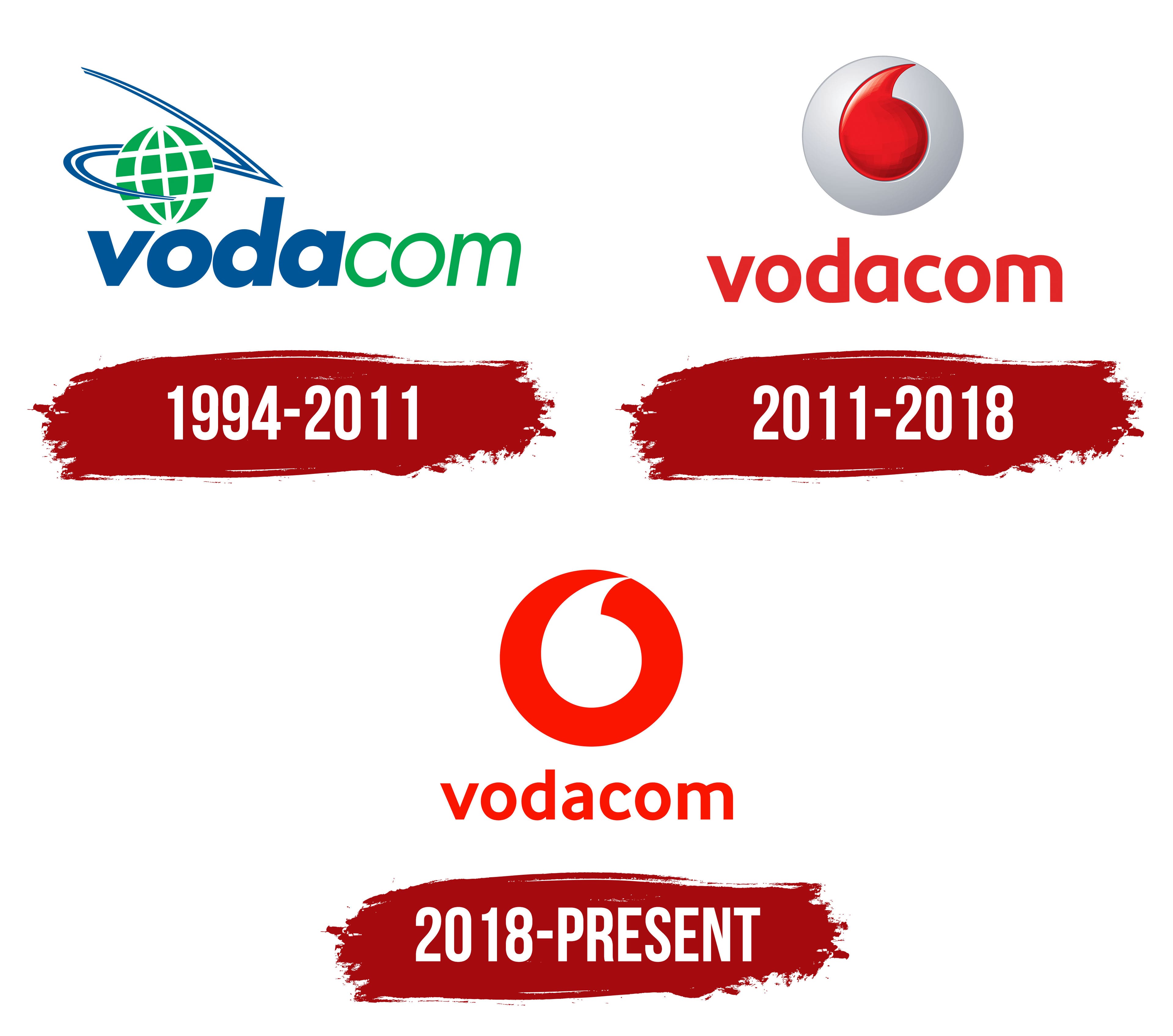
The Vodacom name predated the mobile network launch. The operator was established in South Africa in 1993 with the participation of Telkom, Britain’s Vodafone, and the Rembrandt group. Its name combined parts of “Voice and Data Communications.” In 1994, the company began serving customers and connected 10,000 subscribers on its first day. The two forms of communication reflected in the name became the foundation of the new operator’s business.
The early logo combined blue and green sections of the name with a globe emblem. Lowercase “vodacom” used slanted sans-serif lettering resembling Futura or ITC Avant Garde. The blue “voda” used heavier strokes, while the green “com” used thinner ones. The weight and color differences distinguished the parts of the name while keeping them on a single line.
A green globe with a white grid of meridians and parallels appeared above the left side of the name. Blue lines wrapped around it diagonally, some passing in front of the sphere and others rising above it. Two closely spaced outlines converged on the right in a sharp, arrow-like point. The interweaving lines and globe gave the emblem several layers, while its colors were repeated in the name.
The blue-and-green identity accompanied Vodacom’s early development and remained until 2011. After Vodafone gained control in 2009, the local name stayed. Still, the next major identity change brought it closer to the international group. The transition to red was intended to make its Vodafone affiliation visible and connect the South African brand to an international operator’s capabilities.
2011 – 2018
On April 1, 2011, Vodacom introduced the Vodafone group’s red identity while retaining the South African operator’s name. According to the source material, it became the first Vodafone subsidiary to adopt the group’s identity without taking its name. The globe and surrounding lines disappeared along with the blue-and-green colors. Vodafone replaced them with its speechmark, a symbol associated with conversation and human communication.
A single quotation mark used to indicate direct speech inspired the speechmark’s form. In the Vodacom logo, it became a rounded red figure with a pointed upper end curving inward. The symbol sat inside a silver circle above the name. Transitions between light and dark areas, highlights, and shaded edges created depth, making the red figure appear slightly recessed within its frame. Beneath the emblem, red “vodacom” lettering used upright lowercase sans-serif letters. Their rounded forms resembled Helvetica Rounded or Avenir Next Rounded. The earlier slant and the blue-and-green division disappeared.
Designer Gary Broadbent created Vodafone’s original speechmark concept. FCB/Framework Design worked on the Vodacom adaptation with FCB Africa and British agency The Partners. Draftfcb Johannesburg and partner agencies prepared the launch. The transition was accompanied by the group-wide phrase “Power to you.”
The change extended well beyond replacing the logo. Project participants reported rebranding approximately 40,000 locations in 12 weeks. The red brand first appeared publicly on the redesigned top of Ponte Tower in Johannesburg. The identity was then presented at a music event at Orlando Stadium.
2018 – today
In October 2017, Vodacom joined Vodafone’s international brand update. The group brought its major operations outside Europe under a shared identity system, including markets in South Africa, Tanzania, Mozambique, and the Democratic Republic of the Congo. For Vodacom, one of Vodafone’s key African subsidiaries, the new logo accompanied the development of digital services and efforts to help customers adopt new technologies. Brand Union created the parent group’s logo update.
The silver, three-dimensional frame disappeared. A flat red circle replaced it, with a white opening inside forming the comma-shaped speech mark. Its rounded lower portion leads into a sharp upper curve that reaches the circle’s edge. Solid red and white areas replaced the earlier highlights, shadows, and glossy effect. Red lowercase “vodacom” lettering remained beneath the disk, set in Vodafone Regular, a custom typeface commissioned by Vodafone Group.
The identity change came with the slogan “The future is exciting. Ready?” The emphasis shifted to the future and the role of digital technology in everyday life. The speechmark maintained its connection to conversation, while the Vodacom name continued to refer to the voice and data communications that had shaped the operator’s name at its founding.