![]() Wiesmann Logo PNG
Wiesmann Logo PNG
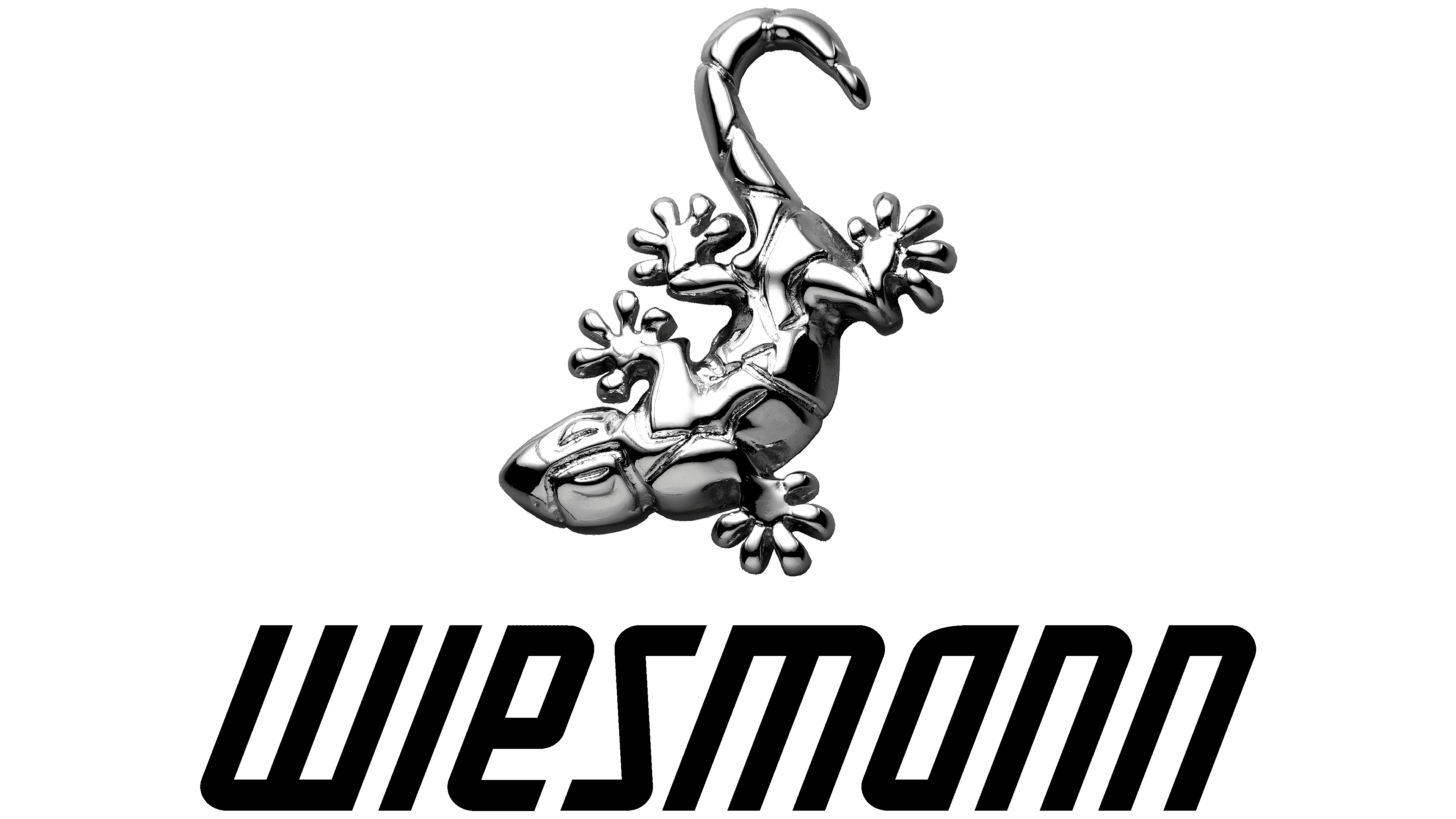
The Wiesmann logo shows technical perfection and brilliance. The company’s cars are unusual, with a bright, eye-catching appearance, like a gecko. The sign demonstrates streamlining and maneuverability.
Wiesmann is a small German company that was temporarily closed in 2013 and, after a brief hiatus, returned to the automotive market. It appeared in 1988 and occupied the niche of handcrafted convertibles. The Wiesmann brothers founded it – Friedhelm and Martin. One received an engineering degree, and the second was a born businessman, so he knew how to turn his brother’s profession into a profitable business. By joining forces, they opened their factory and began producing roadsters. The debut model went on sale in 1993.
Despite initial success, the project fell through. It was unprofitable, so Friedhelm and Martin could not finance it for long. The company never entered the US market because its cars were too expensive. The niche manufacturer sold sports cars for 150-200 thousand euros, and the cost grew with each new model. This is due to manual assembly and the limited-edition status of the Wiesmann, which produced up to 180 cars annually. Each one was adorned with a gecko emblem.
Only a few could afford such machines, and the American market for the company was forever closed to it. Therefore, in 2013, Wiesmann filed for bankruptcy. The owners tried to sell the business to the CMMW consortium, but the deal did not materialize. In the end, the brand was bought out by the Indian brothers Sahir and Roheen Berry. The new owners had no money problems and immediately began rebuilding Wiesmann. They announced the release of the first model in 2020. The original gecko logo has been preserved as an iconic historical value.
The car’s design has not changed much either: it can be called a pretentious but elegant neo-classic. The prototype was tentatively named Project Gecko and had an unusual coloring that mimicked a reptile’s. Production is carried out at the plant in Dülmen. The industrial building is adorned with a large metal gecko figure because the gecko is Wiesmann’s main symbol.
Meaning and History
![]()
What is Wiesmann?
This German boutique automaker crafts exquisite hand-built sports cars, blending German engineering expertise with the classic look of British roadsters. The company’s guiding principle is to create lightweight cars powered by BMW engines, drawing attention to their curved, vintage-style bodies. Skilled artisans meticulously assemble each car to the customer’s specifications at a unique facility in Dülmen, which resembles an art gallery rather than a typical production plant.
1988 – today
![]()
The logo, depicted as a silver gecko, embodies the brand’s unique philosophy. It’s rare to see a reptile, especially a gecko, on an automotive emblem, making the Wiesmann logo distinctive and memorable.
The gecko on the emblem is rendered with great detail. Its feet, equipped with the species’ characteristic suction pads, are carefully drawn, emphasizing the reptile’s ability to cling firmly to any surface. This trait serves as a key metaphor for the company’s cars, which, thanks to their design and engineering, “stick” to the road, providing excellent grip and stability.
The symbol’s silver color adds sophistication and elegance, reflecting the high quality and premium nature of the brand’s vehicles. The gecko’s form, which appears both dynamic and stable, highlights the characteristics of Wiesmann cars: speed, power, and control.
Interestingly, this visual image was chosen to contrast with standard animal symbols, such as tigers or jaguars, traditionally used in the automotive industry. This choice reflects Wiesmann’s desire to stand out, showcasing its uniqueness and individuality.
In addition to the gecko emblem, the company uses a text badge that includes the brand name and the phrase “MANUFAKTUR DER INDIVIDUALISTEN.” The two fonts are harmoniously combined, creating a visual unity. This inscription emphasizes that each car is crafted with the customer’s individual needs and preferences in mind, underscoring the exclusivity and uniqueness of every vehicle.
Font and Colors
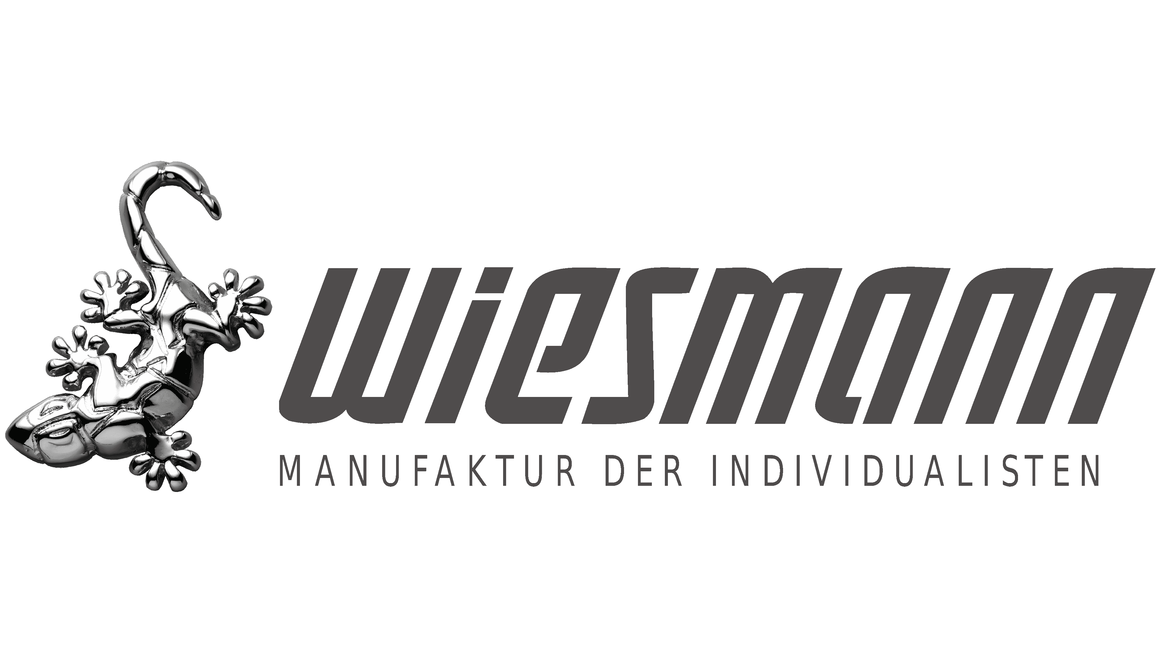
A stylized italic font is used for the brand name. The letters are very condensed and resemble lowercase letters. The upper corners on the left side are partially rounded, while those on the right are left sharp. The “e” and “a” have open, rounded lines. As for the phrase “MANUFAKTUR DER INDIVIDUALISTEN,” it is written in strict Roman type. All characters are uppercase, thin, and not serif.
The emblem with the gecko image is silvery, and two additional colors are mixed with the main colors, black and white. There is a gradient in some places, but there are also solid areas. This is done to make the logo look like a three-dimensional car badge.