


 XPO Logo PNG
Freight transportation requires route planning, transportation coordination, and adherence to delivery deadlines. Logistics companies manage supply chains from shipment to receipt, ensuring goods move between regions. The XPO logo represents a company that provides transportation and logistics services, including freight management and delivery.
XPO, Inc. was founded in 1989 as Express-1 Expedited Solutions. It specializes in urgent freight transportation in the United States. In June 2011, investor Bradley Jacobs announced an investment of up to 150 million dollars in Express-1. He became the company’s head and renamed it XPO Logistics.
From 2011 to 2015, XPO completed a series of major acquisitions and entered the European and North American markets. In 2015, the company spent almost $ 5 billion to acquire two large transport operators. This move made XPO an industry leader.
By 2017, the company had reached an annual revenue of about $15 billion. According to Transport Topics, it ranked first among North American logistics companies. In the years that followed, XPO expanded its warehousing, logistics, and transportation services and strengthened its position in Europe.
In December 2020, XPO announced a business split. In August 2021, it spun off its contract logistics division, GXO Logistics. It became the largest company in this segment. In November 2022, XPO spun off its brokerage business, RXO, as a public company.
After the restructuring, XPO focused on less-than-truckload transportation in North America and European transport operations.
XPO, Inc. remains a public company headquartered in Greenwich, Connecticut. It is one of the largest transportation service providers in the United States and Europe.
Meaning and History
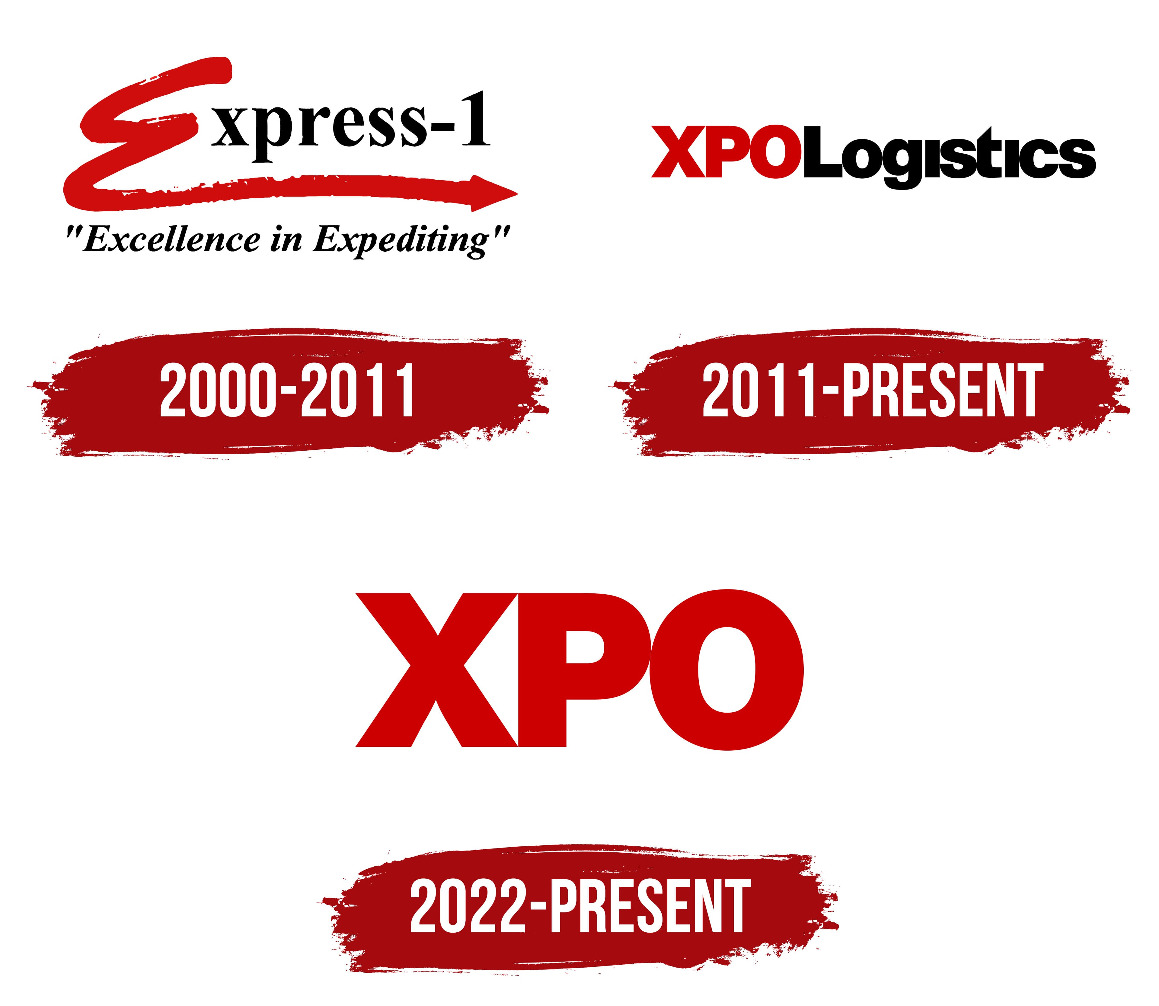
What is XPO?
XPO is an American transportation and logistics corporation based in Greenwich, Connecticut, that specializes in less-than-truckload freight shipping across North America. Its network includes more than 600 terminals covering 99 percent of U.S. ZIP codes, plus Canada, Mexico, and the Caribbean. The company transports over 8 million tons of freight per year using its own platform. It manufactures trailers at its own facilities and trains drivers at one hundred training centers.
2000 – 2011
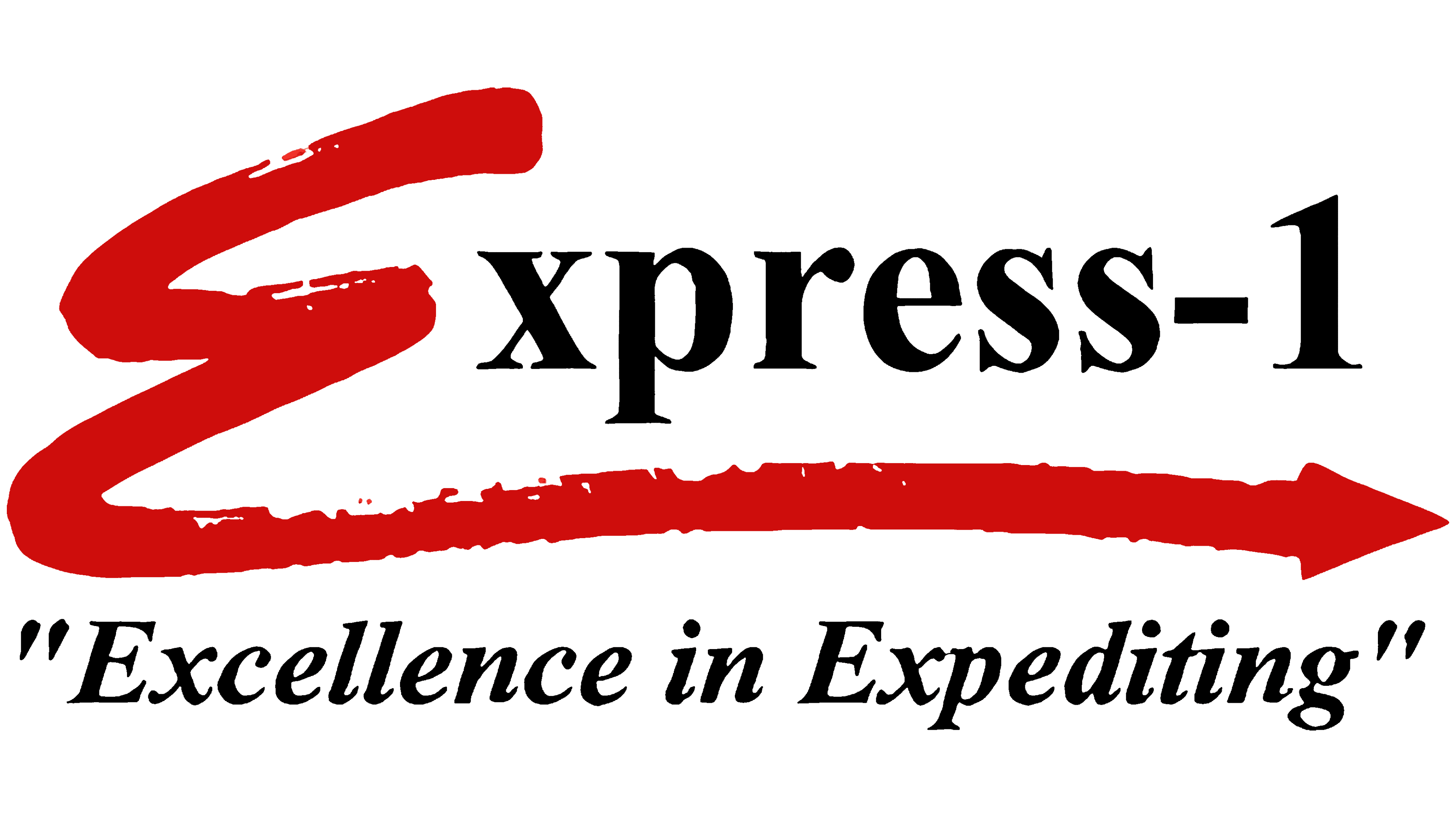
Express-1 was originally the name of an expedited shipping business founded in Michigan in 1989 by Michael Welch and Keith Avery. The name directly referenced express transportation. The business became part of Segmentz in 2004, and two years later, the parent company adopted the name Express-1 Expedited Solutions. A name customers already knew now represented the entire company and reflected its focus on time-sensitive transportation. The company introduced the stock ticker XPO at the same time, and it later became the basis for the corporate name. Today’s XPO, a trucking company, traces its roots to Express-1.
The logo began with a large red “E” that resembled a broad brushstroke. Uneven edges and small white gaps distinguished it from the typeset lettering that followed. The letter’s lower stroke extended beneath the name and ended in a right-pointing arrow. The remaining lowercase letters and the numeral “1” were black, with serifs resembling Times New Roman or Garamond.
The phrase “Excellence in Expediting” appeared in quotation marks beneath the name. It was set in bold, italic serif type that leaned to the right. The tagline promised a high standard of expedited transportation, reinforcing the name and the right-pointing arrow. The brushstroke “E,” the typeset “xpress-1,” and the separate tagline formed three layers within the composition.
2011 – today
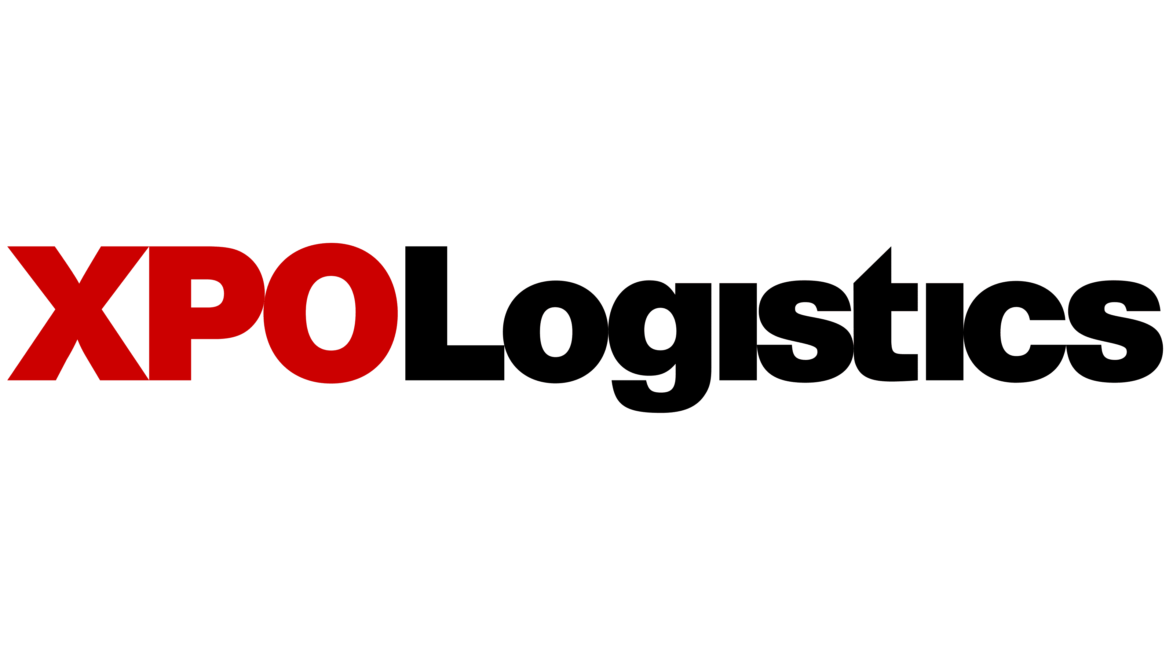
The three letters XPO moved from the stock ticker for Express-1 Expedited Solutions into the company’s name. On September 2, 2011, after Brad Jacobs took over leadership, the company became XPO Logistics. The word “Logistics” identified its business field. Express-1 continued as a separate brand within the group. In 2014, the expedited shipping division became XPO Express, while the final-stage delivery business became XPO Last Mile.
The new logo consisted of a single, tightly spaced line. Large uppercase XPO letters appeared in red, followed by “Logistics” in black. Its initial “L” matched the height of the red letters, followed by lowercase letters. Heavy, upright sans-serif strokes gave the lettering a look similar to Helvetica Black, Arial Black, or Impact. The angular “X” contrasted with the rounded “P” and “O,” while the black lettering followed with little space between the two parts. The brushstroke letter, arrow, and italic tagline disappeared from the corporate logo.
The primary version used red and black on a white background. XPO Red was specified as #CC0000. The guidelines required approved logo artwork with fixed proportions and letterforms. XPO alone was permitted only in certain formats, including business cards and mobile app icons. The tagline “Let’s Move the World Forward” accompanied the logo, replacing “Results Matter.” It was set in XPO Roboto Wide Light.
2022 – today
XPO shortened its name in 2022, coinciding with a corporate split. In November, the brokerage business became the independent company RXO, while XPO’s North American operations focused on less-than-truckload shipping. In this service, a single truck carries shipments for multiple customers. On December 19, the company changed its corporate name to XPO, Inc. The company dropped the word “Logistics” as it shifted to a more specialized transportation business.
The logo reflected this change by removing the black lettering. Only the three tightly spaced red uppercase letters XPO remained. Their upright sans-serif strokes are nearly uniform in thickness, with compact proportions similar to Impact or Helvetica Inserat. The diagonals of the “X” sit beside the rounded upper section of the “P” and the oval “O.” The red is described as close to #CC0000. At the same time, black remained part of the broader visual identity.
Design Director Jeroen Sikma, Senior Partner Rodney Abbot, and Partner Michael Gericke worked on the update. The designers associated the three-letter mark with energy, precision, and the carrier’s leadership ambitions. The shorter lettering matched XPO’s new corporate name and business focus after RXO’s separation.