


 Coca-Cola HBC Logo PNG
Beverage production and delivery involve bottling, storage, and distribution to stores and retail outlets. These processes ensure product availability across different countries and regions. The Coca-Cola HBC logo represents a company that bottles and distributes Coca-Cola-branded beverages in Europe, Africa, and other regions.
Coca-Cola HBC was established in 2000 following the merger of the Greek and Austrian Coca-Cola Beverages companies. The new enterprise became one of The Coca-Cola Company’s largest partners outside the United States. Production in Greece began in 1969. Manufacturing in Austria started in 1929. After the merger, the company moved its headquarters to Athens. The company focused mainly on business development in Eastern Europe.
In 2001, the company’s shares began trading on the stock exchanges of Athens, London, and New York. By 2003, Coca-Cola HBC was already operating in 28 countries, including Russia, Ukraine, and Poland. In 2004, the brand became an official sponsor of the Olympic Games in Athens.
From 2006 to 2008, the company entered the African market and began production in Nigeria. The 2008 global crisis temporarily slowed development. Later, the business recovered through optimization and diversification. In 2013, the company moved its legal registration to Switzerland. The operational center remained in Athens.
Since 2015, Coca-Cola HBC has been expanding its beverage range to include juices, water, energy drinks, and Costa Coffee. In 2019, the company completed construction of a major plant in Egypt. In 2022, the company acquired Coca-Cola’s Egyptian division.
In 2024, revenue increased by 13.8 percent. EBIT reached 1.2 billion euros. Energy drink sales grew for the ninth consecutive year. The coffee segment expanded to more than 4,300 retail outlets.
Coca-Cola HBC announced the acquisition of a 75 percent stake in Coca-Cola Beverages Africa. The deal is valued at $ 2.6 billion. After this, the company will become Coca-Cola’s largest manufacturing partner in Africa and the second largest in the world by production volume.
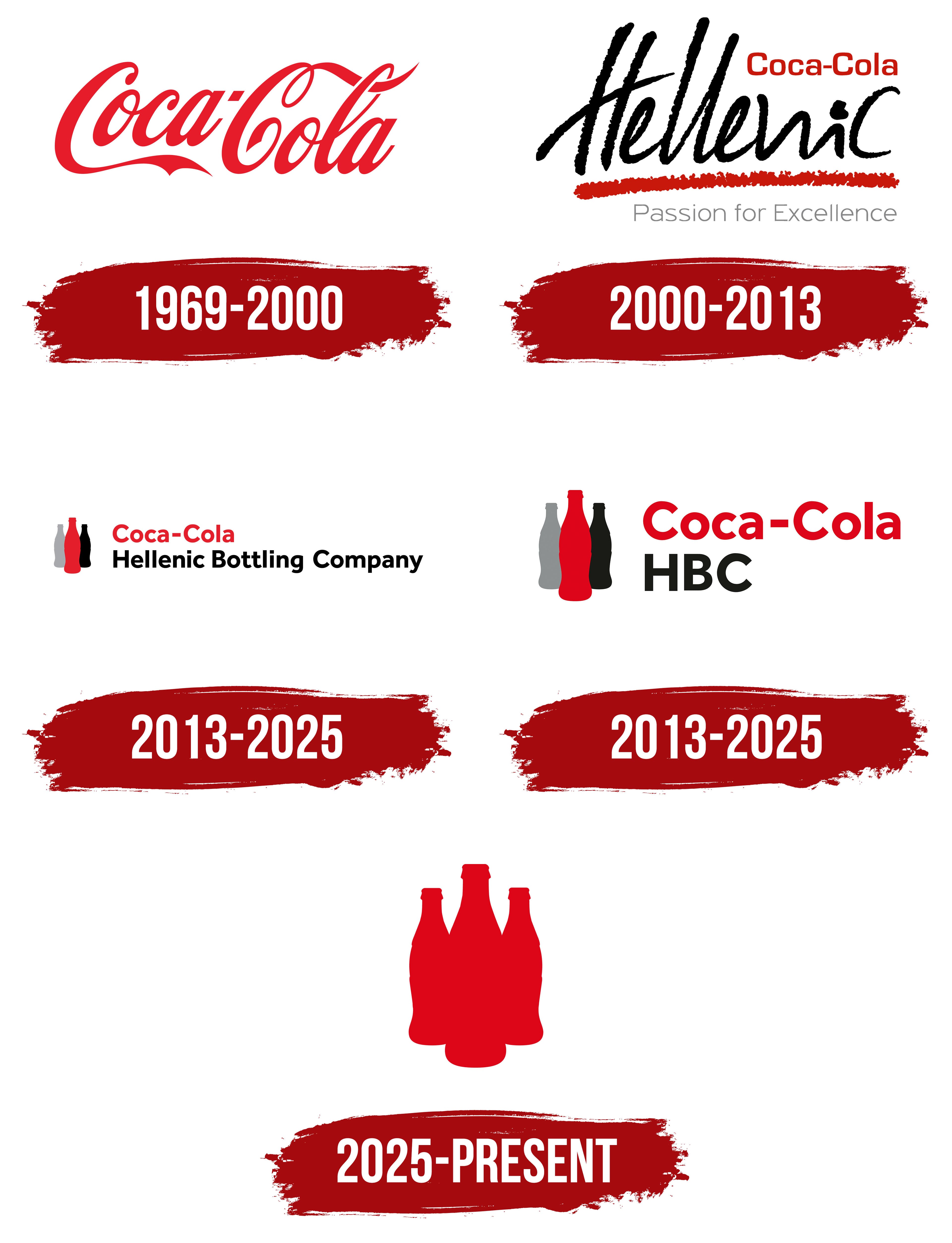
Meaning and History
What is Coca-Cola HBC?
The company is one of the largest independent producers and distributors of The Coca-Cola Company’s non-alcoholic beverages. Its operations span 29 countries across Europe, Africa, and Asia, serving about 600 million consumers and selling more than 2.5 billion product cases per year. Its headquarters is in Zug, Switzerland, and its network includes 59 plants and about 300 bottling lines. The product range includes Coca-Cola, Fanta, Sprite, Dobry and Rich juices, Monster energy drinks, BonAqua water, FUZETEA tea, and Kruzka i Bochka kvass.
1969 – 2000

The red Coca-Cola signature on Hellenic Bottling Company materials represented The Coca-Cola Company’s product brand and the beverages within its system. Its status as Hellenic Bottling Company’s corporate logo throughout the entire period requires separate confirmation. The product trademark and the company’s corporate identity belong to different phases in the brand’s history.
Hellenic Bottling Company was founded in Greece in 1969. It bottled Coca-Cola products and gradually expanded into international markets. In 1981, the company acquired almost all the capital of Kar-Tess Holding. It listed its shares on the Athens Stock Exchange in 1991. The forms 3E and Tria Epsilon, connected with its Greek corporate identity, appeared alongside the full English name.
The logo shows Coca and Cola joined by a hyphen. Both words begin with uppercase letters followed by lowercase characters. The entire wordmark is red and appears on a white background. Letter connections, loops, and extended stroke endings create the long horizontal composition.
The lettering is based on Spencerian Script, an American writing system featuring flowing connections and alternating thin and thick lines. The letters join in a continuous calligraphic line. Broad curves transition into loops and flourishes, while the overall slant directs the wordmark to the right. The hyphen separates the 2 words while retaining them within the shared handwritten composition.
On Coca-Cola products, the red signature represented the product trademark. In the bottling company’s operations, it identified the beverages as part of The Coca-Cola Company system. The logo appeared on bottles, packaging, and partner materials, primarily representing the product. Hellenic Bottling Company used its corporate name and the 3E form.
Hellenic Bottling Company S.A. merged with Coca-Cola Beverages plc on August 9, 2000. The second company was listed in London and operated in 12 countries. The new group received the legal name Coca-Cola Hellenic Bottling Company S.A. The name combined the Coca-Cola product system with the Greek bottling company’s heritage.
HBC came from Hellenic Bottling Company and preserved the predecessor’s name. Coca-Cola reflected the group’s position within The Coca-Cola Company system and its role as a major beverage production and bottling partner. Following the merger, both names became part of the group’s corporate name. At the same time, the red calligraphic signature remained the logo of the Coca-Cola product brand.
2000 – 2013
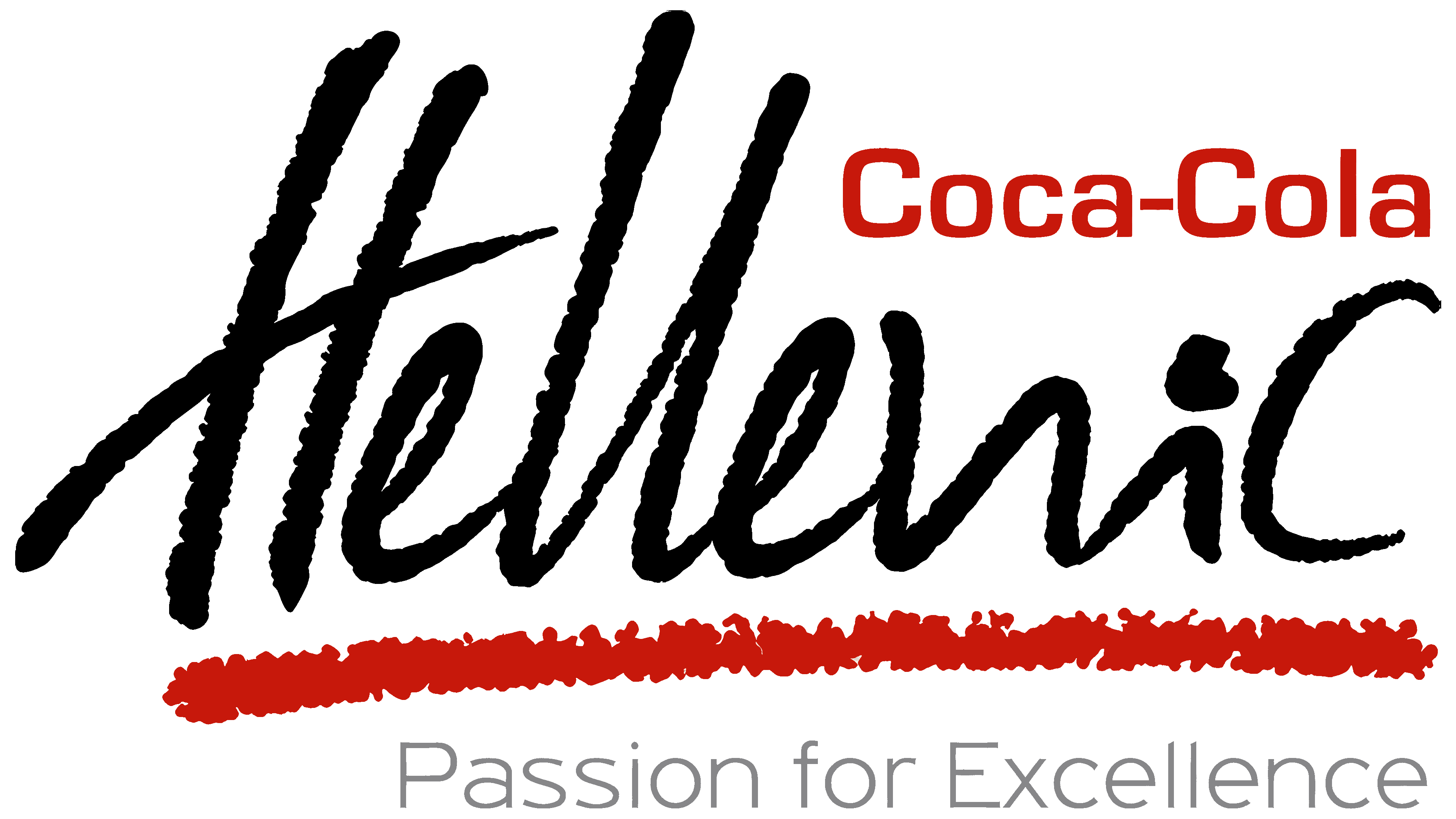
Following the merger of Hellenic Bottling Company and Coca-Cola Beverages on August 9, 2000, Hellenic received a prominent place in the corporate logo. The new group used the Coca-Cola Hellenic name and the statement “Passion for Excellence.” The composition connected the company with the Coca-Cola system while presenting a separate holding group responsible for beverage production and bottling.
The logo consisted of 3 typographic levels. The red Coca-Cola name appeared at the top. Hellenic stood below in large black lettering, while the light gray phrase Passion for Excellence occupied the lower line. A red band separated the corporate name from the statement.
Coca-Cola used Spencerian Script, which is associated with The Coca-Cola Company’s product system. Connected letters, a rightward slant, loops, and extended terminals preserved the brand’s familiar appearance. Red referred to Coca-Cola products and the beverage system, including the bottling group.
Hellenic used a different handwritten style. Its broad black letters resembled brush or marker strokes. Long vertical and diagonal lines extended beyond the primary letter height, creating a loose silhouette. Its large size gave Hellenic the leading corporate role. The different writing styles separated the Coca-Cola product brand from the group name.
A red horizontal band with uneven edges ran beneath Hellenic. It resembled a brushstroke and supported the style of the middle line. The color repeated the Coca-Cola wordmark and connected the upper and middle sections. The band formed a base beneath the large word and separated it from the statement.
Passion for Excellence appeared at the bottom. The “P” and “E” were uppercase, while the remaining letters were lowercase. The statement used a thin light gray sans-serif typeface. Its small size preserved the primary role of Coca-Cola and Hellenic.
The group updated its corporate identity across all 28 operating countries in 2008. The Greek division introduced a version aligned with the shared Coca-Cola Hellenic system. It retained the 3E emblem connected with the company’s former name and Greek history.
The 3E symbol was revised, while red and gray became the primary colors. The text received new typography. The company cited a strong connection between 3E and Greek audiences, so it made the historical emblem part of Coca-Cola Hellenic’s international system. It also recalled the origins of the Hellenic Bottling Company.
2013 – 2025
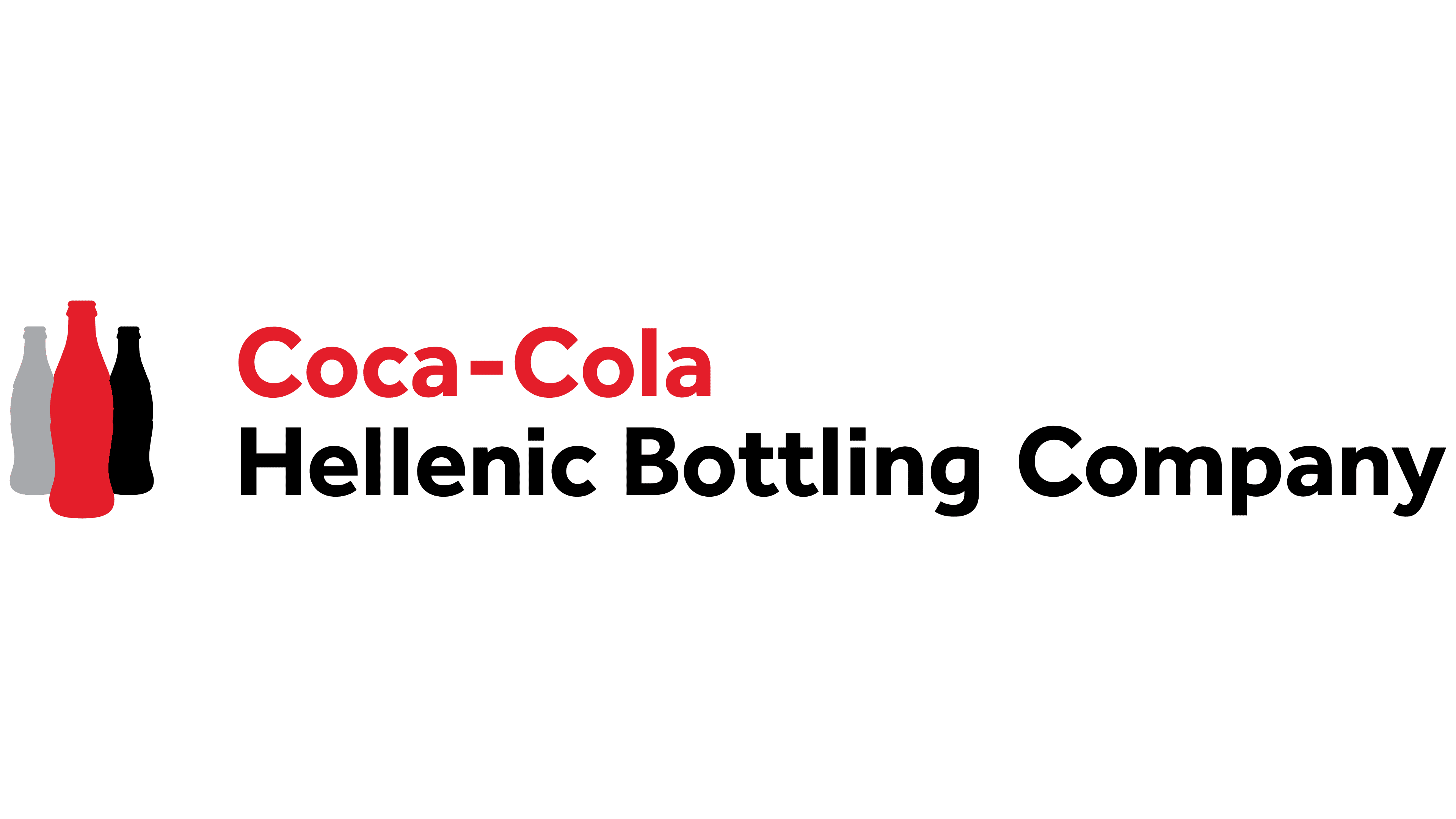
Three outlined bottles became Coca-Cola HBC’s corporate emblem after the group transitioned to a Swiss holding structure and shortened its name. In 2012, the company announced that it would move its parent organization to Switzerland. Coca-Cola HBC AG shares began trading in the premium segment of the London Stock Exchange on April 29, 2013. Coca-Cola Hellenic Bottling Company S.A. later became a subsidiary of the new holding company.
The large-scale implementation of the Trinity identity began in June 2016. Coca-Cola Hellenic announced the replacement of the previous Hellenic system and Passion for Excellence statement across all 28 operating countries. Coca-Cola HBC became the primary corporate name. The international holding company and national divisions received a shared emblem.
Trinity referred to the composition’s 3-part structure. Three elongated Coca-Cola bottle silhouettes appeared on the left. The contours narrowed at the neck, widened through the middle, and drew inward near the base. The forms stood close together, partially overlapped, and created a compact group.
The colors progressed from a gray bottle on the left to red in the center and black on the right. The middle form was larger and occupied the foreground, while the side bottles appeared behind it. The arrangement emphasized the red outline while preserving the distinction among the 3 bottles.
The silhouettes were based on the Coca-Cola contour bottle, one of the primary forms in The Coca-Cola Company’s product heritage. The group associated the 3 bottles with the Coca-Cola system, its role as a major production and bottling partner, and its presence in national markets. The emblem united the global product brand, the bottler’s operations, and the geographic reach of its divisions.
A left-aligned 2-line wordmark appeared on the right. The upper line contained the red Coca-Cola name, while Hellenic Bottling Company appeared below in black. The displayed corporate version used a rounded sans-serif typeface resembling Helvetica Rounded Bold and Gotham Rounded. The words began with uppercase letters followed by lowercase characters.
Other versions shortened the text to Coca-Cola HBC. Coca-Cola appeared in red using the historical script or an adapted corporate form. HBC used a heavy black sans-serif typeface. Red referred to the Coca-Cola product system, while black represented the holding company’s name.
National versions added a country name, with examples including Russia, Ukraine, and Switzerland. The 3 bottles and group name kept their established structure; only the geographic line changed. Divisions used the shared corporate identity with a local country name beside the international Coca-Cola HBC brand.
2013 – 2025
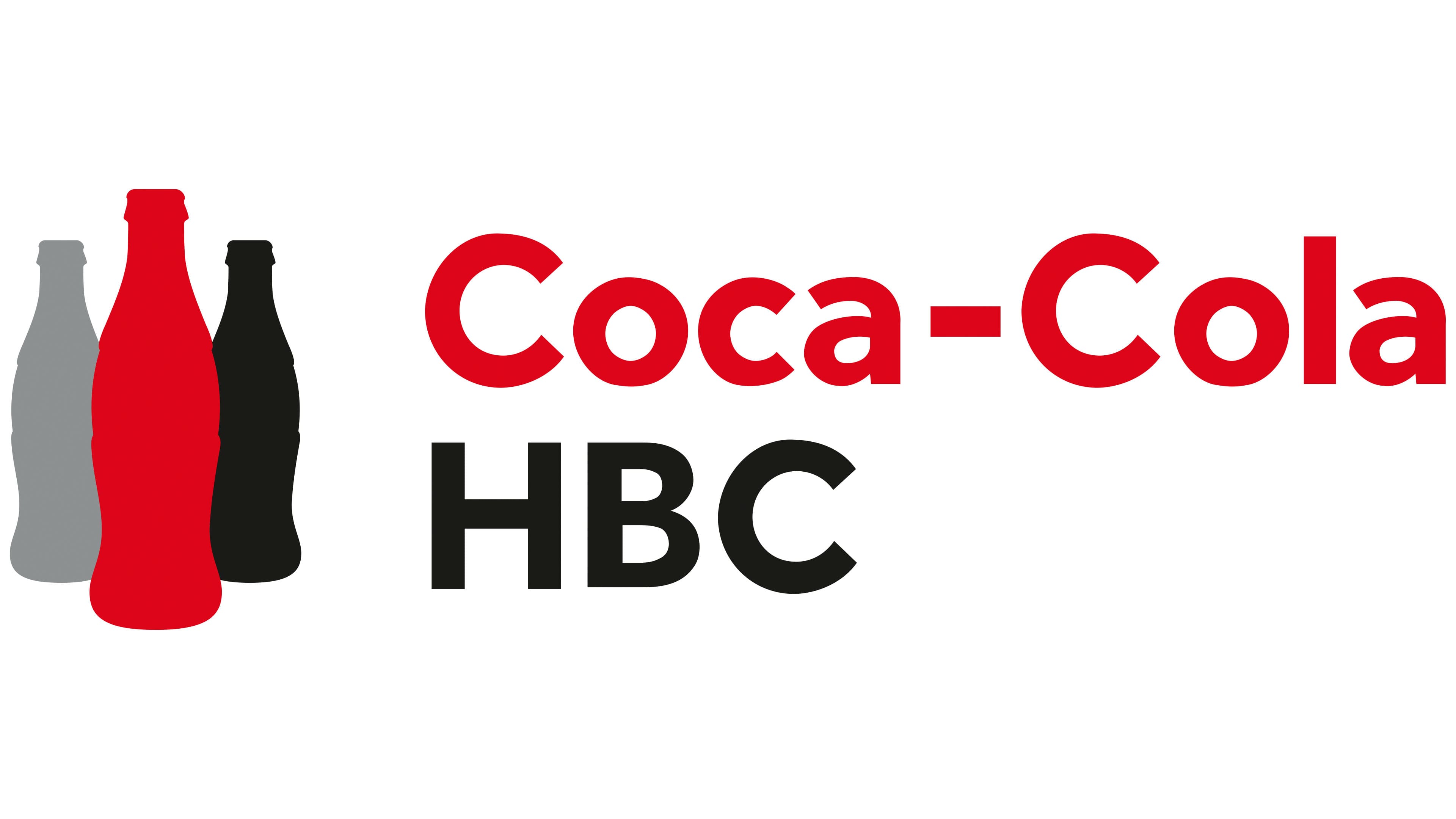
Replacing the full Hellenic Bottling Company name with HBC completed the logo’s adaptation to Coca-Cola HBC AG. After transferring its legal registration from Greece to Switzerland, the group changed its name from Coca-Cola Hellenic Bottling Company S.A. to the Swiss holding company. The typographic section became shorter and reflected the new corporate structure.
The main change affected the lower line to the right of the emblem. The 3 uppercase letters HBC replaced the lengthy Hellenic Bottling Company name. The abbreviation used a heavy black sans-serif typeface. Dense strokes and large dimensions balanced the red Coca-Cola name above. The compact wordmark worked in narrow horizontal formats.
The other components retained the construction of the Trinity system introduced in 2016. Three Coca-Cola contour bottle silhouettes appeared on the left. A gray form stood on the left, red occupied the center, and black appeared on the right. The middle bottle was larger and occupied the foreground, while the side bottles stood behind it.
The outlines repeated the Coca-Cola contour bottle with its narrow neck, expanded middle, and tapered base. The compact group of 3 bottles represented the connection with the Coca-Cola system, the work of a major beverage production and bottling partner, and the group’s presence in national markets. Trinity referred to the number of silhouettes within the emblem.
The red Coca-Cola wordmark maintained the connection with The Coca-Cola Company’s product heritage. The black HBC letters represented the corporate group through a different color and typographic style. The abbreviation shortened the name, while the emblem, colors, and placement remained unchanged.
HBC became the holding company’s compact name. It appeared in international materials, documents, and national logo versions. Local identities added a country name while preserving the overall Coca-Cola HBC AG structure.
2025 – today

In 2025, Coca-Cola HBC changed the meaning of its historical HBC abbreviation. Hellenic Bottling Company became Hellenic Beverage Company. Beverage expanded the corporate name’s scope and aligned it with the group’s modern portfolio, which covers a broad range of drinks.
Over the years, Coca-Cola HBC entered numerous product categories. The group produces water, juice, coffee, energy drinks, sports drinks, ready-to-drink cocktails, and premium spirits. Bottling described the company’s role in manufacturing and filling beverages, while Beverage covered its entire drinks business. The HBC abbreviation remained unchanged, preserving historical continuity.
The revised name was accompanied by an update to the Trinity emblem used since 2016. Three Coca-Cola contour bottle silhouettes remained the foundation. A unified color treatment replaced the former gray, red, and black combination.
The bottle arrangement became more open. Gaps appeared between the contours, separating the 3 silhouettes. The revised placement added depth while retaining the connection with the Coca-Cola bottle. A shared color united the forms and suited the new corporate name.
The 3 bottles continue to connect the group to the Coca-Cola system and its contour packaging. Hellenic Beverage Company covers the company’s expanded portfolio, while HBC preserves the connection with the former name.