 Ageas Logo PNG
Insurance services include property, life, and long-term financial protection. These products help manage risks and provide support in various situations. The Ageas logo represents a European insurance group that provides insurance solutions for private clients and businesses.
Ageas began in 1824. At that time, an insurance company called AG Insurance was founded in Belgium. In 1990, it merged with the Dutch group AMEV. As a result, it created the holding company Fortis SA NV. The new structure quickly became a major player in the European financial sector and began expanding into insurance and banking services.
In 2007, Fortis participated in the acquisition of the Dutch bank ABN AMRO for $ 80 billion. It was one of the largest financial acquisitions in world history. The deal later led to a crisis due to the global economic downturn. After losing liquidity, the group was divided and reorganized with the participation of the governments of Belgium, the Netherlands, and Luxembourg.
In 2010, the insurance business was renamed Ageas SA NV. The company focused its activities on life, health, and property insurance. It also expanded its international presence.
In 2012, Ageas acquired Groupama U.K., strengthening its position in the auto insurance market. In 2015, Ageas created a joint venture, MB Ageas Life, in Vietnam. In 2016, the company purchased AXA’s Portuguese assets for 172 million euros. In the same year, Ageas sold its Hong Kong business and focused on key regions.
By 2017, the company had simplified its structure. The main business areas became Belgium, the United Kingdom, continental Europe, and Asia. In 2021, the company acquired a 25 percent stake in Taiping Re, a reinsurance company.
By 2023, the company had exited the French market. Annual revenue reached 8.3 billion euros. In 2024, Ageas began negotiations with the British company Saga plc. In December, the parties signed a twenty-year partnership agreement.
Under the agreement, Ageas will provide insurance services to 1.2 million Saga customers. The company will also acquire the subsidiary Acromas Insurance for £ 67.5 million.
The company’s cash inflow rose to € 10.5 billion. Operating profit rose to € 734 million. This confirmed the business’s stability and the effectiveness of the company’s strategy.
Meaning and History
What is Ageas?
An international insurance group based in Brussels was created following the restructuring of the Fortis holding company; it holds leading positions in Belgium, where its subsidiary, AG Insurance, provides life and property insurance to almost half of all households. The group covers life insurance, property risk insurance, asset management, real estate, and reinsurance through Ageas Group Reinsurance.
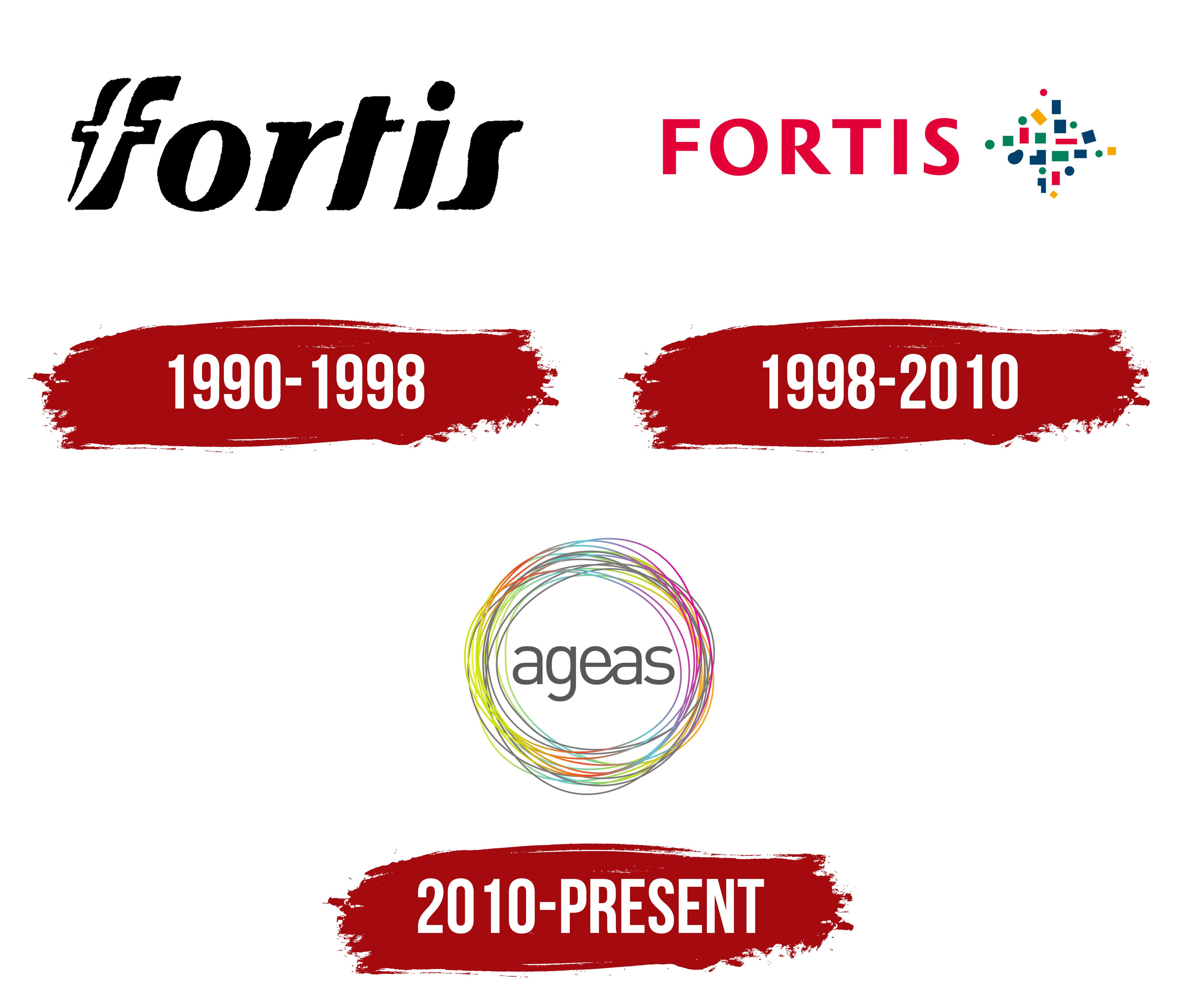
1990 – 1998
Ageas traces its history to 1824, when the Belgian insurance company Assurances Générales was founded. The company later became known as AG. In 1990, AG merged with the Dutch companies AMEV and VSB. The Belgian and Dutch banking and insurance businesses formed a new financial group called Fortis. Ageas regards Assurances Générales as the beginning of its corporate history, while the Ageas brand was introduced in 2010.
The name Fortis comes from a Latin word meaning “strong” and “sturdy.” It suited a large financial group formed by companies from 2 countries. The name became the organization’s shared corporate brand and moved it beyond the former AG, AMEV, and VSB identities. Wolff Olins developed the Fortis identity used from 1990 to 1998.
The first logo featured the black word “fortis.” The name appeared in lowercase italic serif letters. Heavy primary strokes were combined with thin lines, smooth curves, and relaxed contours. The lettering resembled handwriting. Its letterforms resembled ITC Benguiat Italic, though sources confirm a stylistic resemblance rather than the use of the typeface itself.
The main custom feature appeared in the initial “f.” Its upper stroke was extended, while the crossbar passed through 2 slanted vertical strokes. A white opening inside the black letter formed a second “f.” The 2 letters joined into a compact figure integrated into the name.
The initial “f” served as the emblem, combining the lettering and symbol into a single unit. From 1990 to 1998, the black Fortis wordmark represented the financial group formed through the merger of AG, AMEV, and VSB.
1998 – 2010
Fortis introduced a new logo with a multicolored modular emblem in 1998. The black italic Fortis wordmark was replaced by the red uppercase name FORTIS. Industry archives credit Landor Associates with developing the version.
The redesign accompanied a management restructuring and the division of the business into banking and insurance operations. The group was bringing acquired companies into a shared corporate system, giving the Fortis name the leading role across its branding.
FORTIS appeared on the left in bright red. Its uppercase letters used an upright sans-serif typeface with consistent primary stroke widths. The new typography differed sharply from the earlier handwritten form. The letter structure resembled Helvetica Neue, Frutiger, or Gill Sans. The uppercase treatment presented Fortis as a major financial group.
A multicolored figure with horizontal and vertical symmetry appeared on the right. It consisted of squares, elongated 4-sided blocks, circular dots, an oval, a diamond, thin bars, and a curved fragment. The modules occupied separate areas with open gaps between them.
Dark blue, green, red, and yellow elements surrounded a cross-shaped core. The open outer contour resembled a cross, star, or diamond. The separate modules formed a unified emblem when viewed together.
In early 2006, Fortis retained the logo’s overall structure while changing the wordmark color and refining the multicolored figure for smaller sizes. The update accompanied the transition to the unified Fortis brand. The names Fortis Bank, Fortis AG, Fortis ASR, and MeesPierson gave way to a shared corporate signature for the banking and insurance divisions.
2010 – today
The Ageas name combines the company’s history, operating regions, and insurance specialization. The letters “AG” refer to the Belgian company Assurances Générales, founded in 1824. “EA” represents Europe and Asia, the group’s main business regions. The final letters “AS” come from the word “Assurance.” The short name preserved the company’s historical roots while communicating the international scale of its insurance operations.
The new name followed the 2008 financial crisis. Fortis’s banking divisions passed to other owners, while the remaining group continued operating in insurance. In April 2010, shareholders approved renaming Fortis Holding as Ageas. The company separated its insurance operations from the former banking structure and completely updated its corporate identity. The red Fortis wordmark and modular emblem made from colored squares were replaced by a symbol formed from interwoven circles.
The lowercase word “ageas” appears in dark gray at the center of the logo. It uses a rounded sans-serif typeface with soft terminals and letters of similar height. The lettering resembles Avenir or Century Gothic. Numerous thin lines of equal weight surround the name. They follow different paths, intersect, and form offset circles. The overall outer contour remains circular, while the overlapping lines create a layered network.
The ring includes yellow, green, light blue, blue, red, orange, purple, mint, pink, and gray. The colors alternate freely, making the circles appear as separate outlines within a shared system. The colored lines represent the regions and cultural diversity of the international group. Their intersections communicate connections among participants, the exchange of experience, and collaborative work. The gray wordmark provides a restrained typographic base beside the vivid colors.
The Transform Awards Europe archive credits Fish Can Dance with producing the project. The Ageas rebranding received a silver award in 2011 in the category for projects spanning multiple countries. The logo with the gray name and colored ring has appeared in corporate materials since 2010. Regional divisions have occasionally created independent advertising systems. Meanwhile, the parent group has continued using the emblem made from interwoven circles.