The Air Arabia logo stands for modern simplicity, using red letters and a clean design to make its point. It shows the airline’s commitment to making flying easy and affordable without compromising quality. Air Arabia aims to give its customers top-notch flying experiences at low prices. The emblem features the airline’s name in English and Arabic, highlighting its deep ties to its regional culture and traditions. This new logo represents Air Arabia’s fresh, energetic approach to quality air travel.
Air Arabia: Brand overview
Air Arabia was established on February 3, 2003, by the Emirate of Sharjah in the United Arab Emirates as the first low-cost carrier in the Middle East. By offering affordable air travel options to the growing population in the area, Air Arabia was a step in boosting tourism and the economy of Sharjah.
On October 28, 2003, the airline conducted its inaugural commercial flight from Sharjah to Bahrain. Initially operating with two leased Airbus A320s, the company quickly expanded its route network to cover key destinations in the Persian Gulf and the Middle East.
2004, the brand expanded its reach by launching flights to India, Pakistan, and other regional countries. By introducing online ticket booking, the company captured a substantial market share and set a new trend in the region.
In 2006, the airline made history by becoming the first airline in the Arab world to go public through an initial public offering (IPO) on the Dubai Financial Market. This move helped raise additional funds for future expansion and growth.
In 2007, the company took another step by establishing its maintenance facility at Sharjah International Airport. This move reduced reliance on external service providers and improved the efficiency of maintaining its expanding fleet.
The year 2009 marked the beginning of the brand’s international expansion, establishing its first overseas hub in Morocco. Air Arabia Maroc started operations from Casablanca, tapping into the North African and European markets. The airline further expanded its international presence in 2010 by forming a joint venture in Egypt, leading to the launch of Air Arabia Egypt from Alexandria.
In 2012, the brand placed a substantial order for new Airbus A320 aircraft for its fleet renewal and expansion strategy. This move enabled the airline to continue growing and introduce new routes.
In 2015, the company introduced its loyalty program, AirRewards, a unique initiative for a low-cost carrier to enhance customer loyalty and competitiveness.
The airline continued to expand its route network in 2017 by adding new destinations in Europe and Asia. Additionally, the company invested in innovative technologies, enhancing its mobile application and introducing new passenger services.
In 2018, the brand announced plans to acquire additional Airbus A320neo aircraft to support its growth and operational efficiency.
In 2019, the company revealed a joint venture with Etihad Airways to launch a new low-cost carrier in Abu Dhabi, expanding its presence in the UAE.
Despite the challenges faced by the aviation industry in 2020, the brand remained resilient by adapting its operations to new market conditions and focusing on maintaining financial stability.
Meaning and History
Since its start in 2003, Air Arabia has used its logo to tell the story of its growth and values. The logo changes over the years show the airline’s dedication to innovation, making travel easy for everyone and staying connected to its cultural origins. Air Arabia began as a trailblazer for affordable flights in the Middle East, focusing on giving passengers great flights and memorable experiences. Its logo’s evolution reflects this goal, mixing contemporary design with touches that honor its rich heritage.
As Air Arabia grew, connecting more places and cultures, its logo changed, too, to show its larger role and how it blends old traditions with new directions. Each new logo version highlights the airline’s core qualities: pioneering approach, commitment to affordable flights, and pride in its Arab background.
What is Air Arabia?
In 2003, Air Arabia made air travel more accessible as the first budget airline in the Middle East and North Africa, headquartered in Sharjah, UAE. It changed regional travel by offering low-cost flights, allowing more people to fly. The airline’s growth includes many destinations, up-to-date planes, and a unique business model. Known for affordable flying, Air Arabia also boosts tourism and the economy where it flies. It shows how an airline can serve travelers on a budget and help the regions it serves grow.
2003 – 2018
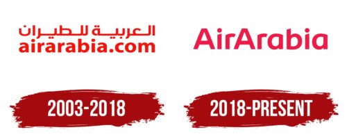
From 2003 to 2018, Air Arabia’s logo beautifully showed its respect for tradition and love for aviation. The airline’s name is written in English and Arabic, showing its goal of connecting different cultures through its flights. This choice goes beyond just including two languages; it’s about making real connections between people from different places, helping everyone understand and appreciate each other more.
Air Arabia made a smart marketing move by putting its website address in the logo instead of the usual brand name. This change makes it super easy for customers to book flights online, showing that the airline values convenience and modern ways of doing things. This approach simplifies booking flights and attracts tech-savvy travelers, showing Air Arabia’s willingness to use new technology to improve the flying experience.
The red logo stands for energy, leadership, and action, qualities Air Arabia wants to be known for in the competitive world of flying. Red grabs attention, showing the airline’s ambition and boldness in the market. This color reflects Air Arabia’s desire to be seen as a leader who is always ready to bring new ideas and high service standards to the industry.
2018 – today
Celebrating its 10th year, Air Arabia introduced a new look that shows how much it has grown in the airline world. Now flying to 89 cities, the new design shows off its wide network and strong position globally. The updated logo, with big red letters and smooth shapes, is all about aerodynamics, highlighting the airline’s focus on fast and efficient flights and ensuring passengers have a smooth journey.
As Air Arabia grew into a bigger company with four subsidiaries, it needed a simpler logo that could grow with it. The changes include dropping the Arabic script and website from the logo for big capital letters, making the brand look bigger and more global. This cleaner look matches Air Arabia’s big goals and place as a key player in international flying.
The logo’s color change to a deeper raspberry highlights the luxury and comfort passengers can expect. Air Arabia aims to attract young, dynamic travelers looking for fun and stylish flying ways. This color choice speaks to its promise of high-quality service that’s both luxurious and welcoming.
The new logo isn’t just about looks; it’s about Air Arabia’s plans for the future. It shows the airline’s goal to keep leading as a budget-friendly option while looking for new growth methods. This rebranding tells passengers that Air Arabia aims to make flying affordable and enjoyable for everyone, anywhere.
Font and Colors
Air Arabia’s logo uses strong, uppercase letters without any added lines or details, known as a sans-serif font. This font is similar to those in Nevó Bold, Kabrio Bold, and Corporate Seli Bold, but with some unique adjustments.
The bright red logo represents energy and passion, showing Air Arabia wants to be seen as an energetic and passionate airline. This red pops out, helping the airline catch people’s eyes and stand out from other airlines.
The straightforward design matches Air Arabia’s reputation as a cost-effective airline that puts value and good service first. The logo tells you that Air Arabia is serious about offering trustworthy and easy flights on the wallet.
FAQ
What is the meaning of the Air Arabia logo?
The Air Arabia logo, with its bright red and white colors, represents the airline’s commitment to providing excellent flying experiences filled with passion and expertise. The red color highlights Air Arabia’s enthusiasm and skill in aviation, ensuring passengers have unforgettable trips. The white color emphasizes the airline’s dedication to reliability, passenger safety, and comfort.
Together, these colors do more than catch the eye; they communicate Air Arabia’s goal. They aim to be the dependable airline that offers unique services in the competitive world of aviation. The logo is more than its appearance; it signifies Air Arabia’s promise to deliver exceptional service, safety, and reliability. It reflects their dedication to enhancing your travel experience.
What is the slogan of Air Arabia?
Air Arabia’s slogan, “Fly More,” aims to make flying affordable and enjoyable. They offer good quality and budget-friendly flights, so more people can use air travel. Their focus on economy services helps a broader audience fly more often. This approach makes flying accessible to more individuals, not limited to those who can handle high costs. Although Air Arabia operates out of the United Arab Emirates, their mission is clear: flying should be accessible to everyone interested.
What are the colors of Air Arabia?
Air Arabia stands out with its vivid red color on its logo and airplanes. This red reflects the airline’s dynamism, passion, and commitment to bringing people together from various locations. The goal is to spread this red across the globe, indicating a desire to expand its reach and make air travel enjoyable and accessible.
Air Arabia’s choice of red declares its intent to stand out in the aviation industry. The red color embodies its pledge to offer passengers a smooth, affordable, and enjoyable journey wherever they fly.
Which bird is on the Air Arabia logo?
The Air Arabia logo features a falcon, a constant symbol throughout the airline’s branding evolution. This falcon symbolizes power, speed, and beauty, aligning with Air Arabia’s commitment to swift, dependable, and enjoyable air travel. Recognizable globally, the Falcon ties the airline to the Middle East’s cultural heritage, emphasizing Air Arabia’s mission to simplify travel and unite individuals. It represents the airline’s dedication to excellence and promise to deliver outstanding service on every journey.


