 Bangkok Bank Logo PNG
Financial transactions in Thailand include payments, transfers, savings, and business services that support day-to-day operations and international connections. The banking system facilitates the movement of funds both within the country and abroad. The Bangkok Bank logo represents a major bank that provides financial services to individual clients and businesses, including international transactions.
Bangkok Bank was founded on December 1, 1944, by a group of entrepreneurs led by Chin Sophonpanich. The initial capital was five million baht. The office was located on Silom Road in central Bangkok. From its earliest years, the bank provided loans to merchants and small businesses in the Chinese community.
In 1947, Sophonpanich became the sole owner and began expanding the branch network. In the 1950s, the bank became a key lender to rice exporters and industrialists. In 1954, the bank opened a foreign representative office in Hong Kong. In 1955, it began financing industrial enterprises.
In 1964, Bangkok Bank opened a branch in Tokyo. After the founder died in 1965, his son, Chatri Sophonpanich, took over management. In 1970, the bank entered the U.S. market and opened an office in New York. In 1975, the bank held an initial public offering on the Thai Stock Exchange.
In the 1980s, the bank participated in Thailand’s economic boom. The bank opened branches in London and Singapore. In 1983, Bangkok Bank became the first Thai bank with a branch in China, in Shenzhen. In 1990, the bank began a program to automate operations.
The 1997–1998 crisis was difficult. Bangkok Bank incurred heavy losses and underwent a government-supported recapitalization. From 1999 to 2001, the bank underwent restructuring. The bank returned to profitability in 2003.
In 2007, the bank acquired a controlling stake in Indonesia’s Bank Permata. In 2008–2009, the bank successfully withstood the global financial crisis. In 2013, it opened a representative office in Vietnam. In 2016, the bank sold its stake in Bank Permata.
In 2018, the bank began collaborating with fintech companies and began developing digital payments. In 2020, digitalization accelerated. The bank introduced artificial intelligence for customer service. In 2022, the bank launched a financing program. In 2023, it created a new platform for corporate clients.
Bangkok Bank remains Thailand’s largest bank. Its assets exceed five trillion baht. The bank operates in fifteen countries.
Meaning and History
What is Bangkok Bank?
The largest commercial bank in Thailand, headquartered in Bangkok, was founded by Chin Sophonpanich and is managed by the family’s third generation. Under the leadership of Chartsiri Sophonpanich, the bank controls assets of about 4.5 trillion baht ($ 124 billion). The network includes more than 1,120 branches in the country and over 300 abroad, including Indonesia through PermataBank. The bank serves corporate and private clients, provides investment products, SWIFT transfers, and mobile services.
1944 – 1956
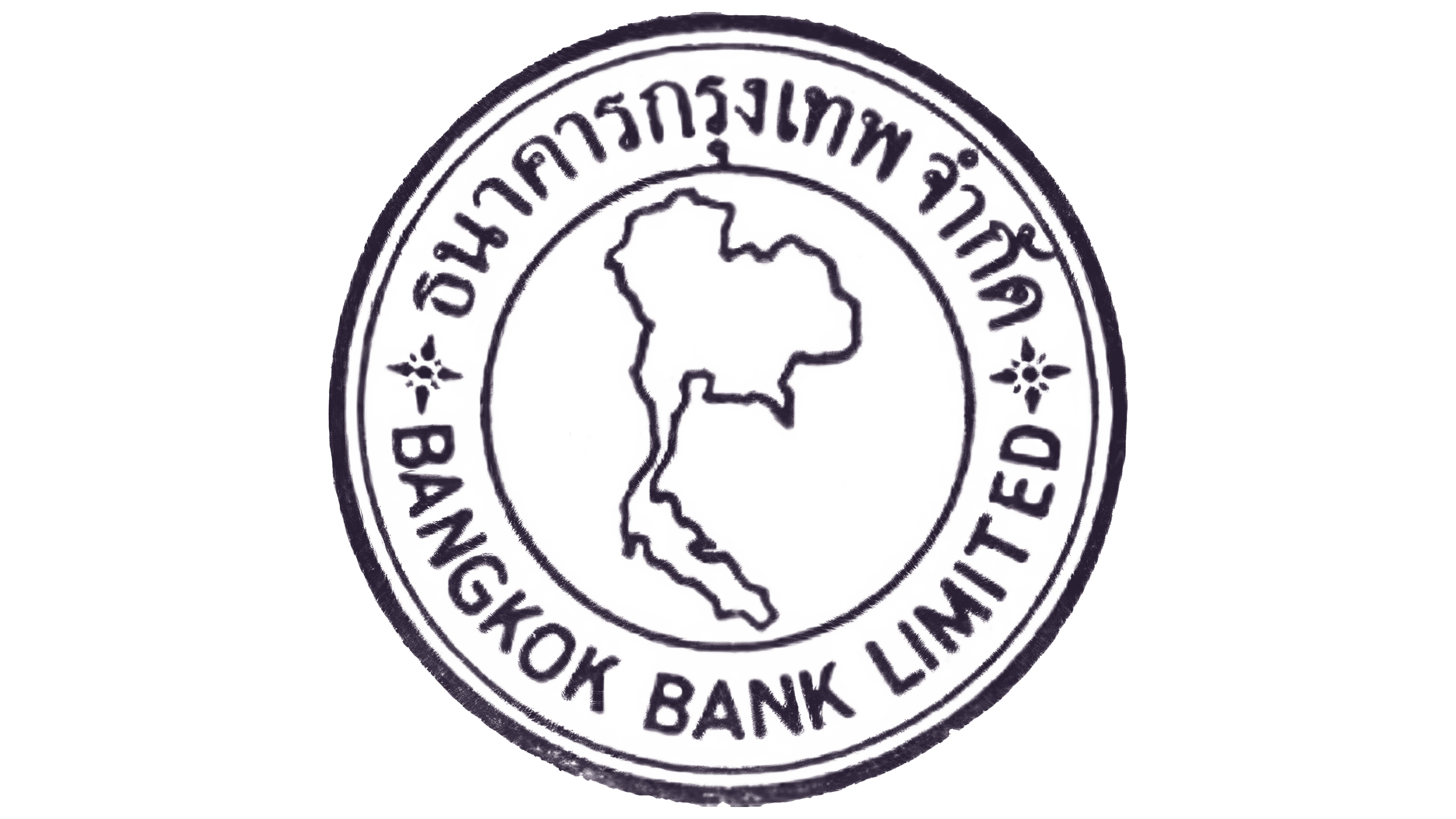
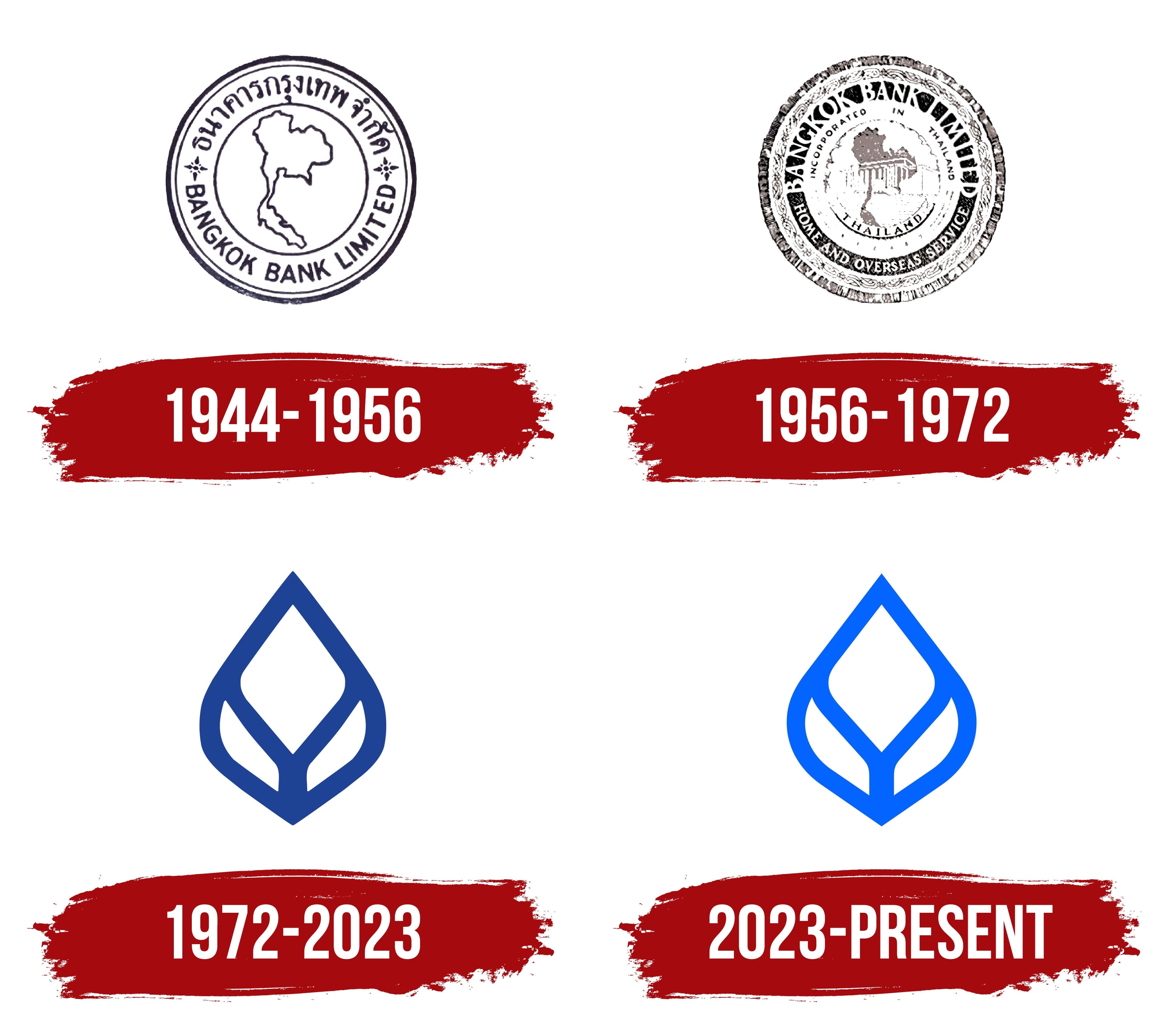
An outline of Thailand occupied the inner circle of Bangkok Bank’s early emblem, establishing its geographic theme. Used from 1944 to 1956, the version resembled a bank seal with a double border, Thai and English inscriptions, and small floral rosettes. Its formal appearance suited a financial institution in its early years.
Bangkok Bank opened on December 1, 1944, in 2 commercial units in Bangkok’s Chinatown. Its founders were Thai business owners of Chinese descent. Among them was Chin Sophonpanich, who later became the bank’s president. Historical accounts and anniversary exhibition materials identify the initial capital as 5 million baht.
Bangkok Bank meant the bank of Bangkok, referring to the city where it was established and the original territory of its operations. The Thai name ธนาคารกรุงเทพ is pronounced “Thanakhan Krung Thep” and carries the same meaning. Both inscriptions appeared in the emblem, presenting the organization to local and English-speaking audiences.
The logo consisted of 2 concentric circles. They formed an outer text band and an inner field containing the map. The outlines, letters, and decorative components were dark purple. The single-color treatment made the circular composition look like an official seal.
The Thai name followed the upper curve. BANGKOK BANK LIMITED occupied the lower half of the ring. The English words appeared in heavy uppercase sans-serif letters arranged along the curve. The inscriptions filled the outer band, leaving open sections on the left and right.
Two 4-point rosettes resembling small flowers appeared between the Thai and English lines. They separated the names and completed the text’s circular arrangement. Their symmetrical placement supported the double-border structure, while their small size preserved the map’s central role.
An outline of Thailand occupied the center. A thin hand-drawn line showed the country’s general shape. The geographic silhouette connected the city-based Bangkok Bank name with the national territory. At the same time, the circular structure resembled an official seal from the bank’s early period.
1956 – 1972
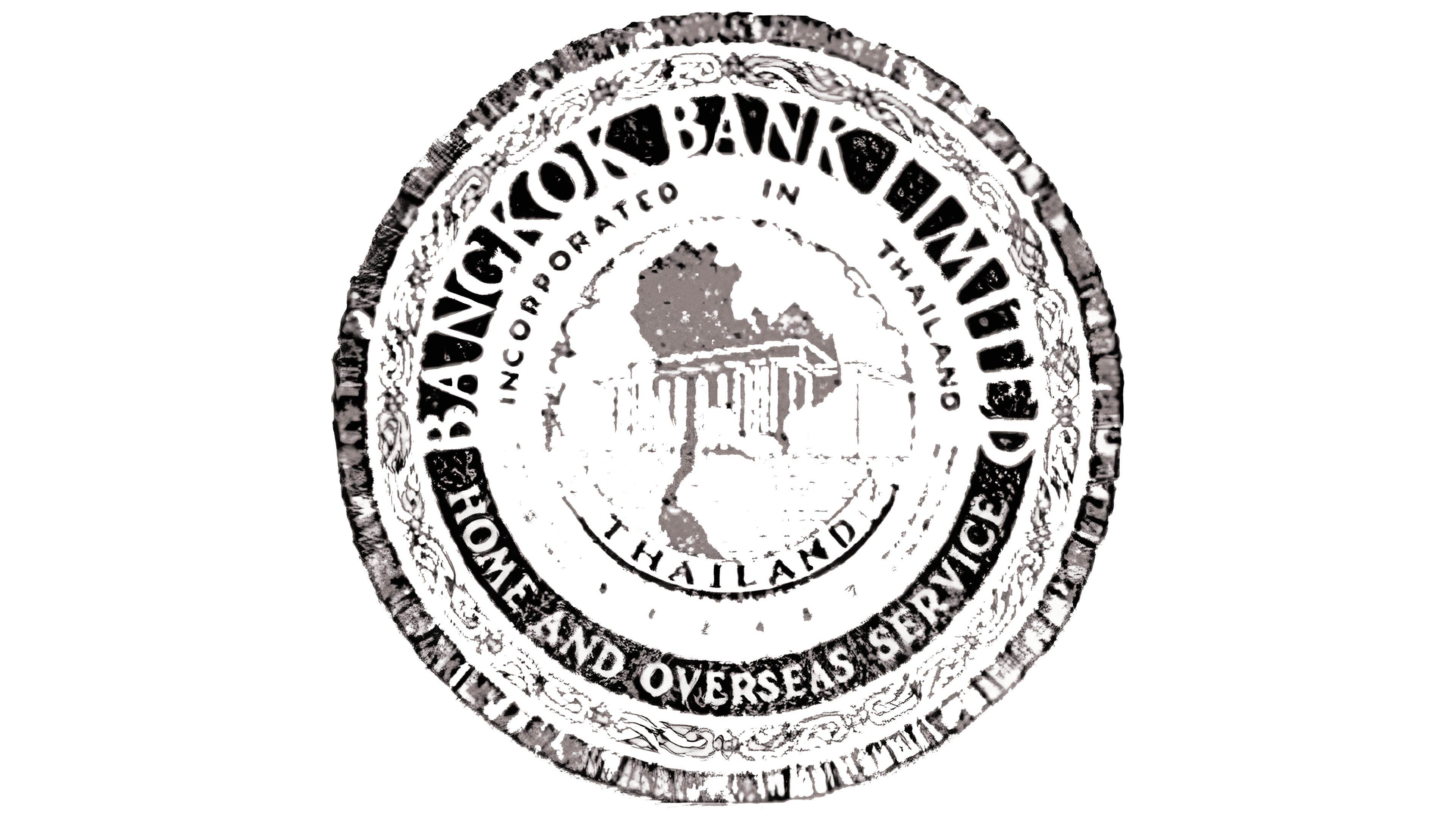
The Bangkok Bank seal used from 1956 to 1972 added the phrase HOME AND OVERSEAS SERVICES. Information about the bank’s incorporation in Thailand and its services at home and abroad appeared beside its name. The emblem included several text bands, dense ornamentation, and an interior scene featuring a map, building, and tree.
The international wording appeared after Bangkok Bank began expanding abroad. Its first branch outside Thailand opened in Hong Kong in 1954. The bank later expanded into other Asian and Western financial centers. The revised seal presented the organization as a Thai bank with an international presence.
A broad decorative border formed the outer edge. Its surface featured a dense pattern combining plant forms with traditional engraving techniques. The ornament surrounded the inner text bands and separated them from the emblem’s edge.
A dark ring behind the decorative frame contained the white words HOME AND OVERSEAS SERVICES. The uppercase letters had small serifs and varying stroke widths. The text followed the curve and identified the bank’s operations in domestic and international markets.
The next band contained the name BANGKOK BANK LIMITED. It occupied the upper curve in heavy white letters against a black background. Thick strokes gave the bank’s name greater visual weight than the smaller supporting lines.
INCORPORATED IN THAILAND appeared below, while THAILAND occupied the lower area. The supporting inscriptions used uppercase sans-serif letters. Size differences separated the legal name, incorporation information, and international service statement.
A schematic map of Thailand filled the inner field. A building with a symmetrical facade and 6 vertical columns appeared against the map, with a tree beside it. Thin lines defined the map and architecture, separating the interior scene from the heavy black bands and white inscriptions.
1972 – 2023

The Bualuang lotus replaced Bangkok Bank’s circular seal in 1972. The multilevel composition with lengthy inscriptions gave way to a compact blue emblem. The new symbol appeared beside the bank’s name or stood alone as an identifier.
The Thai word บัวหลวง is pronounced “Bualuang” and means “royal lotus” or “great lotus.” Bangkok Bank describes Bualuang as its business emblem and associates it with the lotus flower. The name reflected the brand’s Thai origin and became an additional identifier for the banking group.
The introduction of Bualuang coincided with Bangkok Bank’s development into a nationwide brand. During this period, the bank prepared to list its shares on the Stock Exchange of Thailand, which occurred in 1975. Replacing the complex seal with one compact form suited the branch network, documents, and banking products.
The emblem was drawn with a single blue line. Its outer contour was elongated vertically, with a pointed top and a narrowing base. The silhouette resembled a closed bud, while the inner curves represented opening petals. The lower strokes met at one point, forming a stem-like base.
A diamond-shaped petal appeared inside, separated from the outer contour by smoothly curved lines. Beneath it, 2 side sections spread outward and upward. They resembled open leaves or shoots; together with the upper diamond, the sides formed 3 interior segments.
Symmetry and broad, continuous lines preserved the emblem’s form across sizes. The lotus appeared on signs, printed documents, and banking products. Blue remained part of Bangkok Bank’s identity for decades.
The Thai name appeared with Bualuang, the English words Bangkok Bank, or both together. The English version used heavy serif letters. Some corporate materials displayed only the blue lotus as a standalone symbol for the bank.
Bualuang later became part of the names of related organizations and services. They included Bualuang Securities, BBL Asset Management, and Bualuang Ventures. The shared lotus image connected the group’s different operations with Bangkok Bank.
2023 – today

Bangkok Bank introduced the Bua Luang lotus in an updated blue color on September 21, 2023. The bank retained the former silhouette while revising the inner lines, open spaces, and relationship with the name. The new version prepared the emblem for digital formats and continued a form used for decades.
The flower’s outer contour retained its pointed top, diamond-shaped inner petal, and 2 open side sections. The lines were refined, and the spaces between the segments were enlarged. Wider gaps separated the inner petals, preserving their outlines at smaller sizes.
The dark blue was changed to a lighter, brighter shade. The difference from the previous version amounted to 1 or 2 tones. The new color covered the entire lotus and appeared in compositions with the English and Thai names. A white version was used against dark backgrounds.
The English Bangkok Bank wordmark adopted an upright style with heavy serifs. Wider letter spacing gave the bank’s name a more open construction. In the 2-line composition, the Thai name appeared above the English line. The emblem could sit beside both lines or be paired separately with either the Thai or English name.
Bua Luang continued to represent a stylized lotus and retained its established meaning within Bangkok Bank’s identity. The refined outer contour maintained a connection with earlier versions, while the new shade and revised typography defined the 2023 edition.
In 2025, the bank announced an expanded identity system. The project included a revised Lotus, new primary colors, an updated typeface, and shared guidelines for applying the brand in branches, digital interfaces, and communications materials. The consulting firm Lynxeye participated in the project and published a case study covering the complete system.
The project adapted Bangkok Bank’s image to changing customer habits and digital touchpoints. Its phased implementation covered branches, online services, and communications materials across the banking group. The lotus geometry remained, while the main revisions focused on the blue shade, typography, and rules governing emblem placement.