 Bank Mandiri Logo PNG
The name Mandiri, meaning “independent” in Indonesian, reflects financial independence. For a bank with a nationwide network, this idea relates to everyday operations that help manage money and plan expenses. The Bank Mandiri logo represents an institution that provides account services, transfers, lending, and business support.
The Indonesian government established Bank Mandiri on October 2, 1998. This occurred during the Asian financial crisis. The government formed the new bank by merging four state-owned institutions. These included Bank Bumi Daya, Bank Dagang Negara, Bank Exim, and Bapindo. The merger aimed to create a national bank in response to a wave of financial-sector bankruptcies.
After the merger, the new institution’s assets reached approximately 140 trillion rupiah. From 1999 to 2001, Mandiri carried out a large-scale restructuring. It closed unprofitable branches and wrote off non-performing loans. In 2003, the bank held an initial public offering, after which the state retained about seventy percent of the capital.
In the mid-2000s, the bank modernized its IT systems and began implementing digital services. In 2010, it introduced internet banking. Later, the bank launched a mobile application for retail customers. By 2015, the bank’s assets reached 900 trillion rupiah, strengthening Mandiri’s position as the country’s largest bank.
In 2017, Mandiri launched the Livin by Mandiri app. It helped the bank become a leader in digital banking in the region.
From 2021 to 2023, Mandiri developed its fintech direction. The bank partnered with startups, introduced artificial intelligence for credit risk assessment, and used blockchain for trade finance.
The bank serves about fifty million clients. Its network includes 1,000 branches and digital platforms. It remains Indonesia’s largest bank by total assets. The state owns a controlling stake of about sixty percent.
Meaning and History
What is Bank Mandiri?
The largest state-owned bank in Indonesia, holding leading positions in assets, loans, and deposits. The branch network covers the entire archipelago. The main areas include services for individual clients, corporations, and small businesses. The bank offers accounts, deposits, mortgages, loans, bank cards, and digital services. For companies, there are credit programs, settlement operations, currency control, and investment solutions. It operates an Islamic Banking division based on Sharia principles.
1999 – 2008
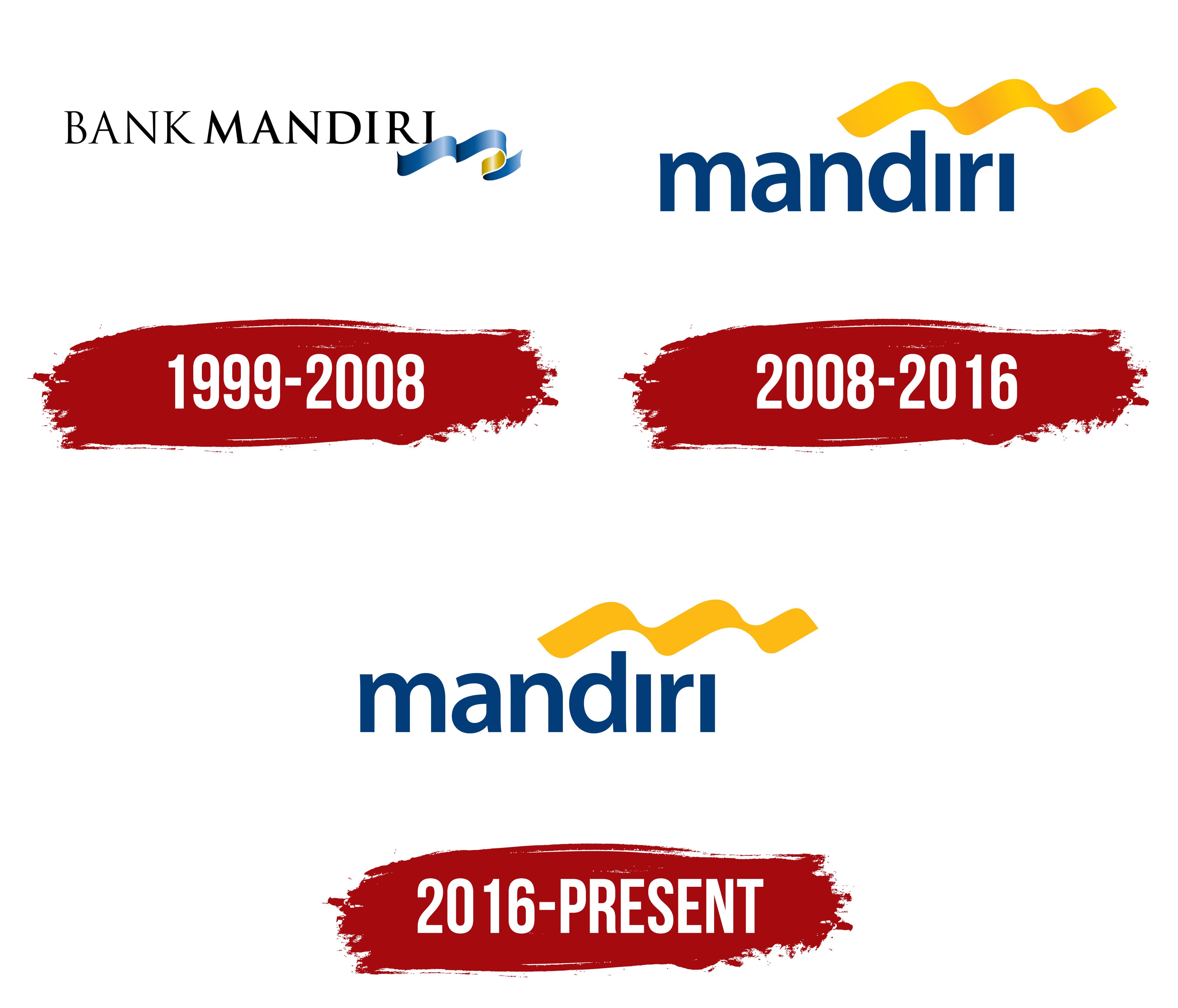
Following the Asian financial crisis, 4 Indonesian state-owned banks were brought together under one brand. The government established Bank Mandiri on October 2, 1998, as part of an industry restructuring program. Bank Bumi Daya, Bank Dagang Negara, Bank Ekspor Impor Indonesia, and Bank Pembangunan Indonesia, known as Bapindo, were legally merged into the new organization on July 31, 1999. Some of its predecessors dated back to the colonial era. The first Bank Mandiri logo appeared as the merger process was being completed.
The Indonesian word “mandiri” refers to independence and self-reliance. The name presented the state-owned bank as a single organization formed by merging 4 institutions. The English word “Bank” became part of the legal and international name. Both words carried equal visual weight in the early identity because the combined organization was still in its initial stage of development.
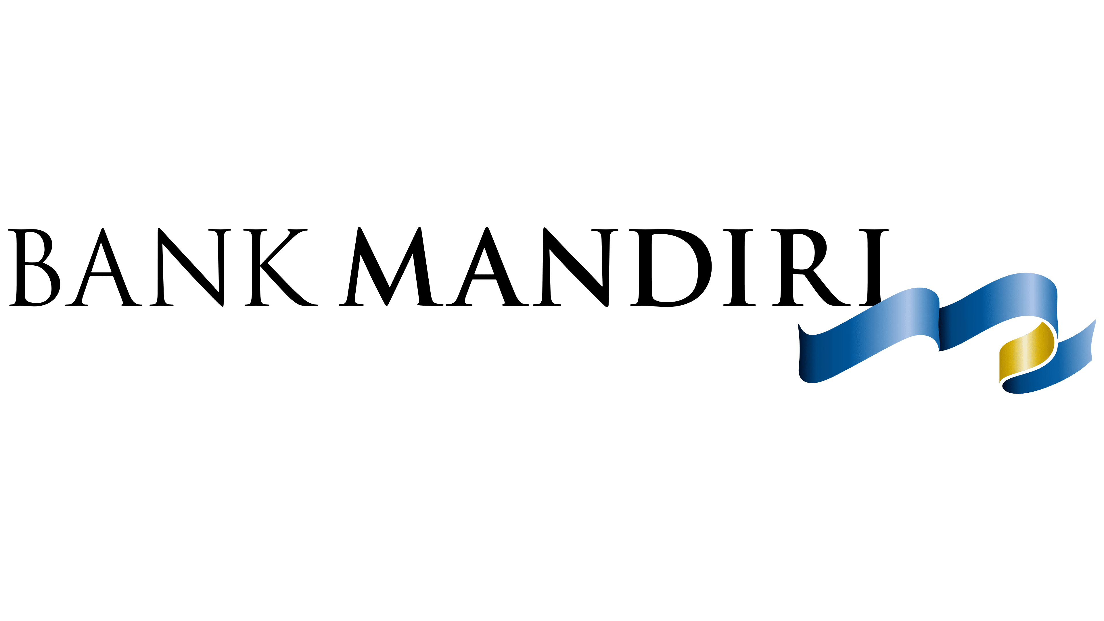
The logo centered on the words BANK MANDIRI in black uppercase letters. Trajan Pro provided serifs, traditional proportions, and strokes of varying thickness. The name occupied one horizontal line, with a narrow space separating BANK and MANDIRI. The formal typography reflected the status of the new state-owned institution and brought the 4 banks together under one name.
A dimensional emblem made from 3 curved bands appeared to the right of the final “I.” The connected sections formed a short ribbon-like wave with a smooth curve. The front portions used blue and light blue, while the rear sections were gold. Gradients, highlights, and shadows separated the segments and created the appearance of a folded ribbon. The compact emblem completed the long wordmark with a color accent.
The logo remained in use while the branches, employees, and operating systems of the 4 banks were being consolidated. The full name held the primary position and introduced Bank Mandiri to customers and business partners as one organization. Annual reports featured versions with different wave placements, text sizes, and color reproduction. The main design remained in use until 2008.
2008 – 2016
AC Nielsen research found that the previous Bank Mandiri brand had little visual distinction from competing banks. The findings led to a complete identity redesign introduced on January 14, 2008. The Indonesian office of the international agency Brand Union, now known as Design Bridge and Partners, developed the project. The new system retained blue and gold while changing their distribution, typography, and placement.
The lowercase name “mandiri” became the primary component and appeared in rich blue. Bank moved into a secondary role, while the more distinctive part of the name became the main identifier. The wordmark used Myriad Pro Bold, with dense strokes, soft curves, and broad rounded forms. Both “i” letters appeared as vertical strokes. The lowercase treatment formed an even line with subtle variations in letter height.
The corporate guidelines associated lowercase lettering with friendly communication, customer closeness, and humility. The revised typography moved the image of a major state-owned bank toward a more open style of communication. Blue continued the color scheme of the first version and maintained continuity between the 2 identity periods.
The ribbon emblem moved from the right side to a position above the word “mandiri.” It consisted of 3 wavy bands joined into an elongated rising form. A gold gradient replaced the blue-and-gold sections of the previous version. Transitions between yellow tones, shadows, and light highlights created depth and a metallic sheen. The bank called the emblem “fluid gold” and linked it to the prosperity customers achieve with Mandiri.
Placing the wave above the name gave the composition an upward direction. The rising curve represented growth and prosperity, while gold served as the brand’s primary color accent. The dark blue wordmark formed a base beneath the 3-part ribbon. The emblem and lettering remained separate and worked within a compact horizontal format.
Beginning in 2008, the logo was accompanied by the corporate statement “Terdepan, Terpercaya, Tumbuh bersama Anda.” Its English meaning was presented as “Leading, trusted, growing with you.” The statement connected the bank’s positioning with leadership, trust, and shared development, continuing the meaning of the rising gold emblem.
2016 – today
Bank Mandiri converted the emblem to a flat format on October 2, 2016, while retaining the structure introduced in 2008. The update focused on the wave-shaped figure. Its form and position above “mandiri” remained unchanged. Decorative effects were replaced by a solid fill suitable for different media.
The 3 gold waves received one yellow-gold color. Flat coloring replaced gradients, metallic highlights, shadows, and tonal transitions. The contours retained their previous curves and overall silhouette.
The word “mandiri” remained blue and lowercase. Its letter proportions, width, and typographic construction carried over from the 2008 version. The blue name and gold waves preserved Bank Mandiri’s established color scheme. At the same time, the flat fill reduced the number of shades.
The blue is Pantone 654C (RGB 0, 61, 121). The yellow used for the wave-shaped emblem is Pantone 7549C (RGB 255, 183, 0). Standardized specifications support consistent reproduction in print and on screens.
The system includes horizontal versions for wide formats. Use single-color editions when color reproduction is limited, and reversed versions for dark backgrounds. All versions retain the lowercase “mandiri” name, established letter proportions, and flat 3-part wave.