 Banorte Logo PNG
Banking operations in Mexico include transfers, account management, lending, and payments related to daily life and small businesses. These tasks are carried out through a network of branches and digital services integrated into daily life. The Banorte logo represents a Mexican bank that serves individual clients and entrepreneurs, offering basic financial products and services.
Banco Mercantil de Monterrey was founded on November 16, 1899, in Monterrey, Mexico’s industrial center. The institution was created to serve the region’s enterprises. It became one of the largest banks in the north.
In 1982, after oil prices fell and a financial crisis began, the government nationalized the banking sector. In 1986, Banco Mercantil de Monterrey merged with Banco Regional del Norte. Based on these structures, Banco Mercantil del Norte was established and later became known as Banorte. By the early 1990s, the bank was among the country’s most profitable financial institutions.
In 1992, the bank was privatized and came under the control of entrepreneur Roberto González Barrera. Afterward, it began developing new business areas, including leasing, factoring, and investment services.
Despite the 1994 currency crisis, the bank continued operations thanks to a balanced credit policy. In the late 1990s, it expanded and acquired troubled banks. These included Banco del Centro and Grupo Financiero Asemex-Banpais. In 2001, the bank became one of the country’s four largest. It acquired Banco de Credito y Servicio (Bancrecer).
In 2006, Banorte entered the U.S. market and acquired the Texas-based “Inter National Bank”. In 2011, it merged with Ixe Grupo Financiero. After that, Banorte became the third-largest bank in the country by deposits and mortgage lending volume.
In 2013, the bank consolidated its pension business and became Mexico’s largest pension fund operator. In the following years, Banorte developed digital services and strengthened its position in the insurance market.
In January 2024, Banorte launched the digital bank Bineo. It targets clients who prefer online services and loyalty programs.
In 2025, Banorte acquired the naming rights to Estadio Azteca in Mexico City and allocated 2.1 billion pesos to its modernization ahead of the 2026 World Cup.
Meaning and History
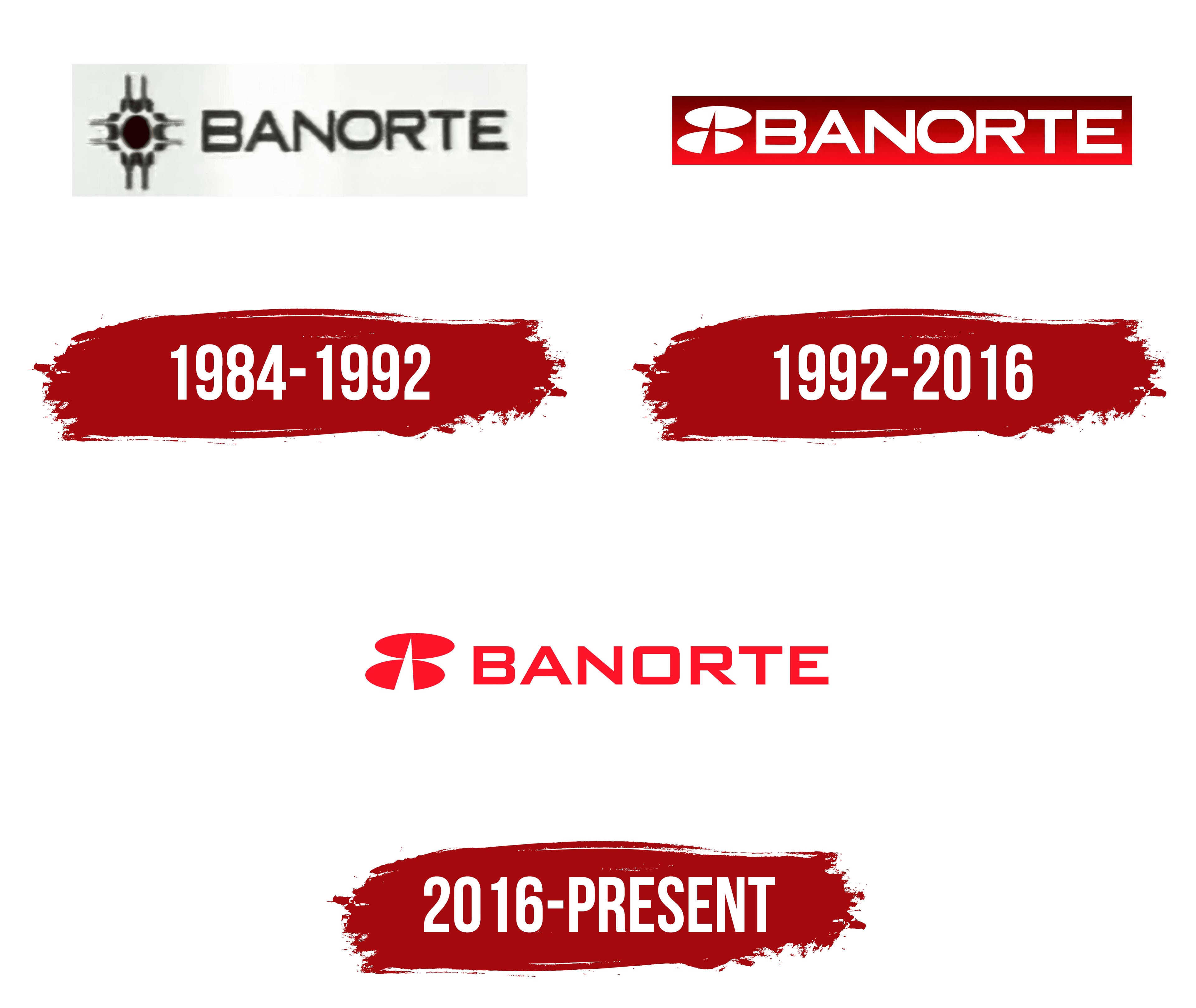
What is Banorte?
It is the country’s largest financial group, fully owned by local shareholders and managed by a Mexican team from offices in Monterrey and Mexico City. The structure includes a universal bank, a brokerage company, an insurance business, leasing and factoring divisions, and the largest pension fund operator, Afore XXI Banorte. Assets exceed $ 147 billion, and the network includes about 1,000 branches.
1984 – 1992

A radial emblem represented Banorte while 2 regional banks prepared to merge and operate under a common name. Used from 1984 to 1992, the version consisted of a circle with radiating lines and the uppercase word BANORTE. The figure resembled a directional marker and linked the new banking organization to northern Mexico, where its historical roots lay.
The group’s history began in Monterrey. The authorities granted a banking concession on July 27, 1899, and Banco Mercantil de Monterrey was established on November 16. The institution served industrial and commercial businesses in Mexico’s northern states. Banco Regional del Norte opened in Monterrey in 1947. The 2 banks merged in January 1986 under the legal name Banco Mercantil del Norte.
The commercial name Banorte combined parts of the words Banco and Norte. The shortened form meant “northern bank” and preserved a reference to the region where the organization originated. It replaced the lengthy legal name and united the former institutions under a shared brand.
A symmetrical figure with a circle at its center appeared on the left. Eight rays extended from it. Four long bands formed vertical and horizontal axes pointing upward, downward, and to both sides. The cross-shaped structure resembled a stylized sun, target, traditional ornament, or compass rose. Alternating long and short rays made the circle the focal point.
Banorte later described the emblem as a compass and associated it with finding the right financial path. The navigational theme suited the bank’s operations and presented the figure as a guide for customers. The compass image reinforced the northern theme contained in the Banorte name.
BANORTE appeared on the right in uppercase sans-serif letters. The dense lettering and wider characters balanced the radial emblem. Its construction resembled modified versions of Eurostile and Bank Gothic. Even geometric strokes supported the bank’s formal image, while consistent capitalization combined the shortened name into a solid typographic block.
The central circle often appeared in dark red. The rays and name were reproduced in black or gray. Other materials used a single-color version depending on the medium and printing method. The contrast between the red circle and dark lines highlighted the axes’ intersection.
1992 – 2016

A red panel with a white emblem became part of Banorte’s identity as it transitioned from a regional bank to a nationwide financial group. In 1992, an investor group led by Roberto González Barrera acquired the bank during the privatization of Mexico’s banking sector. Banorte purchased Afin Grupo Financiero in 1993, forming Grupo Financiero Banorte. The expansion required a shared identity, so the multi-ray compass was replaced with an emblem made of 2 rounded forms.
The logo appeared inside an elongated red panel. Its upper area used a dark red shade that gradually shifted to a brighter color near the lower edge. The white emblem and BANORTE wordmark appeared against the background. Red became the bank’s primary color, while the white components remained distinct on documents, branch facades, and corporate materials.
Two horizontally elongated ovals appeared on the left, stacked vertically at an angle. The upper form contained a narrow pointed cut. The lower oval had a large opening dividing it into 2 segments. The openings aligned vertically, creating a shared gap between the rounded contours. Their pointed inner edges resembled a blade, ray, or arrow directed toward the center.
The 2 ovals continued the compass theme from Banorte’s previous identity through simplified geometry. A paired construction with a vertical opening replaced the circle and its 8 rays. Rounded outer lines contrasted with sharp inner terminals. The emblem maintained the connection between the Banorte name, northern Mexico, and the image of a financial guide.
BANORTE appeared on the right in white uppercase sans-serif letters. The typeface had heavy strokes, square proportions, and rounded interior joints. The broad typographic block balanced the compact emblem, while the shared white color unified both components inside the panel. Horizontal, reversed, and Grupo Financiero Banorte versions appeared across branches and documents.
After acquiring Bancrecer in 2001, Banorte expanded its network into new regions of Mexico. The red emblem became the shared brand for the group’s banking, insurance, pension, and brokerage divisions. Services across the country were presented under the Banorte name.
Grupo Financiero Banorte announced a stronger unified corporate identity in 2015. Banorte became the foundation of the entire group. Ixe became a premium banking division within the shared brand. The red panel with white lettering and the 2-part compass remained in use throughout Grupo Financiero Banorte.
2016 – today
The integration of Grupo Financiero Banorte and Grupo Financiero Interacciones led to an identity update. The international branding agency Landor completed the project, and the bank identified it as the creator of the logo and corporate system. The new version retained the compass and BANORTE name. The red panel gave way to an open background, while the emblem and letters received the same bright red color.
An abstract compass made from 2 horizontally elongated ellipses appeared on the left. Their outer contours were refined while preserving the previous version’s rounded 2-part structure. A white wedge-shaped gap appeared between the upper and lower forms. It widened at the base and narrowed toward the tip, resembling an upward-pointing arrow. The red ovals formed the emblem’s outer frame.
Landor retained the compass associated with the Banorte name and adapted it for different applications. A flat single-color version replaced the gradient and colored panel. The new format worked at compact sizes and across digital interfaces, documents, and division identifiers. The red compass appeared independently or within a horizontal composition beside the name.
BANORTE appeared in uppercase sans-serif letters. Compared with the previous heavy style, the characters became narrower and received wider spacing. Even geometric forms complemented the ellipses and wedge-shaped opening. The lettering shared features with Eurostile and Bank Gothic. The supplied information requires separate confirmation of the typeface name. The red wordmark appeared beside the emblem on a white background.
The compass remained central to Banorte’s identity. In the bank’s communications, it serves as a guide, helping customers find a suitable financial path and product. The arrow between the 2 ellipses conveys direction and builds on the theme of the earlier multi-ray compass. The open arrangement works across different formats and applications.
Public materials use the red emblem on its own or alongside the BANORTE name. The shortened commercial name represents the group’s banking services and divisions. The legal name Banco Mercantil del Norte appears in regulatory documents. After the merger with Grupo Financiero Interacciones, the logo expanded across the larger financial organization.