


 Bluey Logo PNG
The Bluey logo invites viewers into a magical world of carefree games and adventures. The series’ characters are funny dogs who go about their daily lives, make friends, learn, have fun, and find joy in small things. The emblem immerses you in the cartoon’s positive atmosphere, where every moment is filled with joyful discoveries.
Bluey began in 2016, when Australian animator Joe Brumm started developing a children’s series about modern family life in Australia. His experience as a father of two shaped the stories, games and household situations. Bluey, an Australian Cattle Dog, was based on his older daughter. At the same time, many episodes drew on ordinary events Brumm observed at home.
In 2017, Brumm presented the project to Ludo Studio and the Australian Broadcasting Corporation. Production began that year, with writers and animators building the characters and using Australian culture and daily family routines as the setting. The series premiered on ABC Kids on October 1, 2018. Season one contained 52 episodes of about seven minutes and became the most-watched program on ABC iView.
BBC Studios acquired global distribution rights in 2019. In 2020, the series reached American viewers through Disney Channel, Disney Junior and Disney+. Season two premiered in March 2020 with 52 episodes, followed by season three in 2021. New episodes aired in 2022, while dubbed versions expanded the show into additional countries.
Bluey received an AACTA Award and a Logie Award in 2019 and 2020, then won a BAFTA for Best International Animation in 2022. Further episodes were announced for 2023. By that year, the brand covered books, toys, clothing, interactive publications and educational products, and began working with educational institutions on learning materials based on the series for children and their parents.
Meaning and History
What is Bluey?
This charming animated show from Australia has won viewers’ hearts worldwide, appealing to children and adults. At the center of the story is a six-year-old puppy and her family, who explore life’s everyday joys and challenges through creative play. Set in Brisbane, the plot explores themes of family, friendship, and growing up, presented through a uniquely Australian perspective. Each episode is filled with imagination, humor, and genuine emotions, often inspired by popular children’s games. Notably, the show reflects modern family roles, with the puppy’s father, Bandit, actively engaging in parenting and play, challenging traditional gender stereotypes. The show’s success lies in its ability to resonate with children, while adults also appreciate the subtle yet touching portrayal of the joys of family life and parenting.
2016
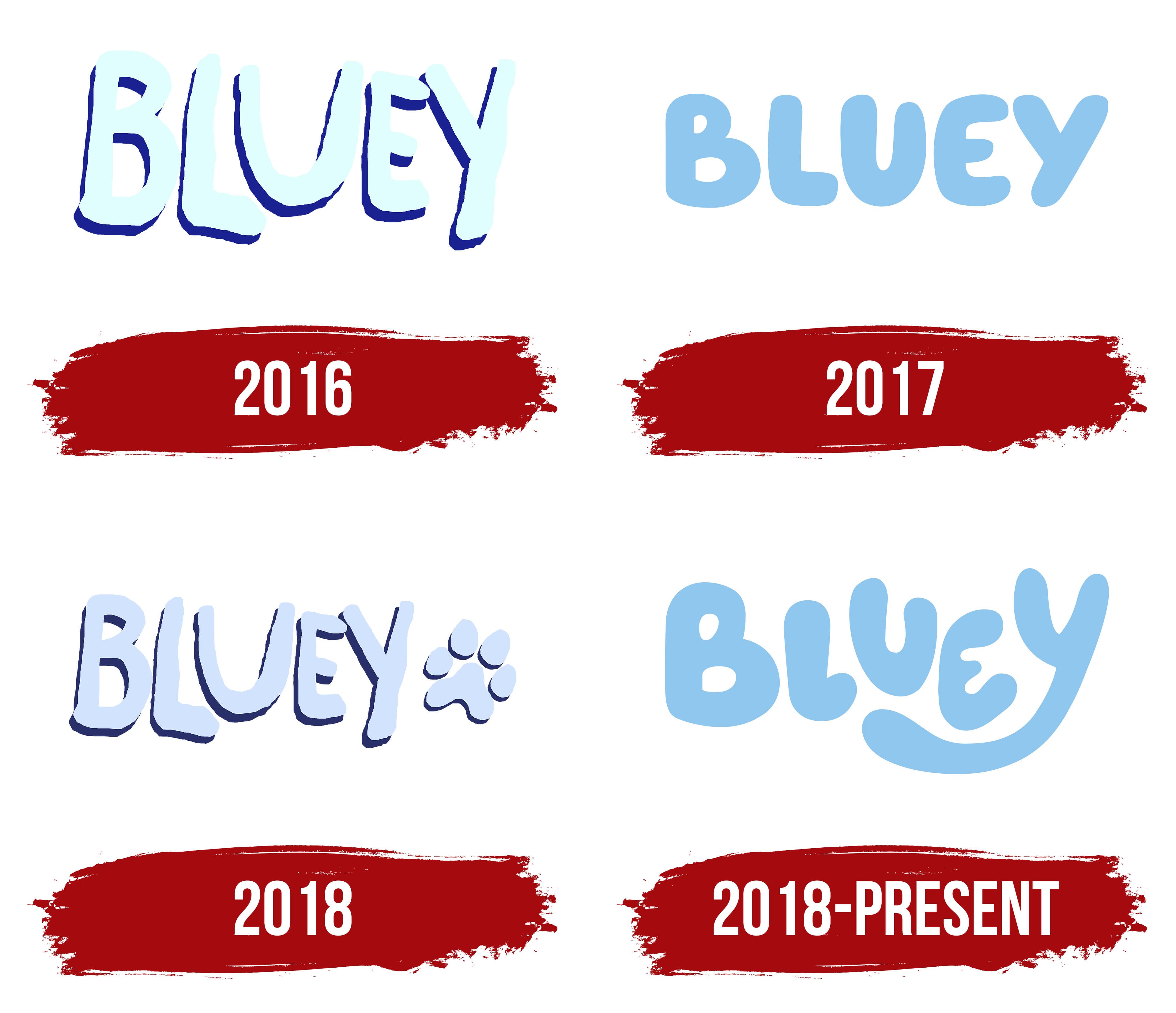
The earliest Bluey logo appeared in a 2016 pilot episode. Joseph Brumm and his team released a short sample of the cartoon about a puppy to attract the interest of television network executives and request funding to produce a new animated series. So, the designers didn’t put much effort into creating the emblem for the opening title; after all, it was assumed that it would be changed and refined in the future.
The name “Bluey” looks like it was hand-drawn in a primitive graphic editor. The uneven lines appear shaky because of their wavy, jagged edges, revealing the artist’s carelessness. The deliberately rough style matches the cartoon’s light-hearted mood, initially aimed at a young audience. As we know, children love everything simple and informal, not bound by strict rules.
Due to their blurriness and unclear boundaries, the letters resemble clouds. They seem to float upwards, unable to stay in a single line and swaying in different directions. The uneven placement of the glyphs gives a sense of lightness and strengthens the association with something weightless. In this case, the airiness is an advantage because it evokes a sense of childhood.
The “B” and “L” are tilted to the right and pressed against the other letters, which are slightly raised and closely positioned. There are practically no spaces between them, which grounds the logo and prevents the visual lightness from becoming excessive. Another “weighting” factor is the dark lines drawn along the edges of the glyphs. They add depth to the text despite its primitive two-dimensional appearance.
The Bluey name uses no existing fonts because all the elements are hand-drawn. The artists made the letters uppercase and bold and avoided adding serifs to keep the emblem uncluttered. As a result, two opposites are combined here: seriousness and playfulness. The first is reflected in the massiveness of the glyphs, while the second is in their disproportion.
The logo’s colors are perceived neutrally, as the light-blue shade dominating the text creates a sense of lightness and freshness. Dark blue is used only for the outlines, which add volume to the letters. The chosen shades perfectly convey the concept of the animated project, in which the main character is a funny, energetic blue puppy.
2017
The short cartoon sample interested the executives at the American Broadcasting Company so much that they allocated several thousand dollars to produce a seven-minute follow-up. The new pilot episode was released in 2017, and with it came an improved Bluey logo, completely different from the previous version. Few people know about its existence because it was used in only one episode and never aired.
The designers refined the inscription, making it more readable and fixing several details that had made the cartoon’s title look sloppy. To get rid of the primitive style, they had to:
- Align all the glyphs by height.
- Smooth the edges of the lines.
- Balance the stroke thickness.
- Increase the spacing between the letters.
So now it’s not just a drawing but a true wordmark created with the Hello Headline font. Even with all the changes, it retains a sense of childhood, as the bubbly style of the letters makes the logo playful, relaxed, and welcoming. It perfectly matches the cartoon’s concept, which is aimed at preschoolers.
The glyphs still resemble small clouds because they lack outer corners. The rounded ends add visual softness to the text, emphasizing the kindness of the animated project, whose characters are friendly dogs exploring the world through play.
The letters’ minimalist design conveys simplicity and clarity. The designers didn’t add gradients or outlines to create a three-dimensional effect; instead, they focused on finding the right color. They chose a pleasant light-blue shade bright enough to catch children’s attention yet neutral and calming, setting the mood for watching the cartoon. The logo’s color perfectly matches Bluey’s name and the main character’s appearance.
2018
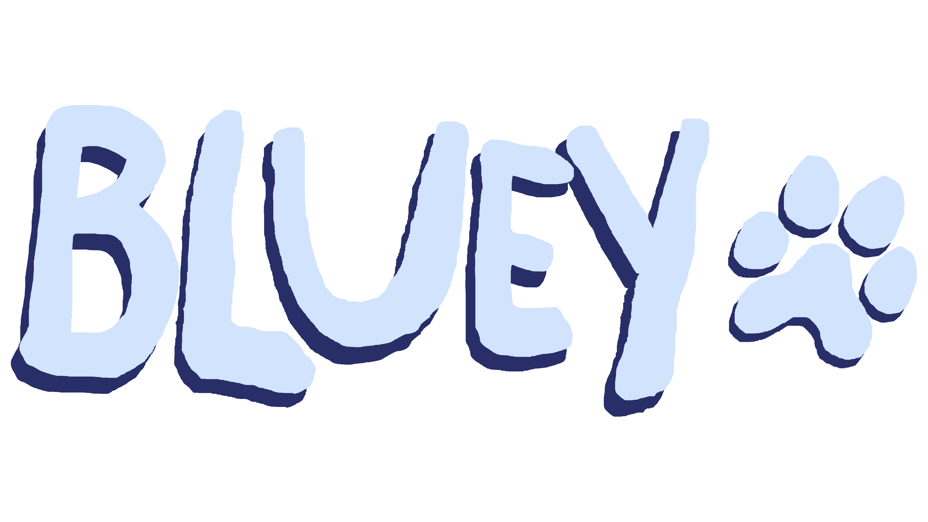
As they prepared for the animated series premiere, the developers created a draft version of the logo. It is based on the earliest wordmark used in 2016, known for its messy style. The inscription looks like each letter was hand-drawn sloppily, disregarding modern graphic tools.
There isn’t a single straight line in the emblem: the asymmetrical glyphs tilt in different directions, press against each other, levitate above the line, and create a sense of chaos. This might deter meticulous adults, but it appeals to children, the cartoon’s target audience. The playful Bluey logo captures the essence of the animated series, in which each episode sees the characters invent new games and learn about the world through play.
The lettering looks like it was drawn by preschoolers who haven’t mastered markers. It lacks any particular beauty, symmetry, elegance, or the traits typical of minimalism. The shaky edges of the letters touch each other, creating a chaotic jumble. But this imperfection lends the emblem a spirit of fun, perfectly aligning with the cartoon’s goal to emphasize the importance of play for children’s learning and development.
Thin, dark blue outlines around the letters are uneven, mostly placed on the left and bottom sides. The designers intentionally made the shadows one-sided to achieve a three-dimensional effect. The visual depth reminds us that the logo belongs to a modern animated project, and all its deliberate messiness is just a facade hiding a philosophical view of the world.
To the right of the inscription is a paw print, hinting that all the characters in the series are dogs, big and small, of various breeds. They solve family problems, work, study, go shopping, and engage in ordinary human activities. All elements of the emblem are colored in a gentle grayish-blue shade. This refers to the cartoon’s main character Bluey, the puppy, named for the color of his fur.
2018 – today
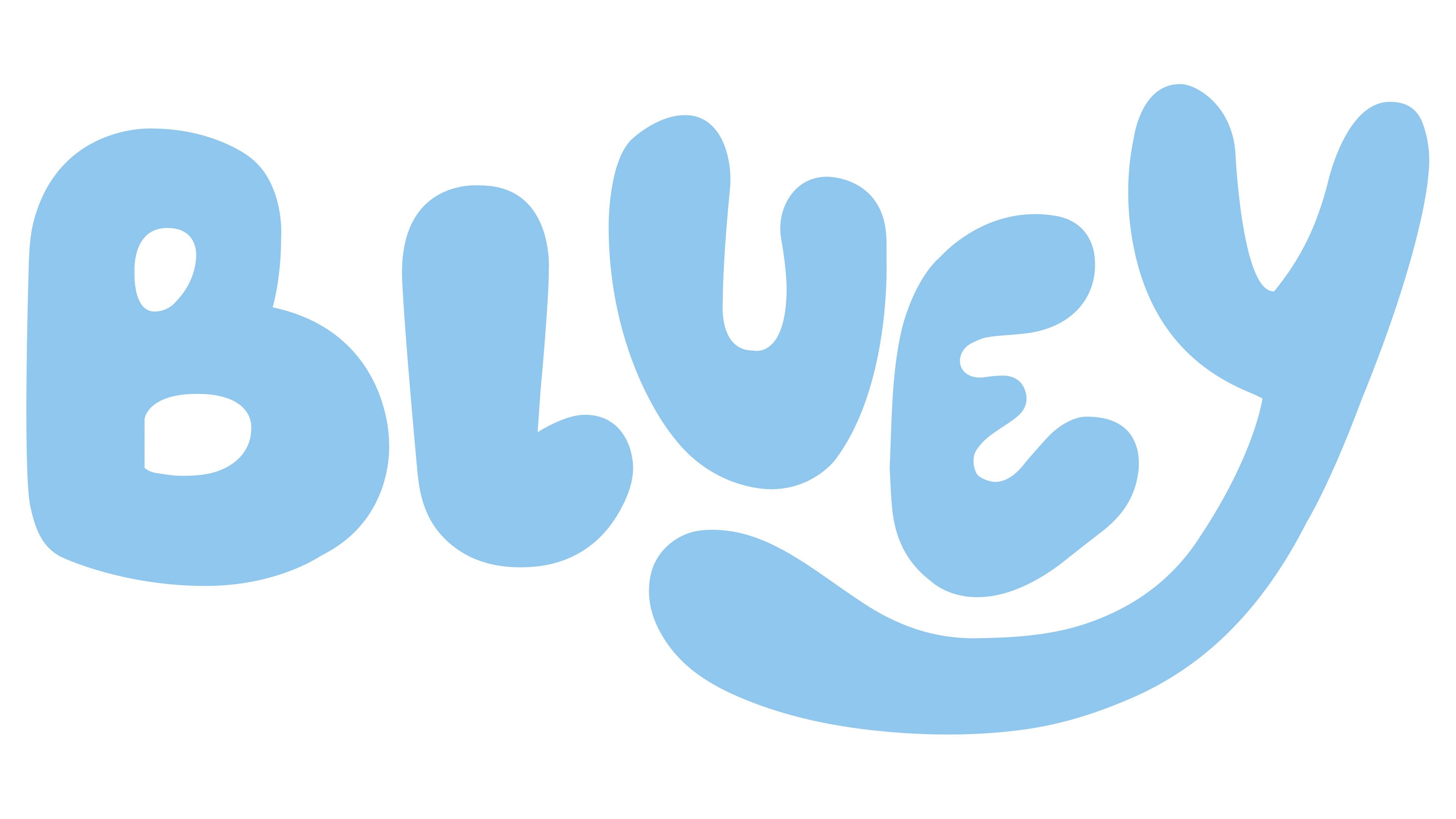
The animated series debuted in 2018 with a new logo that marked the final point in the creative search. The designers combined the most memorable features of the previous emblems: uneven lines, rounded corners, asymmetry, and a pleasant blue color. The result was a unique inscription that perfectly captures the concept of Bluey.
The bubbly Hello Headline font inspired the creators of the logo, as indicated, for example, by the characteristic shape of the “B.” But after significant refinement, each letter gained its unique features:
- “B” became bolder and more rounded;
- The horizontal line of “L” was shortened and curved upward.
- The left side of “U” is longer than the right.
- “E” is noticeably deformed and compressed;
- The tail of “Y” is extended so much that it touches the “L.”
One could say that “Y” is the main “culprit” behind all the transformations, as it’s “Y” that made the designers change the shapes of the other letters to fit within the limited space. For the same reason, “U” is slightly raised and “E” is lowered, almost creating a visual balance between them.
This unusual arrangement is associated with a construction set, in which each piece must be in its place. At the same time, the uneven lines of the letters appear flexible, like pliable clay or jelly-like slime. The transformations that the inscription underwent added a sense of playfulness and childlike spontaneity, which are the core of the cartoon. And even without the paw print, the logo fully reflects the Bluey concept.
The wordmark’s color also changed, although the designers aimed to stick to the old palette that matches the main character’s name. The new shade of blue is more concise, restrained, and calm. It balances the excessive energy of the letters composed of dynamic lines.