


 Cartoonito Logo PNG
The Cartoonito logo evokes a sense of fun and curiosity. The emblem comes to life with a playful cartoon character that seems to interact with young viewers, making the logo friendlier and more approachable. The soft, gentle colors of the logo highlight the channel’s young audience, creating a sense of comfort and warmth. The emblem elements are designed to capture attention and foster an emotional connection with young viewers, offering them a world full of adventure and discovery.
Cartoonito began in 2006, when Turner Broadcasting System Europe developed a preschool television brand for children aged two to six. The brand officially launched in the United Kingdom on September 4, 2006, as a programming block on Cartoon Network Too. Its schedule mixed entertainment with early-learning content, using familiar children’s shows and acquired programs, including Peppa Pig, Baby Looney Tunes, and Fireman Sam.
The first years proved that the format could work beyond the UK market. Turner Broadcasting expanded the brand in 2011, when Cartoonito became a 24-hour channel in Italy. In 2012, it reached Spain and Latin America as a programming block on Boomerang, giving the name access to a wider family audience. In 2013, separate channels were introduced in Central and Eastern Europe, including the Czech Republic, Romania, and Hungary, with local adjustments to the schedule.
In 2014, the UK version became a full 24-hour network after changes connected with Cartoon Network’s local channel structure. The brand expanded online in 2015 with an official website offering games, videos, and educational resources. A 2016 rebrand introduced a new logo and updated visual style, while the company began investing more in original preschool programming.
Corporate ownership changes shaped the next stage. AT&T acquired Time Warner in 2018, placing the brand inside WarnerMedia. In 2020 and 2021, the company announced wider launches in the United States and other markets. In September 2021, Cartoonito debuted in the U.S. on Cartoon Network and HBO Max, with Bugs Bunny Builders, Lucas the Spider, and Batwheels among its original shows. From 2022 to 2023, the brand grew in Latin America, added new series, and adapted its content for streaming platforms.
Meaning and History
What is Cartoonito?
This vibrant block of programming for preschoolers, created under the banner of HBO Max and Cartoon Network, offers a fresh approach to children’s entertainment. It stands out for its animated series aimed at young audiences, which focus on inclusive storytelling, empathy, and creativity. The brand produces content that shows children diverse cultures and stories, helping them understand the world around them and broaden their horizons. The brand’s programs balance fun and learning, integrating educational elements into entertaining stories and fostering a creative learning environment for its viewers.
2006 – 2018
The emblem for Cartoonito programs evokes a feeling of lightness and joy, as if you are looking at a fluffy cloud in a clear sky. It is designed in a simple, soft style, with white letters outlined in bright blue, giving the text a friendly, calming appearance. This creates an atmosphere perfect for children’s programs for the youngest viewers.
Particular attention is drawn to the two “o” letters, which look like eyes with purple pupils. This small visual element gives the logo character as if it comes to life and welcomes the viewer. These “eyes” symbolize curiosity and openness to new things, which align with the main themes of children’s programs: exploration, play, and learning through fun.
The name “Cartoonito” is interesting because it combines English and Spanish. The word “Cartoon” highlights the brand’s core animation and cartoons, while adding “ito,” a Spanish diminutive suffix, makes the name especially cute and cozy. It seems to say, “This is for the little ones, for those just beginning their journey into the world of cartoons.” The Spanish-speaking population makes up a significant part of the U.S., so this name brings the brand closer to a broad audience.
The logo symbolizes children’s programs and the approach to childhood as soft, joyful, and slightly magical. It is an ideal combination for increasingly educational cartoons focused on early development. The color palette, dominated by white and blue, is associated with purity, serenity, and clarity, making it even more appealing to children and their parents.
2018 – 2022
The emblem was used during the channel’s launch in the United Kingdom when Cartoonito became a 24-hour network. The overall look of the logo was preserved. Still, small changes were made: the blue pupils in the “o” letters were replaced with black ones, and a purple Italian inscription, “il mio primo canale,” which translates to “my first channel,” appeared under the name. This slogan was likely developed when the channel launched on Italian television in 2011.
Integrating multiple languages- English, Spanish, and Italian- highlights the channel’s global reach and diverse programming aimed at educational and developmental shows. Cartoonito is broadcast in various parts of the world, including the East, Europe, and the United States, which is reflected in the emblem, which symbolizes care for children worldwide and the creation of a shared space for their development and fun.
2022 – today
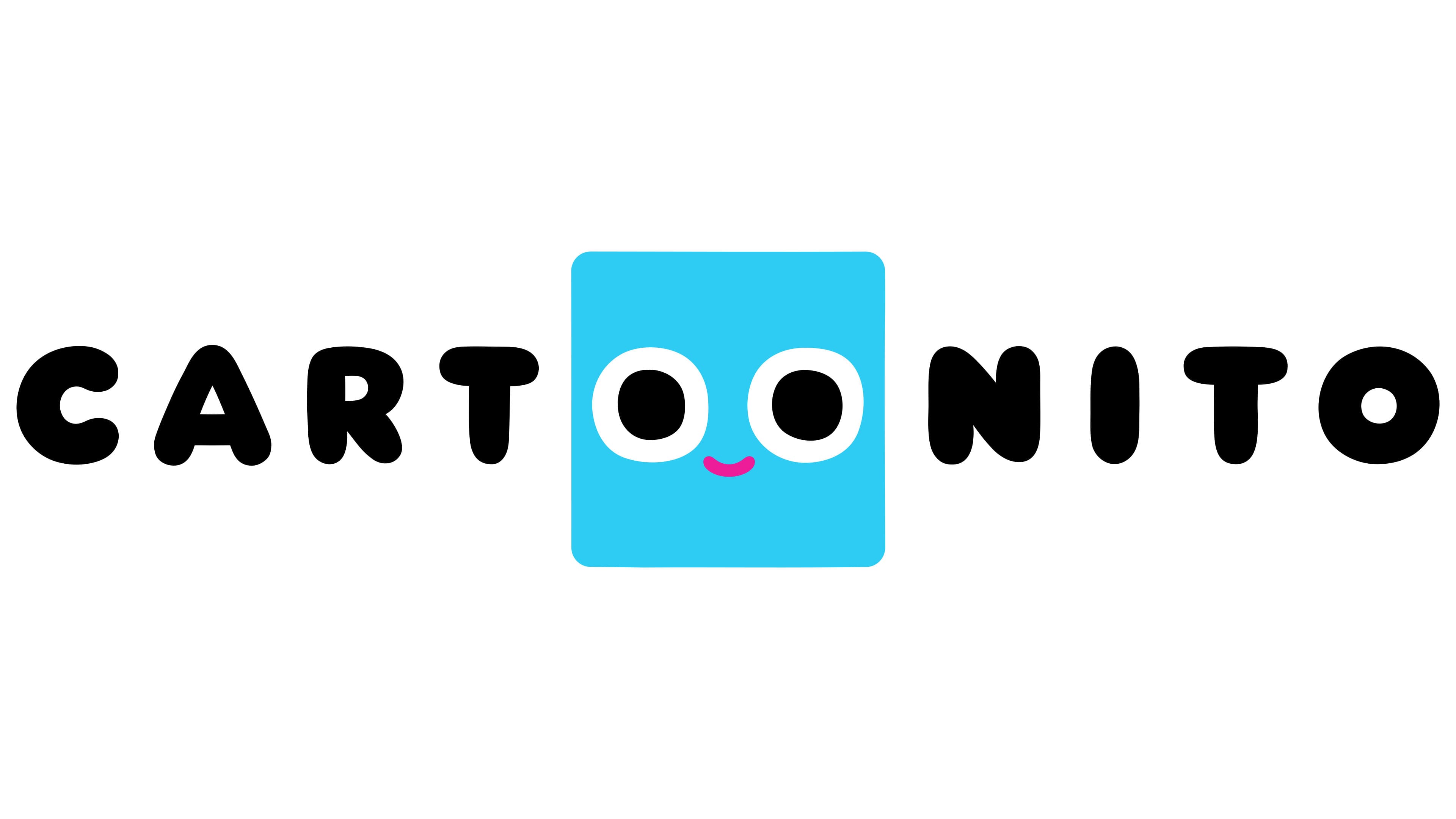
Following a global rebrand, the Cartoonito logo adopted a more streamlined, mature look while maintaining its childlike innocence and friendliness. Instead of the previous simple eyes, the new symbol features a blue square with large eyes and a small pink smile. This character comes across as a curious and friendly companion, always ready to have fun and learn alongside children.
The blue square, symbolizing a television screen, alludes to learning and entertainment and is perfectly suited for a preschool audience. The simple geometric shape reflects the early steps in education, where basic elements include shapes, colors, and simple concepts.
The emblem’s black letters have become more expressive and clear. This color choice emphasizes the channel’s commitment to clarity and simplicity in communicating with children. Black appears more universal and modern than the previous colorful designs, making the logo more noticeable and memorable.
This rebranding shows Cartoonito is adapting to new conditions and expanding its audience. It offers high-quality content for young children that combines play and learning elements.