


 Bravo Logo PNG
The Bravo logo creates the impression that the channel is conversing with viewers, as if promising unforgettable programs. It seems to communicate directly, reflecting an understanding of its audience’s tastes and preferences. This element of dialogue emphasizes that the channel is always “in tune” with its viewers, considering their interests and adapting to their needs.
The emblem represents modern television, offering a selection of the best and most beloved shows and movies, going beyond ordinary entertainment programs. The logo says, “We know what you like and have what you’re looking for.” It symbolizes the channel’s commitment to staying relevant and maintaining a connection with its audience by providing timely, relevant content.
Bravo began on December 1, 1980, when Cablevision launched the channel as a premium cable service focused on independent films, foreign cinema, documentaries, theater productions, and classic Hollywood titles. In its first years, Bravo aired films without commercials, which gave the channel a more specialized profile within American cable television and helped it reach viewers interested in arts and cinema.
In 1985, Bravo introduced Inside the Actors Studio, its first original program. Hosted by James Lipton, the show became one of the channel’s defining projects through detailed interviews with actors, directors, and other film professionals. During the 1990s, Bravo expanded its original programming and, in 1992, began airing the IFP Gotham Awards, strengthening its connection with independent film culture.
A major ownership change came in 1998, when Cablevision sold 50 percent of Bravo to NBC. In 2003, the company bought the remaining stake for $1.25 billion, and Bravo’s programming moved away from arts-centered content toward broader entertainment. Queer Eye for the Straight Guy became a breakout hit in 2003, followed by The Real Housewives of Orange County in 2006 and Top Chef in 2007, two formats that reshaped the channel’s schedule.
In 2009, NBC Universal merged with Comcast, giving Bravo a larger corporate base for further growth. In the 2010s, reality television remained the main direction, while scripted projects such as Girlfriends’ Guide to Divorce in 2014 and Odd Mom Out in 2015 tested other formats. By 2020, Bravo had become a major U.S. cable entertainment brand, with Below Deck, The Real Housewives, digital content, social media projects, streaming experiments, and new show concepts continuing through 2023.
Meaning and History
What is Bravo?
This American cable television network has carved out a unique place in the entertainment industry. Initially created as a platform for performing arts, it eventually evolved into a major player in reality shows and lifestyle content. The network is best known for its popular series “The Real Housewives,” which offers viewers a unique glimpse into the luxurious lives of wealthy women from various American cities. The channel has attracted a large and loyal audience, particularly fans of dramatic reality shows, competitions, celebrity interviews, and behind-the-scenes content about glamorous professions. The network’s content often revolves around themes of fashion, food, beauty, and pop culture, making it appealing to viewers interested in lifestyle and entertainment.
1980 – 1991
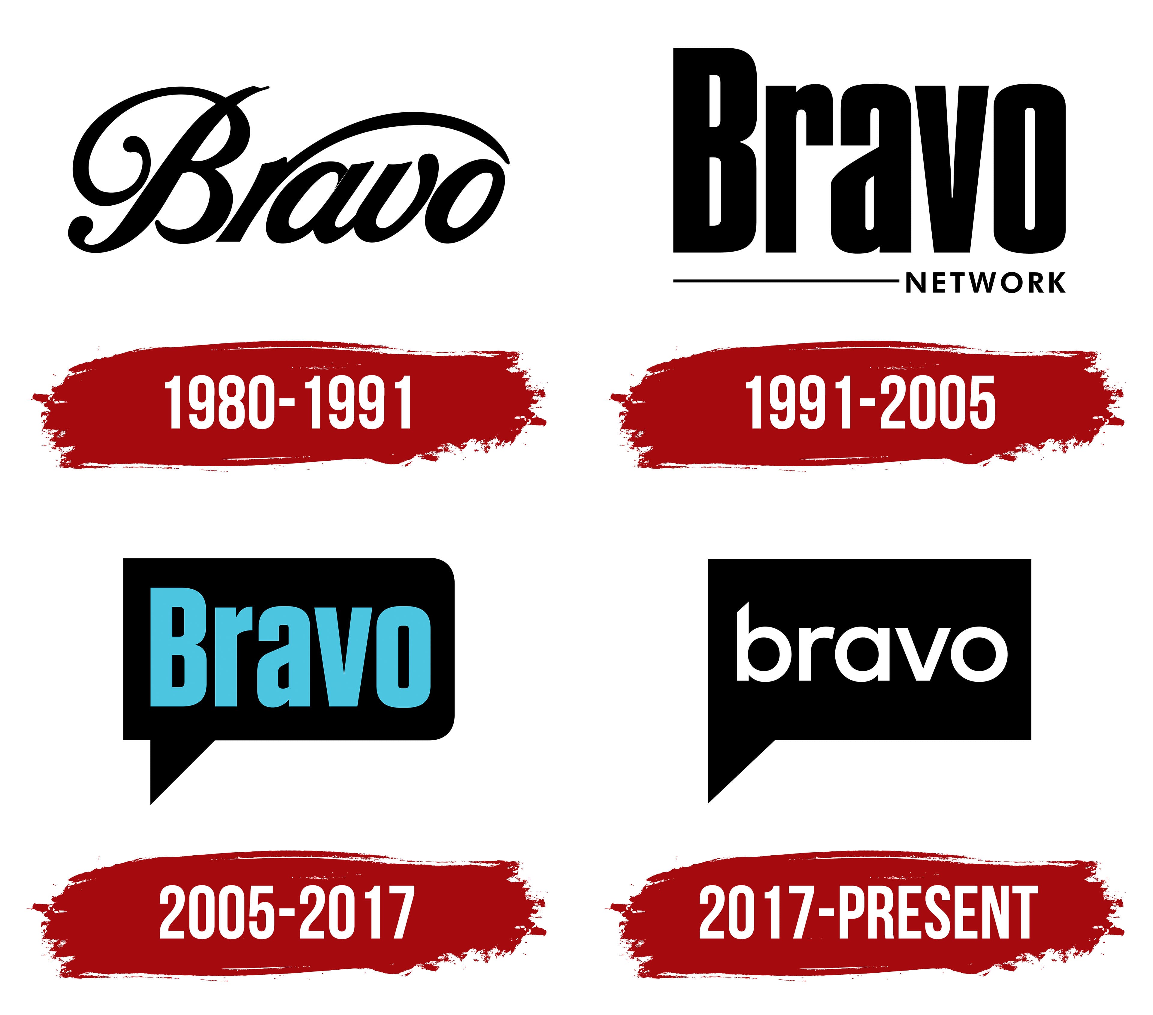
The first Bravo channel emblem looks very refined and sophisticated. It is done in a smooth, ornate font, evoking associations with something highbrow and cultural. It is a true symbol of style and elegance. When the channel started in those early years, it focused on art and cinema, so this style was entirely justified. The font conveys that the channel broadcasts something important, cultural, and meant for connoisseurs.
The word “Bravo” is the term audiences use to express appreciation for an excellent performance. When viewers shout “Bravo!” they express their admiration for the artistry. In this way, the channel’s logo hints at its goal of supporting and developing high art, making it accessible to viewers. It reflects the channel’s mission to serve as a bridge between the world of the arts and the general audience, showcasing what deserves applause and loud ovations.
The black-and-white color of the visual sign used in those years adds restraint and seriousness. This minimalism gives the emblem a sense of prestige, as if to emphasize that the channel is not chasing bright colors and light entertainment but offers viewers something important and worthy of attention.
This first logo perfectly conveyed the spirit of the times and the channel’s direction, art, style, and elegance.
1991 – 2005
The number of viewers sharply increased from 48,000 to 350,000 as the channel became a basic cable product accessible to a broader audience. This scaling process was reflected in the new logo, which featured large, bold letters. The characters are stretched upward as if predicting the channel’s further growth and expansion and attracting an even larger audience.
In the bottom-right corner, neatly continuing the thin line of the logo, the word “Network” is added in small capitals. This logo element resembles a scrolling ticker on a television screen, creating a sense of constant movement and progress and emphasizing the channel’s commitment to staying modern and dynamic.
2005 – 2017
After the channel became part of NBC Universal and its programming became filled with popular reality shows, the logo was updated again. The emblem is now designed as a speech bubble, evoking live communication in the shows. This change symbolized the channel’s shift in a new direction, making it more relatable to the modern youth audience, who actively use social media, leave comments, and send messages.
The design, resembling a text message, reflects the spirit of the time and emphasizes that the company is always in dialogue with its viewers. The word “Bravo” in the speech bubble appears like an exclamation, expressing admiration and approval of the channel’s programs. This reflects the audience’s enthusiasm and the channel’s ongoing commitment to staying relevant and connected with its viewers.
2017 – today
The Bravo logo changed with the release of the film Imposters. The black speech-bubble background, resembling a dialogue window, was retained to symbolize the brand’s core focus on communication, discussion, and opinion exchange. The speech bubble element evokes associations with lively conversations and active discussions on the channel’s topics.
The text is now in a simple, lowercase white font, giving the logo a modern, minimalist look. The contrast between the black background and the white letters draws attention to important themes of conscience, morality, and ethics, which became central in projects like “Imposters.” White symbolizes clarity, truth, and purity. At the same time, the black background creates a sense of depth and seriousness, highlighting the drama and tension often explored in the channel’s stories.
Interestingly, the shift from a softer, playful style to a stricter, more concise one aims to expand the channel’s audience, including men. With its sharp, strong lines, this bold style reflects more masculine, mature themes that have now become integral to Bravo’s programming.
This visual change was a significant step, aligning with a time when the brand was at the crossroads of more complex themes. It aimed to refresh its image while maintaining important elements from the past, such as the speech bubble, which symbolized conversation and interactivity.