Build-A-Bear Workshop Logo PNG
The Build-A-Bear Workshop logo symbolizes an entire world of warm memories. The company didn’t just offer ready-made toys; it gave customers the chance to create a unique character by choosing details, voices, and stories, turning its stores into spaces for unforgettable experiences.
Build-A-Bear Workshop began in 1997 after Maxine Clark, a former executive at May Department Stores, was inspired by a young girl named Katie who couldn’t find the teddy bear she wanted while shopping. Clark opened the first store at the Saint Louis Galleria Mall in October 1997, allowing customers to design personalized stuffed animals, including customization with outfits, sound modules, and birth certificates.
Rapid growth followed, and by 1999, Build-A-Bear operated 14 stores across several U.S. states, receiving recognition as “Retail Store of the Year” from the International Council of Shopping Centers. In 2004, the company went public on the New York Stock Exchange, funding further expansion.
The brand entered the UK market in 2006 and launched an e-commerce platform the same year. Expansion in Europe accelerated in 2007 with the acquisition of Bear Factory stores. By 2008, significant licensing agreements had been signed with major brands, including Disney, Marvel, and DC Comics, thereby broadening the product’s appeal.
In 2012, the company began incorporating digital technology into store designs, introducing interactive touchscreens. This concept evolved further in 2015 with the introduction of the “Discovery” store format, which featured advanced customization stations.
Build-A-Bear marked its 20th anniversary in 2017 with the “Count Your Candles” promotion, offering birthday bears at special prices. From 2021 to 2023, the company enhanced its digital presence, expanded its product lines, collaborated with entertainment brands, and opened new locations worldwide.
Meaning and History
What is Build-A-Bear?
This is a retail chain where customers can create their unique stuffed animals. Shoppers choose a plush base, fill it, and add sound modules, clothing, and accessories to create an engaging, interactive experience. The stores feature themed areas where each step of the creation process is set in a special atmosphere. In addition to classic teddy bears, the selection includes plush toys inspired by popular movies, cartoons, and video games. There is also an online platform where customers can design their characters or order pre-made ones.
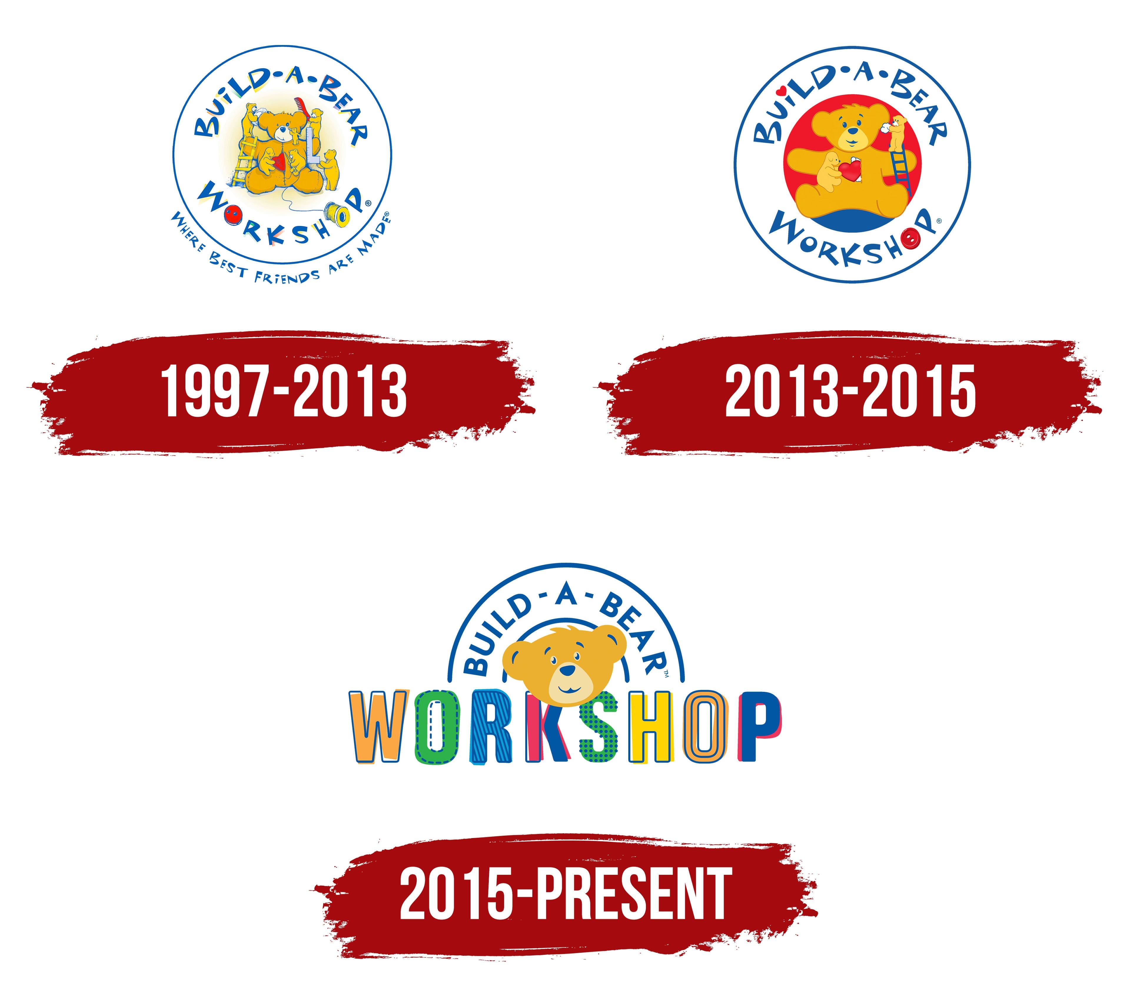
1997 – 2013
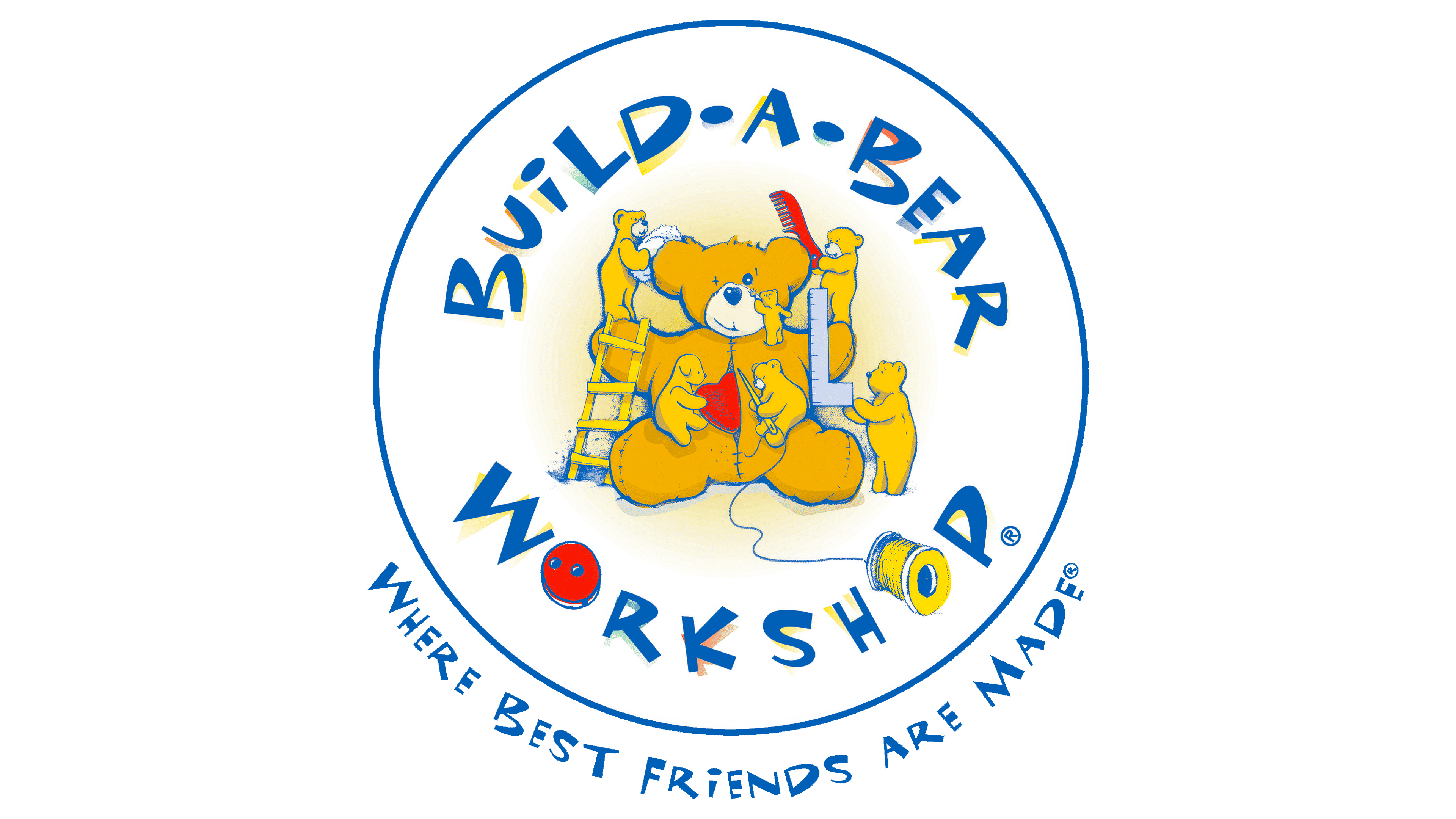
The first Build-A-Bear Workshop emblem was born as a visual expression of the idea that Maxine Clark sought to convey through a new format of children’s retail. The founder personally participated in the development and assembled a team of designers, ensuring that every step aligned with the concept of personalized toy production. The artists were tasked with highlighting the handcrafting process and showcasing the uniqueness of each item.
The design features a circle with inscriptions along its perimeter. The upper part contains the name “BUILD-A-BEAR WORKSHOP,” and the lower part includes the slogan “WHERE BEST FRIENDS ARE MADE.” The inner field is occupied by a large bear figure surrounded by several miniature characters. Each of the miniature characters is engaged in a separate activity. One is sewing on a heart, another is measuring with a ruler or brushing fur, working with a needle, thread, and ladder. Through soft, drawn lines, the authors conveyed a sense of warmth and care.
The font is based on decorative glyphs, in which intentionally uneven heights and tilted letters create the effect of a child’s handwriting. Additional accents are integrated into the letters. In the word “WORKSHOP,” the first letter, “O,” is styled as a button, and the second, “S,” is depicted as a spool of thread. In this way, the brand’s visual style is closely tied to the concept of individual tailoring.
The color system is oriented toward a child audience. Yellow-orange tones form the basis, filling the image of the bears with a sense of coziness. Blue works as the background for the outline and text, adding contrast and balance. Red is used in the heart and in the button, strengthening the emotional subtext and emphasizing the theme of friendship.
Despite subsequent changes, this design effectively conveyed the core principles of Build-A-Bear Workshop, including an individualized approach, customer involvement in the process, and a playful brand perception.
2013 – 2015
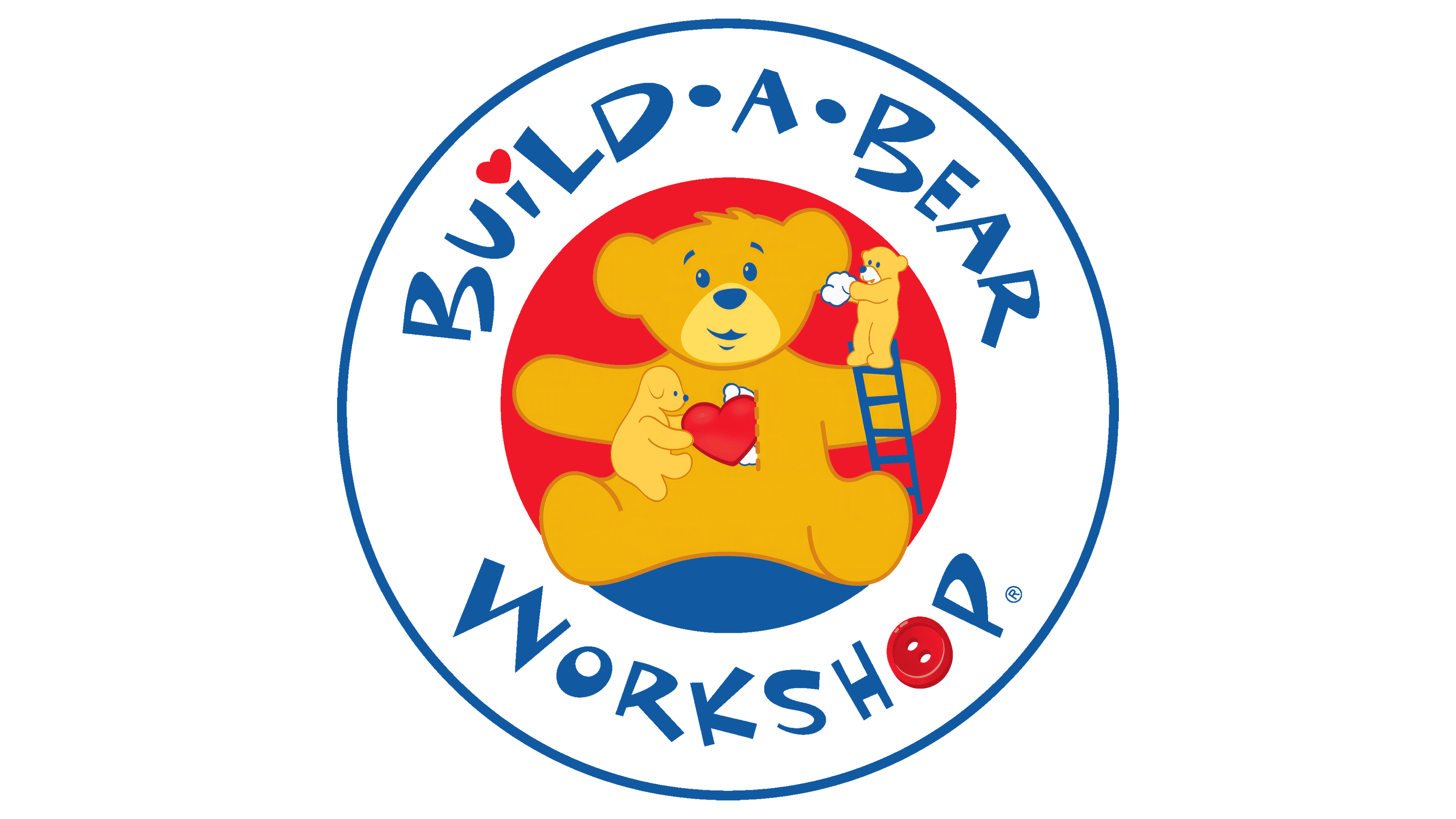
Compared to the first logo, which was filled with many characters and intricate details, the Build-A-Bear Workshop image was simplified. The artists retained the general round format and narrative basis, but reworked the emblem in the spirit of flat, minimalist design. At the center, there is now only one bear and a couple of helpers instead of a whole group. The narrative became more concise and easier to perceive.
The bear figure received cartoon features and a symmetrical structure. Complex strokes and auxiliary attributes were removed, resulting in a calmer and more expressive image. Additional focus shifted to the background. The red circle highlights the character and adds energy to the composition.
Changes also affected the typography. The handwritten playful style of the letters retained a sense of playfulness, but now the font was made more accurate, with smoother contours. In the word “WORKSHOP,” only one decorative “O” in the form of a button was kept, while the second letter took on a standard form. A new symbolic accent appeared. The dot above the letter “I” was replaced with a heart. It became the new symbolic accent, giving the brand more emotional appeal.
The color palette gained greater contrast. The blue in the inscription deepened, and the red and yellow gained an extra warmth. The distribution of shades emphasizes appeal to a child audience and reinforces the brand’s friendly character.
The updated emblem showcased a transition from decorative detailing to a simplified form, while retaining the emotional markers that connect the brand to the theme of handcrafted toys.
2015 – today

The 2015 transformation of the Build-A-Bear Workshop logo demonstrated the company’s efforts to adapt to the digital environment and expand its audience. Instead of a detailed narrative composition with multiple characters, the brand introduced a design that is easily perceived on screens and equally readable in various formats.
The main symbol evolved into a bear head, simplified to a flat form. The smile and open gaze of the image convey friendliness and accessibility, maintaining the emotional bond that was key for the brand.
The logo’s structure underwent a radical change. From the former circle, only the upper arc remained, turned into the inscription “BUILD-A-BEAR.” It is executed in a strict geometric sans-serif set along a semicircle and forming a kind of arch above the bear head symbol. The lower part of the composition is built on the word “WORKSHOP,” written in letters each styled as a multicolored patch of fabric with its own pattern. This approach is tied to the idea of handcrafted toy making, where individual parts are assembled into a unique whole.
The upper sans-serif font is aimed at clarity and digital readability. The lower row of customized letters contains decorative elements, including dotted lines, stripes, dots, and imitation stitching. It creates associations with craftsmanship while also supporting a playful mood.
The palette became broader than in previous versions. In addition to yellow, red, and blue, green, orange, and textured variations of the main tones were added. The expansion of the color system emphasizes the assortment’s variety and the idea of personalization, allowing each toy to be unique.
The logo established a new stage in the evolution of Build-A-Bear Workshop. It became a symbol of the company’s move beyond the classic retail space, turning into a universal mark for digital platforms and a multi-generational audience. In the updated image, modern design trends merged with the brand’s traditional emotional attachment to craftsmanship and play.