


![]() Bushmills Logo PNG
Bushmills Logo PNG
The whiskey emblem testifies to the valor and heroism of the product’s buyers. The elitism of alcohol is visible in every element of the visual sign. The Bushmills logo represents the best drink for the most deserving and courageous.
The history of Bushmills traces back to 1608, when King James I of England granted a distillation license to Sir Thomas Phillips in County Antrim. That date remains on every bottle, though the distillery itself was formally established later.
In 1784, Hugh Anderson set up the first recorded commercial operation in Bushmills. Ownership changed frequently until 1835, when James McKibben stabilized production and expanded its reputation across Ireland.
In 1860, Belfast merchants James McColgan and Patrick Corrigan acquired the distillery, and in 1880, they registered a joint-stock company. A fire in 1885 destroyed most facilities, leading to bankruptcy. James Stine Boyd and Charles Connor rebuilt operations, and by 1889, Bushmills won a gold medal at the Paris Exposition.
The early 20th century brought a decline in Irish whiskey production due to the Irish War of Independence, trade boycotts, and Prohibition in the United States. Director Wilson Boyd stockpiled aged whiskey, allowing Bushmills to ship a large consignment to Chicago after Prohibition ended.
By the mid-20th century, only a few distilleries remained. In 1972, Bushmills joined Irish Distillers, alongside Midleton Distillery. In 1988, Pernod Ricard acquired the group and prioritized Jameson.
In 2005, Diageo bought Bushmills for £200 million, invested €45 million, and expanded output. Competition intensified with brands like Glenfiddich.
In 2014, Diageo exchanged Bushmills for a stake in Don Julio from Jose Cuervo via Proximo Spirits. Bushmills became part of Casa Cuervo’s portfolio.
By 2022, annual sales exceeded one million cases. In 2023, the Causeway Distillery opened with a £37 million investment, increasing capacity to 11 million liters per year while the original site continued to operate.
Meaning and History
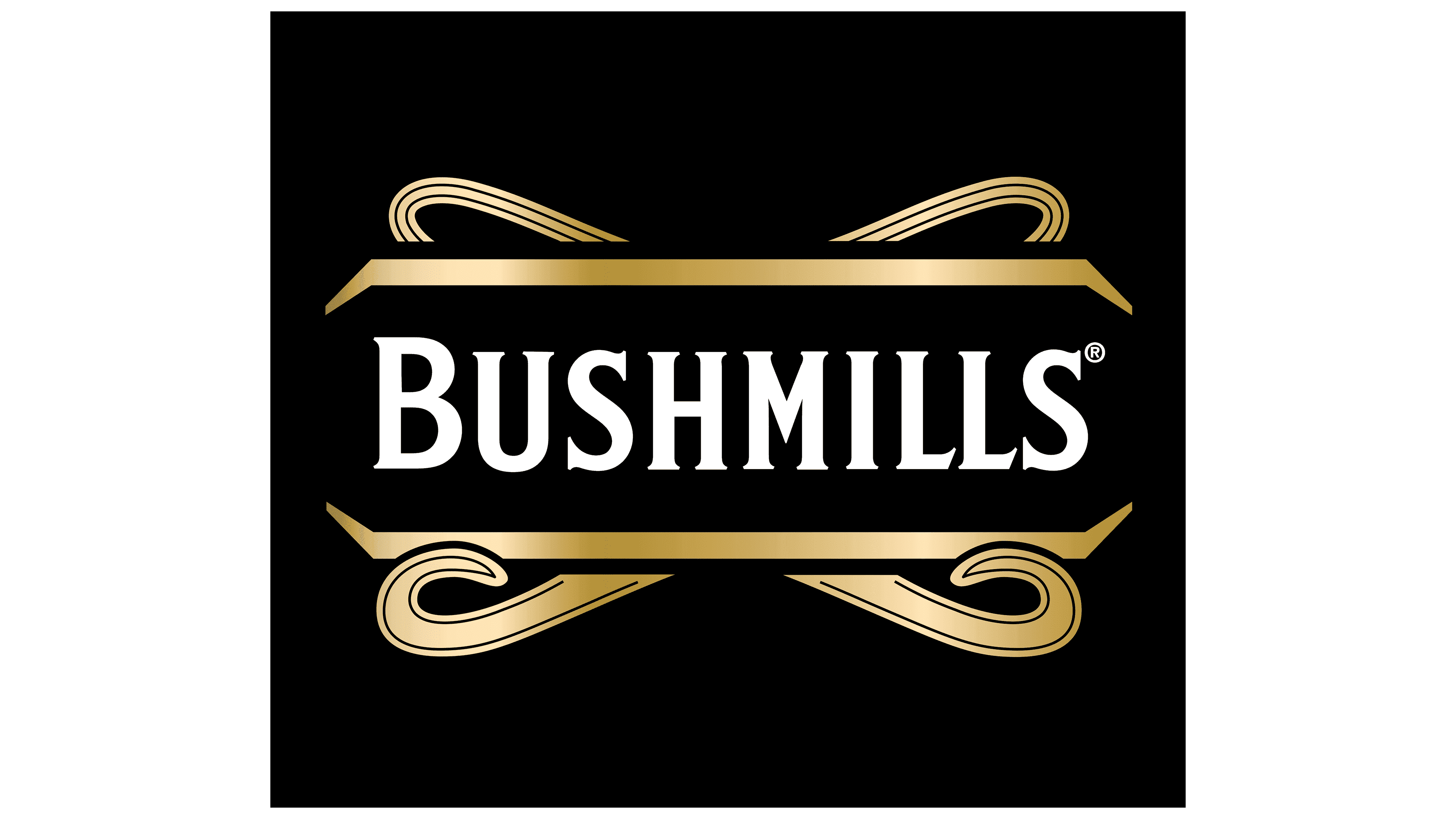
The brand logo is minimalist. The word “Bushmills” is written in large letters in the most conspicuous place. The distillery is named after the native village, so the trademark serves as a tribute to its ancient traditions. All printable characters are lowercase, except “B,” which is above the rest. The font is even and sharp-angled, with short serifs.
The caption is centered within the cutoff rectangle. The top and bottom of the geometric shape are outlined in wide golden lines with a dark outline. They are complemented by curved ribbons of the same color, emphasizing the special status of Irish whiskey.
What is Bushmills?
Bushmills is an Irish whiskey distillery producing the eponymous whiskey. It is located in County Antrim, Northern Ireland, along one of the tributaries of the River Bush, from which it takes water for whiskey production. The company has three founding dates: 1608 (when a license for whiskey distillation was issued), 1784 (completion of distillery construction and the start of operations), and 1885 (reconstruction and relaunch following a fire).
The designers originally designed the logo using a gradient. Due to the smooth transition of shades, the drawing appears to glow from within. This graphic effect reflects the premium quality of Bushmills and its products.
Font and Colors
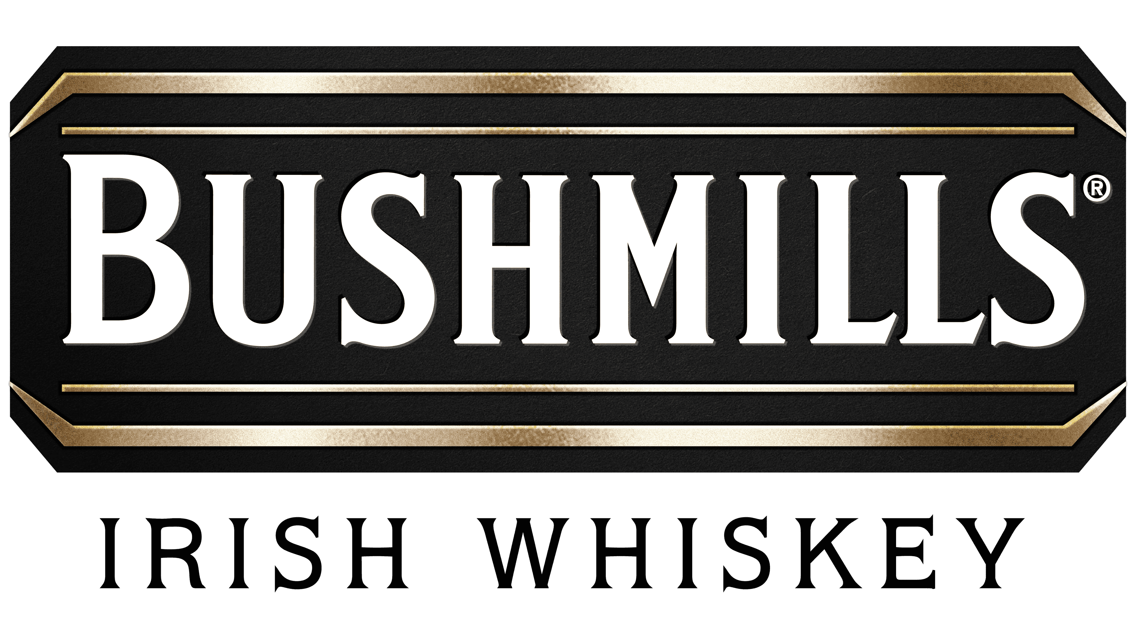
The Irish whiskey logo is surprisingly stable. Suppose there were any corrections, then absolutely insignificant ones related to the varietal differences of the alcoholic drink, to emphasize its individuality. The key element is white lettering on a black background. This is the brand name, in capital letters, with an “B” emphasis above the rest.
The word “BUSHMILLS” appears above and below in wide, golden linear frames. They form a horizontal rectangle with clipped corners. The appearance varies by whiskey type. For example, there is an option with a tape collected by rings, and another with a curl at the top. There is also a version without ribbons with two thin stripes on the inside and the inscription “IRISH WHISKEY” at the bottom. All elements are edged except for letters.
The designers chose an elongated font with miniature serifs for the logo, which resembles classic extensions at the ends of letters. Only sharp projections are visible from them. The inter-character distance is average, but in the last two “L” and “S,” it is reduced to a minimum, so the signs almost touch.
The corporate palette is monochrome. It consists of only two colors: black and gold. The first is a contrasting background for the second, which denotes the natural shade of whiskey.