 Cemex Logo PNG
Construction projects rely on materials that form the foundation of buildings, roads, and infrastructure. Cement and concrete are used in the early stages of construction and determine the strength of future structures. The Cemex logo represents a company that manufactures construction materials and supplies cement, concrete, and aggregates for projects in various countries.
Cemex was founded in 1906 in Mexico. Two local companies, Cementos Hidalgo and Cementos Portland Monterrey, merged into a single corporation called Cementos Mexicanos. In 1931, their merger became the foundation of a future global leader in cement production. By the mid-1960s, the company was expanding its presence in Mexico. It acquired new plants and increased production volumes.
By 1976, the company had listed its shares on the Mexican Stock Exchange. In the same year, Cemex acquired three plants from its competitor, Cementos Guadalajara. After that, the company became the country’s largest cement producer. In the 1980s, Cemex strengthened its position in the domestic market. Its market share reached 65 percent. During this period, the company began exporting products to the United States.
In 1985, Lorenzo Zambrano, the founder’s grandson, led the company. He developed an expansion plan. After Mexico liberalized its economy, Zambrano said Cemex had to become a global corporation to remain competitive. In the 1990s, the company began large-scale international acquisitions of cement plants. In 1992, it purchased major facilities in Spain. Two years later, the company strengthened its position in the United States, Panama, and Venezuela.
By 1995, Cemex ranked third worldwide in cement production volume. In the late 1990s, the company became North America’s largest producer.
In 2005, Cemex acquired the British company RMC. In 2006, it completed a merger with the Australian company Rinker Group. This deal became the largest in the industry’s history. As a result, the company’s revenue exceeded $ 23 billion.
In recent years, the company has continued expanding its presence in global markets. In 2021, operations at the first kiln in Mexico were resumed. In 2022, the company invested $ 29 million to modernize its production facilities.
The company began implementing technological and environmental innovations, including electric concrete mixers in Europe, the Middle East, and Africa.
Meaning and History
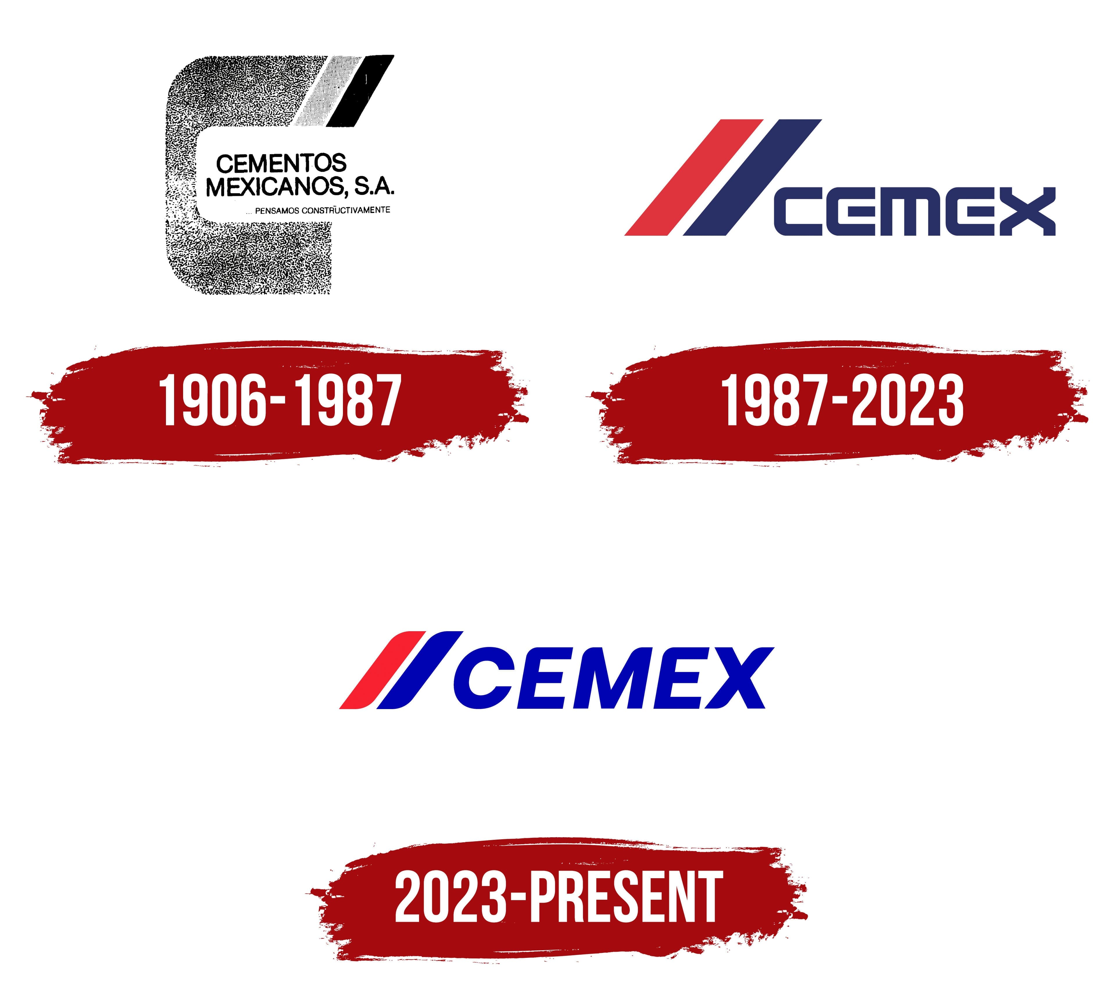
What is Cemex?
A Mexican corporation headquartered in San Pedro Garza García, near Monterrey, was formed by merging Cementos Hidalgo and Cementos Portland Monterrey. It is among the world’s largest cement producers, operating 60 plants in 30 countries. It manufactures cement, concrete, gravel, sand, asphalt, and roofing materials.
1906 – 1987
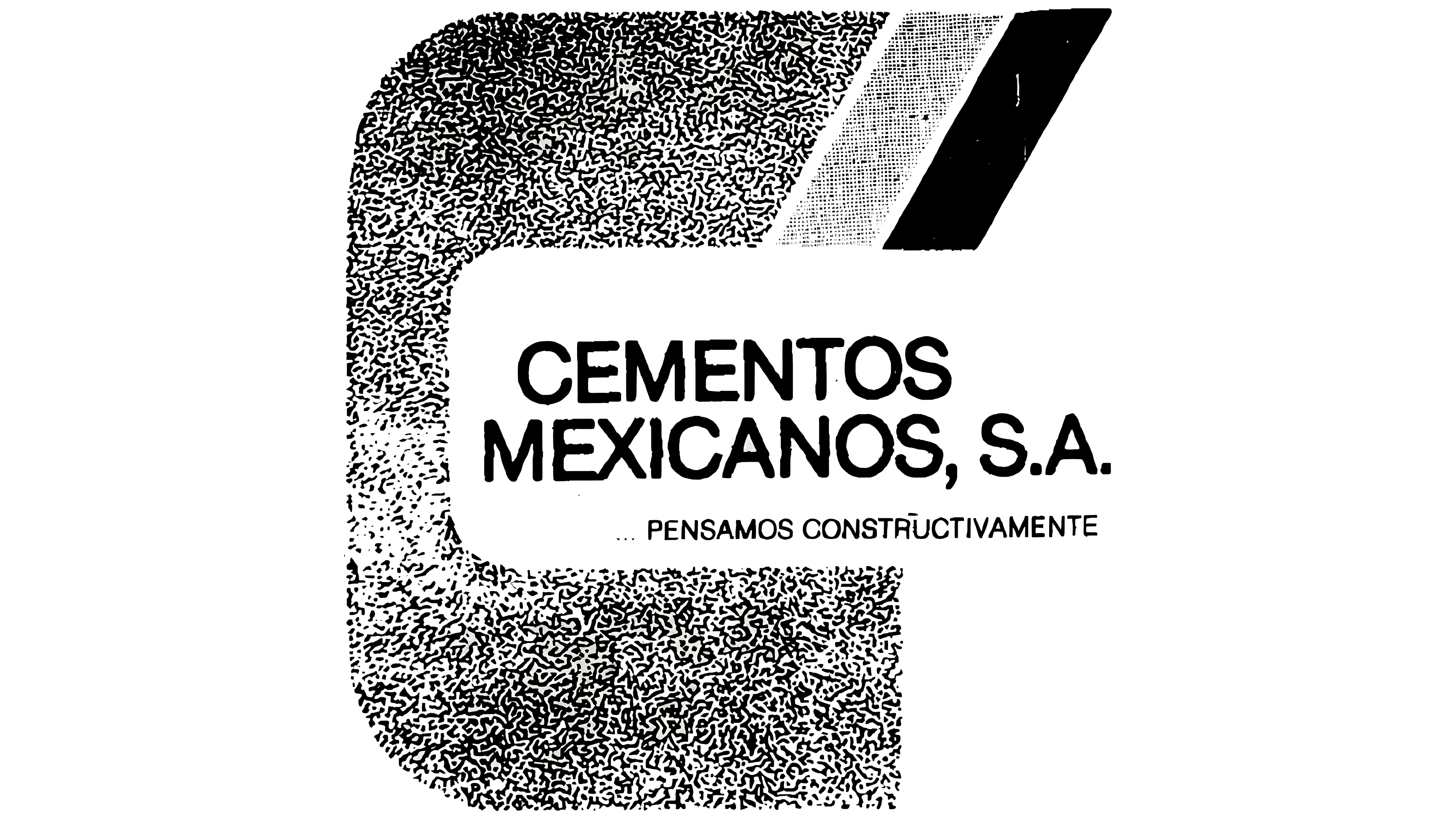
CEMEX began in 1906 near Monterrey, where the Cementos Hidalgo plant opened. A separate company, Cementos Portland Monterrey, was incorporated in 1920. The 2 manufacturers merged in 1931. Following the merger, the group adopted the name Cementos Mexicanos, S.A.
The full CEMENTOS MEXICANOS, S.A. name helps date the early logo. The historical timeline lists 1906–1987, though the Cementos Mexicanos name did not appear until 1931. The version containing the full wordmark therefore dates from after the merger of Cementos Hidalgo and Cementos Portland Monterrey.
Cementos Mexicanos means “Mexican Cements” and identifies the company’s industry and country of origin. The abbreviation CEMEX was later formed from the first letters of the two words. The shortened name worked well in international markets. Cementos Mexicanos, S.A. changed its legal name to CEMEX, S.A. on April 28, 1988.
The early logo centered on a large angular figure resembling an open letter “C.” A broad line with smooth, curved corners formed the shape. An opening on the right preserved its resemblance to the first letter of Cementos. The heavy frame surrounded the name and occupied most of the composition.
The upper section differed from the other sides of the frame. Two slanted bands extended from its right end and continued the horizontal line at an angle. Some descriptions mention several fragments, though the image shows 2 primary bands. They created a stepped edge and reduced the visual weight of the heavy open “C.”
The main outline used a dark color close to black. The treatment worked for seals, packaging, corporate documents, and industrial markings. The limited color scheme allowed the logo to be reproduced on materials associated with cement production and sales.
CEMENTOS MEXICANOS, S.A. appeared inside the open “C.” All letters used an uppercase sans-serif typeface. The characters had consistent stroke thickness and tight spacing. The full legal name occupied the primary line and represented the company before it adopted the CEMEX form.
The phrase PENSAMOS CONSTRUCTIVAMENTE appeared below, preceded by an ellipsis. The statement meant “We think constructively.” It used smaller black sans-serif letters. The scale difference separated the company name from the advertising message.
The phrase contained wordplay related to both thought and construction. Constructivamente referred to a constructive approach while connecting with the use of cement. The advertising line supplemented the company’s full name and communicated its business through a short statement.
1987 – 2023
Cementos Mexicanos acquired Cementos Anáhuac in 1987, followed by Cementos Tolteca in 1989. The acquisitions expanded the business in Mexico and created a need for a short name that could unite the companies. CEMEX replaced the full Spanish name, and an emblem made of 2 slanted red and blue bands appeared beside it.
CEMEX combined shortened sections of Cementos Mexicanos. The beginning came from cementos, while the ending retained part of Mexicanos. The compact form communicated the group’s Mexican origins and worked internationally. The company adopted the legal name CEMEX, S.A. on April 28, 1988.
A horizontal arrangement replaced the large open “C.” The previous version placed Cementos Mexicanos, S.A. and PENSAMOS CONSTRUCTIVAMENTE inside the frame. Following the update, a small emblem appeared on the left, and CEMEX stood on the right. The shortened brand replaced the lengthy legal name as the primary mark.
Two broad diagonal bands formed the emblem. They rose to the right at the same angle and ran parallel. A narrow white gap separated the colored sections. The outer silhouette was elongated and angular.
The left band was red, while the right was rich dark blue. The different colors separated the lines while retaining them as a pair. The compact form worked across packaging, machinery, production facilities, and corporate materials. It could appear independently from the full name.
CEMEX appeared on the right in large uppercase sans-serif letters. References to lowercase characters in the source description conflict with the image, where the name uses all uppercase letters. The characters had angular contours, broad strokes, and compact proportions. Their construction resembled modified versions of Eurostile and Microgramma.
The dark blue wordmark matched the right diagonal and connected both sections of the logo. The red band introduced a second rich color, while the white gap preserved the boundaries between the lines. Blue used Pantone 281 C and the digital value #023185. Red corresponded with Pantone 185 C and #E3303D.
The defined specifications supported consistent color reproduction across printed materials, building facades, vehicles, and screens. The horizontal arrangement worked in countries using different writing systems because the short name retained the same form in every market.
CEMEX acquired the Spanish companies Valenciana and Sansón in 1992. The transaction expanded the group beyond Mexico and accelerated its international growth. The red-and-blue identity retained its basic structure for more than 3 decades. It represented acquired businesses under the shared CEMEX brand.
2023 – today
After using its previous corporate identity for nearly 30 years, CEMEX introduced an updated version on March 15, 2023. The red and blue diagonals remained beside the name, though their proportions, typography, and colors changed. The redesign accompanied the company’s business transformation, digitalization, and development of next-generation building materials.
CEO Fernando González connected the update with product development and a new stage in CEMEX’s growth. The corporate identity needed to reflect the changes accumulated during the preceding years. The company linked the redesign to a new positioning in the construction industry and the development of its technology operations.
Two parallel bands to the left of the name remained the emblem’s foundation. The red line came first, followed by blue. Both rose to the right at the same angle. At the same time, a white gap separated the colored forms, preserving the previous version’s structure.
The bands became smaller and moved closer to CEMEX. Their ends became softer, and the distance between the forms decreased. The emblem occupied less space relative to the name and created a compact pair of diagonals before the wordmark.
The name retained its uppercase single-word spelling. A sans-serif style with bold strokes, rounded transitions, and a slight rightward slant replaced the heavy angular lettering. Its construction resembled Eurostile Bold Extended and Microgramma with softer contours.
The letters’ slant followed the angle of the colored bands, connecting the emblem and wordmark into one horizontal composition. A shared direction extended from the red line to the “X.” The aligned angles allowed the diagonals and name to read as one brand.
Blue became lighter than Pantone 281 C, the shade used in the previous identity. Red took on a richer tone and emphasized the first band. Blue connected the second diagonal with the name, while the white gap kept the colored forms separate at small sizes.
The previous version was created during CEMEX’s international expansion and featured heavy geometric letters beside a large emblem. The 2023 version used lighter proportions, while the historic red-and-blue pair retained continuity with the identity introduced in the early 1990s. The updated logo was intended for corporate materials, digital services, and the company’s new product operations.
CEMEX described the new image as “fresher” and “closer.” A third term from the presentation referred to the energy created by the shared slant of the bands and letters. The primary changes involved spacing, contours, proportions, and logo use across digital media.