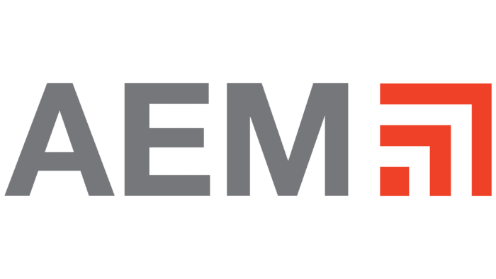
The designers developed the AEM logo in a geometric style to give company-wide recognition in the professional market. These are three angles of different sizes, placed vertically. They represent parts of attachments because the company is engaged in producing special equipment and devices for it.
AEM: Brand overview
| Founded: | 1894 |
| Headquarters: | Milwaukee, Wisconsin, U.S. |
| Website: | aem.org |
Meaning and History
The beginning of this organization was laid by the National Association of Agricultural Implement and Vehicle Manufacturers, founded at the end of the 19th century to enlarge the special equipment segment. In the course of expansion and development, it changed its name several times to fully reflect the changes in the industry. In 1911, a large-scale event took place in its history – the first official meeting, which gave rise to the CIMA (Construction Industry Manufacturers Association) company, which became the direct prototype of AEM.
The firm began its active introduction into the US economy in 1968, when its first safety manual appeared. CIMA greatly increased its membership list by accepting foreign manufacturers a year later. This was her contribution to recognizing the globalization of the industry she represents. In 2002, the Construction Industry Manufacturers Association merged with the Equipment Manufacturers Institute, forming an enlarged profile structure – the current Association of Equipment Manufacturers (AEM).
Building on their achievements, the new organization continues the technical legacy. Thus, the industry segments were able to survive and form a powerful industry for producing off-road equipment (construction and agricultural equipment). The company’s rebranding touched all its aspects, including the visual identity mark.
What is AEM?
AEM is the Association of Equipment Manufacturers from the United States, which brings together heavy transport equipment market manufacturers. Its key area is the production and sale of special equipment for the agricultural sector, the construction industry, and the road sector. It is one of the largest companies in North America, with over 1,000 members. The head office is located in Milwaukee, Wisconsin.
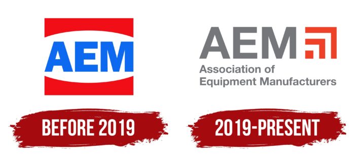
Before 2019
The logo featured an abbreviation consisting of the word “AEM.” It was executed in bold grotesque with a predominance of even and precise lines. The monolithic letters were painted bright blue and placed between two red figures that resembled arches with a horizontal base. They reflected the company’s direction as they conveyed the form of bulldozer blades, a bucket for grabbing land, and a grader shovel for roads. The central part between them formed an open ellipse, which contained the name of the association of special equipment manufacturers.
2019 – today
After AEM became a partner and member of the board of Commodity Classic, it changed the style of the logo. As a result, he received a cleaner structure. First, the developers corrected the disproportionality of the “M,” in which the right leg was slightly wider than the left, so now both sides are the same size. Secondly, they have replaced the wide font with a thin one. Thirdly, the designers proposed new symbols instead of red dumps – one miniature cube and two right angles made up of straight stripes.
The graphic part directly conveys the type of activity of the association because the geometric shapes symbolize attachments for special equipment and stop for fastening during intensive work (for example, when lifting loads and digging ditches). At the bottom, in small print, the company’s full name is transferred – “Association of Equipment Manufacturers.” The inscription is left-aligned, made in classic block letters, and colored in dark gray.
Font and Colors
The designers tried to reflect the scope of AEM activity in the logos, so they chose strict geometric shapes reminiscent of special equipment elements for visual identity. And since attachments most characterize it, they used its general structural forms. To attract attention, the authors of the logo preferred a contrasting palette.
The lettering in the first AEM logo was done with the TeeFranklin Heavy typeface by Suomi Type Foundry. In the second version, the font used for the abbreviation is identical to David Bold, and the bottom inscription is typed in Arabic-font-2013 Bold by Ramzi2005. Accordingly, the letters are wide; in the other, they are narrower. Their unifying feature is the absence of serifs.
Now the corporate palette includes red (graphic sign), gray in several shades (text part), and white (it serves as a background). The early emblem was more colorful and consisted of bright blue and red.
AEM color codes
| Nickel | Hex color: | #76777a |
|---|---|---|
| RGB: | 118 119 122 | |
| CMYK: | 3 2 0 52 | |
| Pantone: | PMS Cool Gray 9 C |
| Neon Red | Hex color: | #ef4128 |
|---|---|---|
| RGB: | 239 65 40 | |
| CMYK: | 0 73 83 6 | |
| Pantone: | PMS Bright Red C |
