


 Chinabank Logo PNG
Behind the Chinabank logo is a Philippine bank closely tied to the Chinese Filipino business community. The bank’s name may suggest a connection to China, but its history is rooted in the Philippines’ trade and business needs. Its services for small and midsize businesses connect the brand to the country’s commercial life and local company financing.
Chinabank was founded on August 16, 1920, on Calle Rosario in Binondo, Manila, the world’s oldest Chinatown. Its founders included Dee C. Chuan, Albino Sycip, and other leading business figures. The bank was created as a local private commercial bank for Chinese-Filipino merchants who often struggled to obtain credit from existing institutions.
From the start, Chinabank combined Chinese business values, including the principle of trust known as “xinyong,” with Western banking practice. Its first managers were American bankers J. W. McFerran and Eugene Wing. The bank moved into its own building in 1924, was listed on the Manila Stock Exchange in 1927, and opened branches in Xiamen in 1925 and Shanghai in 1929.
World War II nearly stopped the business. In 1942, Japanese military authorities liquidated the bank in occupied Manila. Still, management had already moved more than 14 million pesos abroad in 1941. This preserved almost half of its assets and allowed Chinabank to reopen on July 23, 1945. In 1949, it granted a 1-million-peso credit line to Henry Sy, who later built the SM Group. In 1956, it lent 500,000 pesos to John Gokongwei, the future founder of another major Philippine conglomerate.
Chinabank later became a pioneer in banking technology. In 1969, it computerized operations and moved to online processing of deposit accounts. In 1988, it launched TellerPhone, the first telephone banking service in the Philippines. In 1990, it helped create BancNet with seven other banks. It received a universal banking license in 1991, competed in a market shaped by BDO Unibank and Banco de Oro, acquired Manila Bank in 2007, and relaunched it as China Bank Savings. By its 2020 centennial, assets reached 1 trillion pesos.
Meaning and History
What is Chinabank?
This Filipino commercial bank is not affiliated with China despite its name. The bank offers a range of financial services, including investment banking, insurance, retail banking, and corporate banking. It focuses on supporting small and medium-sized businesses while contributing to the country’s economic stability. The bank has an extensive nationwide network of branches and ATMs, making it accessible to a wide range of clients. With its conservative management approach and low-risk profile, the bank remains stable even during economic downturns.
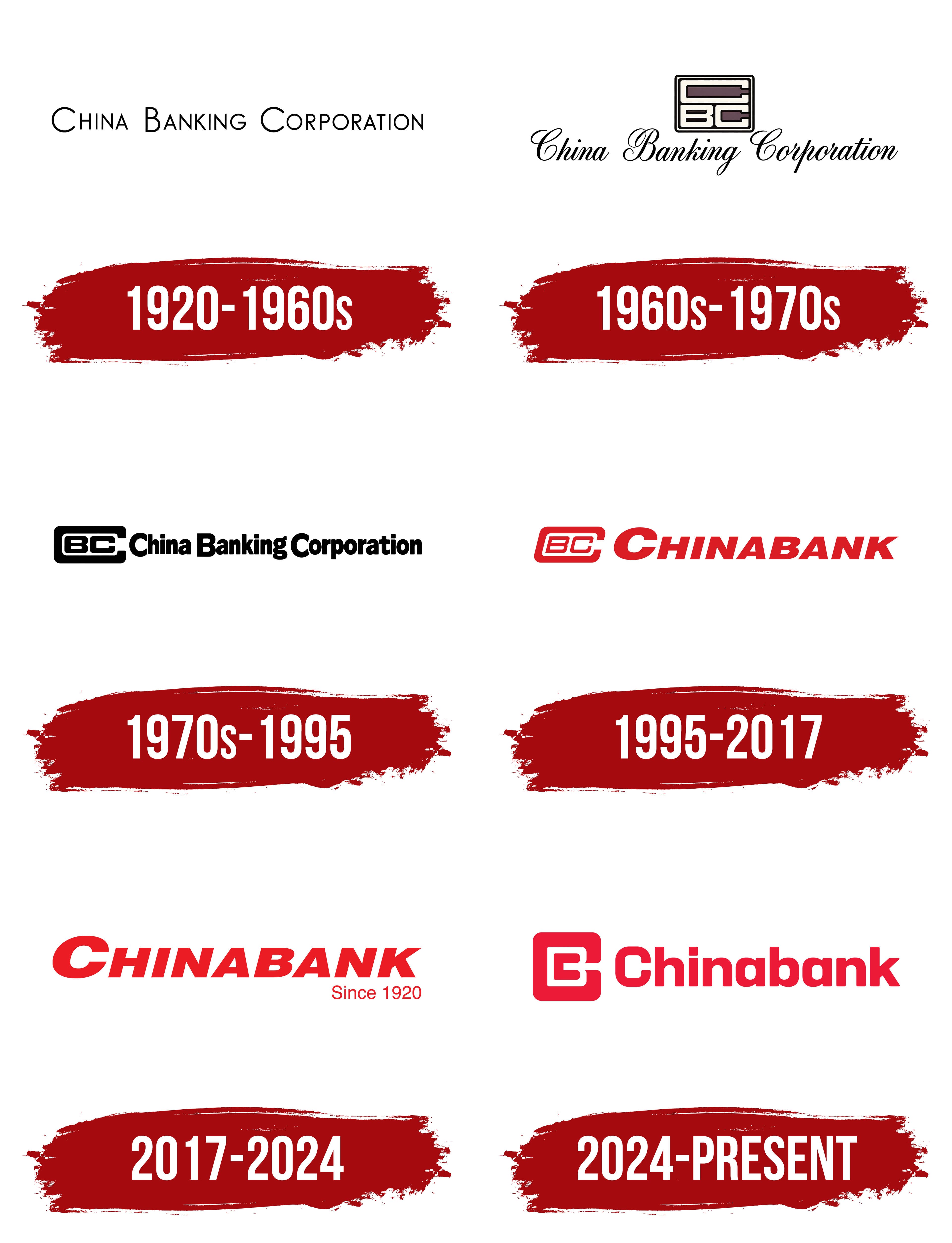
1920 – 1960s

The name China Banking Corporation reflects the bank’s history and the customers it was established to serve. Businessman Dee C. Chuan led the effort to establish the bank, seeking to give Chinese merchants access to banking services. It opened on August 16, 1920, on Rosario Street in Manila’s Binondo district. The word “China” referred to the Chinese business community in the Philippines, which the bank was founded to serve.
The early logo consisted of the full name, China Banking Corporation. Thin black sans-serif letters formed a single horizontal line. All the letters were uppercase, but the initial “C,” “B,” and “C” were larger, marking the beginning of each word. Even strokes gave the lettering a restrained appearance, while generous spaces separated the three words.
The name later provided the basis for two approaches to the bank’s branding. The shortened form, Chinabank, appeared in the logo as a single word. The initials “CBC,” already emphasized by their size in the early version, became the basis for several generations of the emblem.
1960s – 1970s
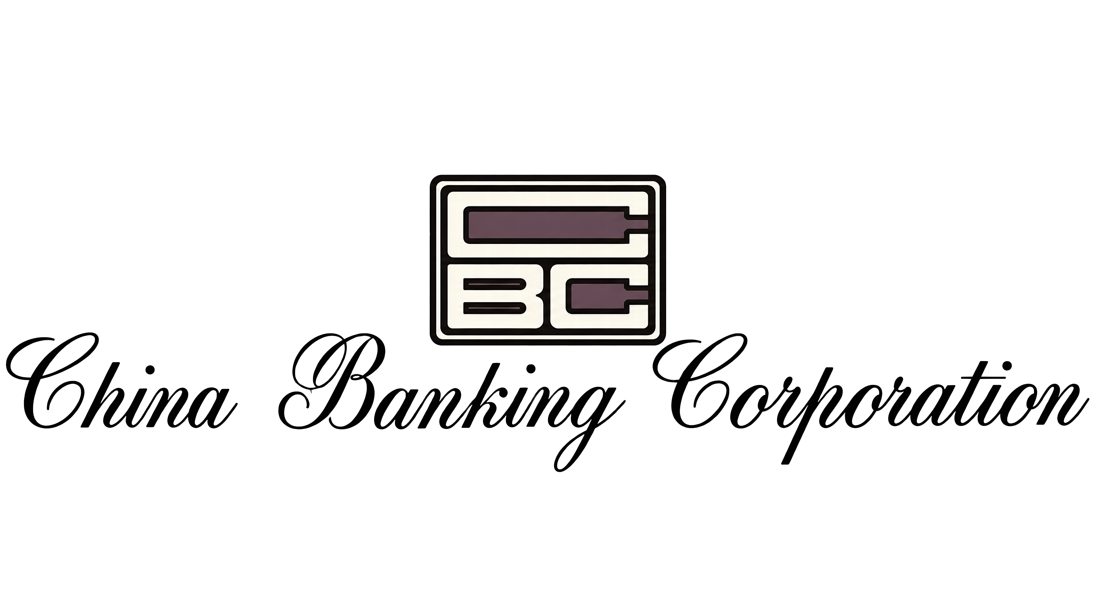
The next China Banking Corporation logo paired the bank’s full name with a geometric monogram. The design had two tiers. An emblem enclosed in a rectangular frame with rounded corners appeared above a calligraphic wordmark. The angular letters inside the frame contrasted with the flowing script below.
The monogram consisted of three initials. A large “C” occupied the upper portion of the frame, while a “B” and a second “C” shared the lower row. The letters’ elongated proportions and rectangular forms echoed the frame’s outer contour.
The name used a slanted calligraphic typeface that alternated between fine connecting lines and thick strokes. Loops and flourishes on the capital letters gave the lettering a flowing rhythm. In this stacked arrangement, the emblem and name retained their distinct lettering styles.
1970s – 1995

By 1979, the China Banking Corporation logo placed the emblem and full name side by side. The monogram sat on the left, while the name on the right used a tightly spaced, bold sans-serif typeface. Short, heavy strokes replaced the calligraphic flourishes.
The initials’ arrangement inside the emblem also changed. The “B” and “C” sat side by side inside a large outer “C.” Its broad outline resembled a rounded rectangle open on the right. The first letter framed the other two, combining the three initials into a horizontally elongated monogram.
1995 – 2017

Adopting the shortened name Chinabank shifted the balance between the logo’s components. The bank’s name appeared as a single word, while the nested “CBC” letters preserved the three initials of its full legal name. In the red version, both components slanted to the right. The monogram’s slant was set at 15 degrees.
The Chinabank wordmark used Helvetica Black Italics, stretched horizontally to 120% of its original width. The initial “C” stood taller than the remaining letters and was set in small capitals. Broad, solid strokes gave the lettering a uniform appearance. Its slant connected it visually to the emblem, which retained the “B” and “C” inside the large outer “C.”
An expanded version of the logo included a gray bar beneath the emblem and name, along with two additional lines of text. The bar used a 30% black tint, and its thickness matched the strokes of the inner “B” and “C.” The line “Since 1920,” identifying the bank’s founding year, appeared in regular Arial. The slogan “Your Success is Our Business” used bold Arial, linking the bank’s work to its customers’ success. The width of the Chinabank wordmark guided the size and placement of the additional text.
2017 – 2024

By 2017, the Chinabank name had become a standalone wordmark. The “CBC” monogram was removed, shortening the logo. The red color, rightward slant, and letterforms with an enlarged initial “C” maintained a connection to the previous design.
A small “Since 1920” line appeared beneath the right side of the name, recalling the bank’s founding year. Its upright letters contrasted with the slanted wordmark above. This version, consisting of the name and founding-year line, preceded the 2024 redesign.
2024 – today

The “CBC” monogram returned to the Chinabank logo on April 16, 2024, when the bank unveiled its new identity. The update responded to changing customer needs and the growth of digital services. The bank sought to connect with a new generation of users, while “Focused on You” expressed its commitment to putting customers’ interests at the center of its work.
The restored emblem adopted a taller format with an almost square silhouette. Red and white areas form the nested “CBC” initials. A broad outer “C” surrounds the inner letters, with horizontal openings extending to the right. The main strokes are uniformly thick, and rounded corners soften the precise geometry. Chinabank describes the shape as an expression of simplicity.
Beside the monogram, the red Chinabank name appears in custom lettering. The letters are now upright, with an uppercase “C” followed by lowercase letters. Their rectangular forms and rounded corners echo the emblem, bringing the logo’s two parts together.
Yonder developed the identity. Wilfred Castillo handled design and creative direction, working with Jonathan Bernstein, Soyeon Park, and Trixie Chua. Senior marketing consultant Nita Claravall also contributed.
The initials “CBC” took on another role on June 19, 2024, when they replaced “CHIB” as Chinabank’s stock ticker symbol. The bank tied the ticker change to its rebranding so its visual identity would align with its stock-market name.