


 Coca-Cola Logo PNG
The Coca-Cola logo looks like a ribbon from gift wrap opened on Christmas evening. The red letters appear festive and joyful, evoking warmth, happiness, and the feeling of a holiday about to arrive.
Coca-Cola’s history began in May 1886 in an Atlanta pharmacy, where John Stith Pemberton prepared a syrup mixed with carbonated water and sold it for five cents a glass. The drink contained coca leaf extract and kola nut, which shaped its name. Facing illness and financial problems, Pemberton sold rights to the formula in parts.
By 1888, Asa Griggs Candler had gained full control of the brand for about $2,300. In 1892, he founded The Coca-Cola Company and built national distribution through coupons and branded materials. By 1895, the drink was sold across the United States.
In 1899, Benjamin Thomas and Joseph Whitehead bought the bottling rights for $1. The franchised bottling system they developed became the basis for global expansion. In 1916, the contour bottle, created by Root Glass Company, established a distinctive visual identity.
In 1919, the company was sold to Ernest Woodruff for $25 million. In 1923, Robert Woodruff took leadership, expanded Coca-Cola internationally, and supplied American troops during World War II at a fixed price.
Competition with PepsiCo intensified from the 1930s and escalated in the 1980s with the Pepsi Challenge. In 1985, Coca-Cola introduced New Coke, then restored the original formula after strong public backlash.
During the 1990s, the company expanded into Eastern Europe, China, and India, while adding brands such as Minute Maid, Powerade, and Dasani to its portfolio.
Meaning and History
All the company’s logos feature the inscription “Coca-Cola.” Accountant Frank Robinson coined the name from the original product’s main ingredients: coca leaves and kola nuts. John Pemberton entrusted him with branding matters. A master of beautiful writing, Robinson wrote the words Coca-Cola in neat, ornate letters. The trademark he proposed is still in use, and time has not affected the font or proportions.
What is Coca-Cola?
It is the flagship brand of the American corporation The Coca-Cola Company. This non-alcoholic beverage initially contained cocaine and caffeine and was distributed in pharmacies as medicine. Today, the soda’s recipe is a commercial secret. The primary manufacturer produces a concentrate using a secret formula and sells it to bottlers.
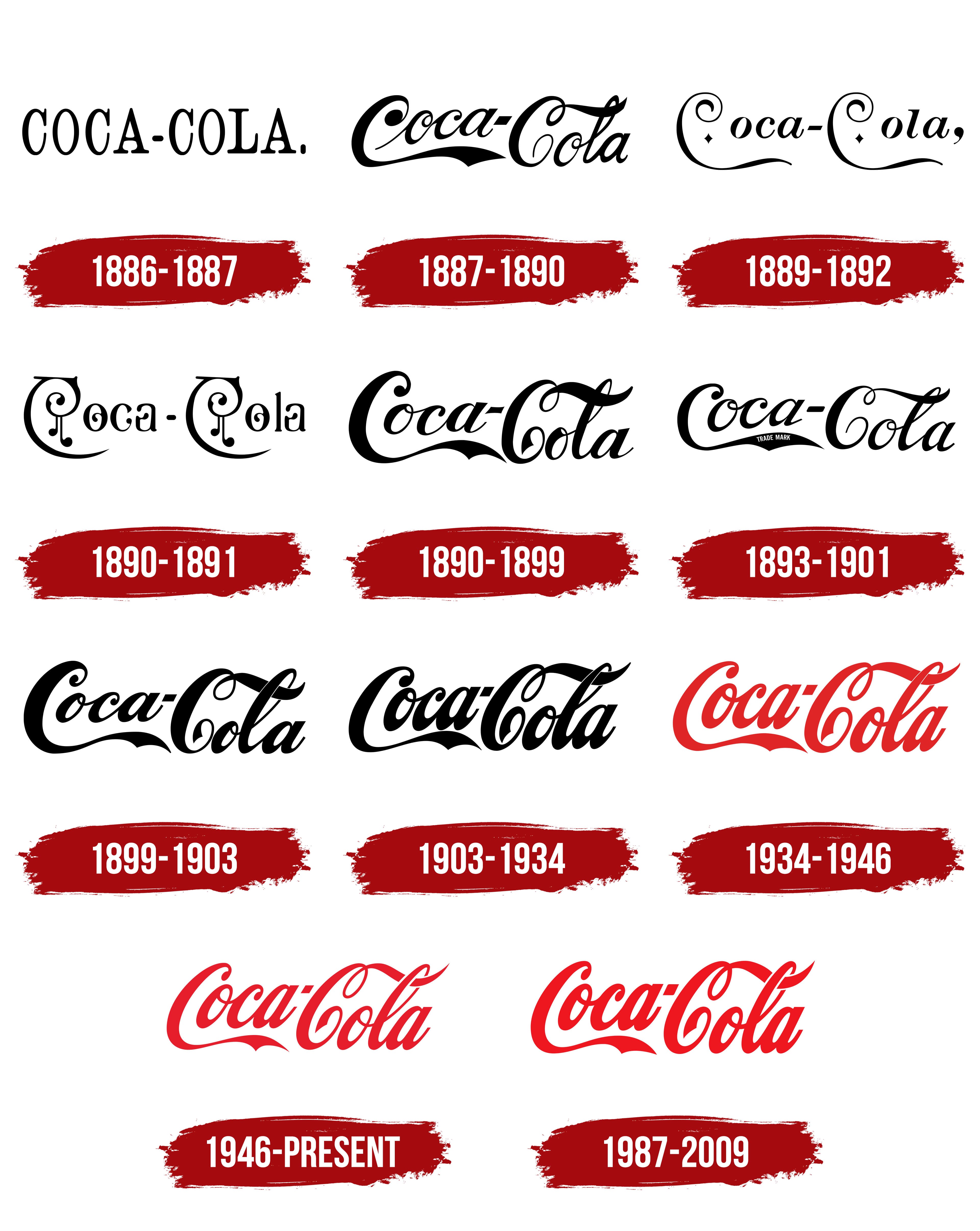
1886 – 1887
The history of Coca-Cola began on May 8, 1886, when John Pemberton introduced a nonalcoholic drink with an unusual flavor and name to the public. The idea had originally emerged a year earlier as an alcoholic tonic called French Wine Coca, which copied the popular French drink Vin Mariani made with wine and coca leaf extract. In 1885, however, Georgia banned the sale of alcohol, so the wine was replaced with a sweet syrup made from kola nuts, which have a high caffeine content, and Coca-Cola began its history in its familiar form.
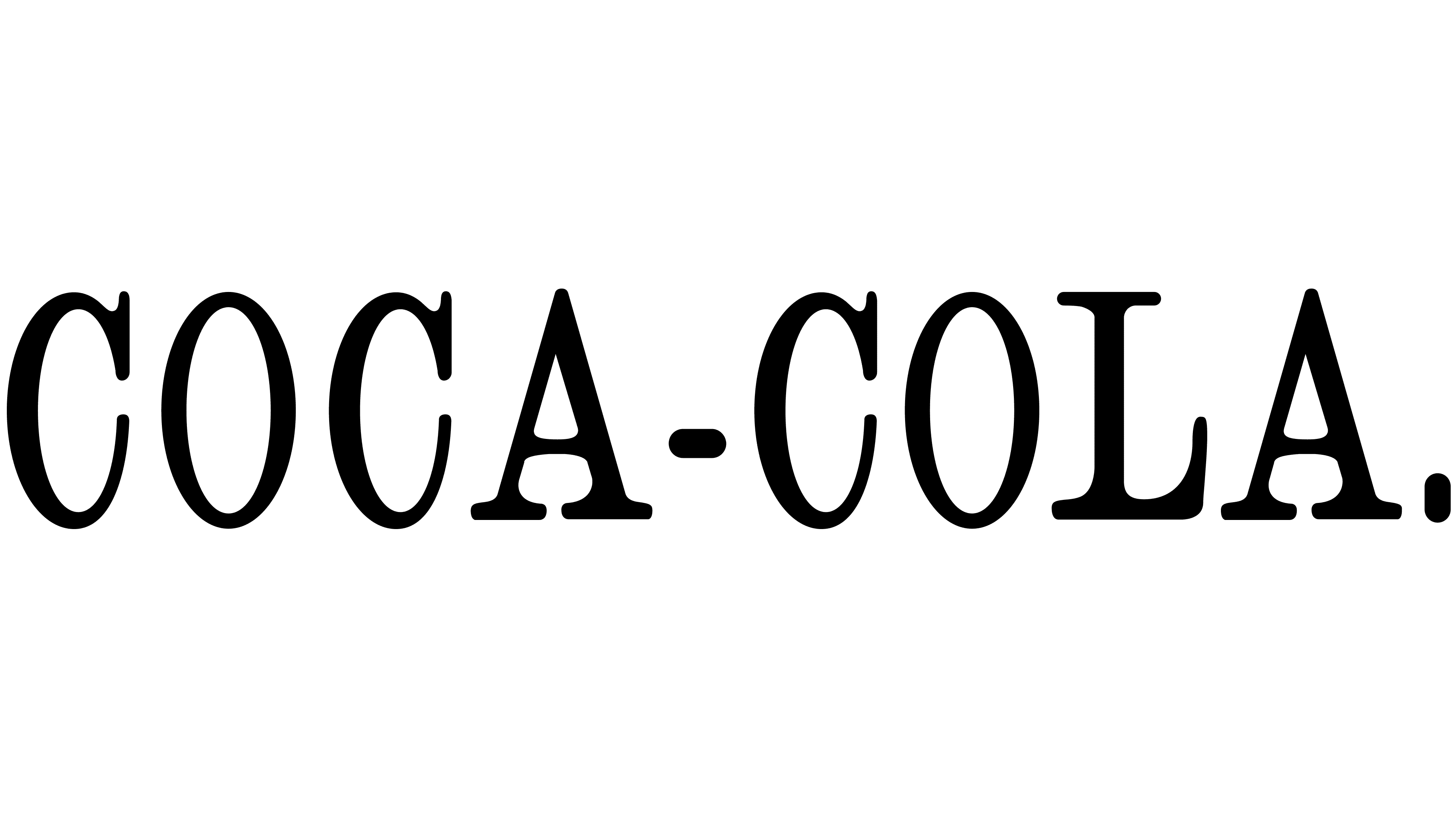
In its first year, Coca-Cola lacked a developed style or recognizable identity. The earliest brand logo, used in 1886–1887, was a restrained black-and-white COCA-COLA wordmark. The name was set in capital letters with even spacing between characters and a strict short hyphen placed slightly below the central line, closer to the crossbars of the letter A. A period followed the second word. The typeface used featured serifs and resembled popular styles such as Clarendon.
At the time, the brand had not yet earned its famous decorative recognition and was seen as just another beverage on the market. Still, this logo laid the foundation for the company’s future style, becoming the starting point for one of the world’s most famous brands.
1887 – 1890
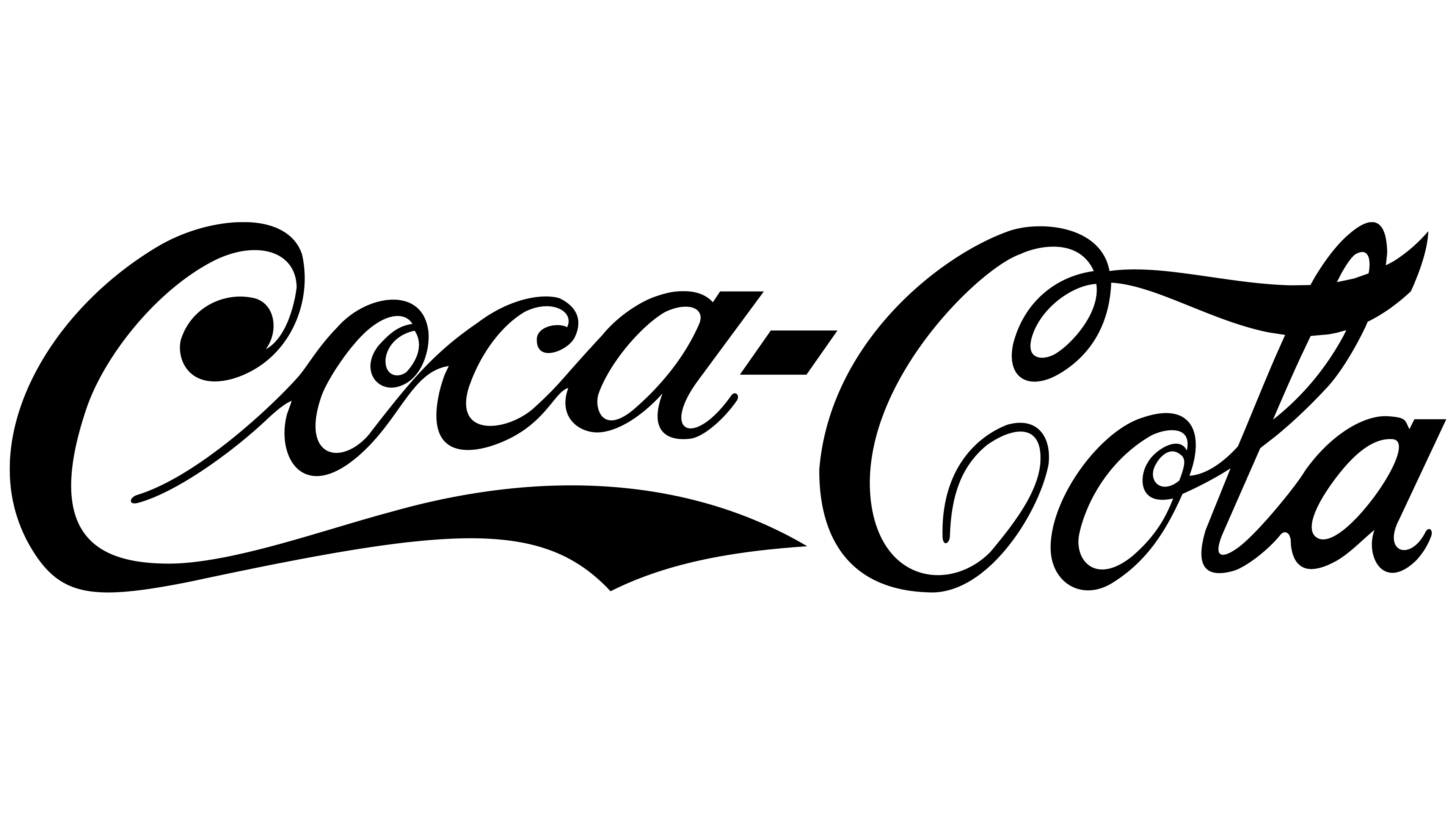
In June 1887, Coca-Cola adopted the style recognized worldwide today. Frank Mason Robinson developed a new typeface for the drink’s name. It was an elegant cursive script known as Spencerian. In the early years, the lettering varied from one advertisement to the next, with many versions in use, but the 1887 version became the most widespread. It was copied more often than the others. Similar logo styles appeared later, for example, in 1892 and 1903.
In this new version, the logo appeared as the Coca-Cola name in smooth, black, handwritten script. The TA was bold and slanted, with the hyphen connecting the two words positioned slightly above the midpoint of the line. The text combined lowercase letters with capitals adorned by ornate details. The initial letter C featured a large loop at the top and a long, flowing line at the bottom that extended to the right and ended with a decorative tail beneath the first word.
The type style resembled Spencerian Script, a calligraphic style with thin strokes at the tops of letters and heavier strokes at the bottoms. The letterforms were rich and fluid, creating an image that became a benchmark and reference for all later brand emblems. From this point on, Coca-Cola has maintained a visual identity that has remained largely intact, with only minor changes, to the present day.
1889 – 1892

At the turn of the nineteenth and twentieth centuries, Coca-Cola’s visual identity was in a phase of stylistic exploration. The logo of this period reflected Victorian typography and stood out for its decorative richness. It resembled the calligraphic lettering used at the time on signs, labels, and tags for various products.
In this version, the Coca-Cola inscription ends with a comma. A short black hyphen connects the two words. The initial C is emphasized and decorated with large ornamental spirals and long downward lines. Inside the C, small diamond-shaped symbols appear.
The typeface in this version closely resembles classic Victorian scripts, with italic strokes and decorative elements. The composition reflects the era’s stylistic features and aesthetic preferences, when brands sought to attract buyers through elegance and ornamentation.
1890 – 1891
In 1890, Coca-Cola briefly moved away from its familiar lettering and adopted an Art Nouveau-style logo. This experiment appeared on a series of branded calendars released between 1890 and 1891.
The Coca-Cola wordmark looks both extravagant and grotesque. A short dash separates the two words. The letters feature unusual shapes, broken lines, and inward curling elements that create a spiral effect. The capital C letters are formed with large curls and vertical strokes that split at the bottom and end in rounded, droplet-like terminals. They resemble decorative Victorian-era monograms or elongated musical notes. In some details, shapes resembling ripe cherries hang from a branch.
The lowercase letters also feel whimsical. Inside the o and a, curls appear, continuing the composition’s spiral theme. The wordmark fits organically within the decorative style of the time, though its execution feels unconventional and eccentric.
The visual treatment of the lower portion is supported by long curved lines extending downward from the capital C letters and rounded at the ends. They form a kind of frame, completing the overall composition.
1890 – 1899
In 1890, Coca-Cola adopted a new typeface that brought the brand closer to its recognizable look. By that time, the drink was already associated with the color red, as the company used red barrels for syrup so inspectors would not mistake it for alcoholic beverages during transport.
The logo itself appeared as a calligraphic Coca-Cola wordmark, composed of two parts connected by a short black hyphen. The letters were written in smooth cursive. The style closely resembled Spencerian Script, known for its elongated strokes, ornate curls, and strong contrast between thin and thick lines.
A distinctive feature of the letter C was its large upper loop and thickened lower stroke curving to the right. The lower line flowed downward and extended beneath the word Coca. In the word “Cola,” the capital C formed a large curl that transitioned into a wide ribbon, wrapping around and merging with the cross stroke of the letter l to create a single continuous line.
1893 – 1901
At the end of the nineteenth century, Coca-Cola used a lighter version of the typeface alongside the main version, primarily in period advertising. Introduced in January 1893, the inscription consisted of the Coca-Cola name with a neat TRADE MARK insert.
The name was rendered in capital letters in an American Spencerian Script style, but in a more restrained form. The initial letter C appears bold and rounded at the top, gradually thinning and becoming an elegant stroke at the bottom, where it transitions into a ribbon bearing the words TRADE MARK. The text within this ribbon is white, set in capital letters on a black background.
Spencerian Script was common at the time, as the style was associated with elegance and refinement. While the original script was complex and rich in flourishes, the Coca-Cola logo offered a more controlled approach.
The lettering’s simplicity and lightness made the logo easy for the public to read. At the same time, the presence of “TRADE MARK” underscored the product’s authenticity amid growing competition in the soft drink market.
1899 – 1903
Another version of the Coca-Cola logo appeared, almost identical to the 1890 version. The typeface and overall style remained unchanged. Even side by side, it was difficult to notice differences. The changes involved a slight adjustment to the letter slant and subtle thinning of certain strokes.
Overall, the lettering stayed the same, preserving the classic American script with flowing lines and curved strokes. In the new version, the thickness of some elements and the inscription’s angle were lightly refined. These minor adjustments had little impact on the overall appearance consumers had expected since 1890.
1903 – 1934
At the beginning of the twentieth century, Coca-Cola began to rethink its advertising, gradually abandoning multiple typefaces and variations in favor of a bolder, more consistent look. The company ultimately settled on a single logo design that changed only slightly compared to earlier versions.
The main updates affected the letters themselves, which became slightly thicker. The typeface remained closely aligned with American Spencerian Script.
In addition to stabilizing the visual identity, Coca-Cola made important changes to its formula. Traces of cocaine, previously present due to the use of coca leaves in production, were removed from the recipe.
1934 – 1946
During this period, Coca-Cola officially adopted a bright scarlet red for its emblem for the first time. At least, there is no earlier evidence of this color being used. The lettering style remained unchanged, with the typeface retaining its flowing lines, elegant curls, and contrasting transitions from thin to heavier strokes.
The changes were so minimal that they were nearly impossible to notice without comparing the logo to the previous version. The impression is that the company simply took the familiar logo and colored it bright red.
1946 – today

When Coca-Cola introduced a new logo style in 1946, developed by the industrial design studio Raymond Loewy Associates, few could have expected it to endure to the present day. Alongside creating new vending machines and streamlining transportation for the brand, designers developed a standardized typeface with slightly slanted letters and balanced proportions.
The logo took on a more refined and compact appearance, becoming more elegant than earlier versions. The letters grew thinner while preserving smooth lines and decorative curls. With this new typeface, the company formed an image that became one of the most recognizable in the world.
Since 1946, the logo has remained largely unchanged, becoming part of design history and a symbol of Coca-Cola that remains relevant today.
1987 – 2009
In the late 1980s, Coca-Cola subtly refreshed its famous logo in collaboration with Landor Associates. An updated trademark appeared as early as January 1986 and became the primary version starting in 1987.
The changes were not radical. Designers made the letters bolder and slightly less slanted. All other elements, including familiar proportions and the overall writing style, remained unchanged.
In this form, the Coca-Cola symbol remained until 2002, when it was removed. Four years later, as part of The Coke Side of Life campaign, the logo briefly returned, existing alongside the main brand mark. In 2009, the Open Happiness campaign launched, and the brand permanently discontinued this version.
Minor typeface updates did not interfere with recognition or visual continuity, reinforcing the sense of tradition that has defined Coca-Cola for decades.
Font and Colors
The brand name is written in large letters on Coca-Cola cans and bottles. This famous emblem, conceived by accountant Frank Robinson in 1887, has been slightly adjusted by modern designers in terms of slant and color. However, as before, the changes did not affect the overall concept: the emblem’s central element is an imaginative inscription in calligraphic handwriting.
Special attention was given to typography, as the brand name contains no graphic elements; it consists solely of text. The font mimics handwriting, but the first letter, “C,” stands apart and features long decorative curls. This is a clear example of Spencerian script created in the 1840s and used in the USA for business correspondence until the invention of typewriters.
The handwriting on the 1890-1891 emblem is radically different. At that time, the company’s name looked atmospheric: the letters had many large dots and unusual curls, evoking an enchanted forest. However, the company’s owners returned to the familiar Spencerian Script font, abandoning such experiments forever.
The color palette is also not diverse. Until 1891, only black-and-white emblems were used. Then Coca-Cola became associated with bright shades of red, and black receded. White remains the background color, though the palette can change depending on the visual context. For example, some versions use white inscriptions on red backgrounds. This combination of colors expresses perfection, purity, optimism, and youth, all the values the brand aspires to.