


![]() Daft Punk Logo PNG
Daft Punk Logo PNG
The Daft Punk logo emphasizes the duo’s recognition and iconic status. Its minimalist design symbolizes the group’s style and technical perfection, which became iconic in electronic music.
The French duo Daft Punk formed in 1993 in Paris, when Thomas Bangalter and Guy-Manuel de Homem-Christo met. They first formed the rock group Darlin’, named after a Beach Boys song. When a Melody Maker critic described their music as “daft punky thrash,” they adopted the phrase as their new name.
In 1993, they launched the electronic project Daft Punk, achieving popularity with the single “Da Funk,” whose video was directed by Spike Jonze. Their debut album, “Homework” (1997), featured hits “Around the World” and “Da Funk.” Since 1999, they have performed in robotic costumes and futuristic helmets.
Their second album, “Discovery” (2001), featured the Japanese anime film “Interstella 5555”. Their legendary Alive tour in 2006–2007 set a benchmark for electronic shows. “Random Access Memories” (2013), featuring “Get Lucky,” won five Grammy Awards, including Album of the Year. Daft Punk collaborated with artists like The Weeknd and influenced many musicians, including The Rolling Stones.
In February 2021, Daft Punk announced their breakup after 28 years together.
Meaning and History
![]()
What is Daft Punk?
It is a French electronic music duo known for its futuristic compositions and robot personas, often wearing shiny helmets. Members concealed their identities, sustaining a story about transforming into cyborgs after an accident. Their music blends disco, house, rock, and funk, achieving cult status in club culture. Concerts featured high-tech shows with special effects and giant screens. Over nearly 30 years, the duo heavily influenced electronic music and concluded their career while remaining iconic.
1995 – 2001
![]()
The logo created by Guy-Manuel de Homem-Christo in the mid-1990s appeared on the duo’s releases as their name was becoming established internationally. The first singles released on the Soma Quality Recordings label around 1995 set a visual standard that continued until the brand’s identity update in 2001. The creator’s name was credited on early releases and in materials accompanying the 1997 album Homework.
The logo composition consisted of two lines, with the group’s name rendered in large, slightly slanted letters to the right. The stroke edges appeared rough, as if hastily applied by brush, creating a sense of energy and informal expression. The style resembled fan fonts such as Kotoba Dua Italic. In this case, it was custom-made and featured a distinct artistic character.
Typography was sans serif, the strokes varied in thickness, and the contrast between the uneven edges and the dense fill enhanced visual dynamism. Letter-spacing was minimal, with glyphs placed close together to maintain visual cohesion.
The original palette relied on monochrome, allowing the mark to be applied in both direct and inverted formats.
The brushstroke style reflected the experimental nature of the duo’s music. At the same time, the dynamic form resonated with the futuristic direction of their sound. The presentation emphasized boldness and a willingness to adopt innovative techniques.
Versions of the logo appeared on covers for singles such as “Da Funk,” “The New Wave,” “Revolution 909,” and others, as well as in the artwork of Homework. The two-line format and distinctive slant became a recognizable visual marker for the period from 1995 to 2001.
2001 – 2005
![]()
The duo’s visual style shift in the early 2000s retained the previous logo shape while altering the color scheme. The logo remained recognizable by form, though it now appeared different due to color inversion: the lettering was white on a dark background. This change increased contrast and enhanced visual expressiveness.
The structure remained a two-line composition of the group’s name. The internal details of the letters were removed, making the silhouette more solid and visually lighter than the previous version.
The palette consisted of white typography on a black background, ensuring maximum readability and versatility.
This logo version occupied a prominent place in the visual presentation of the album Discovery, from the cover and interior layout to promotional campaigns. It became part of the visual concept for the animated project Interstella 5555.
2005 – 2007
![]()
By the time the duo’s album Human After All was released, their visual identity had undergone another revision. It retained the recognizable handwritten style but softened its overall texture. Stroke edges lost their jagged appearance and gained smoother outlines with slight blurring, adding fluidity and giving the impression of artistic refinement.
The composition remained arranged in two lines, tightly packed with lowercase sans-serif letters and minimal letter spacing, forming a compact visual block. Subtle glyph distortions and variations in stroke thickness maintained a sense of craftsmanship and dynamism.
In the color scheme, there was a return to a lighter background.
The adapted logo retained continuity in the visual concept while making it more flexible and versatile. It fit the promotional aesthetics and visual communications of the period, extending beyond the musical context to become a cultural symbol easily integrated across various media formats.
The softer shape, balanced monochrome palette, and continued use of unique handwritten styling reinforced associations with the duo’s creative, experimental approach, while simultaneously preparing the brand for future evolutions in its identity.
2007 – 2009
![]()
After 2007, the duo retained the logo’s existing shape but altered its perception by reversing the color scheme. The composition inherited from the previous phase now featured white handwritten lettering on a dark background. This increased visual contrast and made the letters’ silhouettes more expressive across media formats.
The logo was based on custom lettering done in a brushstroke style. According to participants in fan and design communities, including discussions on Reddit, it could not be attributed to existing typefaces and was specially created for the group. The line structure appeared refined, with thin and smooth stroke edges. At the same time, the interior of the letters remained clean, without additional textures.
The format remained two-line, tightly composed of lowercase letters with minimal letter spacing. The palette was based on the contrast of a white logo against a black background.
2009 – today
![]()
The logo’s return in 2009 coincided with its revision. The creator maintained the handwritten brushstroke style but smoothed the lines, refined the edges, and removed excessive roughness typical of earlier versions. A slight handmade texture effect remained, maintaining continuity with previous iterations.
The construction remained a two-line arrangement of the group’s name rendered in large, handwritten sans-serif lettering. Dense strokes with varied thicknesses conveyed a sense of fluidity and motion. Letter-spacing remained minimal to ensure visual cohesion.
The typeface was unique and specifically developed for Daft Punk. Among fans, there were attempts to replicate this style, including the unofficial “Dafter Harder Better Stronger” font.
The palette predominantly relied on the contrast between white lettering and a black background, becoming a recognizable visual foundation for the Tron: Legacy and Random Access Memories projects. Inverted variants were also used, featuring dark lettering on a lighter background.
Font and Colors
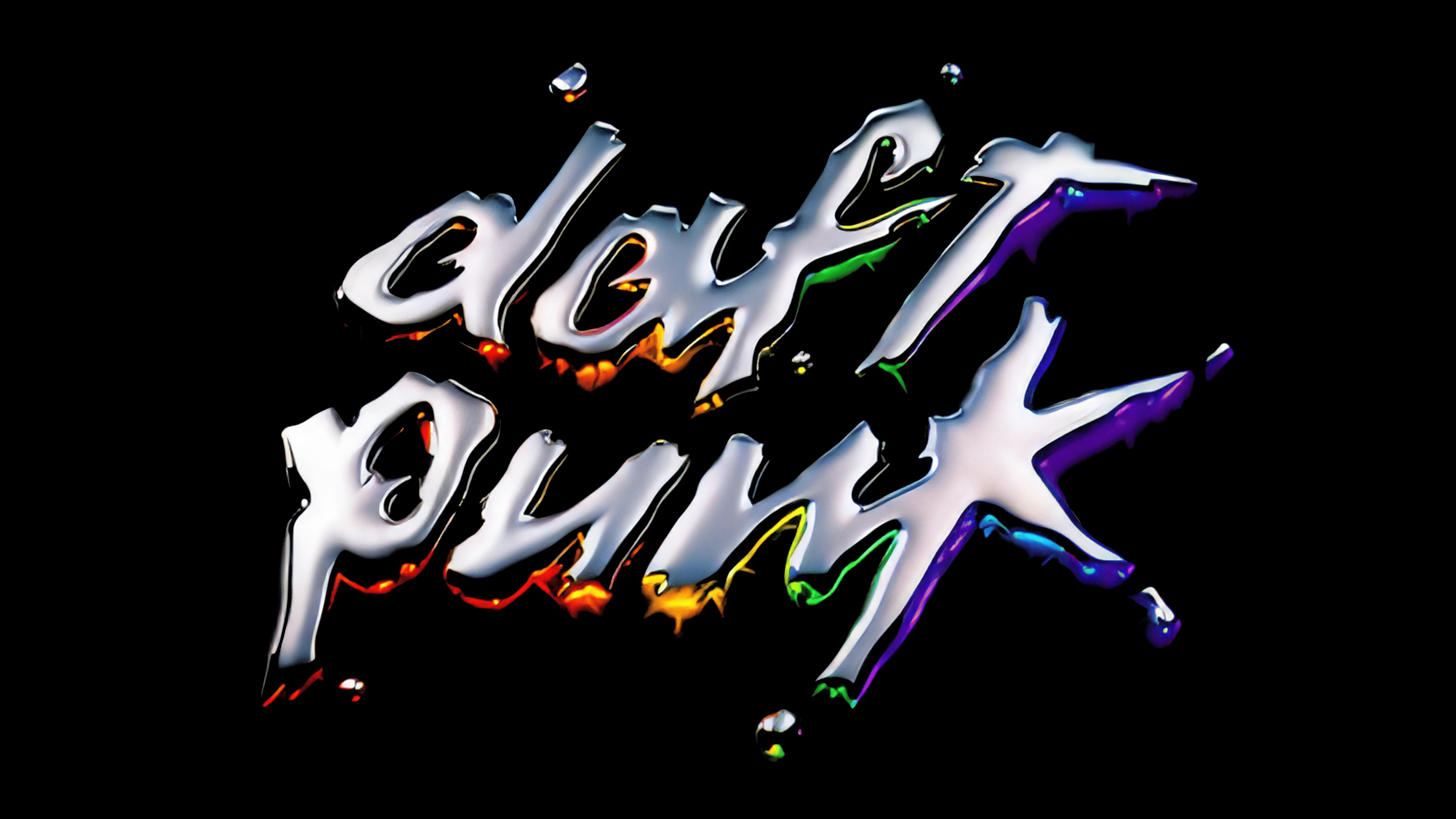
The visual style is based on a custom-designed, italicized sans-serif typeface. Its lines imitate swift brushwork, with forms displaying irregularities typical of hand-painted strokes. Some strokes include subtle stripes and dotted accents, enhancing the impression of real brushwork. The lettering resembles the plasticity and dynamics of Kotoba Dua Italic but has been modified to reflect the group’s aesthetics. Fans have attempted to recreate this style, including Duncan Wick’s Dafter Harder Better Stronger variation.
Color usage is reduced to a monochromatic, contrasting pair: a black logo on a white field. This approach ensures a stable perception of form and maintains expressiveness across media. The clean contrast between two tones emphasizes the letter silhouettes, eliminating distractions and giving the design expressiveness without the need for bright colors.