 Danske Bank Logo PNG
Financial transactions in everyday life include receiving income, paying for purchases, and applying for a mortgage. In many Northern European countries, these tasks are handled by a single bank that supports individuals at various life stages. The Danske Bank logo is associated with a major banking group that provides accounts, credit products, and financial services for individuals and businesses.
Danske Bank was founded in 1871 in Copenhagen. The bank’s original name was Den Danske Landmandsbank. It was established to provide loans to farmers and support agriculture. By the beginning of the 20th century, the bank had become one of the largest in the country. In the 1920s, it began expanding its operations, working with trading companies and industrial clients.
After World War II, Landmandsbank developed retail services and mortgage lending. In 1976, it merged with Kjøbenhavns Handelsbank. After the merger, the bank was renamed Danske Bank. In the 1980s, the organization entered the insurance and asset management markets. In 1989, the bank’s shares were listed on the Copenhagen Stock Exchange.
In the 1990s and 2000s, Danske Bank expanded in Northern Europe. In 2000, it acquired the Norwegian company Fokus Bank. In 2004, the bank bought Ireland’s National Irish Bank. In 2006, it acquired the Finnish Sampo Bank for 4 billion euros.
After the 2008 crisis, the bank received state support of 20 billion Danish kroner. By 2013, it had fully repaid these funds. It then restructured its foreign operations.
In 2017, Danske Bank became the center of a scandal involving the laundering of about 200 billion euros through its Estonian branch. Following the investigation, the bank’s CEO resigned. The company faced large fines and legal cases in several countries.
In 2022, the bank paid 2 billion dollars in fines to the United States. In 2023, it sold its Norwegian retail business. Danske Bank focused its operations on the Scandinavian markets. In 2024, the bank invested in digitalization and introduced a new mobile app with financial planning tools.
The company remains the largest bank in Denmark. It serves about 3 million clients in Northern Europe. The bank continues to develop corporate lending and digital services, with a focus on rebuilding trust after the reputational damage of previous years.
Meaning and History
What is Danske Bank?
The largest commercial bank in Denmark and one of the leading financial institutions in Northern Europe. It serves more than five million clients. The structure includes Danica Pension and operations in Northern Ireland. The bank leads the domestic market in loans and deposits and operates in Finland, Norway, and Sweden. Its loan portfolio exceeds 1.5 trillion kroner, and its deposits amount to about 1 trillion kroner. The largest shareholder is A.P. Møller Holding, affiliated with the Maersk Group.
before 2000
The name Den Danske Bank appeared after the bank expanded its operations. The institution had previously worked mainly with agriculture but developed into a major financial organization serving individuals and businesses. Before 2000, its identity used a compact emblem and the full three-word name.
The bank was founded in Copenhagen on October 5, 1871. Its original name was Den Danske Landmandsbank, Hypothek- og Vexelbank i Kjøbenhavn. It translates as “The Danish Farmers’ Bank, Mortgage and Exchange Bank of Copenhagen.” The institution provided funds to farmers during a period of growth in agricultural production and exports. In everyday speech, the bank was called Landmandsbanken, meaning “The Farmers’ Bank.”
By 1976, the organization served individuals and businesses from various industries. The name associated with farmers had lost its former relevance. The bank became Den Danske Bank af 1871, while the shortened form Den Danske Bank, meaning “The Danish Bank,” became common in business. The name change was accompanied by the phrase “A New Name, but You Know Us Well.” It reminded customers that the familiar bank continued operating under a new name.
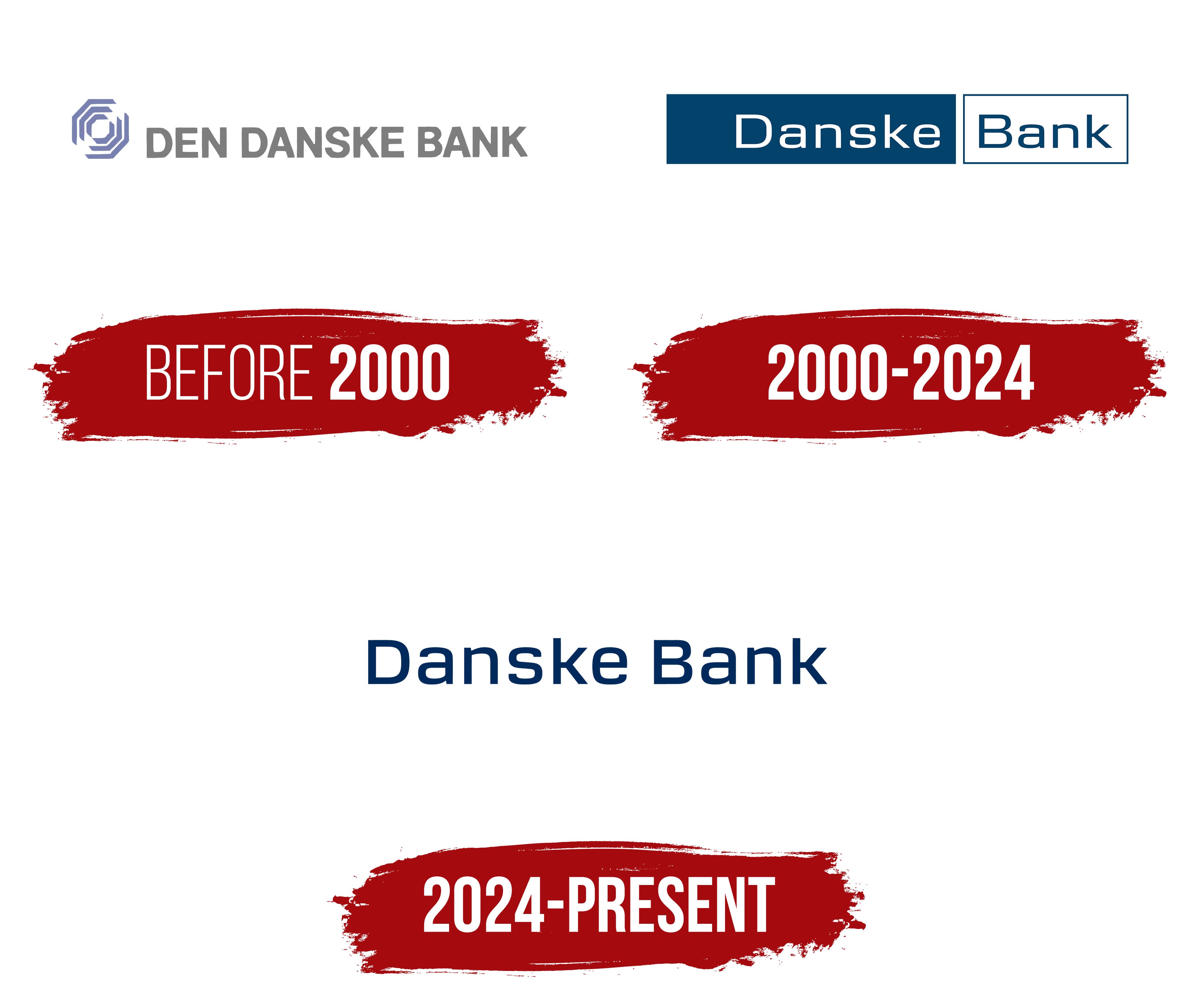
The logo from that period included a blue-purple emblem on the left and the gray words DEN DANSKE BANK on the right. The emblem consisted of several nested hexagonal outlines separated by equal spaces. Short segments formed a multilayered figure resembling a three-dimensional cube. An open area in the center made the complex form easier to perceive.
The name appeared on one line in gray uppercase sans-serif letters. The color separated the text from the saturated emblem. The full name identified the bank’s Danish origins, while the compact figure was suitable for documents, advertising, and other applications.
Den Danske Bank merged with Handelsbanken and Provinsbanken in 1990. The new group continued operating under the existing name. During the following decade, the bank acquired financial companies in Northern Europe and entered neighboring markets. Its expanded operations led to updated names and identities for use across several countries.
2000 – 2024
In 2000, the bank shortened Den Danske Bank to Danske Bank. The article Den was removed, while the new name retained the meaning “Danish Bank” and its connection to Denmark. The shorter form suited the group’s operations in different countries. The name change introduced a unified identity for the parent bank and its international divisions.
The Danish agency Kontrapunkt developed the project. Its specialists created a shared system for arranging names and colored blocks. The parent bank and subsidiaries received a common visual foundation while retaining different names. The number of components was reduced, and unified guidelines simplified logo use across different countries.
The name Danske Bank was divided into two quadrilateral blocks placed on one line. The left section had a dark blue background with the word Danske in white. On the right was a white block with a dark blue outline containing the word Bank in the same color. The size of each section depended on the length of its word.
The words used a sans-serif typeface. The letters “D” and “B” were uppercase, while the remaining letters were lowercase. The different backgrounds separated the two parts of the name while keeping them within one horizontal structure. Dark blue was used for the right outline, the word Bank, and the background of the left block.
The identity was extended to the group’s international banks in 2012. Finland’s Sampo Bank, Norway’s Fokus Bank, Northern Bank in Northern Ireland, and National Irish Bank in Ireland adopted the public name Danske Bank. The shared logo connected divisions in several countries with the parent group.
Danske Bank returned to Kontrapunkt for another identity update in 2024. The name was separated from the quadrilateral blocks, while light blue shapes began to appear independently from the wordmark. The version with two connected blocks was discontinued after 24 years.
2024 – today