


 DisneyToon Studios Logo PNG
The DisneyToon Studios logo embodies an atmosphere of magic and mystery. The emblem’s graceful, smoothly curved, and intertwined glyphs create a sense of enchantment, as if stories about princesses, magical kingdoms, and untold treasures are hidden within them. This symbol represents thrilling journeys to unknown and amazing worlds born of the studio’s creators’ imaginations. It evokes anticipation of extraordinary adventures in viewers and captivates with its mysterious yet alluring design.
DisneyToon Studios began in 1990 when The Walt Disney Company established Disney MovieToons to create animated films for the growing home video market. The studio’s first major release was DuckTales the Movie: Treasure of the Lost Lamp, based on the popular television series, which introduced the team’s approach to producing animated features outside traditional theatrical releases. During the 1990s, the studio focused mainly on sequels and spin-offs connected to Disney classics, including The Return of Jafar in 1994 and Pocahontas II: Journey to a New World in 1998.
In 2003, Disney MovieToons was renamed DisneyToon Studios and continued producing animated projects while expanding into original stories. The studio released Pooh’s Heffalump Movie in 2005 as an attempt to develop theatrical releases. However, its main focus remained animated franchises. A major success came with the Tinker Bell series, launched in 2008 and based on the character from Peter Pan. The franchise received several sequels and became one of the studio’s most recognized original projects.
The studio changed direction after Disney acquired Pixar, with John Lasseter taking a leading creative role and encouraging more original productions instead of relying mainly on sequels. In 2013, DisneyToon Studios released Planes, a spin-off connected to Pixar’s Cars franchise, followed by Planes: Fire & Rescue in 2014. Despite these projects, the studio faced challenges from changes in the animation market and shifting audience interests.
In 2018, after Disney’s acquisition of 21st Century Fox, DisneyToon Studios was closed as part of a larger restructuring of Disney’s animation divisions. During its existence, the studio produced more than 47 films, expanding Disney’s animated catalog through direct-to-video releases, original franchises, and spin-off projects. Many of its titles continued to be available through platforms such as Disney+ after the division ended.
Meaning and History
What is DisneyToon Studios?
This is a separate branch of the Disney animation company, focused on creating direct-to-video spin-offs and sequels to the studio’s classic works. By introducing new characters and expanding familiar universes, this company found its niche in producing content that lets viewers relive beloved stories from new perspectives. The projects often included unreleased backstories or continuations of adventures, revealing new aspects of classic characters. The company is particularly known for the “Fairies” series centered around Tinker Bell. This allowed the creation of an entire universe around the character, adding new layers to Disney’s legacy and attracting a new audience.
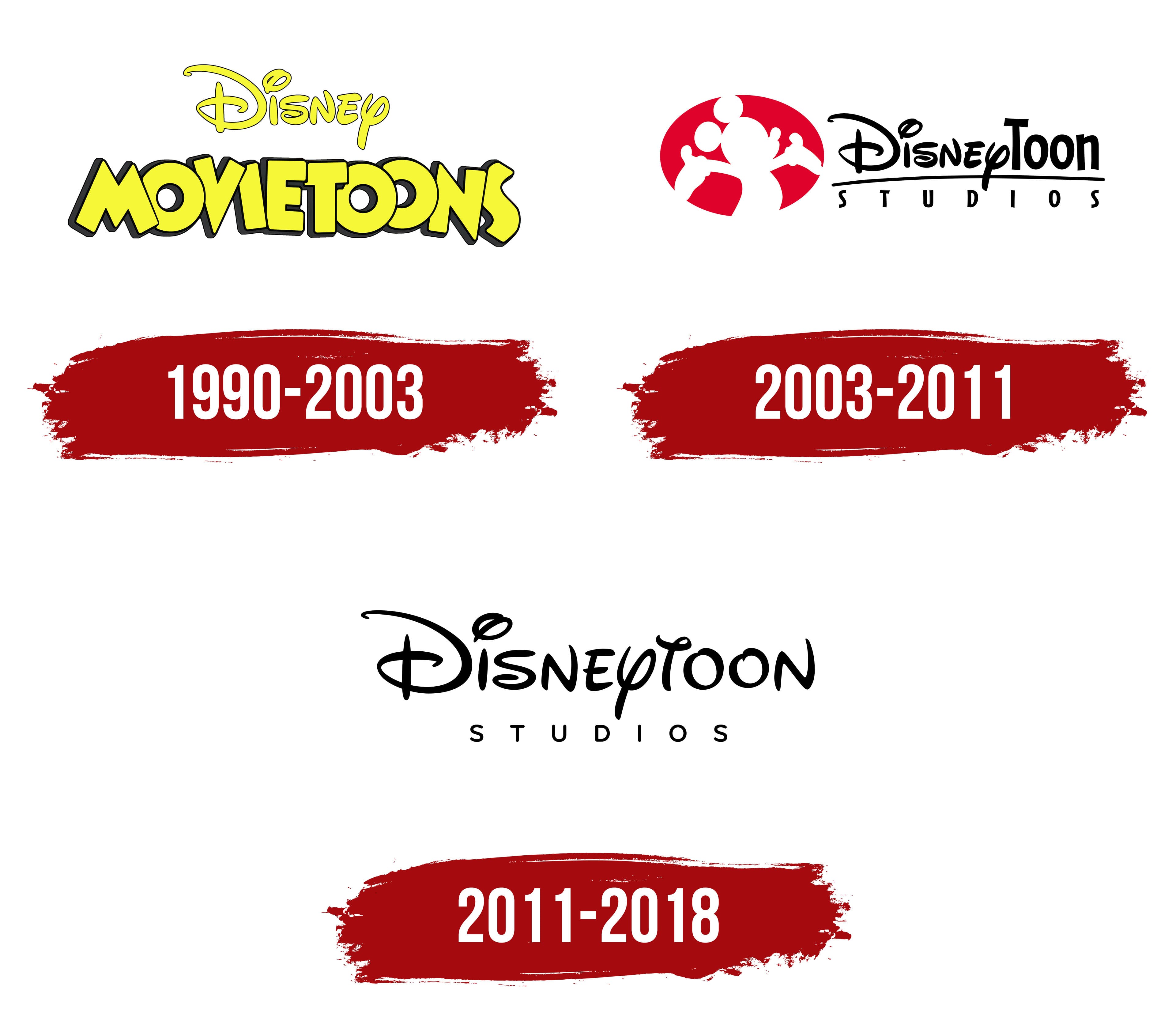
1990 – 2003
The emblem with the company’s first name, Disney MovieToons, looks bright and cheerful. The upper part of the logo features the traditional Disney inscription, with the name MovieToons placed underneath. The playful composition is created by bright yellow letters tilted in various directions, giving the logo a lively, dynamic feel. This shade symbolizes childlike spontaneity and joy, reminiscent of the studio’s first animated film, DuckTales, where the characters’ yellow beaks and Uncle Scrooge McDuck’s gold played key roles.
The large capital letters predict the success of the division’s future projects, which will become hits. The black outlines and borders make the inscription clearer and more expressive, drawing attention to the details. This reflects the high-quality animation and character development for which the studio’s films are known.
2003 – 2011
The company introduced an updated logo after transitioning to Walt Disney Feature Animation and changing its name. The main element of the emblem became a bright red oval, inside of which is the most recognizable character, Mickey Mouse, with his arms outstretched as if welcoming viewers and immersing them in a magical world.
In the DisneyToon name, the “Disney” part is displayed in the parent company’s standard logo, while the word “Toon” is rendered in thin black letters with slight irregularity. This detail gives each letter a distinct personality and underscores the studio’s creative freedom. The font hints at the imagination and uniqueness of each character created.
Below a thin black line, perfectly stretching the length of the main title, is the word “Studios” with noticeably increased letter spacing. This technique symbolizes each studio employee’s contribution to the creation of beloved animated films. Each letter represents a member of the team who, with every project, strengthens the company’s foundation and propels it forward.
2011 – 2018
The DisneyToon Studios logo is built on the recognizable style of its parent brand, Disney. This is an important element, as the studio took on the task of releasing spin-offs of popular franchises like “The Lion King,” “Aladdin,” and other animated projects that have become iconic for entire generations. The emblem’s design highlights this close connection to the parent company.
The main part of the logo is the large, elegant “Disney” inscription, set in the signature font with characteristic curls. This element instantly evokes associations with classic animated films and the magical world familiar to millions worldwide. The curls in the lettering give the emblem a sense of movement and lightness, connected to the adventurous spirit of the studio’s spin-offs and original animated films.
The word “Toon” in the inscription is seamlessly integrated, continuing the theme of creativity and children’s animation. It is rendered in the same style as the rest of the logo, helping to maintain a unified perception of the brand and its connection to Disney. Below the visual symbol is the word “STUDIOS,” done in a more formal font. It contrasts with the playful letters above and symbolizes the studio’s serious approach and professionalism, giving the entire composition balance.
The color scheme is simple and concise, classic black. It emphasizes minimalism and draws attention to the content rather than decorative elements. The black color symbolizes tradition and stability, showing that despite the lightness of the animated films, each project is backed by extensive work and years of experience.