


![]() Foxhound Logo PNG
Foxhound Logo PNG
The Foxhound logo reflects the gaming identity and style of the special unit from the Metal Gear Solid video game series. Its clear design emphasizes the brand’s military nature, discipline, and seriousness in gaming culture.
The fictional FOXHOUND unit from the Metal Gear game series first appeared in 1987’s Metal Gear for MSX2. Series creator Hideo Kojima, inspired by the movie “The Great Escape,” focused on stealth gameplay due to hardware limitations. Kojima joined Konami in 1986, working briefly on Penguin Adventure before creating Metal Gear.
In the first game, FOXHOUND operative Solid Snake attempts to destroy Metal Gear, a nuclear-armed tank. Kojima later created Metal Gear 2: Solid Snake (1990), exclusively for the MSX2, as an alternative to Snake’s Revenge (NES), which was made without his involvement.
The series gained global acclaim with 1998’s Metal Gear Solid for the PlayStation, which featured FOXHOUND as a terrorist group led by Liquid Snake, the protagonist’s twin brother. Success spawned sequels like Metal Gear Solid 2: Sons of Liberty (2001), one of the PlayStation 2’s2’s best-selling games.
By 2025, the Metal Gear franchise is expected to have sold 62.9 million copies across various platforms. Foxhound evolved with the gaming industry, becoming an iconic figure in video game history.
Meaning and History
![]()
What is Foxhound?
It is a fictional elite special forces unit from the Metal Gear Solid video game universe. The squad includes operatives with unique skills who utilize unconventional combat methods and advanced technology. Each soldier has a distinct codename and specialty, such as expert marksman, precision sniper, or paranormal specialist. The team’s storyline features psychological conflicts, dramatic events, and moral dilemmas.
1970 – today
![]()
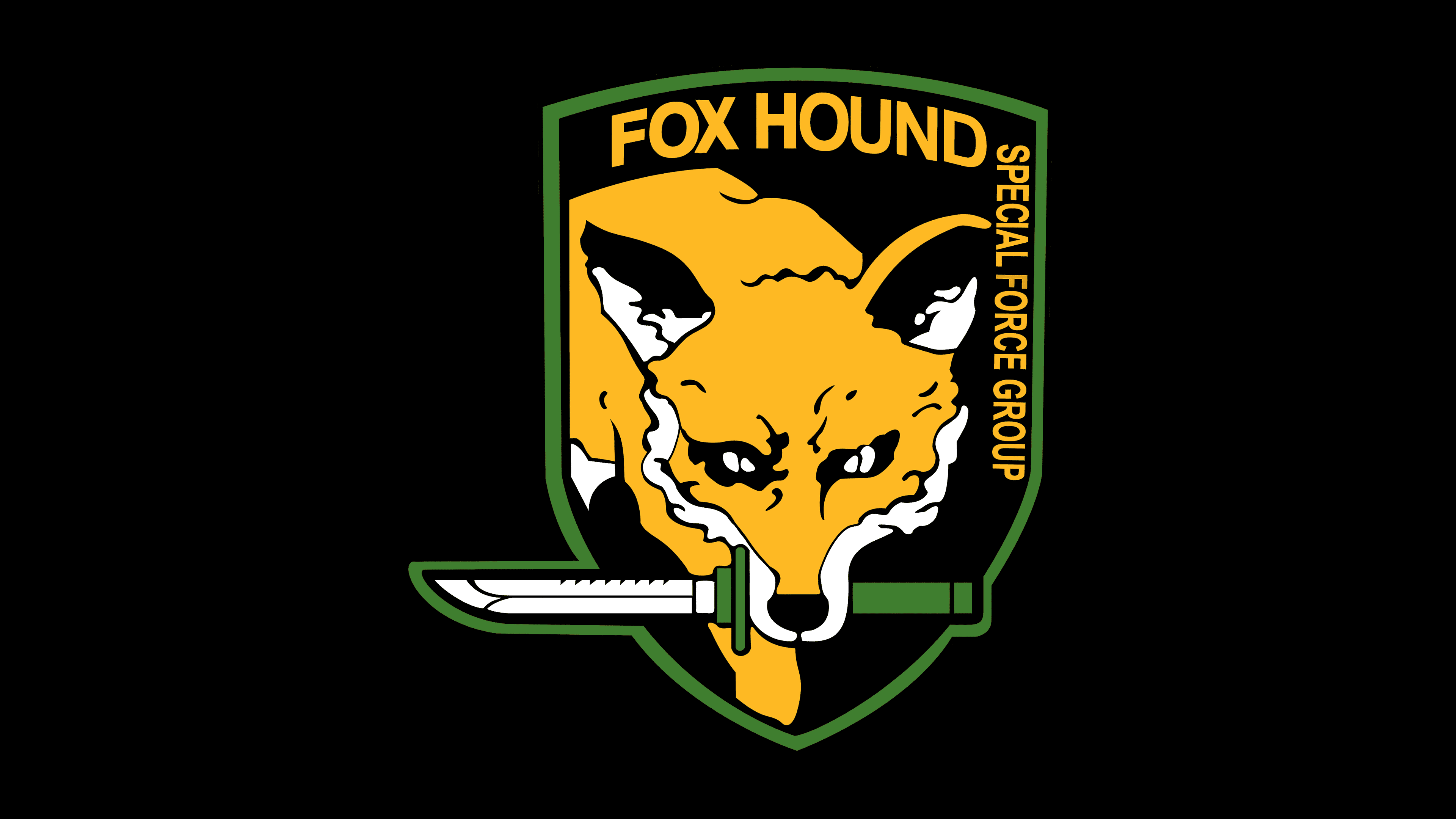
The FOX HOUND emblem was first introduced in the 1998 release of Metal Gear Solid, becoming the symbol of one of the most recognizable and pivotal units in the game’s universe. The design was created by art director Yoji Shinkawa, known for his unique visual style that blends the expressiveness of Japanese manga with the aesthetic of Western graphic novels, particularly the works of Frank Miller and Moebius. Under his direction, a memorable image was crafted for the special forces unit, embodying brutality, stealth, and ruthless precision through a visual language.
The emblem’s composition features a black shield with a green border. At its center is an orange fox staring aggressively forward. White outlines accentuate the predatory features of its face, and its intense eyes convey a sense of threat and readiness to strike. In the fox’s mouth is a knife with a green handle, its tip extending beyond the shield’s edge. This gives the impression that the animal is emerging from the shadows and beyond the image’s boundaries, symbolizing the elusiveness, stealth, and sudden-strike capability of elite special forces.
The knife, as a symbol of aggression and readiness to act, underscores the unit’s focus on direct, brutal engagement. The black shield represents secrecy and covert operations, while the green border references a military context. The fox’s orange color is associated with cunning, calculation, and tactical adaptability, aligning with FOX HOUND’s philosophy and combat profile.
The typography is set in uppercase letters in a bold, military-style sans serif. Across the top is the name “FOX HOUND,” reinforcing the unit’s identity, and along the right side, vertically, is the text “SPECIAL FORCE GROUP,” indicating its role and status. The restrained typeface matches the emblem’s overall style and aggressive tone.
Within the Metal Gear Solid universe, this logo symbolized FOX HOUND’s shift under Liquid Snake’s command toward radical and uncompromising combat methods. Compared to earlier, more cartoonish versions, this design signaled the unit’s transformation into a brutal, determined fighting force, becoming the primary antagonist group opposing the protagonist in the struggle for control of the Metal Gear REX platform.
The emblem achieved cult status among fans, appearing on merchandise, patches, pins, and souvenirs, as well as in various adaptations and fan communities. It became a signature element of character gear and has remained a constant part of the franchise for many years.
Font and Colors
The FOX HOUND emblem’s color palette centers on the dominant orange-and-black combination, with green and white accents. The orange, chosen for its emotional impact, was taken from the animal’s natural coloring. It represents combat drive, aggressiveness, and readiness for action, while also evoking adrenaline and combat tension, qualities central to the unit’s nature.
The black background emphasizes secrecy and stealth, visually expressing the uncertainty and threat posed by the special forces unit. Combined with the vivid orange, it creates a striking contrast that metaphorically illustrates the clash between order and chaos, concealment and open confrontation.
Green, used in the border and knife handle, ties into the military theme, symbolizing tactical preparedness, survival, and belonging to a military structure. White highlights on the fox and the blade emphasize key elements of the composition, adding clarity and sharpness to the details and enhancing the emblem’s visual aggressiveness.
The lettering is set in a bold sans-serif typeface. This choice provides a strict, confident, and straightforward look for the text, fitting the special forces unit’s military style. The closest analogs for reproducing this typeface are SSNicksonTwo by Spencer & Sons Co. and Asap SemiBold, both of which feature uniform, heavy letterforms with minimal decorative elements, reinforcing the sense of discipline and functionality.