 Georgia Tech Yellow Jackets Logo PNG
The Georgia Tech Yellow Jackets logo showcases the strength of college sports—that it nurtures real talent, which eventually moves on to professional teams. The emblem emphasizes the athletes’ excellence, highlighting their essential qualities: the ability to deliver a decisive strike in any situation, even the most unexpected ones.
Georgia Tech Yellow Jackets: Brand overview
The Georgia Institute of Technology was established in Atlanta, Georgia, in 1885, marking the beginning of the Georgia Tech Yellow Jackets’ history in the late 19th century. The athletic teams of the school swiftly came to define its character.
Founded in 1892, the football program served as the prototype for the Georgia Tech Yellow Jackets. The school’s inaugural match occurred on November 5, 1892, with a 0-28 loss to the University of Georgia. Even though it got off to a poor start, this game launched one of the most storied and intense rivalries in college football history in the United States.
The term “Yellow Jackets” first surfaced in the early 1900s. The most widely accepted explanation of its origins pertains to the uniforms worn by the pupils. The Georgia Tech students who wore black pants and yellow jackets to football games in the 1890s earned the moniker “Yellow Jackets.”
The famous coach John Heisman, for whom the Heisman Trophy is named, led the football team to its first major victory in 1917. In addition to going unbeaten that season, the squad defeated Cumberland College in a historic 222-0 victory that currently stands as the record for the most points scored by a single team in an official American football game.
The football program’s “golden era” was defined as the 1920s and 1930s. Under head coach William Alexander, the squad won the 1928 national championship and dominated the Southern Conference.
A new era in the school’s athletic programs began in 1934 when the university was admitted as a founding member of the Southeastern Conference (SEC).
There were more successes in the 1950s. Coach Bobby Dodd’s football team won its second national championship in 1952. Dodd coached the squad from 1945 to 1966, becoming one of the most successful coaches in the institute’s history. His name is currently displayed at the team’s home stadium.
Following its separation from the SEC in 1964, the institute gained greater autonomy over the administration of its athletic departments.
While other sports continued to grow, the football program underwent reconstruction in the 1970s and 1980s. Under coach Bobby Cremins, the basketball team succeeded greatly, even making it to the NCAA Final Four in 1990.
The school joined the Atlantic Coast Conference (ACC) as a founding member in 1979 for basketball and as a conference for other sports in 1983.
The institute had special memories from 1990. Under coach Bobby Ross’s direction, the football team went unbeaten at the end of the season and shared the national championship with Colorado.
Georgia Tech kept improving its sports programs in the 2000s. The football team won the ACC championship in 2009 and regularly played in bowl games.
The athletic teams also had notable success in other sports. The golf and tennis teams consistently achieved top rankings in national contests, and the baseball team routinely made it to the College World Series.
2009 was very successful in football. Under head coach Paul Johnson’s leadership, the team defeated Clemson in the conference final to win the ACC championship. Thanks to their success, the team made it to the esteemed Orange Bowl; however, Iowa defeated them.
Another noteworthy accomplishment came in 2014 when the institute defeated Mississippi State in the Orange Bowl, their first big bowl victory since 1955.
However, the football program ran into problems after 2014. Following 11 seasons as head coach, Paul Johnson announced his resignation in 2018.
The football team’s rebuilding began in 2019 with Geoff Collins’s appointment as head coach.
Basketball-wise, the institute went through ups and downs. Under coach Josh Pastner’s direction, the men’s team won the ACC tournament in 2021, marking the first conference championship since 1993.
The women’s basketball team was also successful, advancing to the NCAA Sweet Sixteen in 2012 and 2014.
One of the best baseball programs in the nation is still in place. The club advanced to the College World Series championship game in 2006. As a baseball powerhouse, the institute regularly participated in the NCAA Tournament.
The school maintained its strong performance in golf. The group regularly participated in NCAA national championships, and several players moved to the professional circuit.
The tennis programs also yielded consistent outcomes. The men’s team regularly participated in the NCAA national tournament and won numerous ACC championships.
A new football training facility established by the institute in 2011 greatly enhanced the environment for athlete preparation.
The home stadium of the basketball teams, McCamish Pavilion (previously known as Alexander Memorial Coliseum), underwent extensive renovations in 2013 that significantly improved the environment for players and spectators.
The school stressed the importance of its student-athletes academic performance. It was frequently honored for its excellent academic standing and high athletic graduation rates.
The institute commemorated the ACC’s 40th anniversary in 2020, emphasizing the conference’s significance in the growth of the university’s athletic departments.
The athletic teams are still a major force in American university sports, maintaining their rich traditions and aiming for new heights in various sports despite some setbacks, particularly in football.
The athletic program has produced many exceptional athletes with prosperous professional careers. These include baseball star Mark Teixeira, football players Calvin Johnson and Demaryius Thomas, basketball players Chris Bosh and Stephon Marbury, and numerous others.
The institute, which combines academic distinction with athletic triumphs and a storied past, remains a vital component of the Georgia Institute of Technology’s identity.
Meaning and History
Georgia Tech’s sports arm consists of eight men’s and seven women’s teams that compete in 17 sports. They are the Atlantic Coast Conference, Division I NCAA, and Football Bowl Subdivision members. According to the survey, four varsity teams were named national champions in the last century: 17th, 28th, 52nd, and 90s. In 2007, the tennis players won a resounding victory over the UCLA team.
What is Georgia Tech Yellow Jackets?
These are the Georgia Institute of Technology sports teams competing in the Atlantic Coast Conference. Distinguished by their bright gold and white uniforms, they represent the ingenuity and perseverance of their engineering-focused university. The team’s mascot, a stylized yellow jacket named Buzz, entertains spectators with its memorable antics at sporting events. The institute’s athletic department is renowned for its baseball, basketball, and football achievements while maintaining high academic success. Bobby Dodd Stadium at Grant Field, one of the oldest college football stadiums, hosts thrilling football games.
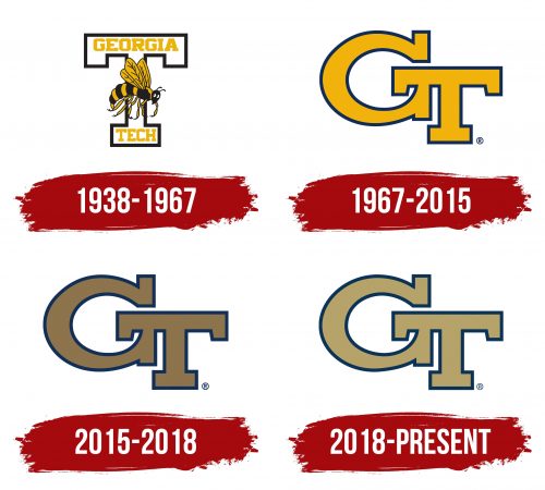
1938 – 1967
The Georgia Tech Yellow Jackets logo stands out with its dynamic and memorable design. At the center is a wasp or hornet, symbolizing strength, energy, and persistence—qualities essential to the university’s team. This insect embodies relentless determination and readiness to strike at any moment, perfectly capturing the fighting spirit of a sports team.
The hornet is depicted in a lively pose: its wings are raised and spread as though poised to spring into action. The black and yellow stripes on its body add vibrancy and mirror the natural coloring of a real hornet, while these colors together symbolize loyalty and courage. The hornet’s white eyes stand out against the black, adding a playful yet slightly aggressive expression. This hornet is both a mascot and a powerful team symbol, instilling a sense of unease in opponents.
In the background is a large letter, “T,” representing the Georgia Institute of Technology. This bold element is designed cleanly with an outline, emphasizing clarity and structure. The words “GEORGIA” and “TECH” are positioned at the top and bottom of the “T” in large, bold font. The bright yellow text contrasts with the black outline, adding intensity and visibility. The font, with its sharp angles, conveys energy and strength.
The color scheme—black, yellow, and white—carries meaning. Yellow represents life energy, movement, and optimism, reflecting the team’s spirit. Black adds a sense of seriousness and determination, while white highlights clarity and openness. Together, these colors create an image of a team that never backs down, always pushes forward, and is ready to fight.
The logo embodies the university’s determination and fighting spirit. Every element tells a story of readiness for battle and resilience in facing challenges.
1967 – 2015
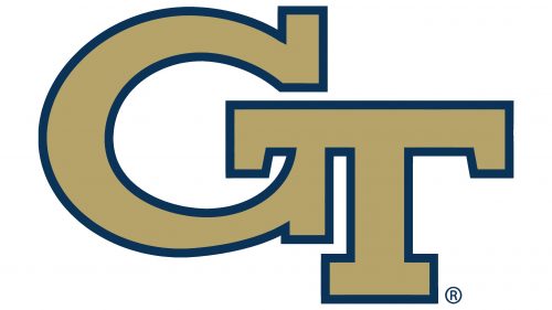
The new Georgia Tech logo features the bold letters “GT,” an abbreviation for the Georgia Institute of Technology, which has become a symbol of the university’s academic and athletic culture. This emblem, rendered in the university’s traditional yellow, highlights the institution’s energy and vibrancy. The yellow color conveys dynamism and positivity, reflecting the progressive and innovative spirit of the university.
Outlined with a thick dark blue border, the letters gain definition and strength. This blue shade represents reliability, stability, and intellectual depth—qualities always associated with the team. Blue also adds contrast, making the emblem stand out on any background.
The letter shapes are slightly angular and structured, giving the logo a confident and monumental appearance. The curve in the “G” seamlessly flows into the “T,” creating a connected effect, symbolizing unity and cohesion among students, alumni, and everyone tied to the university.
Despite their simplicity, these letters convey a sense of teamwork and respect for tradition. The Georgia Tech emblem symbolizes community, pride, and the pursuit of new achievements in science and sports.
2015 – 2018
The logo with the “GT” abbreviation retains its traditional shapes and styling but now features a revised color palette. This time, the interior of the “G” and “T” letters is bronze. This new color adds richness and prestige, underscoring the university’s status and historical significance. Bronze is associated with tradition, continuity, and strength, highlighting the deep roots and legacy of the institution.
The dark blue outline around the letters remains unchanged, adding depth and creating a three-dimensional effect. This blue shade represents stability and intellectual depth, reflecting the university’s academic achievements and reliability. The contrast between bronze and blue brings balance to the logo, giving it a dignified and stylish look.
The shape of the letters remains bold and confident. The large, straightforward “GT” letters appear solid and dependable, embodying Georgia Tech’s students and faculty’s team spirit and determination.
2018 – today
In the new version of the Georgia Tech logo, the color inside the letters has been changed again, while the overall structure remains the same. Now, the “G” and “T” interiors are filled with a soft yet rich golden hue. This color symbolizes the university’s proud heritage and commitment to excellence across all fields. Gold is traditionally associated with success, leadership, and achievement, highlighting the team’s high standing as one of the leading educational institutions.
The dark blue outline still frames each letter, defining the edges and adding confidence to the emblem. The combination of blue and gold creates a harmonious and elegant contrast, drawing attention to its understated luxury.
This logo reflects the spirit of Georgia Tech, where tradition is honored while moving forward to new horizons.
Georgia Tech Yellow Jackets Alternate Logos History
1967 – 1976
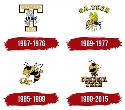
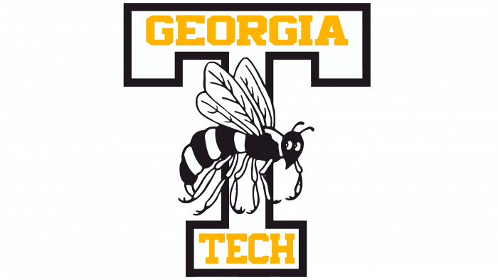
The Georgia Tech Yellow Jackets emblem initially featured a successful and memorable image of the Yellowjacket wasp. This came about due to the analogy between student-athletes and one of the world’s most dangerous insect predators, as they share the same name—Yellow Jackets.
As a result, a striped wasp circles around a block-style “T” in the background. It flies clumsily, with three pairs of legs hanging down and cautiously glancing back. There’s a certain hesitation in its posture, ready to turn into a decisive strike against an opponent at any moment. The insect has transparent wings with thin veins and a powerful stinger at the end of its tail—a needle used to inject venom when threatened.
The wasp and the massive letter are monochromatic, but each has its own style of color combination. The insect has alternating black and white stripes, while the glyph features a black line as an outline, forming a continuous border. The palette’s plainness is brightened by a vivid yellow inscription—the name of the university to which the athletic division belongs.
The top part of the letter “T” (the crossbar) displays the word “Georgia,” while the lower part (the stem) shows “Tech.” The text uses two fonts: the first line consists of short, extra-bold letters with cropped corners, and the second features tall, semi-bold glyphs with sharp edges. All characters are uppercase and in a serif style.
1969 – 1977
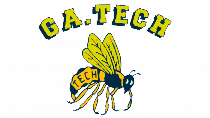
After the monochrome period, a time of colorfulness arrived. However, it was also limited to two colors, as a wasp in nature is yellow and black. The designers used these as the base colors, painting both the insect and the text.
The artists took the Yellowjacket wasp from an old logo, so its pose and expression exactly match the depiction on the 1964 emblem. The wings have thin membranes, the legs hang downward, the antennae stick up, and the head is turned to the left—all rendered as before. The only new addition is a plate with the word “Tech” positioned on the black-and-yellow stripes of the abdomen.
The upper inscription has an arched shape. The letters are widely spaced, creating a stretched line that seems to hang above the wasp, forming a broad, distinctive dome. It displays the name of the sports division, “GA.TECH,” where “GA” stands for “Georgia.” The font is capitalized, with large rectangular serifs. All glyphs are designed in a block style.
A standalone “T” is absent, so the background is neutrally white, allowing the image and text to stand out equally well. Some letters have their corners trimmed at right angles, which is an alternative to rounding and maintains a consistent geometric design across all symbols.
Another advantageous feature of the Georgia Tech Yellow Jackets logo is the addition of shadows, which give it a three-dimensional effect. These shadows appear on the upper inscription, distinctly duplicating the glyphs, making them seem raised above the surface.
1985 – 1999
This version of the Georgia Tech Yellow Jackets emblem appears modern and concise. It is highly adapted to current visual identity requirements because it is:
- compact;
- informative;
- authentic;
- unique.
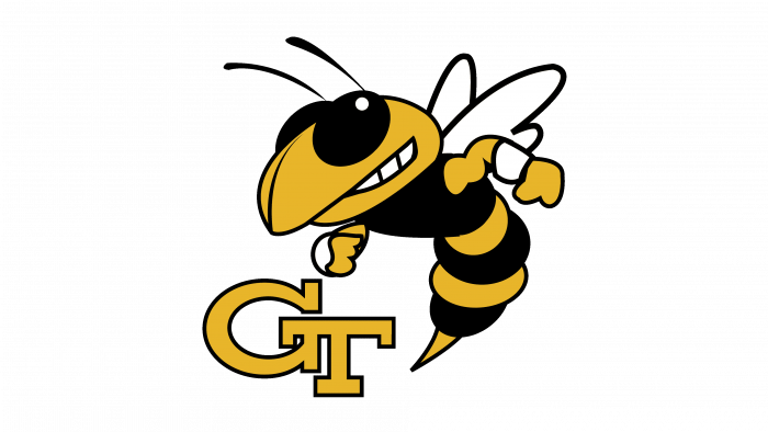
It reflects everything the athletes want to convey to their rivals; for instance, the character displays confidence, fierceness, a fighting spirit, and readiness to step onto the playing field at any moment. Moreover, this version effectively captures a sense of dynamism not present in any previous emblems. Movement is shown through the wasp’s gestures—how it actively waves its arms, calling for action.
This design makes The insect less anthropomorphic since it lacks legs in sneakers. The designers retained only the muscles, wristband-clad arms, and a smirk that reveals tightly clenched teeth. The stinger is elongated to emphasize the threat to competitors. The wasp, as before, looks to the left.
The minimalism of the Georgia Tech Yellow Jackets emblem is also evident in the absence of long inscriptions. The abbreviation “GT” replaces these modestly positioned in the lower left. It is designed as a monogram: the letters are connected and placed at different heights. Rectangular serifs are retained, but the trimmed corners are gone and replaced by regular rounding.
1999 – 2015
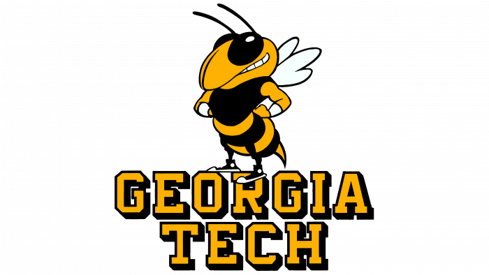
The indecisive wasp is a thing of the past: it has been replaced by a confident character who confirms its status as one of the most dangerous predators among insects. The style of the image has also changed—it is simple, cartoon-like, and slightly anthropomorphic, as the wasp has improvised arms with clenched fists resting on its sides. This stance demonstrates the wasp’s superiority over its rivals, seemingly challenging them.
The insect features a sharp stinger and defined muscles to showcase strength, courage, and fearlessness. Classic sneakers are drawn on their feet, while sports wristbands adorn their wrists. Light reflections in its large, round eyes highlight the yellowjacket wasp’s restless nature. Its antennae stick forward, and its mouth twists into a mysterious smile.
The angelic image has turned rebellious, as the insect no longer hovers in the air with its legs hanging down; it now confidently stands on a two-level inscription, like on a pedestal. Below is the name of the student teams: Georgia Tech. The name is in a geometric typeface—bold, uppercase, serifed, with rectangular-shaped letters. Some corners of the letters have small cuts that replace smooth rounding, found, for example, on the “G,” “O,” “R,” and “C.”
Additionally, the shadows on the glyphs remain but have shifted from left to right, visually organizing the logo and making it neat. The color palette traditionally combines black and yellow, which stand out effectively on a white background.
